
Suppose your eCommerce website design has fuzzy calls to action, low-quality product images, poor navigation, and only one or two payment options. In that case, it’s no better off than a crumbling brick-and-mortar storefront. It’s going to turn prospective customers away just the same.
There are many ways to design a good eCommerce website, enough so you could end up with analysis paralysis and not making any helpful changes.
That’s no way to be. Sometimes, learning from examples is the best way to get your desired results.
In this blog post, we’ll take a look at the best eCommerce website design examples, top trends, and the key elements that make a stunning website.
Table of Contents
Key Takeaways
- Use whitespace generously, showcase large-scale product images, add a search feature to the navigation, be UX-friendly, and keep it simple.
- Implementing these design elements into your eCommerce website strategy requires A/B testing and some degree of trial and error. Once you determine what works, scale up to attract new traffic sources.
Understanding eCommerce Website Design
Before I share these examples, I want to review the most important elements of any successful eCommerce website design, as this will help you appreciate what the examples got right.
Clear navigation
User design, or UX, is a key element of any successful eCommerce website that gets lots of clicks, traffic, and repeat visitors. But, if your site is impossible to navigate, no one will bother with it.
Your navigation menu must be simple. You can include your menu items spelled out across the top of your website or add a navigation bar the user can click to expand.
Mobile optimization
Did you know that in the last quarter of 2023, mobile devices and smartphones were the top two ways people accessed the internet? That’s right! Computers, including laptops and desktops, were third.
That’s why you must prioritize mobile optimization in your website design. What does that mean, you’re wondering? Your site must load within eight seconds, be responsive and easily navigable, and limit the use of pop-ups.
You should also test your website before it goes live to ensure the photos, videos, and text are all the proper size for mobile devices.
CTAs
The call to action or CTA is a must-have element of any good website, especially eCommerce sites. You can use CTA buttons or links (although buttons are much more common in web design) to guide visitors to specific products or pages.
A good CTA button should use a color that contrasts the main website color scheme but isn’t harsh or glaring. Complementary colors are your best choice here. For example, if your brand colors were shades of purple, a yellow CTA button would stand out.
Here’s another helpful pointer. The anchor text in your CTA should clarify what happens when you click. The days of “click here” CTAs are over. Instead, yours should say, “Click here to explore our fall collection,” or something to that effect.
Branding
Your brand should be all over your website like a personal stamp, featured in everything from the color scheme you use to the logo and verbiage (which should suit your tone).
Keep the branding consistent with other brand uses, such as your email marketing and social media. Consistency is one of the most important facets of branding, as different representations of your brand across various platforms don’t help anyone remember it.
Wishlists
As an eCommerce brand, you want people to want your products, so why not make wishlists a feature of your website redesign? Let customers log in and put together their favorite products so they can conveniently buy them later.
Oh, and make the wishlists shareable, as this way, if a customer wants to let others know what to buy for a gift (such as for the holidays or a birthday), they have an easy way to do so. Amazon is a great example of wishlists in action.
Search
I always advise you to use a search function on your website. Ideally, you should build it right into the navigation menu, especially if you have a traveling navigation bar that scrolls along with you. A search option makes it more efficient for those who know what they want to find it.
Product images and videos
Your eCommerce website must have images showcasing your incredible products. It is not just images that will do; they should be high-res and professionally shot. That doesn’t mean you need to hire a photographer, not with today’s tech. You can use a good smartphone camera to get high-quality photos.
Make sure you display the product from various angles and sides so people can get a full picture before purchasing. Videos of the product in action also help people with their decision-making.
Price filters
Almost all online retailers use price filters, so your eCommerce site should also use them. This will help your budget-conscious customers find something they can afford, which can be the difference between making a sale or not.
Reviews
Social proof is a surefire way to drive more sales, so you need as much of it as possible. Share reviews, testimonials, the whole nine. Have an entire page dedicated to reviews, but let people speak their minds freely.
Deleting all the bad reviews because you don’t want negative feedback will not go unnoticed. It’s too sketchy to have a perfect record; no business does.
What matters more is that you reply to the customers who left the reviews and try to make things right.
Product collections
Another way to expedite a website visitor’s shopping experience is by presenting collections of goods. These related products will help customers find what they need and perhaps even items they weren’t looking for but are happy to find.
Best-sellers list
Your website will also benefit from a best-sellers list. Customers might start there, especially those on your site for the first time, and find a fabulous new product to purchase.
Read more: 5 eCommerce Email Marketing Software to Help You Sell More
Top eCommerce Website Design Trends in 2025
Besides those basics, you should also familiarize yourself with design trends in eCommerce website design, as plenty have cropped up throughout the 2020s that will impact the direction you take your eCommerce website.
Let’s take a look at them!
Bold colors
It’s impossible to deny the attraction to bold colors, especially on eCommerce websites. These hues grab attention and turn heads, two things any eCommerce store owner wants to do.
While going bold is brave and profitable, you must be reasonable. For example, you should use plenty of whitespace or empty background space, as that makes bold elements pop that much more. Also, don’t forget the basic rules of complementary colors!
As well as neutrals and pastels
Now, here’s something interesting. While bold colors in eCommerce website design are having a moment, so too are pastels and neutrals. If bold hues don’t suit your brand, you can tone down your colors and still be on-trend.
Interactive elements
I wouldn’t say that interactive elements are a new trend or are limited to eCommerce. Brands of all sizes, shapes, and types like interactivity in web design because it keeps readers on the site longer and engages them.
Content like chatbots, quizzes, interactive infographics, animations, surveys, and industry-specific calculators are all examples of interactive elements you can incorporate into your eCommerce site design.
Website transitions
Who doesn’t love a good transition on a website when you click from page to page? These kinds of sites feel chic, professional, and terrifically upscale. There’s something so nice about browsing them because they produce a unique user experience.
If you decide to add transitions to your website, don’t negatively impact the loading speed with them. Your site should load in two to eight seconds.
Read also: Top Website Header Examples to Inspire Your Design
Detailed Analysis of Selected eCommerce Website Examples
Okay, now it’s time for the moment you’ve been waiting for…the eCommerce website design examples!
This collection of sites is from various industries, so no matter which area of eCommerce you specialize in, there are ideas you can borrow from here.
Fashion
1. Allbirds
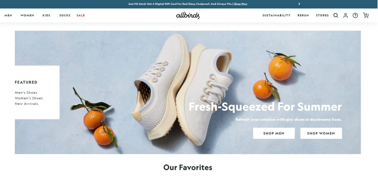
The United States and New Zealand fashion brand Allbirds specializes in sustainable footwear for kids and adults. Its website has many of the crucial elements I discussed above.
For starters, a search bar at the top is built into the navigation. The homepage has a Favorites section with subcategories such as For Activity, For Travel, and For Everyday.
You’ll also notice plenty of whitespace throughout, which lets the high-quality product imagery shine against the simple background.
Simple is the name of the game here. It would be disingenuous to be a sustainable brand with an overcomplicated website design, as it doesn’t gel with what your brand is supposed to represent.
2. Dress Up
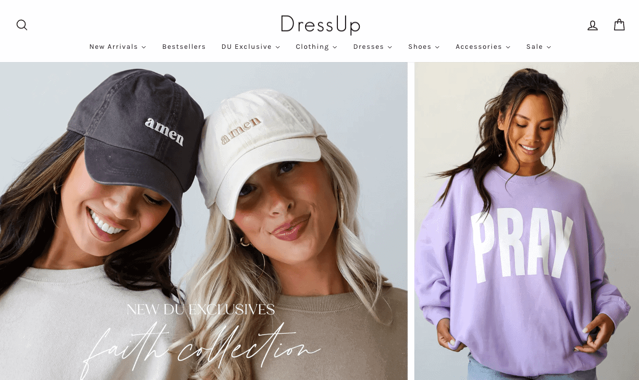
How do you grab attention on a fashion eCommerce site? It’s simple – you use large-scale imagery. That’s what women’s online boutique Dress Up does. Its homepage features a carousel of product collections with images that take up nearly the entire page.
Dress Up opted for the popular pastel color scheme for its site layout, which uses white for the background and a pale salmon pink as the contrasting color. You can see the contrast in action in the form of a CTA button for 10% off.
You’ll again notice a search option on the upper-left side of the page. Also, exploring any clothing category reveals the option to filter results by availability, price, color, and size.
Health and wellness
3. Decibullz
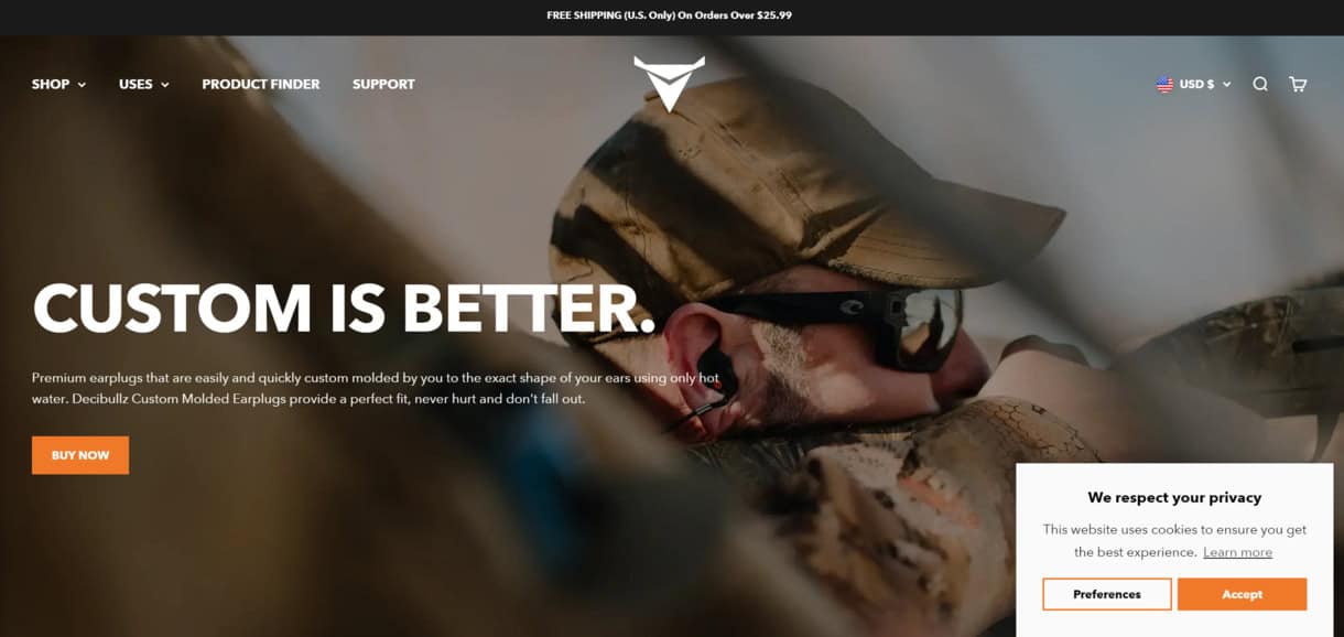
The earplug brand Decibullz produces custom-molded earplugs designed to fit your ears specifically. Exploring its site brings its rustic branding to life. Using large images showing customers using Decibullz earplugs is a benefits-focused practice that pays off.
Scrolling through the site reveals a cool transition where the logo switches from white to black-gray, and the navigation menu becomes off-white.
The orange CTA buttons are a nice contrast, and the color is featured elsewhere on the site. For example, the instruction graphics on how to use Decibullz earplugs feature subtle uses of orange.
Home goods
4. Kettle & Fire
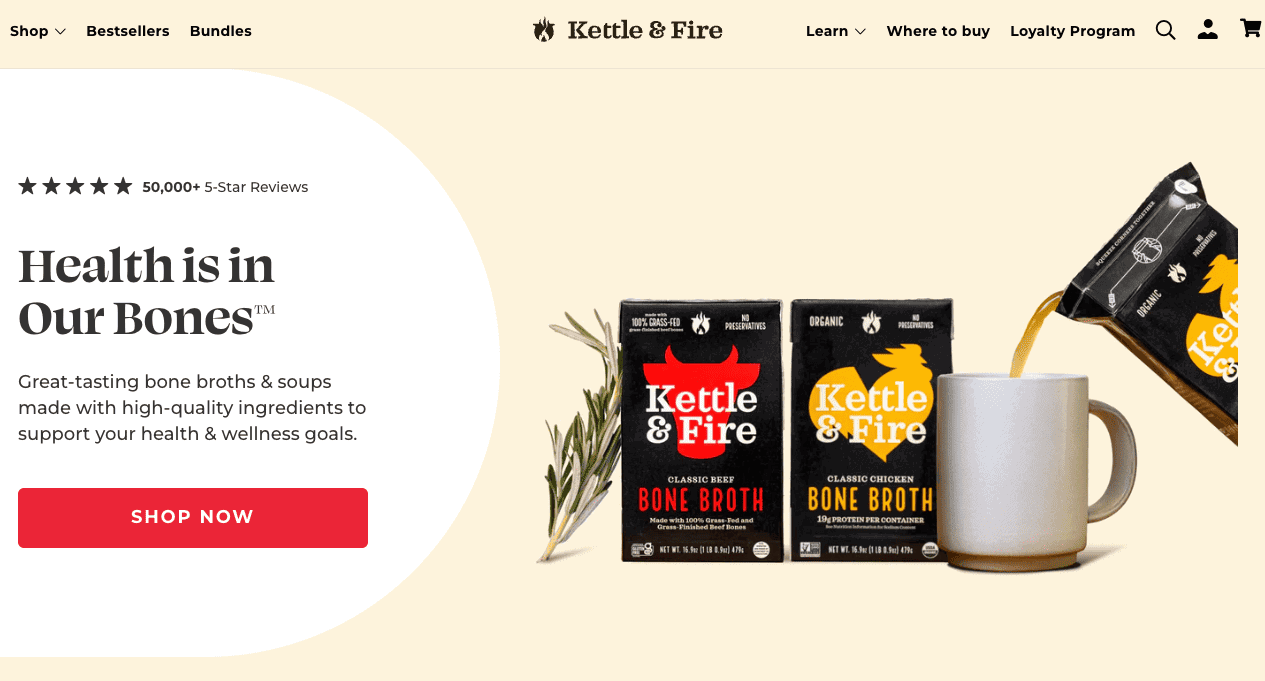
One of the more colorful eCommerce website design examples, Kettle & Fire is a high-end grass-fed bone broth producer. Its site uses a pale beige color scheme with pops of yellow and red, the latter of which is used for the CTA and chat buttons.
Kettle & Fire has a best-sellers section built into its navigation bar so new users can check out which products other customers recommend. The navigation, which travels with you, also has a search bar.
Between its clear-cut CTAs and attention-grabbing photos of its products, Kettle & Fire knocks it out of the park.
Unique niches
5. Milk Boutique
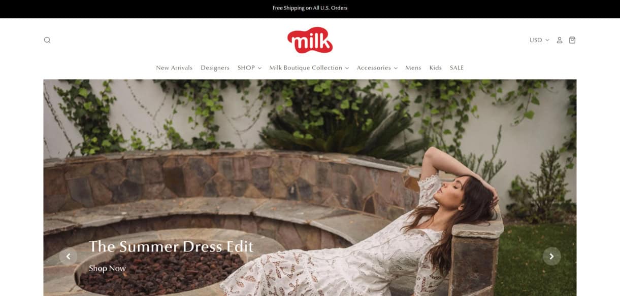
You could say Milk Boutique belongs in the fashion section, but I don’t think so. The brand adjusts its website design to match its products and deserves its special categorization.
Its site is straightforward and rich with product imagery, everything from jewelry to knitted clothing to dresses. Its logo, which resembles a splash of spilled milk, is red and stands out beautifully against the site’s white background.
The purposely simple layout lets the product photos shine just as they should. Other great elements of this site design are an expandable navigation menu, a search bar, and the option to tailor your currency from USD.
6. JOCO
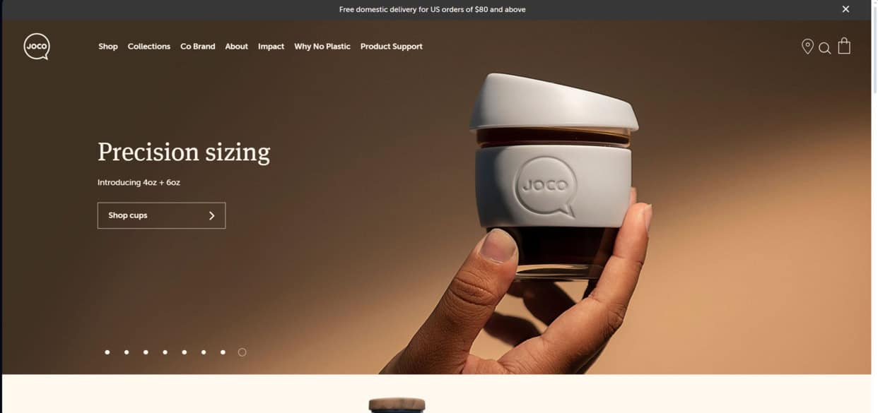
The water bottle brand JOCO is in a competitive market (I’m sure you’ve heard how crazy popular Stanley cups have become). Still, they make the most of it with a balanced, appealing, contemporary website design also based on its products.
Its layout facilitates easily finding the product categories you need with a Collections menu at the top of the page.
Scrolling on the homepage reveals bottle categories, including insulated, glass, and reusable bottles and cups. There’s also a helpful search option.
Read also: 15 Stunning Email Design Examples from Big Brands
Innovative Features in eCommerce Website Design
While I’ve covered all the basics of what should go into great eCommerce website design, you have plenty of options if you’re itching to take yours to the next level.
Let’s go over them.
Interactive product reviews
Some eCommerce websites have begun embracing interactive reviews as a smart way to take collaborations further.
The author, or your customer, can interact with the company or you in real-time (or close to it), discussing any concerns or what the customer enjoyed the most about your products.
This is a more meaningful way to connect with your audience and address their concerns or questions more thoroughly.
Dynamic content
Remember the examples above of eCommerce website designs that cater to their products? That’s dynamic content.
Unlike static content, which remains the same, dynamic content will change based on set criteria. For example, consumer preferences, user behavior, season, or data can influence the dynamic content.
Advanced filtering elements
Most eCommerce sites have basic filters, such as by price or color.
Advanced filtering goes even further, allowing customers to track down more precisely the type of product they’re looking for. Your audience will appreciate the implementation of these filters!
Psychological design elements
Another unique way to design your eCommerce website is through using psychology. These subtle yet effectual elements subtly guide website visitors to a decision. Here are some examples:
- Shapes: Did you know the types of shapes you use in your website design influence your readers? Check out this breakdown of how it works:
- Waves and curves have a calming effect.
- Polygons are used in tech and innovative industries and can immediately command attention.
- Triangles are used directionally and can also represent power.
- Ovals and circles are inclusionary and create harmony.
- Typography: The fonts, typefaces, and typography you choose for your website is another way to influence action. For example, a large, bold type will naturally draw the eye to it and interest the reader.
- Layout: Using elements like whitespace, blocks, and borders can unite elements of your site, create symmetry between dual elements, or separate them.
- Colors: You can’t talk about eCommerce website design psychology without mentioning colors. Each hue has its own emotions it conjures, as follows:
- White: Honesty, cleanliness, innocence, and simplicity
- Black: Mystery, security, sophistication, drama, and formality
- Blue: Competence, loyalty, peace, and trust
- Green: Nature, quality, freshness, and healing
- Brown: Simplicity, trustworthiness, ruggedness, earthiness, and dependability
- Yellow: Cheerfulness, friendliness, happiness, and creativity
- Purple: Ambition, spirituality, luxuriousness, and royalty
- Orange: Sociability, bravery, successfulness, and confidence
- Pink: Sweetness, sophistication, sincerity, and compassionateness
- Red: Energy, love, passion, strength, power, and excitement
Read also: 25+ Top eCommerce Marketing Tools Sure to Boost Sales
eCommerce Website Design Best Practices
Here are some handy tips to help you maximize the quality of your eCommerce website design.
Keep it simple
I’m sure I don’t have to tell you this by this point, but the more straightforward your website design, the better. You’re not trying to win design awards here, but give your customers a UX-focused browsing experience that puts the products first.
Add payment options and multi-currency support
Today, people use more types of payments than ever. If you only accept Apple Pay and PayPal, you must join the program and expand your offerings.
The more payment support options you provide, the more doors you open to future sales.
You should also expand your currency support beyond USD. Dig into where your international customers come from and add their native currency to your list.
Make checkout as easy as possible
Checkout should be a seamless, almost effortless process. There’s no need for 15 form fields; that’s complicated and will turn people away from buying your products.
Let customers check out as guests if they don’t want to make an account.
If they already have an account, let them log in through major portals like Google or Facebook so they don’t have to remember another username and password combo.
Incorporate auto-completion in search
Searching on eCommerce sites is popular because it saves time, but there’s a way to make it even more expedient. Use auto-completion in search so customers don’t have to type their entire search query.
This will especially make them happy when searching on mobile, where it’s easier to make typos.
Build a content taxonomy
Do you have a large library of eCommerce products?
Creating a content taxonomy will go a long way toward helping your customers find what they need without having to trudge through irrelevant results.
For example, a fashion retailer would have a section for bottoms, then products like shorts, skirts, trousers, and jeans under that umbrella.
Read also: Winning in a Competitive World: eCommerce Marketing 101
Conclusion
eCommerce website design requires continuous improvement and adaptation to thrive and meet your audience’s needs.
Experimenting with new technologies and trends is a great way to stay innovative and competitive in a crowded landscape.
EngageBay is an all-in-one marketing, sales, and customer support software for small businesses, startups, and solopreneurs. You get email marketing, marketing automation, landing page and email templates, segmentation and personalization, sales pipelines, live chat, and more.
Sign up for free with EngageBay or book a demo with our experts.
Frequently Asked Questions (FAQ)
1. What are the first steps in redesigning an eCommerce website?
You should begin with a web design audit, reviewing your metrics to determine where your website traffic comes from and what your bounce rate is.
You can also survey your audience for personalized feedback on your site design. This information will help you decide what to change first.
2. How do I choose the right design element for my product type?
Consider the user above all else and how well the design element will connect with the rest of your website layout.
You should also use A/B testing to determine the performance potential of the website element.
3. What are the most common mistakes in eCommerce design, and how can they be avoided?
The most egregious eCommerce website design errors are:
- Not having a call-to-action button or featuring the button below the fold
- Ignoring SEO
- Overcomplicating the checkout process
- Making navigation confusing or vague
- Not including contact information
- Having outdated or incorrect product information
- Using low-res images and videos
Most of these mistakes are fixable with a website audit, which will reveal your weak points. Giving your site a clean sweep and redesigning it for UX will increase traffic, conversions, and sales.
4. How often should I update my website design?
Once you nail your design, you don’t have to change it again for a year or two. Some eCommerce businesses wait up to three years.