Many factors play into your email open rate, and email design is one of them.
After all, if the design of your message doesn’t please the eyes of your visitors, they could stop opening your messages and may even unsubscribe. Well-designed emails, by comparison, drive conversion rates and user engagement, keeping your audience eagerly opening your messages. That’s why it helps to have email design examples.
Look, I get that mastering email design is no easy task, but that’s what this guide is here to help you do.
In this blog post, we’ll understand the importance of email design, why it matters, the key principles, and 15 of the best email design examples from successful brands.
Let’s get started.
Table of Contents
Key takeaways
- Effective email design can improve click-through rates and conversions.
- When designing emails, utilize whitespace, optimize for mobile, include high-quality imagery, have a clear hierarchy, use complementary brand colors, and feature a readable typeface with prominent CTAs.
Understanding Email Design
Before delving into some can’t-miss email design examples, let’s start with the basics. For example, what is email design, and what role does it play in a marketing campaign?
First, a definition. Email design entails the visual elements of your email messages, which include the following:
Layout
An email layout presents all the elements, including images, copy, headlines, CTA buttons, and more. There is no one right way to plan a layout, as it depends on your branding and the elements in your email, among other factors.
The layout is one of the most important elements to get right. If it’s not optimized for mobile or otherwise askew, your open rates could tank.
Color scheme
The next part of email design is the colors you utilize throughout the message.
Let’s talk color theory, shall we? Complementary colors look good when paired up. Think orange and blue or purple and yellow. These colors are opposite on the color wheel, which explains why they work well.
Besides complementary colors, you can also pair shades of the same color. For example, forest green is a darker color, while moss green is lighter. Dark blue and teal also look nice together.
The colors utilized in your email design should be your brand colors, at least ideally. However, you can also venture into similar colors while still remaining on-brand.
Typography
Did you know that almost 80% of readers will only skim text instead of reading it? That means your content must be readable. One element of readability is typography, a cornerstone of good email design.
Typography serves many purposes in email design examples. It establishes a hierarchy in your copy, such as using H2 and H3 tags. It’s also used to strengthen your brand.
Imagery
Next, there’s the imagery that goes into your email. This will be brand-specific, featuring your products or services to engage the reader and motivate them to click your links, visit your website, and purchase your products and services.
That said, your imagery—including photos and videos—must follow basic email design rules. Use high-quality imagery and watch the file size, as it can make your email load slowly and hurt click-through rates.
Call to action
You can’t send an email without a call to action.
Whether you want your link embedded within your email copy or a button above and then below the fold will depend on your small business campaign and goals, but a CTA (or several) inspires your audience to take the desired action.
Read also: 15 of the Best Newsletter Examples for Creative Inspiration
Why Email Design Matters
Check out these benefits of good email design to understand why its emphasis is critical.
Promotes brand consistency
Utilizing the same colors as seen elsewhere across your branding, such as on your website and social media, creates more consistency.
You can build a brand more easily when it’s memorable across channels, including your emails. You can also use good email design to strengthen your small business brand.
Connects with newer and longer-term customers alike
While email copy is important, visuals also matter.
They make your emails more appealing, grabbing the attention of readers who might have otherwise been disengaged. You can also express your message more succinctly and clearly through visuals and copy.
Nurtures your Leads
With the conversion rate for email marketing campaigns up to five percent and an ROI of $40 max for every dollar you spend, email marketing is a cost-effective and results-driven way to move leads through the funnel.
Good email design uncomplicates your goals to get the leads one step closer to conversion as you continue nurturing the burgeoning relationship.
Inspires your audience to act
Between high-caliber visuals and well-placed CTAs, you can educate your audience with your email design. Your copy can also inspire more clicks, purchases, and conversions, ensuring your email campaign succeeds.
Increases reader engagement
You can only keep your audience engaged by ensuring they open your emails, and this is another area where good design is critical.
When your audience develops expectations for what your emails will look like, they’ll get into a habit of opening your messages to see if you continue to meet those expectations.
This consistency is also an excellent way to strengthen your brand, making it doubly important.
Read also: Best CTA Examples for Small Businesses To Learn From
Key Principles of Effective Email Design
Of course, there are differences between good and great email design. The following benchmarks of effective design will help you determine where to put your priorities for your next campaign.
Simplicity and clarity
An email needn’t be overloaded with images and videos.
Think of your email as a doorway to your store, as that’s ultimately where you want your readers to land. You don’t need to show your readers the whole shebang to get them to click. A tantalizing glimpse is enough.
On that note, clarity is also important. Using header tags to create a copy hierarchy and having definable above-and-below-the-fold portions are critical to clear your message.
Mobile-first approach
More than 80% of today’s consumers read emails on a mobile device in 2023, so imagine how much higher that number will get as the 2020s continue.
Bearing that in mind, your emails must be optimized for mobile users first and foremost, as they’re your primary audience, not desktop users.
Ideally, reading your emails should be an identical experience to reading on your mobile device or desktop. You might have some minor layout changes, but the key elements should be displayed similarly.
Color psychology
Earlier, I discussed complementary colors. Now that you’ve passed basic color theory, it’s time to move on to another color lesson: the psychology of hues.
You should have treated yourself to a color psychology lesson when creating your brand, as certain colors convey specific feelings and emotions.
The best way to use colors is to draw out the feeling you want, so keep these color meanings in mind as you draft your next email campaign layout.
- Red: Energy, strength, love, excitement, boldness, passion, power, and drama.
- Orange: Warmth, confidence, optimism, sociability, bravery, success, friendliness, and innovation.
- Yellow: Cheer, warmth, happiness, creativity, optimism, and friendliness.
- Green: Quality, prosperity, freshness, nature, health, hope, and healing.
- Blue: Security, competence, serenity, loyalty, dependability, peace, and trust.
- Purple: Ambition, wisdom, spirituality, wealth, luxury, and royalty.
- Pink: Creativity, sweetness, balance, sophistication, transformation, sincerity, passion, imagination, and compassion.
- Black: Substance, security, authority, sophistication, power, drama, and formality.
- White: Peacefulness, honesty, freshness, innocence, simplicity, purity, and cleanliness.
- Brown: Simplicity, support, trustworthiness, authenticity, ruggedness, earthiness, reliability, seriousness, and dependability.
Typography
Fonts such as Helvetica, Tahoma, Arial, Veranda, Times New Roman, Georgia, and Lucinda are examples of readable fonts you should use.
They’re safe bets because most of your audience will have them on their phones or computers (they’re default fonts in most systems). If you venture into downloaded fonts, characters or typefaces may not display, leaving your emails unreadable.
Use of visuals
Visuals such as GIFs, icons, and images differentiate your emails from others, but several best practices are at play here.
First, when it comes to GIFs, less is more.
Too many GIFs can be visual overkill and detract from what is otherwise a nice email design. As for non-animated graphics like social media icons, they should be mobile-optimized so they load quickly without looking blurry.
Read more: Email Design Best Practices — Do Your Emails Convert?
15 of the Best Email Design Examples from Big Brands
Okay, are you ready to feel inspired? Then check out this showcase of the best email design examples.
Welcome emails
1. Fiverr
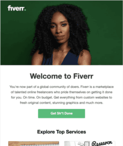
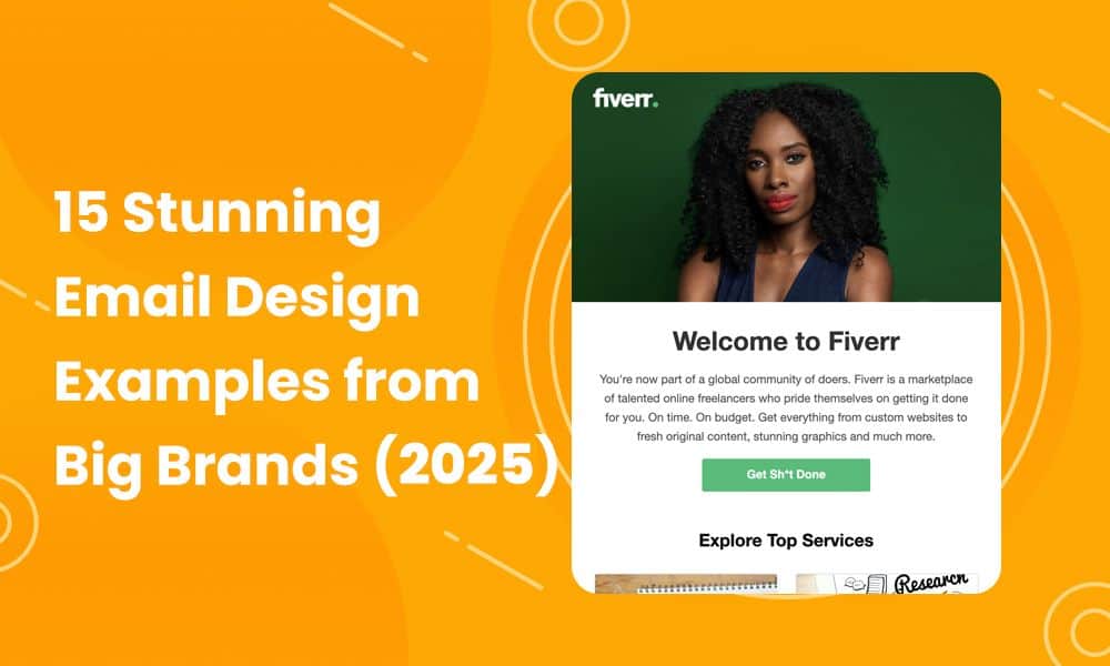
This welcome email, courtesy of Fiverr, features an image of a serious-looking woman against an emerald green background with the Fiverr logo on the upper left.
Below is a lead-in copy that says in large, bold font: “Welcome to Fiverr,” followed by mentions of having joined a “global community” and “marketplace of talented online freelancers.”
The CTA is a lighter shade of green than the background in the image, so it stands out against the white background.
2. Wix
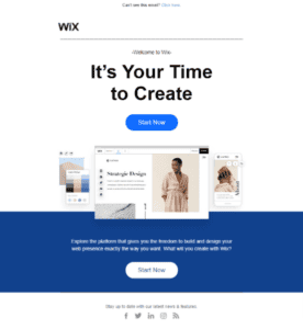
Wix is a website design service. Upon joining, you will receive a welcome email, as shown above. The large intro copy reads, “It’s Your Time to Create,” followed by a blue CTA button that says, “Start Now.”
Below that is a carousel of images showcasing the various website designs you can use as a Wix customer. Then, there’s a block of dark blue and another “Start Now” CTA button in contrasting white. It’s an overall clean and efficient design.
3. Mint Mobile
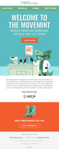
Mint Mobile, a virtual network operator geared toward mobile, has a two-toned mint green bespectacled fox as its mascot. Therefore, it seems only appropriate to use the fox in its welcome email, as Mint Mobile does twice.
First, the fox is in a large, above-the-fold graphic, wearing a lab coat and working at a desk with scientific equipment. The copy reads, “Welcome to the Movemint,” which is a cute pun.
The CTA button above the fold is a bright, neon orange, which contrasts visually with the mint green shades. However, it works because orange and green are complementary.
Underneath a paragraph of copy on a white background is an orange block with a second graphic of the fox mascot holding a smartphone. This part of the email lets you check compatibility with the service and features a CTA in bright orange.
Promotional emails
4. Hair Sisters
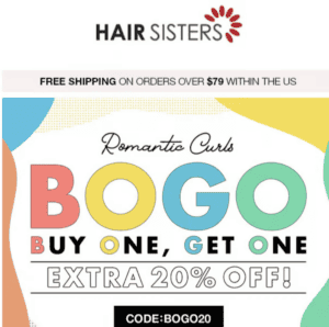
BOGO deals always draw attention, but playing them up in your email marketing is wise, as you can convert more on-the-fence customers.
Hair Sisters used colors and large text expertly to announce their 20% off and BOGO deal. You can’t miss out on an email like this!
5. ASOS
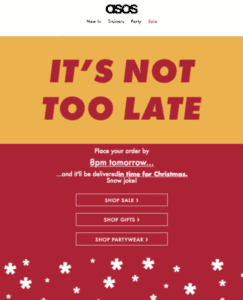
Holiday shopping is stressful, let’s be real. Sometimes, you wait until the last minute, but many retailers have hard-and-fast shipping deadlines for orders to arrive in time for Christmas.
Emails like this one by retailer ASOS stand out. You’ll notice that ASOS uses a GIF at the top where the graphic says, “It’s not too late,” which flashes in several colors. Under that is a solid maroon background and CTA links to ASOS’s on-sale items, partywear, and gifts.
6. Emma & Sam
Image courtesy of Email Tuna
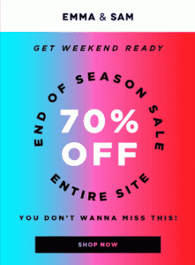
Another way to announce a major sale, like Emma & Sam’s end-of-season sale, is with an eye-catching graphic, as seen here.
The multicolored gradient with shades of teal, purple, pink, and red is a good background for announcing 70% off. The brand also smartly uses large black and white type.
The CTA button beneath is solid black, so it doesn’t get lost among all those colors.
Newsletter designs
7. The Skimm
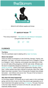
As stylish as the media brand itself, The Skimm’s newsletter uses bright teal and white, a simple, clean, and timeless color scheme.
You’ll see The Skimm’s graphic below the intro, then a quote of the day and news under that.
Using the teal for hyperlinks and social buttons unifies the entire email. It’s a great email design example to emulate.
8. Lady Lake Smiles Dentistry
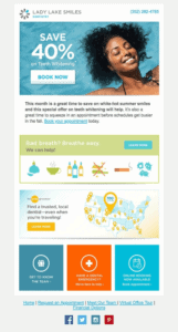
Here’s an example of a dental newsletter. Proving that dentists don’t have to be stuffy, Lady Lake Smiles uses color excellently throughout. The newsletter features unique graphics about bad breath, then colorful blocks in hues like teal and bright orange.
Opening this type of email would visually engage a reader, and that’s all it takes to draw them in. You can keep them there with great content.
9. AdEspresso
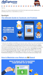
Hootsuite’s AdEspresso newsletter sheds the usual Hootsuite owl mascot and has its own cartoony, Little People style.
This SaaS newsletter may be heavy on the copy, but it also has appealing graphics and bright colors to make it visually attractive. That’s why it belongs on this list of email design examples.
Re-engagement emails
10. Winc
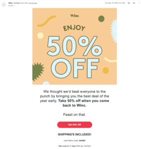
Winc wants you back, and the best way to do that? It’s to incentivize you with great deals, of course. In this case, its 50%-off deal is advertised loud and clear with oversized text and colorful patterned graphics.
The bolded copy that reads, “Take 50% off when you come back to Winc,” is also a smart touch.
11. Help Scout
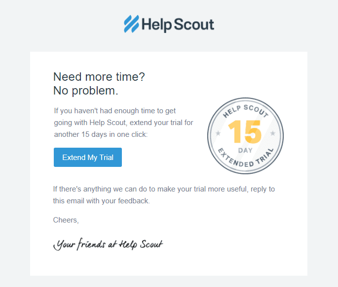
The email is short, sweet, and not graphically flashy because it doesn’t need to be. All it’s trying to do is benefit the recipient by letting them try Help Scout longer for free and incentivize them to make a purchasing decision soon.
12. Grammarly
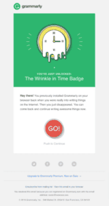
Grammarly gamifies its re-engagement in this email design example.
If you don’t use its service enough, you get The Wrinkle in Time Badge with a melting clock. The copy mentions how the user had “previously installed Grammarly on your browser back when you were really into writing things on the internet,” then invites them to “come back and continue writing awesome things now.”
The “Go!” button underneath, a CTA button, is tempting not to click!
Seasonal campaigns
13. Loft
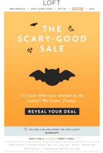
Retailer Loft checks all the right boxes with its fun Halloween sales email. Orange background? Check. Spooky language in the copy? Check. Halloween emblems? Check. A sense of whimsy and mystery? Double check.
Loft offered a mystery deal only revealed by clicking the CTA button at the bottom. What a smart strategy to inspire more click-throughs!
14. The Washington Post
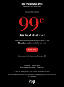
The Washington Post incentivized its readers to buy its newspaper on Black Friday of all holidays by mentioning how 99 cents is its “best deal ever.” The oversized 99-cent text in red and bold font against the black background draws the eye toward it, as does the red CTA button.
The use of black backgrounds for Black Friday is common among retailers, as is the oversized font, so customers know exactly what they’ll save. With so much competition on this major shopping holiday, you must do what you can to stand out.
15. Jack Spade
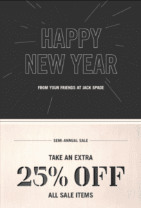
I like this seasonal email design example because it crosses between a holiday greeting and a sales email. The first part of the email features a black background and white lines that look like fireworks, then a copy that says, “Happy New Year from your friends at Jack Spade.”
Then, below that is a beige-colored graphic advertising the semi-annual sale, where shoppers can save 25%.
Read also: 50 Powerful Call-to-Action Phrases (and Tips) to Boost Conversions
A Step-by-Step Guide to Designing Your Emails
How are your inspiration levels? Overflowing yet? Good.
It’s time to design small business emails for your next campaign with these helpful instructions.
Step 1: Choose the right tools and software for email design
Email design has become so commonplace that almost every marketing tool has some form of it.
Ideally, the software or tool you select should offer responsive, varied templates at affordable prices.
EngageBay offers more than 1,000 single-click HTML email templates, email marketing personalization, omnichannel marketing automation, and a powerful CRM suite. It’s no wonder EngageBay is an award-winning all-in-one marketing & CRM software 😊
Step 2: Plan your layout
As I said before, a layout is highly personal, but there are correct and incorrect ways to go about it.
You need an informational hierarchy, with the most important elements at the top (above the fold), then the less important ones further down the page, and the least important at the bottom.
There’s a tendency to sneak in a second CTA at the bottom of an email design. That’s not because this secondary CTA isn’t important. Rather, it’s another chance to grab the reader if they scrolled past or missed the first CTA button.
Step 3: Incorporate branding
Your email marketing must be consistent with your brand, especially as a small business working tooth and nail to build a memorable, identifiable brand.
Everything about your email design should be reminiscent and in line with your brand values, from the fonts you select to the colors you embrace.
Don’t forget to incorporate your logo, another important branding element!
Step 4: Create compelling cTAs
Next, it’s time to focus on the call to action.
Although you can always insert CTAs as hyperlinks within the email text, buttons outperform hyperlinks. A CTA button gets a click-through of 5.31% versus 4.23% as an average.
That said, deciding on a CTA button is only the beginning. Should the button be oval? Square-shaped? Something different entirely? And what color? Oh, and what should the copy say?
While the best way to answer these questions is by testing your emails, I can provide a few pointers. The color of the CTA button should be complementary but opposite the main color used in the email.
You can scroll back up to the design examples above to see how CTA buttons are rarely the same hue as the background, as they risk being swallowed up and ignored.
As for the copy, you only get a few words, so you need to inform the reader of what happens when they click. It’s not enough to say, “click here.” Instead, you need more action-driven copy like, “Explore the collection now.”
Step 5: Test your emails
A/B testing is the single most important step of successful email design. Without it, you won’t know how your elements will perform, which can hamper your campaign.
Testing involves you previewing your emails on a related audience to determine how they perform. By modifying the elements and content, your emails should resonate more with your target market.
Beyond the initial testing, you will also have to revise your email strategy based on analytics, so be ready for more tweaks at that stage.
Read more: Email Design Essentials — Crafting Campaigns That Convert
Common Mistakes to Avoid in Email Design
Split testing will keep you straight and narrow as you launch your next email campaign, but check that you aren’t making the following errors.
Overloading with too much text or images
An email is not a novel. You only need up to 125 words of copy, with as few as 50 just fine.
Remember, the point of the email is not to give them the whole enchilada but to inspire enough curiosity to get your readers to click and then learn more on your website. You’ll have much more copy space to work with on your landing pages.
As for images, too many are also bad. You can overload the page, causing mobile users a negative experience. Your emails might also take too long to load, which will cause people to ignore your future emails or unsubscribe. They could even report you for spam.
Ignoring mobile responsiveness
Remember, more than 80% of people will use their mobile devices to access emails, so if your messages aren’t optimized, you can forget about winning their long-term business.
Skip mobile optimization at your own peril, as it can be the death knell for your email marketing campaign.
Using inappropriate color contrasts
Watch your color contrasts. Just because red and green go together doesn’t mean you need the most vivid red anyone has ever seen and a bright, glaring lime green.
These colors are too harsh on the eye and hinder readability.
Neglecting the importance of whitespace
Whitespace is your friend when designing email layouts.
It’s more than okay to have that bit of empty space here and there between elements; it breaks them up and helps a reader visually distinguish between one element and another.
How to Measure the Success of Your Email Design
Did your newly designed email campaign succeed? There’s only one way to be sure: request a report from your chosen CRM to see how your campaign performed due to the design changes you made.
KPIs such as open rates, click-through rates, and conversions will point you in the right direction. Compare the current campaign against historical data if you’ve got it; this way, you can pinpoint more accurately which specific factors elevated this campaign.
EngageBay’s robust reporting will help you determine where your campaign succeeded and failed so you can improve for next time. You can also use Mailchimp, HubSpot, Nutshell, SendPulse, and Braze.
Don’t forget to continually A/B test to improve and refine your email designs, using the information from each campaign to plan the next steps.
Conclusion
One key to successful small business marketing is responsive email design. With so many inspiring examples, it’s time to experiment with different designs to see what fits!
EngageBay is an all-in-one marketing, sales, and customer support software for small businesses, startups, and solopreneurs. You get email marketing, marketing automation, landing page and email templates, segmentation and personalization, sales pipelines, live chat, and more.
Sign up for free with EngageBay or book a demo with our experts.
Frequently Asked Questions (FAQ)
1. What are the best free tools for email design?
Tools like Beefree, Unlayer, Stripo, and Postcards are all free tools renowned for their email design templates. Small businesses can’t go wrong.
2. How often should I update my email design?
You don’t want to update too frequently, so plan for a change at least quarterly. You can also wait every six months, and some companies change their emails yearly.
3. What is the ideal email size for optimal loading time?
The email shouldn’t exceed 2 bytes, achievable if your images aren’t greater than 200 kilobytes and you follow the 60/40 ratio, where 60% of the email is text and 40% images.
4. How can I ensure my email design is accessible to everyone?
A responsive design with alt-text that isn’t reliant on colors (since some people are colorblind) should do the trick, but test your emails before they go live to be sure.
5. Can I use any image in my emails, or are there copyright considerations?
Copyright laws don’t disappear in an email marketing campaign, so only use photos you have the legal rights to.
