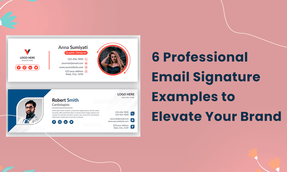
If you’re in marketing, you probably see a huge opportunity in standardizing and branding company email signatures. For one, emails sent by fellow employees can be a great way to drive more traffic to your website and social media.
Also, research proves that visitors landing on your website via a link in the email signature stay up to 3x longer than other channels.
You probably already have a standard format and user guidelines for employees to follow when creating branded email signatures. However, if you’re still seeing poor formatting or misaligned logos, consider sharing relevant email signature examples. That way, they’ll have a clear picture of what to do and what not to do.
To make your job easier, we’ve put together a list of best practices, plus some excellent email signature examples you can share with your team.
We’ll discuss:
- How to make an email signature stand out?
- Design elements for an effective email signature
- Email signature examples you can learn from
Let’s get started.
Table of Contents
What Does a Professional Email Signature Look Like?
With professional email signatures, you often wonder how much is too much. To make your email signature stand out, you need the right blend of content and design. Here are a few tips.
1. Stick to the basics
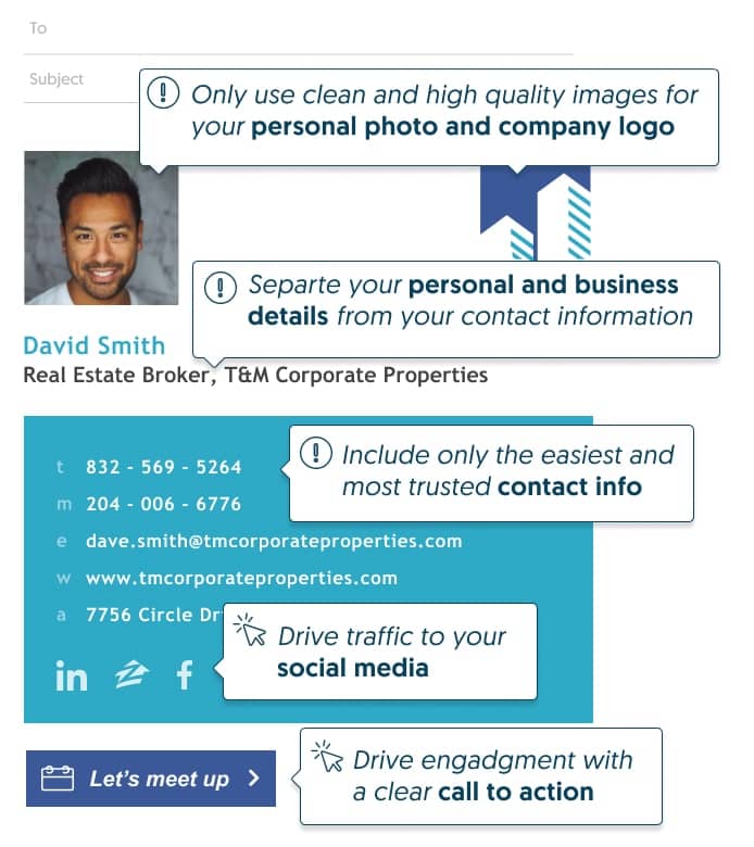
There’s a reason the standard email signature format works—name, title, company name, contact number, and email address. It helps the reader see instantly who the email is from and increases the odds they’ll respond. The standard format gives enough space for branding elements like logos, improving brand recall.
Plus, there’s a better chance your email will make it through the spam checkers. For organisations managing signatures at scale, email signature software can help maintain consistency across entire teams while ensuring every message reflects your brand.
2. Provide the right contact information
A professional email signature must only include phone numbers you answer yourself. Remove any third-party numbers you might have. For example, a corporate office board line or main switchboard. In most cases, one phone number is all you need. Remember, most readers will just hit the ‘reply’ button to respond to you rather than get on the phone.
3. Include only relevant links
If there’s a business reason why some employees need to have multiple links in their email signatures, ask them to create separate versions for internal and external use. Email signature tools make this very easy. Customizing email signatures in this way means readers have to scroll less, increasing the odds they’ll click on them.
4 Email Signature Formatting and Design Tips to Remember
Now that we have talked about the content, let’s look at the key design elements that make an email signature appealing.
1. Use a clean layout
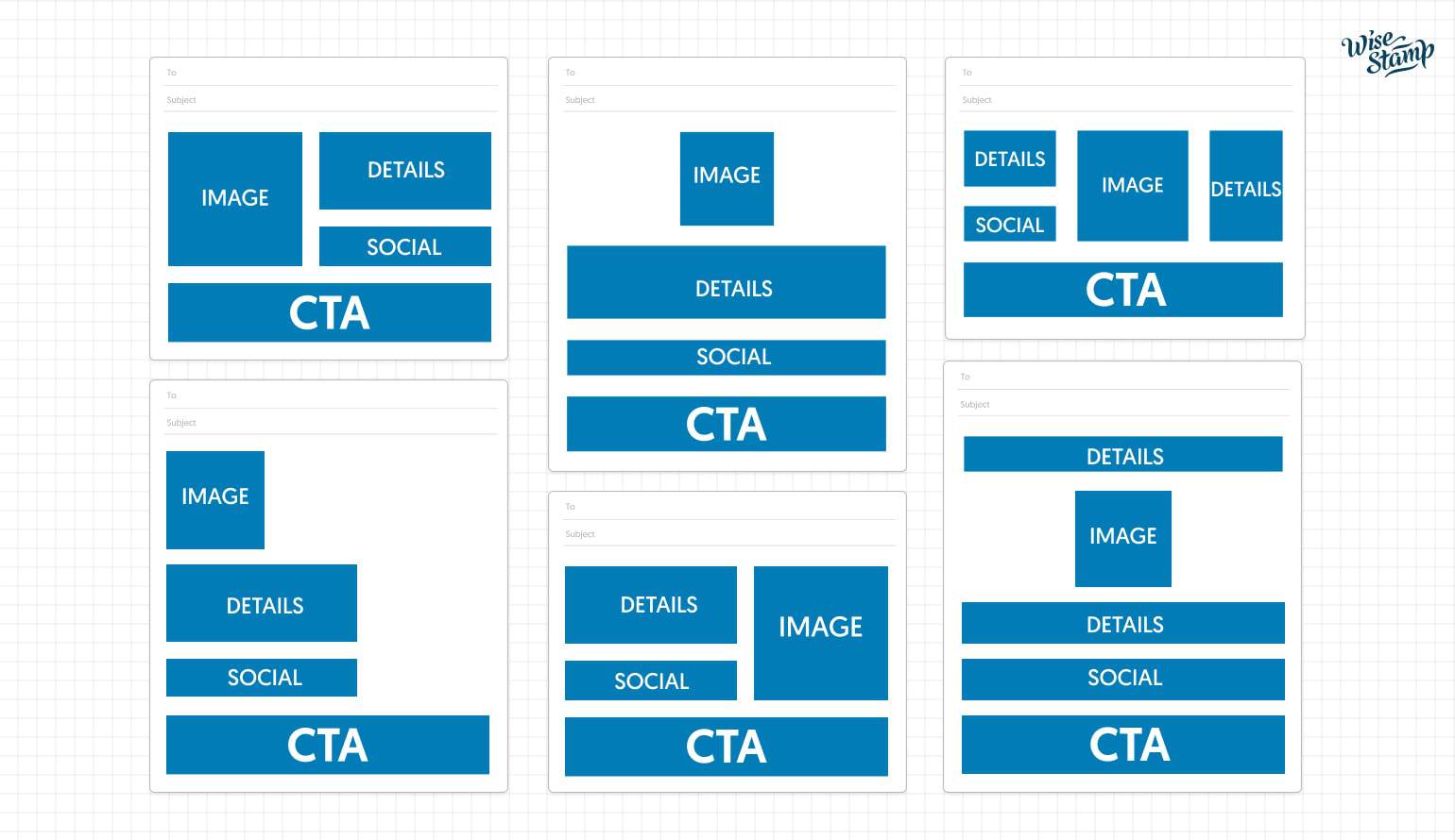
A clean, simple layout is professional and attractive at the same time. The key is to create a natural visual hierarchy for the reader to follow. For example, positioning your photo to the left and the details to the right saves space and helps readers associate your face with the name. You can experiment with the layout however the key is to not make the reader scroll!
2. Align the size and dimensions for each email provider
Broken links, missing images, and formatting errors can pop up when you least expect them. To avoid surprises, check the email size limits for each provider and follow the recommendations. Each email provider renders emails differently, and factors like the user’s screen size and operating system also come into play.
Likewise, for an email signature, a width of 500 to 600 pixels works best. It’s also a good practice to seed test your emails and check how your email signature displays across platforms before actually sending them.
3. Make your email signature mobile responsive
Make sure your email signature is responsive across devices. If you have large graphics and text, scale them down to fit smaller screens or some elements may disintegrate. Pay close attention to social media icons and hyperlinks that can affect the alignment and spacing of others in the next line.
The key is to test each element to make sure they are readable and clickable. The footer area just below the signature usually carries multiple links and social media icons. Check if there’s enough space between them and if every link is working as it should.
4. Select only compatible fonts and colors
The right combination of font and color can make key parts of your email signature stand out. When choosing fonts, stick to ones that are compatible across email providers. Arial, Georgia, and Lucida Sans are good options. If the font you’re using is not compatible, the email provider will put in a default font that might change the whole look of your email signature.
Also, the color of the background should complement the text or it may not be visible to readers. If you use color gradients, test for breaks before you send any emails. Not all email providers render color gradients the same way and readers may see a very different color from the one you originally used.
Read also: How To Create a Cold Email Campaign That Will Hook Your Readers
How To Design an Email Signature? (With Examples)
There are plenty of elements that make your email signature more engaging. However, the key is to use one or two that best complement the overall layout and branding. In this section, we’ll look at some popular design elements to draw inspiration from:
1. Email signature banners
Adding a banner below your email signature can be a great way to reinforce your brand and promote special offers like a discount or loyalty program. Banners like these can act as an extension of any display ads campaigns and capture valuable leads – at a fraction of the cost!
However, there are a couple of do’s and don’ts to keep in mind. First, make sure the width of the banner is the same size as the signature block. And don’t use more than one banner, as it could detract from the main CTA in the email body.

2. Clickable email signature
Why use one website link in your email signature when you can add more? For example, adding a clickable CTA button like ‘sign up for free trial’ can make it easier for readers to buy from you. Alternatively, you can add appointment links so users can schedule appointments with you at their convenience.
While you can have multiple clickable links, creating and updating them in tools like Photoshop is time-consuming. More often than not, formatting issues can affect how they appear to recipients. This is where automation EngageBay comes in.
It allows you to add clickable signature links in minutes.

Remember to:
- Add links only to key landing pages
- Design the clickable elements in a way that makes it obvious they can be clicked.
3. Video email signatures
Adding a short video to your email signature may sound a bit excessive. However, if you’re a business owner or influencer, it can help you make an instant personal connection with readers and drive conversions, too. The key is to keep it short, use a compelling introduction, and, of course, add a clear CTA.
For example, you can add a CTA to your email signature so recipients can sign up for a free consultation, demo, etc.
Segmenting your audience and creating different variations for each can get you even better results.
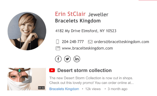
Remember to:
- Have a clear outcome in mind when creating a video
- Keep it under 60 secs
- Create a thumbnail with a play button, or readers won’t click
- Make sure it’s the right format for your email provider
- Add a CTA to generate leads
- Track engagement so you know when to optimize or replace
4. Email signature with quotes
Quotes are another great way to personalize and make your email signature memorable. You can use virtually any quote – inspirational, business, funny, etc.

5. Animated GIF email signatures
Research shows that GIFs can drive 42% more clicks and double the conversion rate. They are appealing to the eye as they combine images, logos, animations, and CTA while taking up minimal space. You can add special effects to make each element stand out. However, before you use them, remember to run A/B tests.
This will help you identify creative assets likely to work best with your target audience. Also, it will make for a consistent brand experience. For example, if you have an informal brand image, an A/B test could help you use elements that reflect that.

6. Handwritten signatures
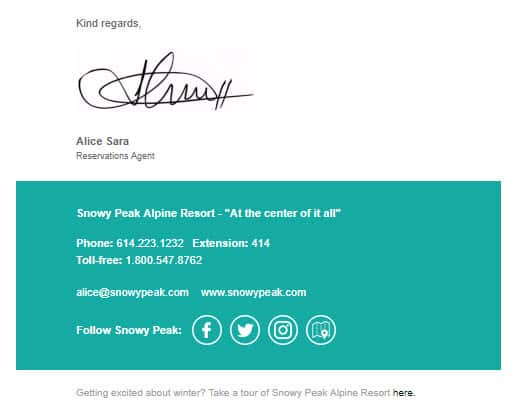
Handwritten signatures may feel a bit too old-fashioned for this day and age, but they are classy and attractive. There’s something about cursive writing that digital fonts just can’t match. A handwritten signature adds credibility to any email and makes it look more ‘official’. There are several ways you can add a handwritten signature to your email signature.
For example, you can use a scanner, take a picture using your phone, email it to yourself, edit it, and add it to your signature block, etc. As you can imagine, these methods take too much time and leave a lot of room for errors. It’s much easier to use an online signature software like EngageBay instead.
Another popular choice is signNow, a cloud-based eSignature tool. Reviewing Signnow pricing can help you pick the right plan for your needs.
Leveraging Email Signature Templates to Amp Up Your Emails
Enforcing brand guidelines when it comes to company email signatures is no small task – especially for small business marketers. You wear multiple hats, and keeping track of email signatures can be burdensome. However, the negative impact of employee non-compliance can add up over time.
For example, formatting issues could result in emails going to spam, affecting brand reputation. Automating email signature management can take policing duty off your plate!
Maintain brand consistency
You can add and update elements like social media links, logos, or handwritten signatures with ease. This gives you a handle on brand consistency across growing teams.
Streamline design and formatting
EngageBay provides a range of designs with rich formatting options for creating attractive designs. You don’t need to struggle with Photoshop or hire external agencies to design email signatures.
Enhance deliverability
With the help of an email signature tool, you can optimize layouts, images, code, and other elements that are a red flag for spam. For marketers, this means better deliverability and sender reputation, plus better reach.
Read also: 10 Best Email Fonts for Your Next Campaign
Wrapping Up
Having a standard email signature template is great for brand consistency. However, people like to add their own flair to their emails. The key is to set clear expectations as to what can and cannot be changed. You can also set default parameters like font size, color, logo, etc., so that individual users cannot change them.
We hope this blog has been helpful. If you’d like to nail your email marketing for as little as a dollar a day, try EngageBay!
FAQ
1. What is a professional email signature?
A professional email signature is short and to the point. It includes the sender’s name, designation, direct contact information (phone and email) plus company logo, website link, and a few social media icons. In terms of design, professional email signature blocks usually stick to a two-color palette.
2. How do I style my email signature?
To style your email signature, make sure you:
- Use a safe font supported by all email clients like Arial, Helvetica, or Lucida Sans
- Use a clear hierarchy so that readers see the most important information first
- Limit social icons to four or five
- Use space dividers to separate various sections of your email signature
- Limit colors to no more than two
- Use an email signature software like EngageBay for standardizing company signatures
- What should I write in my email signature?
The key elements every email signature should have include your name, title, phone number, email address, company name, website, and social media links. You should ideally have a headshot so people can put a face to your name. In terms of design, stick to color, font, and graphics guidelines recommended by your company.
3. What should I write in my email signature?
The key elements every email signature should have include your name, title, phone number, email address, company name, website, and social media links. You should ideally have a headshot so people can put a face to your name. In terms of design, stick to color, font, and graphics guidelines recommended by your company.
