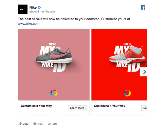
Landing pages drive traffic and convert visitors and act as the starting point of your sales funnel — this is where your potential customers will likely learn about your products and services.
If you aren’t using landing pages to help sell your products or services, you could be missing out on countless potential customers.
Building a landing page is quite easy.
Building a landing page that converts visitors into paying customers?
That’s the hard part!
Luckily, there are proven ways to design converting landing pages. In this guide article, we will cover everything you need to know about how to make landing pages that convert:
- Offer Something of Value That Solves a Problem for Your Visitors
- Keep Your Landing Page Simple
- Offer Social Proof
- Utilize Video
- Write a Killer Headline
- A/B Test Various Elements of Your Landing Page
Happy learning!
Table of Contents
Wait a Minute — What is a Landing Page?
First, it helps to understand what a landing page is, what it aims to accomplish, and why you might need one.
A landing page acts as a standalone web page that you design specifically for marketing or advertising your products and services. It’s a page you send visitors to when you want them to do something particular, hence the term “landing page” — they “land” on this page.
This means a landing page has its own unique call-to-action (CTA).
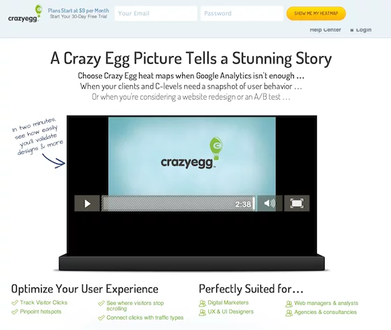
Below is an example of an excellent landing page. The action here is to fill out the fields for your name and email address and click the CTA button.
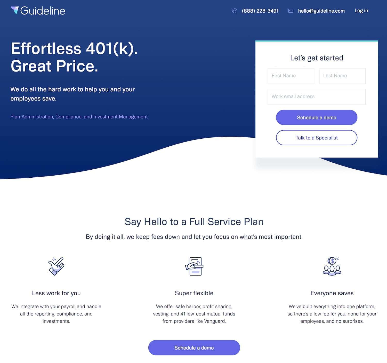
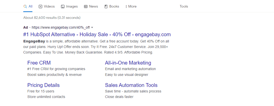
Digital marketers often create landing pages when running a paid promotion or ad campaign. Landing pages are a common destination for Google PPC ads and Facebook ads.
Let’s go over an example together to illustrate this better.
Say you’re a dentist, and you want to run a Facebook ad for a teeth whitening ad you’re running for the week. The ad might be promoting a 50% discount on the service. You would want to link that ad to a landing page you create, and on that page, visitors can quickly and easily schedule their appointment and possibly even pay ahead of time.
In this case, the CTA is having them schedule an appointment.
That’s the action you want them to take, and that’s what the landing page is designed to do — get people to schedule a time. Know that your CTA can be whatever you want it to be, whether that’s getting people to buy something or even just submitting their email address to join your mailing list.
It’s an action that you want them to take, plain and simple.
Read also: 12 Great Landing Page Optimization Practices — The Ultimate Guide
You Can Use Landing Pages However You Like!
To be clear, you don’t use landing pages only in paid campaigns. You can create a landing page for just about anything and still send traffic there organically (read: for free).
It’s just that digital marketers are often eager to spend money on ads because they can work so well.
You now have an idea of what a landing page is and what it’s used for, and you might be itching to dive right in with a page of your own — but it’s not that simple.
Your landing page needs to be constructed in a way that when people ‘land’ on it, they’re not only willing but eager to follow through with your intended CTA.
Digital marketers often make landing pages, drive tons of traffic with ads, and end up frustrated because even though they got the traffic, hardly anyone converted.
A landing page that doesn’t get you leads or paying customers isn’t doing its job properly.
Let’s talk about how you can start crafting a landing page that really drives those conversions through the roof.
Read also: 7 Landing Page Optimization Tools For Smooth Conversions
How to Make a Landing Page That Works
While making landing pages that convert isn’t easy, it isn’t rocket science either.
Here’s a practical guide to help you make a landing page that converts visitors into paying customers. We have six steps for you in no particular order.
Let’s get started!
#1. Offer Something of Value That Solves a Problem for Your Visitors
The first step in learning how to make a landing page is to think of something your followers genuinely care about.
You need to pique your visitor’s interest.
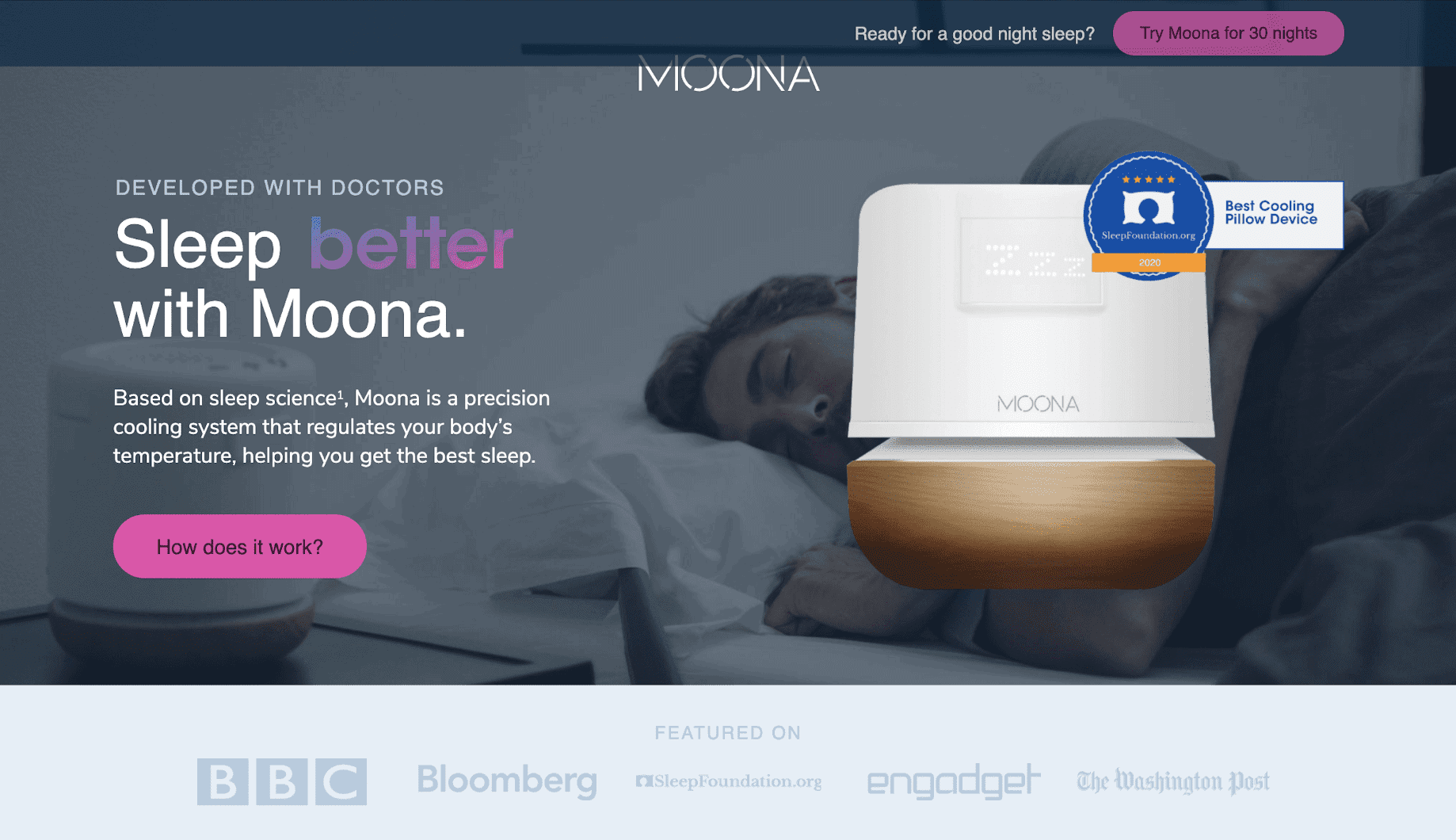
If you’re not offering something enticing that they stand to benefit from — like the example from Your landing page needs to give your customers an idea of what kind of material you send out and what they stand to gain from it.
What problems do you solve?
Are there going to be freebies, discounts, contests, or giveaways?
If they give you their email address, what do you give them in return?
You can emphasize this by taking your visitors on a quick journey. They’re at Point A right now, and they’re frustrated. They need help, and you can help them! So, you take them on a journey to Point B, where they want to be.
This is what your landing page needs to convey.
How will you help them get from where they are now to where they want to be? Answer that question and give them enough proof (more on this later), and your landing page will convert like crazy.
Read also: Product Landing Pages — Everything You Need to Know
#2. Keep Your Landing Page Simple
Less is the new more, but what exactly does this mean?
It means that your landing page shouldn’t say any more than it absolutely has to.
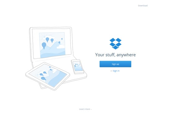
Your copy should be concise, and you should require visitors to fill out as little information as possible. For instance, if you don’t need their phone number, don’t ask for it.
Now, this doesn’t mean that your landing page needs to be short. It can absolutely be on the longer side but remember these things:
- Get to the point early on, in case they don’t finish reading.
- Allow them to opt-in (follow your CTA) near the top of the page, but also scatter the CTA throughout the page.
- Your copy should still be specific to the landing page and CTA, even if you decide to go with something longer.
People are busy, distracted, and they have short attention spans. Keep things as simple, quick, and straightforward for the visitor as possible.
This will improve the user experience and make yours a high converting landing page.
You can use tools like EngageBay to build an effective landing page for your business.
Read also: Unlocking Success: 8 Exceptional Landing Page Examples And Why They Work
#3. Offer Social Proof
Social proof is everything.
People might not trust you right off the bat, but they’ll take into high consideration what others say about you. Examples of social proof are customer reviews, testimonials, and even case studies.
Don’t underestimate just how powerful customer reviews are.
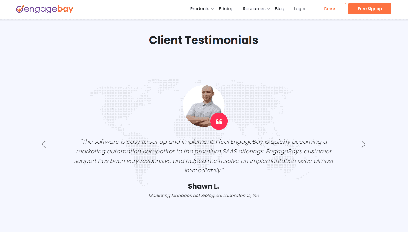
Over and over again, research proves that they significantly impact people’s purchasing decisions. Here’s an example of a testimonial from our own website.
For instance, according to an infographic by
var EhAPI = EhAPI || {};
EhAPI.after_load = function() {
EhAPI.set_account('ktb76s1540fl2hnhbqnrtd2npb', 'our');
EhAPI.execute('rules');
};
(function(d, s, f) {
var sc = document.createElement(s);
sc.type = 'text/javascript';
sc.async = true;
sc.src = f;
var m = document.getElementsByTagName(s)[0];
m.parentNode.insertBefore(sc, m);
})(document, 'script', '//d2p078bqz5urf7.cloudfront.net/jsapi/ehform.js');
Read also: Everything You Need to Know About Real Estate Landing Pages A landing page made entirely of text is a huge no-no. Your visitors will drop like flies. A page filled with nothing but words is plain, dull to look at, and hard to read. If you have a text-only landing page, expect your bounce rate to skyrocket. Pictures certainly help — but choose them wisely. You already know they need to be high-quality, but did you know that pictures with smiling people tend to convert better? Also, consider adding a photo that somehow shows your website visitors how they benefit from your product or service. For instance, the dentist might show before-and-after photos of a satisfied patient. If you’re a gym owner, you might show pictures of your members before and after they participated in your 30-day fitness challenge. These examples show how powerful and engaging pictures can be, especially if done right. Neil Patel says that viewers are up to 85% more likely to buy something after watching a product video. Videos bring your page to life, make them more dynamic and engaging, and help you build trust and authority. According to a recent timeline tools study by Preceden any type of visuals helps gain a deeper understanding of a specific topic which in turn boosts productivity by 18%! Here’s an example of video utilization done right: People prefer watching videos to reading the text, so combining images and videos is your best bet when it comes to making a landing page that converts. Use images, interactive content, and videos on your landing pages to enhance your digital marketing power. Practice what you preach, right? So here’s an explainer video for this blog post: Read also: Ultimate Insights For High-Converting Lead Capture Landing Pages Headlines are everything. Headlines are the first thing people will read when they land on your page. You have to convey an important message in a short amount of space and time. No pressure! You can write powerful headlines in several ways. Here’s the thing, though: Different kinds of headlines will work for different brands and industries — and that brings us to our last point. Worried you’re not going to get your landing page right on the first attempt? Guess what? That’s likely what’ll happen — and that’s okay. You hardly ever hit a home run on the first try when it comes to marketing. Not only do the industry’s experts know they need to split test, but they also understand that it’s in their best interest to test everything, even if the landing page does perform well in its first iteration. What exactly should you test? Here are some suggestions: You get the idea. Just remember that when it comes to split testing, you want to test only one element at a time. It can be a visual element, a design element, or even SEO settings. If you don’t test for a single variable at a time, you have no way of knowing which specific variable caused the change in performance. If this means you end up having to make five versions of the same landing page (or even more), then go for it. This is how you find what resonates with your visitors and get them to convert to paying customers. There isn’t a one-size-fits-all approach when it comes to how to make a landing page. Once you’ve got an amazing landing page built out, there’s another step after that: driving traffic to it. If you’re already getting a ton of organic traffic to your website, you might be good to go. You can also send qualified traffic to your landing page by sharing it across your social media platforms. That way, your followers are warm leads, meaning they’re already familiar with your brand, and they’re likelier to be interested in whatever your landing page is promoting. However, when it comes to learning how to make a landing page, it can help to go the extra mile. Brands will often run paid ads that send people to the landing page. You can accomplish this through Google Ad, specifically the Google PPC ads, Facebook ads, or through any of the other platforms’ paid promotions features (such as Pinterest). Whichever platform you choose, remember to be specific in who you target. Trying to reach everyone isn’t in your best interest. Instead, you want to target the people most like to spend money on your products or services — your own niche down demographics. Both Google and Facebook are amazing as you can target an audience that you feel will be receptive to your products or services. Choose wisely! Reaching the right audience can make all the difference in the success of your ads — and thus, how many qualified prospects you send to your landing page and ultimately convert. Don’t forget that ad copy and creatives are an important part of the equation, too. Read more: 20 Of The Best Product Landing Page Examples Online Now that you know what it takes to make a landing page that converts, we have news for you! Let’s say you use a so-and-so platform to build a landing page; how would you know if it’s performing well? You’ll need another platform to gauge its performance. Once you get the contact details from your visitors, how would you go about converting them into customers? You might need yet another solution to grab leads, nurture them, and send out campaigns. How do you answer your customer’s queries? There are a million things you need to do — and only so much time… Fortunately, that’s where EngageBay comes in! EngageBay is an all-in-one marketing, sales, and customer support solution with unified CRM for small businesses and growing startups. With a single platform, you can build dynamic and responsive landing pages without writing a single line of code. EngageBay offers predesigned landing pages, drag-and-drop landing page builder, HTML import options, rich text formatting, custom landing page designs, and mobile-responsive designs. You also get A/B testing, advanced reporting, and traffic analytics. You can capture visitors’ contact information and save it in the centralized CRM database so that your marketing team can launch campaigns and your sales team can push leads further down the sales funnel. Wait, there’s more: With EngageBay, you also get segmentation using smart lists, multichannel marketing, deal pipeline management, helpdesk, live chat, task management, drip campaigns, and so much more. And all of this for your weekly coffee budget, at the most! Sign up today and build your dream landing page that converts 🙂#4. Utilize Video
#5. Write a Killer Headline
#6. A/B Test Various Elements of Your Landing Page
Bonus Tips: Driving Traffic to Your Landing Page
Conclusion
