Have you heard the word ‘squeeze page’ thrown around in those marketing meetings?
If you’re not sure about what exactly marketers mean when they say squeeze page, you’ve come to the perfect place.
Not only do we simplify how you understand squeeze pages, we also have curated eight expert tips on creating the perfect squeeze pages for your company, whether you are a small enterprise or a larger one!
So, without further ado, let’s get squeezing and learn to generate more leads using a squeeze page!
Table of Contents
What Exactly is a Squeeze Page?
Let’s break down and simplify what a squeeze page exactly means.
A squeeze page is a web page that gathers email or phone details of your potential customers when they visit your website.
A good squeeze page should gently entice your customers to leave their email addresses with you. ‘Gently’ is the operative word here. 😇
This is achieved by offering prospects something in return. This could be a free e-book, a free webinar, educational videos, newsletters, or even educational emails! A winning squeeze page aims to get maximum prospects hooked into the first stage of the sales funnel.
The simplest way to understand the function of a squeeze page is to think of one of those squeeze toys that children love!
Yes, we’re not kidding.
Children love squeeze toys, especially ones that make a sound when squeezed. The sound of the squeeze toy works as a reward. This prompts the kid to press the toy again and again. The child is in bliss when this happens.

The psychology behind a squeeze page is the very same.
So, the idea is to ‘squeeze’ the email ID out of your customers by providing them with something valuable in return, so that similar responses are triggered in the brain!
Kids are motivated by the sound of a squeeze toy, but adults are a little more (okay, a lot more 😅) complicated than that.
This is where we marketers come in.
When creating a great squeeze page, it’s your job to deliver something valuable to your prospects, and gently entice them into leaving their email ID with you.
Here are some standard features of a good squeeze page:
- A Catchy Headline
- A summary of the value provided by the freebie
- Relevant images with minimal graphics
- A great Call to Action button
Read also: 15 Great Sales Page Examples (And Why They Convert)
What Kinds of Squeeze Pages Do Marketers Use?
Experienced marketers use two main kinds of squeeze pages to generate the maximum amount of leads. A squeeze page could be in the form of a classic landing page or a pop-up squeeze page.
Pop-Up Squeeze Pages
Marketers use the pop-up squeeze page when they really want to grab the attention of prospects. We’ve all been there for these pop-ups, right? You’re just browsing a site and these pop-ups appear. They can be exceptionally annoying too, especially when prospects may be in a hurry.

But, a survey by iPaper showed that the average conversion rate for top-performing pop-ups is a whopping 28%! So, pop-ups are here to stay, whether you find them annoying or not.
Use a pop-up squeeze page if:
- You currently are offering limited-time discounts for your products/services (like a black Friday sale)
- If you want to grab the attention of your prospects
- If you have a valuable digital asset to offer your prospects
Landing Page Style
Of course, there’s absolutely nothing wrong with using the classic landing page in order to engage with more leads. A regular squeeze page would look similar to the one on the Coursera website.
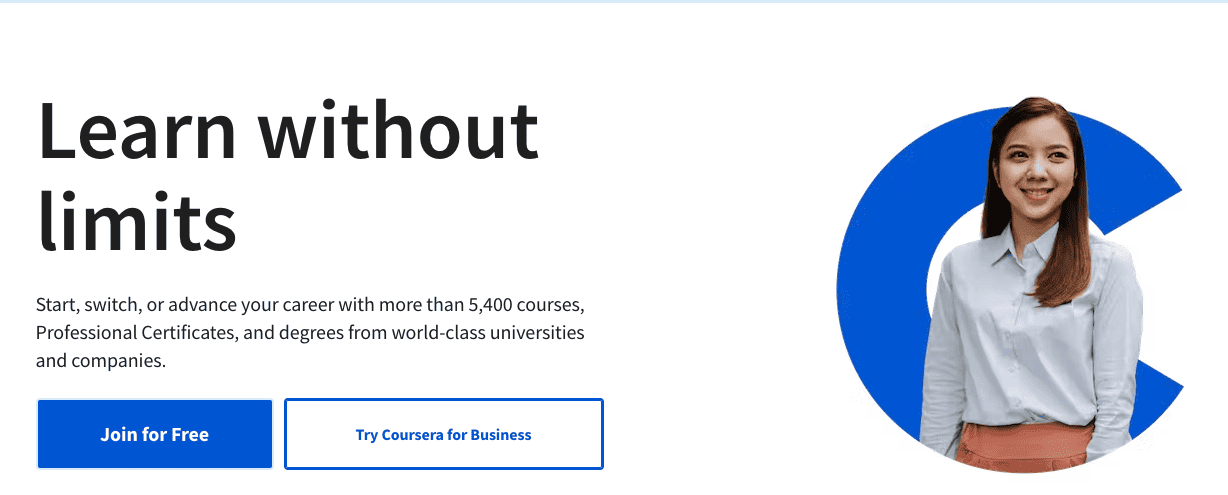
This performs the same function of generating fresh leads for the company, but without the annoying pop-ups. This is particularly suitable if you are an established player in your industry.
Use a landing-page style squeeze-page if:
- This may remain as a standard form field on your website.
- You can offer valuable information or digital assets.
- You want to remain a bit more subtle.
But remember, a landing page is not exactly the same as a squeeze page. Rather, a squeeze page is a kind of landing page that has one specific goal in mind. Let’s go into some more detail about the differences between a home page, a landing page and a squeeze page.
See also: Landing Page Guide With Examples
What Is Not a Squeeze Page?
A squeeze page is not exactly the same as a landing page or a home page.
Although they all serve a similar purpose, a squeeze page has a much narrow focus — gathering the email addresses of prospects.
Here are some key distinctions between a squeeze page, a landing page, and a home page.
| Squeeze Page | Home Page | Landing Page |
| Is a standalone page | Is part of a larger website | Is a standalone page |
| The purpose is to get new prospects | The purpose is to get prospects to explore products/services | The purpose is to convert prospects |
| Contains one or two form fields (name and email address) | Contains multiple form fields | May contain two or more form fields to gather maximum information from leads |
| Does not receive traffic from emails | Receives organic and paid traffic | Receives traffic from multiple sources like email |
| Brief, one-pointed, and short in length | Quite large and comprehensive | Varies in length, but shorter than a home page |
| Simple graphics | Elaborate graphics to draw the attention of customers | Feature some graphics, social proof, and other details |
Read also: 11 Proven Ways to Build an Email List
Example of a Great Squeeze Page
Let’s take a look at a great example of a squeeze page from Forbes Magazine.
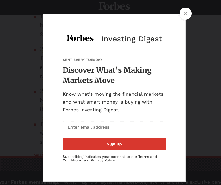
What’s working in favor of this squeeze page? Let’s break it down.
- Minimum graphics with absolutely zero distractions for the prospect.
- A catchy headline that promises a lot of value to the prospect.
- Highlights and sells the value of Forbes Investing Digest
- Brief, clear information about the subscription for Forbes Investing Digest.
- A close button for those who don’t want to subscribe, which actually prevents people from leaving the site.
- Clear Call-to-Action (CTA) button.
Now that you can see for yourself what a winning squeeze page looks like, here are 10 expert tips to get you ahead of the curve.
Read also: 11 Proven Ways To Build An Email List (Still Working)
8 Best Practices to Generate More Leads Using Squeeze Pages
Here are the most efficient and best practices to leverage your squeeze page for maximum leads.
These tips should help you get started if you’re new to creating a squeeze page. And if you’re an old player in this game, it will help you take your squeeze page to the next level.
1. Offer an enticing asset to draw prospects
This is the single most important step of the process!
Without a digital asset that will make prospective clients want to give up their email ID, your squeeze page is almost sure to fall flat on its face.
For example, let’s say I’m running a marketing consultancy firm. If I just directly ask people for their Email, they may not be keen on just giving me their ID. After all, nobody likes spam emails! It’s just human nature.
But, suppose I offer a free planning template for marketers that they can personalize and use every day at the office, it makes more sense for the prospects to give me their Email address so that I can send it to them.
So first, get really clear on the kind of digital assets your company can offer your target audience. The more value your asset provides to the prospect, the more likely they are to sign up.
Here are some of the most common digital assets you can use for your squeeze pages:
- Subscription to a newsletter
- A webinar registration
- Free toolkit
- E-books
- Downloadable design templates
- A free trial of your product
- Downloadable PPT slides
- An email course
- Exclusive access to premium content
- Sample chapters of a book
- Limited-time discounts
- A giveaway or lucky draw contest
- An online workshop
And remember, don’t limit yourself to these assets. The sky is the limit and you can get infinitely creative with them — provided they add value to the customer. Once you have this step cleared out, you can move on to other important aspects of your squeeze page.
Read more: Create A Buzz With Your Coming Soon Page: Inspiring Examples And Tips
2. Minimize distractions and highlight CTA button
When it comes to a successful squeeze page, you can never go wrong with the classic K.I.S.S. method — Keep It Simple, Stupid! Let’s break it down with this example.

Your goal isn’t to provide massive amounts of information to the prospect. Extra information will only serve as a distraction.
Remember that the average attention span is dropping due to the internet age.
On the contrary, your goal is to clearly define the value of the asset on offer. So, keep it crisp and one-pointed. Use only the information that highlights why your prospect needs this particular asset.
Another important step is having a clear call to action (CTA) button. This ensures that prospects who find value in your freebie will give you their address.
So, cut through all the fluff and lead your prospects directly to the CTA button for big wins.
Read also: 14 Stunning eCommerce Landing Page Examples (With Expert Tips)
3. Ensure you are targeting the right audience at the right time
Another key step before taking your squeeze page live is to do the right research about your target audience.
Without knowing who exactly your target audience is, even the best offers will not sell! Another important aspect to keep in mind is the timing of your offer.
For example, let’s say I run a marketing consultancy. I usually offer a free marketing planner as a lead magnet on my squeeze page. But, this year, I developed some new festive social media post templates for Instagram.
So I would offer this asset between the months of October-December on my squeeze page, and revert to the original planner from January onwards.
So, the timing of your offers matters as much as your target audience’s pain points that you are able to solve with your squeeze pages.

4. Make use of social proof
Happy customers beget happy customers! This is a truth that has been long-established since the beginning of business itself.
Don’t shy away from using some social proof to the audience! This could simply be in the form of trust badges placed on the edge of your squeeze pages, if you already have a lot of text.
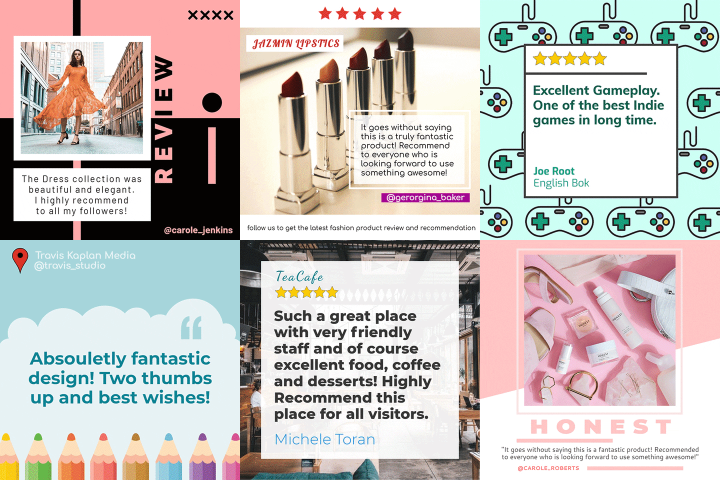
Alternatively, you can also make use of successful customer testimonials as a part of your squeeze page.
But remember to keep this very short as well. As we discussed above, never distract your prospective clients too much at this stage of the sales funnel.
Provided you ensure that the social proof highlights the value of the freebie on offer, always always make use of social proof.
👉Ready to create a winning sales page? Uncover the best examples in our extensive guide for inspiration! 🏆
5. Use the psychology of colors and minimal graphics
Now it’s time to look at the visual aspects of your squeeze page.
Loud graphics and over-loaded text are always a horrible plan for your squeeze page. The graphics have to be minimal, yet appealing to the eye.
Another important aspect is the color scheme you choose for your squeeze pages. You can opt for a minimal sort of color template or make use of color contrasts to keep your prospect’s attention where you want it.
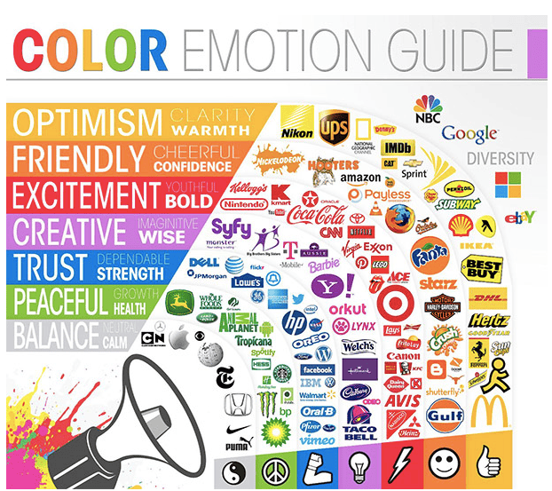
It’s no secret within marketing that colors influence your target audience! For example, the color green is said to evoke associations with peace, tranquility, and nature. So, if you are a holistic health company, it would help you to choose green as part of your color templates.
Here’s a ready list of emotions associated with colors and popular brands that use them.
6. Create a catchy and pithy headline
Your headline is one of the first things that your prospective customers will see. So, ensure that it is catchy and clearly highlights the value you will add if they sign up.
In the Forbes magazine squeeze page, the headline could have simply read ‘Subscribe to Forbes Investing Digest Today’.
But it does not say that because these marketers know what they are doing. It’s far catchier than that.
When the squeeze page says, ‘Discover What Makes Markets Move’, it immediately entices the target audience to learn more about this topic and click the subscribe button.
So, make the headline catchy and pithy for leveraging maximum leads through your squeeze page.
7. Consider using a plugin for designing squeeze pages
This is an entirely optional step, but one that can make your job easier as a marketer.
A great option is to use the plug-ins that are available on WordPress and other sites, that help you create squeeze pages and landing pages with greater efficiency. Here are a few plug-ins for your squeeze pages.
- WordPress Squeeze Page/Landing Page Plug-in: This plug-in makes designing a squeeze page much easier. It offers features like live editing. It helps create stand-alone pages that do not borrow heavily from other pages on your website.
- EngageBay landing page builder: This free landing page plug-in helps you build responsive standalone pages that allow you to maximize lead generation.
8. Ensure the visibility of an exit or close button
This may seem like a small step, but it is an important one nonetheless.
If your squeeze page has no exit or close button that is clearly visible, it immediately reduces the trust of the potential customer.
After all, it is called a ‘squeeze page’, not a ‘force page’ for a reason 😅. Each prospect should have the option to not give their email address.
Without an exit button, prospects will end up navigating out of your site and reduce your conversion rate.
9. Bonus Tip: Run A/B testing regularly
Ensure that you run several A/B Tests on your Squeeze Page for optimization.
Ideally, you should have a few variations of each squeeze page, with different headlines, different color schemes, etc.
Once you have a few variations, you can now run A/B Testing to ensure that your squeeze page is very enticing to your target audience.
Read also: What is a Splash Page? — The Ultimate Guide
Let’s Wrap It Up
We hope this page has ‘squeezed out’ all your doubts regarding squeeze pages!
Which of these squeeze page best practices felt the most helpful to your team and company? Do you do things a bit differently in your company?
Let us know your thoughts in the comments section below. We love those who add value to these conversations!
And if you’d like to build one landing page or squeeze page for free, you can do it now with EngageBay.
