We’ve all been there, staring at the blinking cursor, wondering how to craft that perfect welcome email series. Should you go for five emails or three? How do you balance delivering value and not coming off like an over-eager sales rep?
Meanwhile, your boss is breathing down your neck for those ROI numbers, and you’re drowning in a sea of metrics, wondering which ones matter. Is a 2% increase in open rates worth popping the champagne, or should you be focused on that pesky bounce rate that’s creeping up?
But we can all agree on one thing: a well-crafted welcome email series allows you to make a first impression that’s more memorable than any email flow.
You’re also more likely to convert new subscribers to customers than subscribers on your email list for a while.
In fact, welcome emails, on average, generate up to 320% more revenue per email than other promotional emails.
In this blog post, we’ll look at the steps to create a welcome email series with examples from actual companies, performance metrics, and practical tips you can use immediately. You’ll also learn how different goals influence how you’ll create your welcome email series.
Table of Contents
What Is a Welcome Email Series?
A welcome email series is a strategic sequence of automated emails sent to new subscribers over a period of days or weeks after they join your mailing list. It’s designed to introduce your brand, set expectations, and build relationships with your audience.
Unlike a single welcome email, a series allows you to spread information and engagement over several touchpoints. This approach gives you the opportunity to:
- Properly introduce your brand and its values.
- Deliver on any promises made during the sign-up process.
- Showcase your products or services in a non-intrusive way.
- Provide value through content, offers, or resources.
- Guide new subscribers towards desired actions or conversions.
Think of it as a digital onboarding process. You’re not bombarding new subscribers with everything at once but rather leading them through a carefully planned journey that familiarizes them with your brand and what you offer.
A typical welcome series consists of 3-5 emails, though the number can vary based on your specific goals and audience needs. Each email in the series serves a distinct purpose, moving the subscriber closer to your ultimate objective, whether making a purchase, engaging with your content, or becoming an active community member.
Why Is a Welcome Email Series Important?
A welcome email series might be the one email flow responsible for the increase in your sales. For example, Custom Neon experienced a 20% increase in sales because of their welcome email series. Jake Munday, the CEO, told me:
“We have observed a 20% increase in product purchases directly attributable to our welcome email series.”
We’ll look at the exact email series later on and see how you can replicate specific strategies in your email flow, but first, why is a welcome email series important? Let’s take a look.
Boasts higher open and click-through rates
Welcome emails consistently outperform standard marketing emails in terms of engagement metrics. In fact, welcome emails have a 14.4% click rate compared to just 2.7% in other types of emails.
This presents an opportunity to communicate your message and make a strong impact. With more eyes on your content, you can better convey your brand’s value proposition, offer the promised incentive, and guide subscribers towards desired actions.
Establishes clear expectations
A welcome series allows you to communicate what subscribers can expect from your emails regarding content, frequency, and value. This transparency helps set realistic expectations and reduces the likelihood of future unsubscribes due to misaligned expectations.
Here’s how Leo Smigel, founder of Analyzing Alpha, sets expectations for his newsletter:
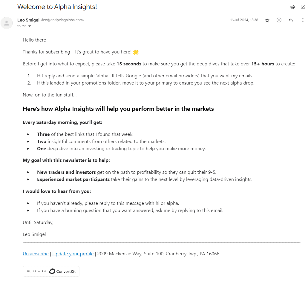
By outlining what’s in store, you’re preparing subscribers for future communications and building trust by demonstrating that you respect their inbox and time.
Builds trust and credibility
A new subscriber expects you to provide the immediate incentive you promised when they signed up.
But when they consistently receive value from you from the start and throughout, they’ll most likely view your brand as credible and share it with friends and colleagues.
Creates segmentation opportunities
A welcome series can include elements that help you learn more about your subscribers’ preferences, interests, and behaviors.
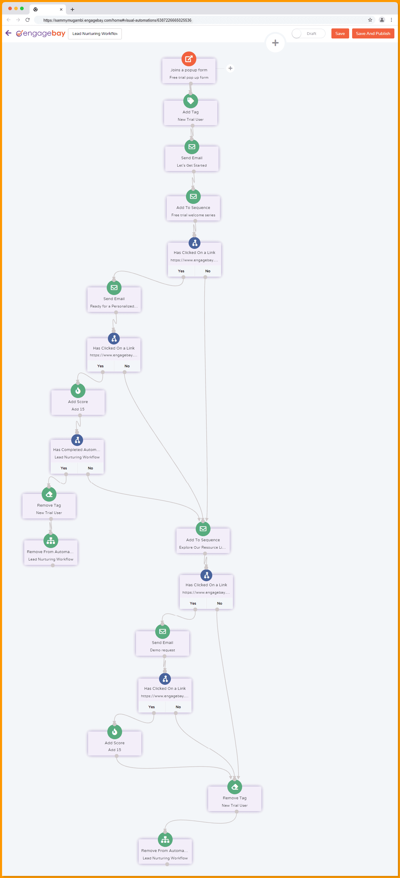
This could be through clickable content options or tracking engagement with different types of content. You can use a tool like EngageBay to segment these subscribers according to their actions. If they click on a link, you can automate EngageBay to send a different email to those who didn’t click on a link.
Here’s an example of a welcome email series automation for a SaaS company that creates segmentation opportunities:
Read more: eCommerce Welcome Emails — Dazzle, Delight, Convert [Examples & Templates]
Examples of Goals for Setting Up the Welcome Email Series
Goals shape the content, structure, and timing of your emails.
These goals help you focus your effort on a known target and not just create a welcome series for its sake. You might need your welcome emails to encourage first-time purchases or increase engagement.
And the emails you’ll create for both goals will be different. But remember, these goals aren’t mutually exclusive. A welcome series can achieve multiple objectives simultaneously.
Here are some common goals you might have for your welcome email series:
Encourage first-time purchases
This goal is relevant for e-commerce businesses or those with a clear product offering. The aim is to capitalize on the initial interest and excitement of new subscribers by presenting compelling offers and showcasing products.
Cross-sell and upsell
This goal is about increasing each customer’s value by introducing them to additional or higher-value products or services.
The strategy here is to gradually expose subscribers to your entire range of offerings, highlighting how different products or services complement each other.
Drive traffic to your website or blog
This goal aims to increase engagement with your online content, boost website visits, and improve SEO metrics.
It’s particularly relevant for content-driven businesses, such as media companies or those using content marketing as a critical strategy. The focus is showcasing your best or most relevant content to new subscribers.
Read more: 15 Email Sequence Software To Ignite Your Campaigns
How to Create a Welcome Email Series With Examples
In this section, we’ll examine two welcome email series examples from eCommerce and SaaS companies. We’ll discuss what they did right and note the format and tips you can learn from each email.
Custom Neon
Custom Neon is a company that creates neon signs based on customers’ custom designs. I asked Jake Munday how their welcome series performed. Here’s what he told me:
“Compared to industry averages, our welcome series has an average open rate of 45%.
The click-through rate across the series averages at 15%, with the highest engagement typically on emails showcasing our customer favorites.
We have observed a 20% increase in product purchases directly attributable to our welcome email series.”
Custom Neon has six emails in its welcome series. We are going to look at each email, but here’s a TLDR of their welcome email series format:
- Immediate welcome email: Introduce the company and provide promised incentives (e.g., discount code).
- Brand value (2 days later): Explain why your company is the best choice.
- Incentive reminder (1 day later): Remind about unused welcome offer.
- Brand story (3 days later): Share company history, mission, and values.
- Final incentive reminder (1 day later): Create urgency for the expiring offer.
- Product showcase (2 days later): Highlight product range or popular items.
Here’s what this series looks like and what you can learn from it.
Email 1: Welcome to Custom Neon
Time sent: Immediately after signing up
This is the first email in the series. It introduces the company, highlights what the customer can expect in future communications, and provides the promised discount code. The email also encourages the recipient to start designing their custom neon sign right away.
Subject line: Open to find your exclusive discount code

Key elements in this email include:
- Call to action (CTA): The email prominently features CTAs encouraging recipients to design their sign, shop bestsellers, and take advantage of the discount code.
- Tip: Provide multiple opportunities for engagement, from exploring products to connecting on social media.
- Benefits: It includes important information like free global shipping, a two-year warranty, and over 1,000 five-star reviews.
- Tip: Mention key benefits like warranties and reviews to build trust.
- Footer links: The email concludes with links to FAQs, showcases, contact information, and social media icons, making it easy for recipients to engage further.
Email 2: Why Custom Neon
Time sent: two days after the first email
The second email explains why Custom Neon is the best choice for neon signs. It provides a simple, step-by-step guide on creating a custom neon sign using their platform. This email also leverages social proof by featuring customer testimonials, reinforcing the brand’s credibility and the quality of its products.
Subject line: Why you need us to light up your life

Key elements in this email include:
- Step-by-step guide: The email provides a simple, three-step process for creating a custom neon sign. It breaks down the process into manageable steps, making it easy for the recipient to understand how they can get started.
- Tip: Simplify complex processes into clear, actionable steps to reduce friction and encourage engagement.
- Customer testimonials: This email uses social proof by featuring real customer testimonials, making the feedback more authentic and relatable.
- Tip: Highlight customer experiences and positive feedback to build credibility and trust with your audience.
- Engaging visuals: The email includes vibrant images of neon signs and a model holding a custom neon sign, reinforcing the brand’s aesthetic and appeal.
- Tip: Use strong, consistent visuals that align with your brand identity to keep the audience engaged and visually invested.
- Call to Action: The email ends with a prominent CTA encouraging recipients to design their custom neon signs immediately.
- Tip: Ensure your CTAs are clear and action-oriented, making it easy for recipients to know what to do next.
Read more: How to Write an Effective Welcome Email
Email 3: Welcome discount reminder
Time sent: one day after the second email
This email serves as a reminder to the recipient about the welcome discount they received upon signing up, but isn’t yet been used. The primary goal is to nudge the customer to take advantage of the discount.
Subject line: Don’t Miss Out

Key elements in this email include:
- A reminder about the discount offer: The email emphasizes that the recipient hasn’t used their welcome discount yet, creating a sense of urgency with a clear CTA to shop and save.
- Tip: Use reminders and urgency to prompt action, especially for time-sensitive offers. Highlight the discount code and the benefit of using it before it expires.
- Product highlights: It showcases popular neon signs in the “Explore Our Shop” section, encouraging recipients to browse and get inspired.
- Tip: Include visuals of popular products to spark interest and inspire recipients to explore more options.
- Multiple CTAs: There are several opportunities for engagement, such as “Shop Now” and “Start Designing Now,” which guide the recipient towards different actions.
- Tip: Provide multiple CTAs to cater to different interests, whether the recipient wants to browse products or start designing their custom sign.
- Social media engagement: The email encourages recipients to follow Custom Neon on social media for additional inspiration.
- Tip: Drive engagement beyond the email by inviting recipients to connect on social platforms where they can see more products and interact with the brand.
Email 4: Brand story
Time sent: three days after the third email
This email is focused on introducing the founders and the story behind Custom Neon. It aims to build a personal connection with the audience by sharing the brand’s mission, values, and commitment to community and environmental causes.
Subject line: Allow us to introduce ourselves
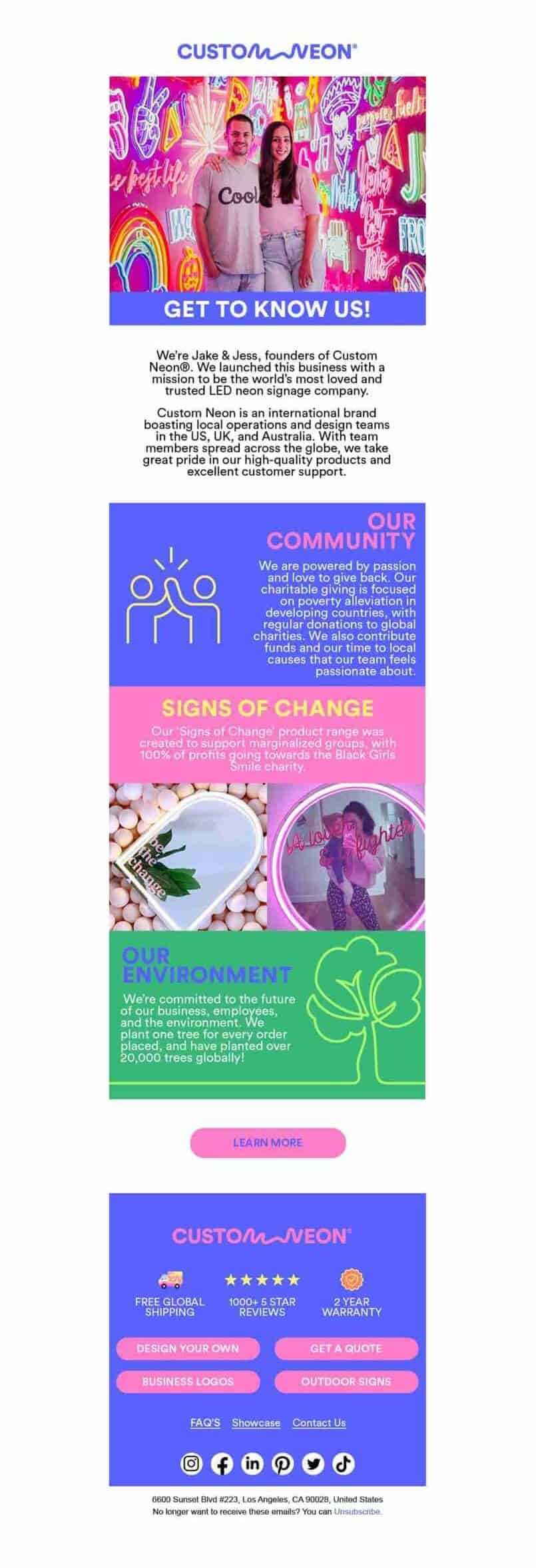
Key elements in this email include:
- Founder introduction: The email shares the story of the founders, Jake and Jess, giving a personal touch and humanizing the brand.
- Tip: Introduce the people behind your brand to create a personal connection with your audience. This can build trust and loyalty.
- Highlighting brand values: The email focuses on the brand’s commitment to community, charity, and environmental sustainability.
- Tip: Share your brand’s values and mission to resonate with customers who prioritize ethical practices and social responsibility.
- Visual storytelling: Images of the “Signs of Change” product range, which supports charitable causes, are featured to align with the brand’s values.
- Tip: Use visuals that reflect your brand’s values and story, reinforcing your message through imagery.
- Community and environmental impact: It details charitable initiatives and environmental efforts, such as planting trees and supporting marginalized groups.
- Tip: Highlight your brand’s positive impact on the community and environment to appeal to socially conscious consumers.
Read also: How to Send the Perfect Welcome Emails to New Employees
Email 5: Welcome discount final reminder
Time sent: One day after the fourth email
This email creates a sense of urgency by reminding the customer that their welcome discount is about to expire. It’s straightforward, with a clear focus on encouraging the recipient to take immediate action to avoid missing out on the savings.
Subject line: Expiring Soon. 10% Off Your Custom Neon
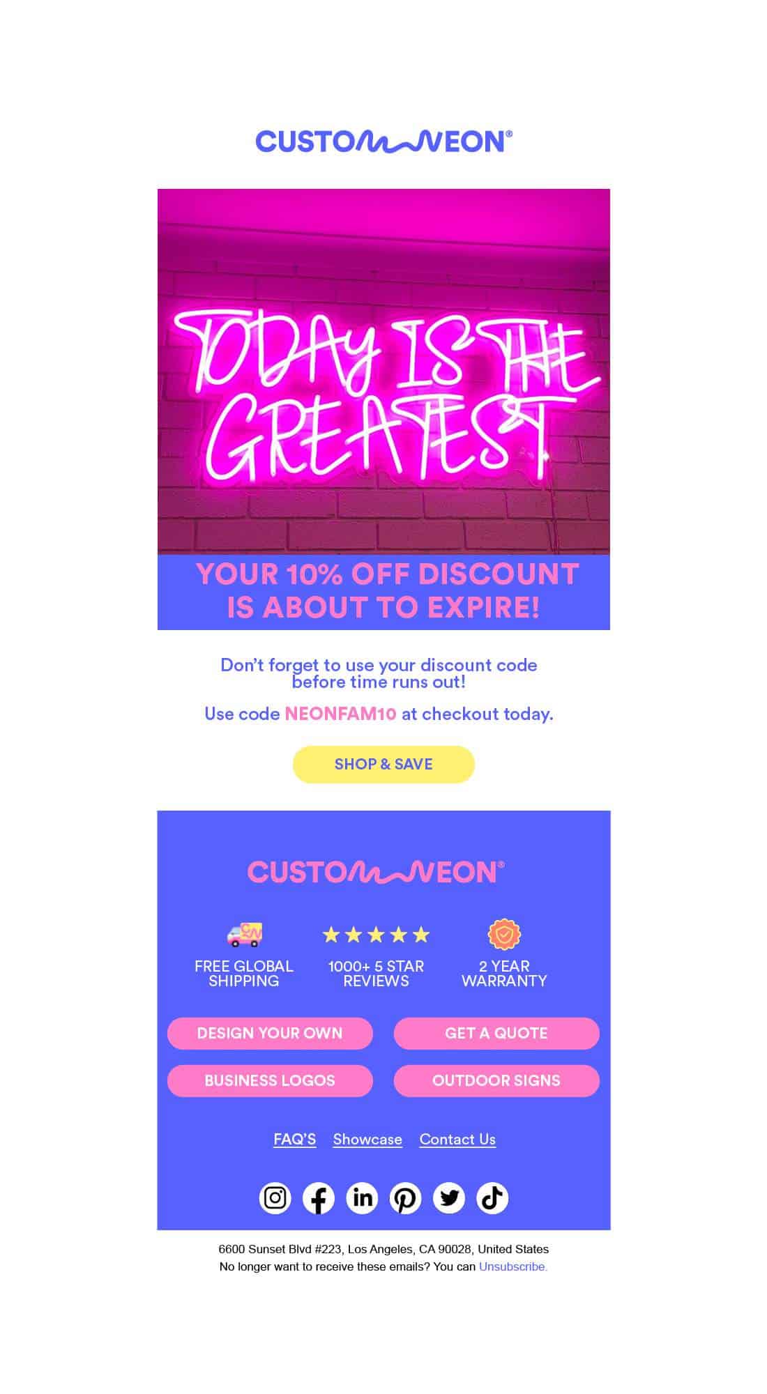
Key elements in this email include:
- Discount reminder: The sole purpose of this email is to remind recipients who haven’t used their discount code to take advantage of it before time runs out.
- Tip: Use reminders and urgency to prompt action. Highlight the discount code and the benefit of using it before it expires.
Email 6: Explore pre-designed signs
Time sent: two days after the fifth email
This is the last email in their welcome email series. It highlights the variety of available designs, categorizing them by use cases such as home decor, wedding signs, bar signs, and party/event signs.
Subject line: Let us light the way
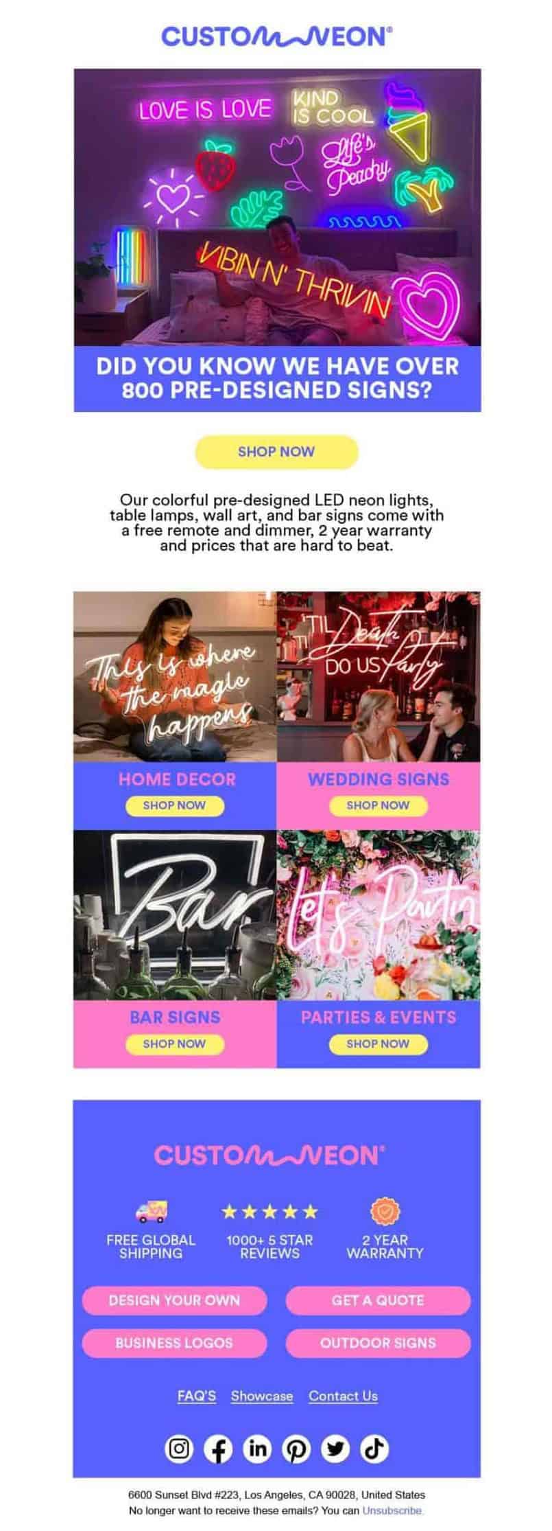
Key elements in this email include:
- Product showcase: The email lists various pre-designed neon signs into categories. This helps recipients easily find designs that match their needs.
- Tip: Categorize products effectively to help customers quickly locate what they’re interested in, improving the overall shopping experience.
- Visual appeal: The email highlights the pre-designed signs with bright and colorful images. These visuals are not only eye-catching but also show the products in real-life settings, which can inspire customers and help them visualize how the signs might look in their own spaces.
- Tip: Use high-quality images that showcase your products in context, making it easier for customers to imagine using them.
- Focus on convenience: The email emphasizes convenience for customers who may not want to design their own sign from scratch.
- Tip: Highlight the convenience and simplicity of your offerings, particularly for customers who value a hassle-free shopping experience.
- Call to Action: The email ends with a clear and inviting CTA to “Shop Now,” directing recipients to browse and purchase the pre-designed signs.
- Tip: Keep your CTAs straightforward and enticing to drive immediate action from your audience.
Custom Neon’s welcome email series encourages immediate engagement. It combines strong visuals, clear CTAs, social proof, and easy-to-follow instructions, which create an effective onboarding experience.
Read more: 4 Introduction Email Examples Worth Replying (and Why)
2. Niceboard
Niceboard is a plug-and-play job board platform that companies use to create and manage job boards. Their welcome email series consists of four emails, each focusing on a different aspect of setting up and optimizing a job board.
I asked Hanna Feltges, growth marketing manager at Niceboard, how this welcome series performed. Here’s what she told me:
“Emails are sent to customers on a free trial, helping them onboard on our platform, pointing out features/settings that are often overlooked and creating a first positive experience.
The ultimate goal of this series is to convert those on free trial to a paid plan. And it’s working. Since implementing the email series, we’ve seen an increase of free trial conversion rate by 5% to currently 30%.”
Here’s what this series looks like and what you can learn from it:
Email 1: Setting up your job board
This is the first email in the welcome series. It welcomes the user to the platform and provides initial setup guidance.
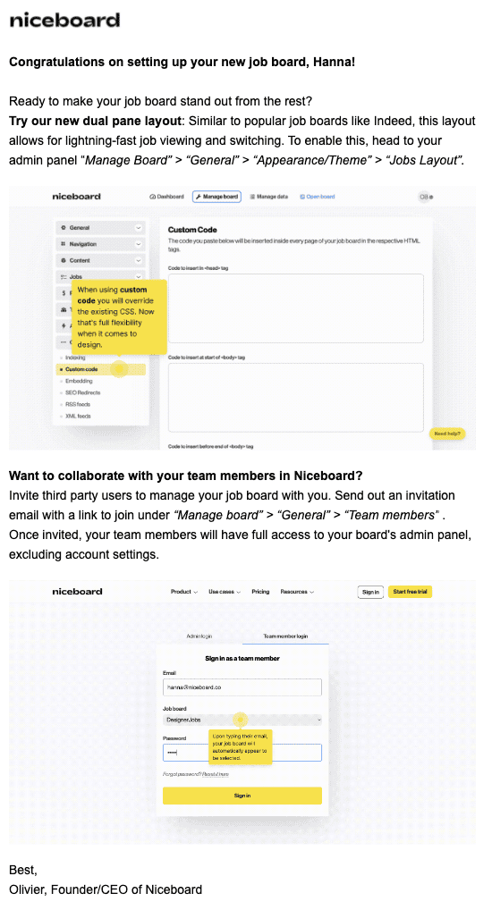
Key elements in this email include:
- Feature highlight: Introduces the dual-pane layout feature, explaining its benefits and guiding the user on how to enable it.
- Tip: Show new features early on to help users get the most out of your platform and provide clear step-by-step instructions
- Collaboration invitation: Encourages the user to collaborate with team members by inviting them to the platform, and providing clear instructions.
- Tip: provide clear instructions on how to add team members, including any limitations on their access.
- Visual aids: Screenshots are included to visually guide the user through the setup process.
- Tip: Use annotated screenshots to guide users through complex interfaces or processes.
Email 2: Tips for job board profitability
This email focuses on helping the user understand how to make their job board profitable. It offers practical tips on developing a pricing structure, monetizing through job postings, and using ads.
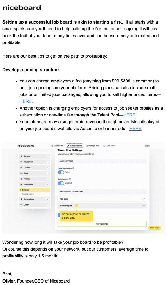
Key elements in this email include:
- Engaging introduction: The email uses a metaphor (“starting a fire”) to draw the reader into the content.
- Tip: Use engaging language to capture your audience’s attention and make your email memorable.
- Supportive content: Links are provided for further reading and action on the platform, along with visual guidance.
- Tip: Use links throughout your email that guide the user to take the next steps. Enhance these links with screenshots or video tutorials to provide visual support.
- Social proof: The email mentions the average time to profitability, setting expectations, and inspiring confidence.
- Tip: If possible, use data and testimonials to set realistic expectations for your users.
Read also: Welcome Email Templates to Win Over New Subscribers
Email 3: Optimizing for SEO
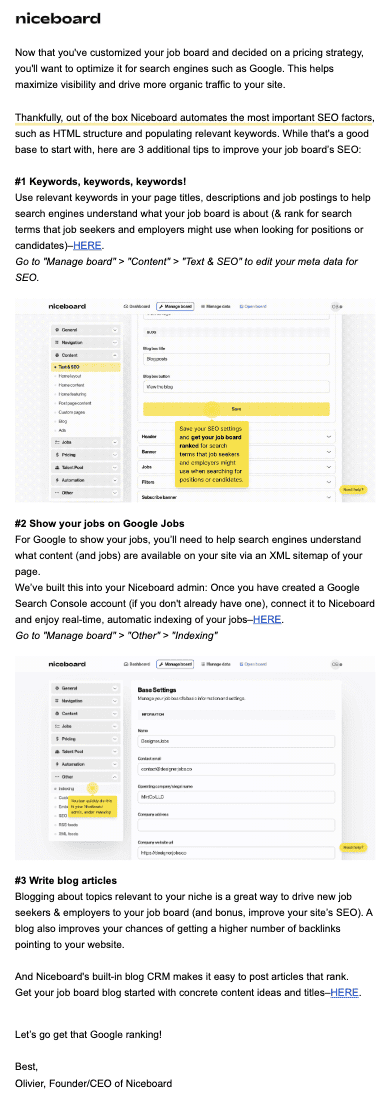
The third email aims to help the user optimize their job board for search engines like Google. It provides SEO tips such as using keywords, showing jobs on Google Jobs, and creating blog articles to increase visibility.
Key elements in this email include:
- Step-by-step guidance: It provides instructions on implementing SEO best practices within the platform.
- Tip: Break down complex tasks into manageable steps to help users make the most of your product.
- Visual guides: Screenshots demonstrate where to make changes on the platform.
- Tip: Use visuals in your emails to make the instructions easier to follow.
Email 4: Getting ready to go live
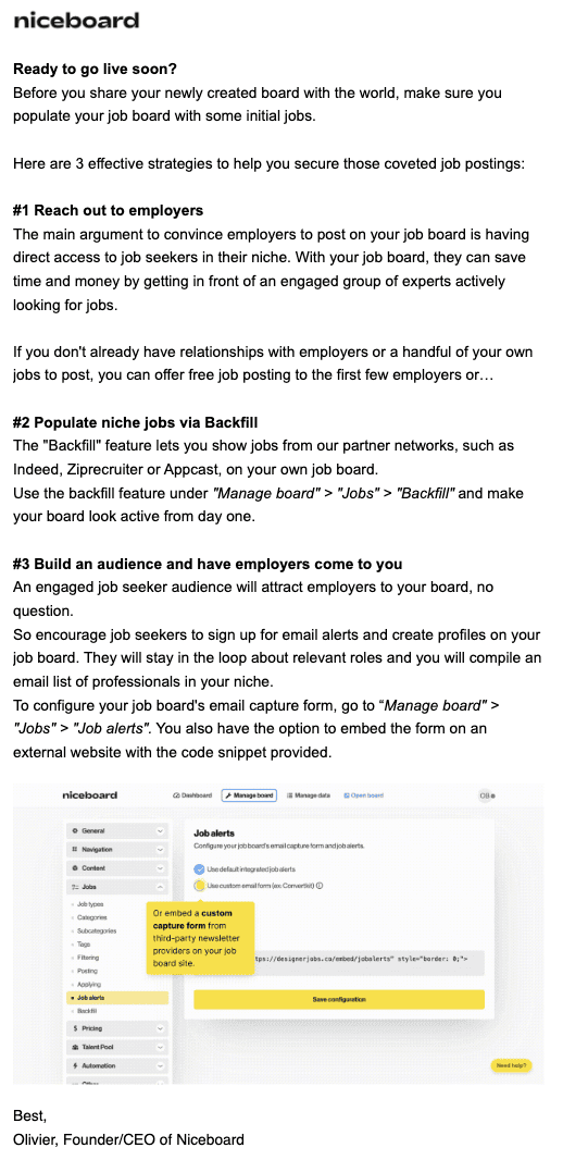
The final email is focused on helping users get their job board ready to go live and maximize its effectiveness from the start.
Key elements in this email include:
- Highlighting practical benefits: The email emphasizes how the platform’s features (like the Backfill feature and job alerts) can help users populate their job boards with relevant jobs and attract employers.
- Tip: Ensure your final email highlights specific features to help users achieve their goals. Include visuals like screenshots or videos.
- Encouraging engagement: By suggesting strategies like reaching out to employers and building an audience, the email motivates users to take proactive steps to maximize their platform’s value.
- Tip: Ensure your final email provides a checklist of key actions users should take before they go live or fully implement your platform.
The Niceboard welcome email series is designed to efficiently onboard new users by providing them with actionable steps to set up, customize, and optimize their job boards.
Read more: You Will Love These 15 Email Campaigns More Than We Do!
Conclusion
Crafting a successful welcome email series is not just about sending introductory emails—it’s about strategically guiding your subscribers through a journey.
As we’ve seen from Custom Neon and Niceboard examples, a well-designed welcome series can significantly impact key metrics like open rates, click-through rates, and conversions.
Key takeaways from these examples include:
- Tailor your content to your specific goals, whether it’s encouraging first-time purchases, driving website traffic, or converting free trial users to paid subscribers.
- Use a mix of elements in your emails, including clear CTAs, engaging visuals, product highlights, and social proof.
- Provide value in each email through discounts, helpful information, or feature explanations.
- Tell your brand story and share your values to connect your audience more deeply.
- Offer practical, actionable advice that helps users get the most out of your product or service.
Frequently Asked Questions
How many emails should be in a welcome series?
Most effective welcome series typically contain 3-6 emails. The examples we discussed, Custom Neon and Niceboard, used 6 and 4 emails respectively.
How far apart should I space the emails in my welcome series?
Timing can vary, but a common approach is to send the first email immediately after sign-up, followed by subsequent emails every 2-3 days. This gives subscribers time to digest each email without feeling bombarded.
What metrics should I track to measure the success of my welcome series?
Key metrics to track include:
- Open rates
- Click-through rates
- Conversion rates (e.g., from free trial to paid subscription)
- Revenue generated from the series
- Unsubscribe rates
For example, Custom Neon reported a 45% open rate and a 15% click-through rate, while Niceboard saw a 5% increase in free trial conversion rates.
