Are you a realtor or a real estate agency looking to build beautiful landing pages for your website?
Truth be told, real estate agents need high-converting landing pages to get new clients the same way actors need to audition to get new roles!
The average human attention span has dropped to just 8 seconds! That’s one second less than that of a goldfish 😅
And, you have just these few seconds to convince your potential client to choose you over thousands of other realtors after they land on your website! This is precisely what a good landing page will help you achieve.
With the right landing page reaching the right prospects at the right time, you’re sure to land more real estate gigs.
So, by the end of this blog post, you’ll get a breakdown of:
- Real estate landing page examples and why they work
- Why you’d need a high-converting landing page for your real estate firm
- Types of real estate landing pages you can use
- Tips for each type of real estate landing page
Table of Contents
9 Elegant Real Estate Landing Page Examples
We’ve curated the top nine high-converting real estate landing pages from all corners of the internet.
Draw inspiration to get started on your pages today.
1. Sotheby’s Luxury Real Estate
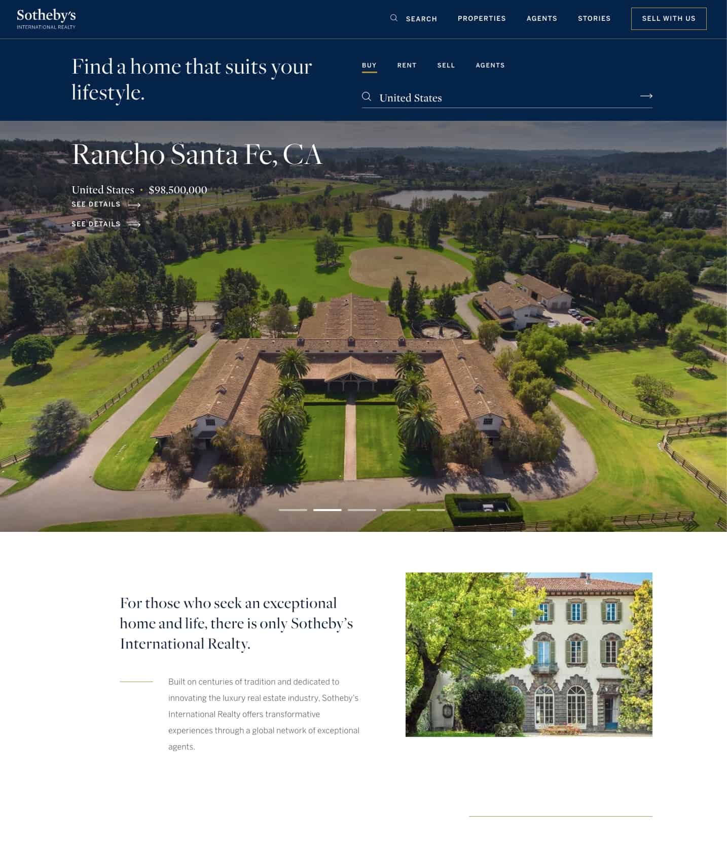
Sotheby’s International Realty has some of the most beautiful real estate landing page design we could find. And, the example above is no exception.
Here’s what is working in favor of this high-converting landing page.
It features an image slider right at the beginning to highlight some exclusive Sotheby’s properties. The high-resolution images of each property convey their luxury presence, which is appealing to potential customers.
This landing page also does an exceptional job of highlighting the firm’s unique selling points (USPs).
It highlights their large experience in selling luxury real estate, emphasizes its international reach, and credits the outstanding realtors who make all this possible. The whole landing page ties in well with their overall brand as well.
A highlighted call to action (CTA) button would make this real estate landing page even more successful. That’s the only aspect this landing page does not do well.
Here’s a tip: Analyse what custom website builder and other tools your competitors use to create their landing pages to gain better insights into website design.
Read more: 12 Great Landing Page Optimization Practices — The Ultimate Guide
2. Opendoor
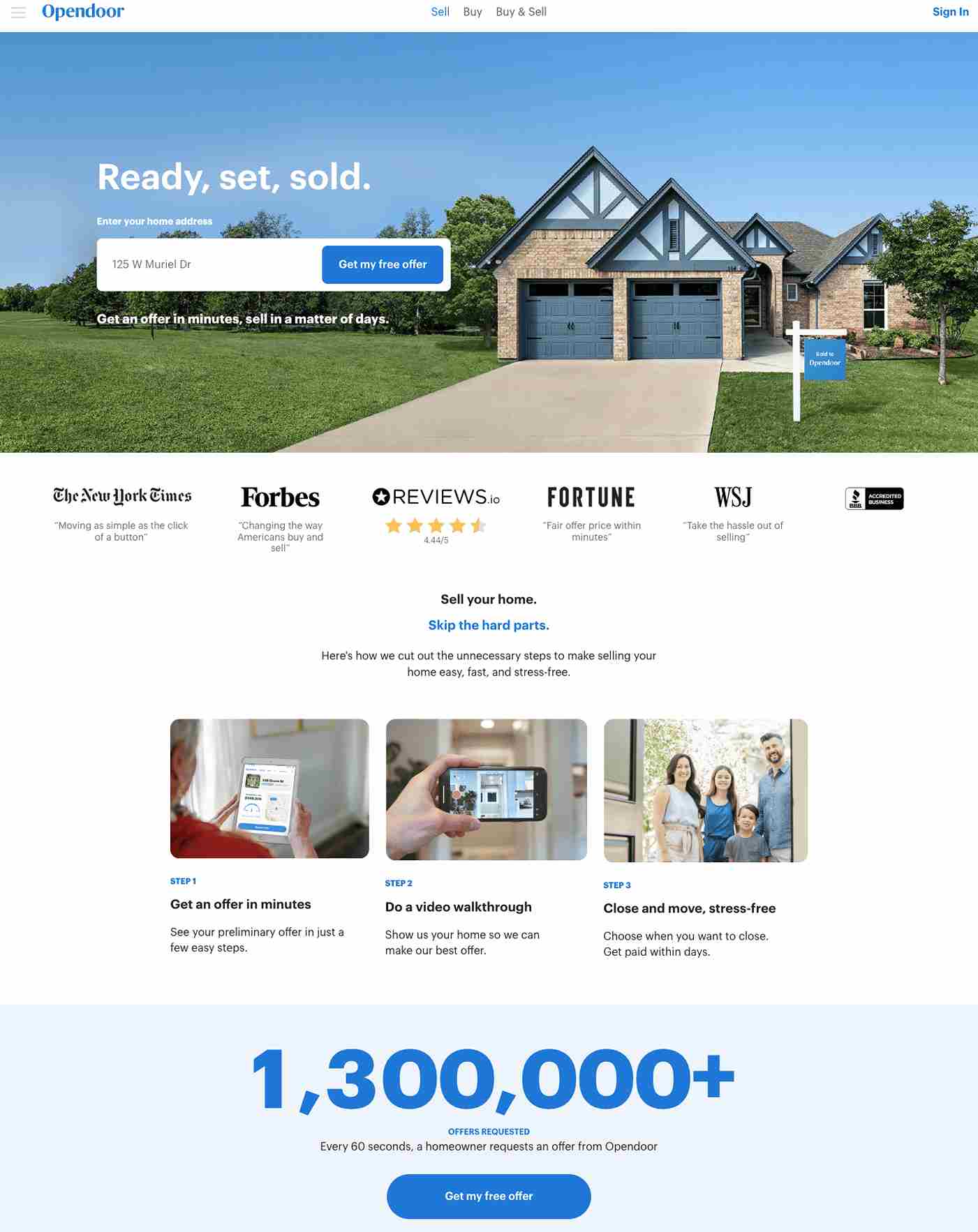
This Opendoor landing page is as functional as it is beautiful and makes it to the second spot on the list.
This landing page is aimed at sellers alone. So the goal of this landing page is to convert more sellers and get them to list with your firm.
It does a great job of highlighting the USPs of the sales process with Opendoor. It enables sellers to sell quickly without the hassles of a drawn-out selling process. The headlines are catchy and stay true to the firm’s USP.
The use of social proof badges from reputed publications like The New York Times, Forbes, and Wall Street Journal makes them seem very trustworthy and dependable.
This is a great example of how you can use social proof for your real estate landing pages.
Finally, they’ve also done a great job with the call-to-action (CTA) buttons. Both CTA buttons are highlighted in blue and encourage the prospective seller to take the next step immediately.
Read also: 20 Real Estate Email Marketing Templates [Ready to Send]
3. HomeLight
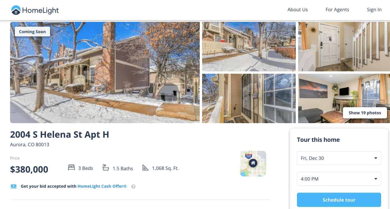
This single listing landing page from HomeLight does a great job of marketing this property.
As you scroll down, there are detailed descriptions of the property. But, all the key information needed by a buyer is listed clearly at the very beginning. There’s also a map widget on the side for buyers interested in the location.
Additionally, the ‘schedule tour’ call to action (CTA) button is an excellent way to entice the potential buyer to take the next step. You can get buyers to schedule a visit without a phone call or further steps.
Read also: 15 Easy Steps to Start Real Estate Email Marketing Like a Pro
4. McGraw Realtors
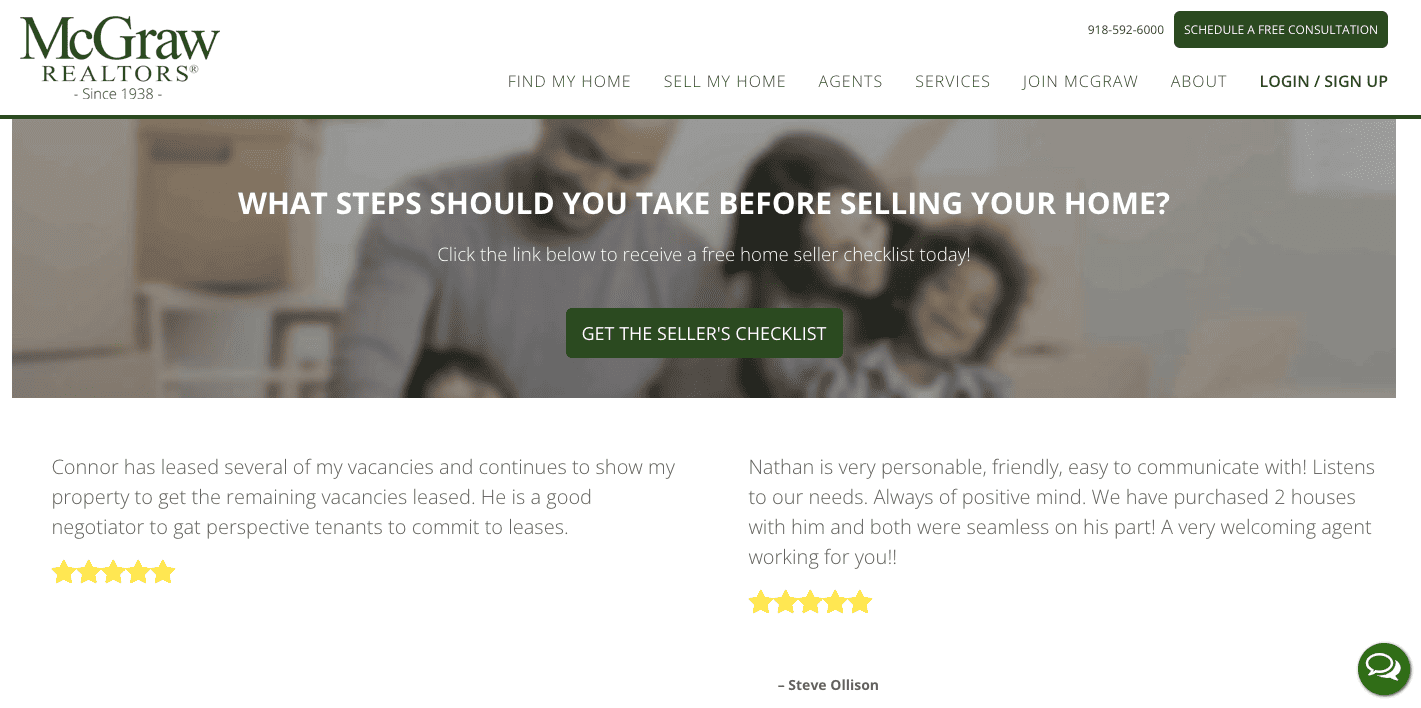
This is a great landing page that aims to generate the maximum number of new potential leads. It provides contact information for free consultation. And the CTA button is aimed at sellers who are not familiar with McGraw Realtors and their services.
Once you click the CTA button, you’ll get the ‘Seller’s Checklist’ after you enter your email ID.
This is a great lead-generation tactic for any real estate business.
Prospects don’t want to just give out their email IDs. Nobody likes spam emails, right? But, when you ask for someone’s email ID to send them a relevant checklist (or anything that’s really useful), they’re more likely to sign up.
Here are some freebies you can consider posting for your real estate landing page:
- Free e-books or sneak peek at exclusive chapters from an upcoming book.
- Checklists for buyers and sellers.
- A real estate webinar
- Special real estate reports
- Free analysis of local markets, neighborhood guides, etc.
When creating a freebie to generate leads, ensure that it is not too long. It should be digestible in one sitting. And ensure that the freebie adds genuine value for the prospect. This establishes your authority in the field as well.
Read more: Real Estate Landing Pages and All You Need to Know
5. MyLondonHome
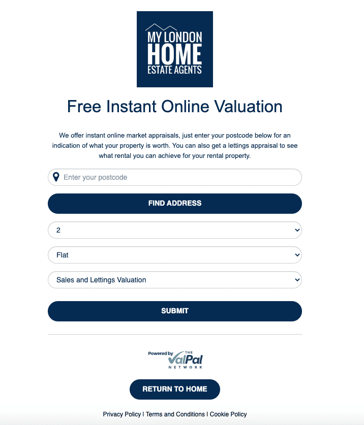
This is a functional landing page from MyLondonHome Estate Agents. The conversion goal of this real estate website is to gather leads from people looking to sell their homes.
Prospects can get an instant home valuation free of charge with this landing page. But, one glaring problem with this particular landing page is the large number of form fields. Not every website visitor is going to have the time to fill out all the form fields.
So, MyLondonHome has solved this problem with a second pop-up landing page that appears a couple of seconds later. This is a brilliant idea to boost conversions.
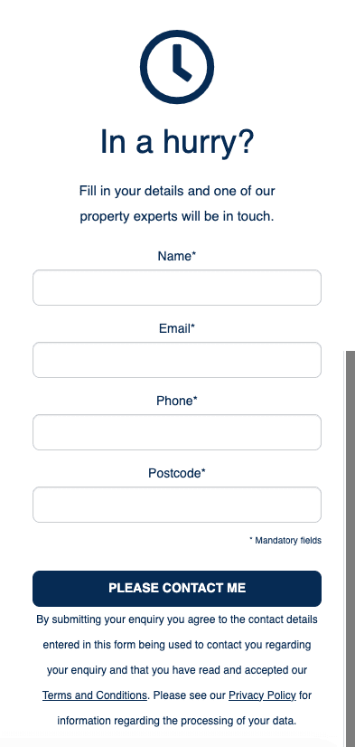
With this pop-up landing page, you can simply enter your details to have someone contact you instead. This is perfect for sellers who are in a hurry.
According to a case study, one company was able to increase its conversions by 120% by just reducing the number of form fields from 11 to four on their landing pages!
For best results, we recommend sticking to anywhere between 1-4 form fields for each landing page.
Read also: Real Estate Landing Pages: 8 Beautiful Examples
6. Jade Mills Real Estate
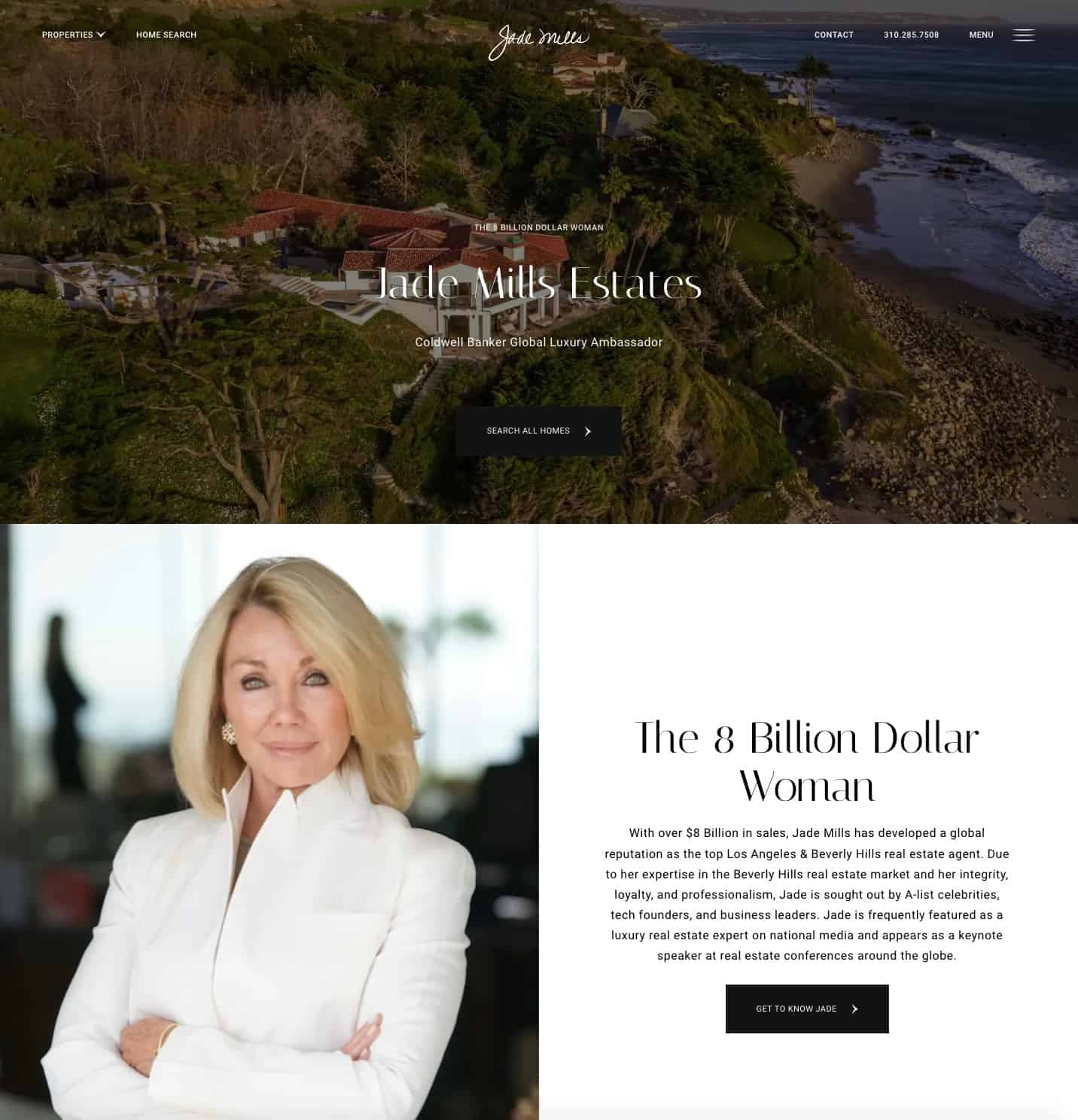
This is a great landing page example from Jade Mills Real Estate, especially in terms of personal branding.
The first CTA button encourages visitors to browse available listings. With high-resolution images of luxury properties, this landing page succeeds in grabbing the attention of prospects.
The second landing page shown here highlights Jade Mills’ experience as a real estate agent. It specifies the areas she works in. The headline is particularly compelling, especially for the high-budget clients they’re hoping to attract.
Overall, this landing page was one of the best I could find in terms of aesthetics, functionality, and social proof.
Read more: 7 Landing Page Optimization Tools for Smooth Conversions
7. Quick Move Now
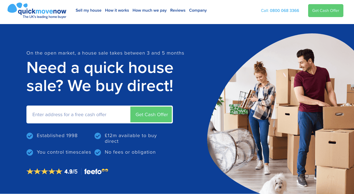
This landing page from Quick Move Now says a whole lot without saying much. This landing page stands out for the copy or the text within it. The headline highlights the advantage of selling with them when compared to selling in the open market.
The bullet points give all the relevant information, without taking too much time. It highlights the main USPs.
As a rule of thumb, your landing page copy shouldn’t exceed 250 words.
Studies have shown that readability increases by 11% with shorter landing page copies. So, at times it’s important to sacrifice some content for more conversions.
Read also: The Complete Real Estate Marketing Automation Guide (With Steps, Ideas, Examples)
8. Adams Homes
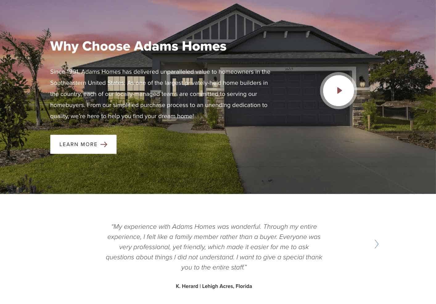
This Adams Homes landing page features a clickable video that highlights the reasons for choosing this real estate firm. There’s also a CTA button that users can click to read about this as well. And, we think this was a great idea on their part.
In a relevant context, video landing pages have proven to increase conversion rates by 86%! Of course, you need to be careful not to overdo videos as well.
Here are some general tips for creating successful videos for your real estate landing pages:
- Only create videos that are going to be helpful for prospects. Google ranks content based on this factor.
- Optimize your videos for SEO to enable you to rank higher in the SERPs (Search Engine Results Page).
- Place the video above the fold. When it comes to websites, placing a video above the fold means there’s no need to scroll down for the video. Hence, more people are likely to watch it. Just like in the past, people were more likely to read articles placed at the beginning of the first page of the newspaper.
- Include a clear call-to-action inside the video or on the landing page itself.
- Create transcriptions for all videos to enable more people to access them.
- Avoid excessive text placed around the video for maximum conversions.
Read also: Real Estate Landing Pages and Everything You Need to Know
9. Redfin
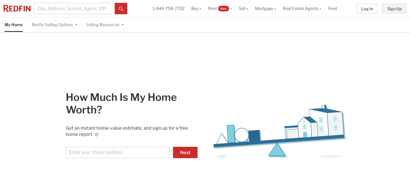
Simplicity can also be a winning strategy in the real estate industry, as seen on this Redfin home valuation landing page.
A minimalistic theme that eliminates distractions on the landing page is one great option for realtors to consider. Here, there are no loud graphics or images of properties. After all, isn’t the goal of this page to get prospects to contact you after a home valuation?
After clicking on the clear CTA button that’s highlighted in red, the prospect is immediately given a valuation. There’s also an option to contact Redfin for customer support or claim the property as the owner.
A minimal design can also help your page load faster. This is another important digital marketing principle to bear in mind while you design your landing pages.
According to Google Consumer Insights, 53% of prospects will leave a landing page if it doesn’t load within 3 seconds! And more than 30% of consumers said that the speed of loading a page affects what they purchase.
There! These were some of our favorite real estate landing pages, and we hope we’ve succeeded in inspiring you a little for your next website design. If you want to get started with your landing pages today, head on to EngageBay to try our landing page builder or use our customizable landing pages.
Oh, we also have a real estate CRM if you’re interested. 🙂
Read more: What is a CRM in Real Estate? Cheat Sheet for Realtors
Real Estate Landing Page FAQ
We get a lot of questions about real estate landing pages. Here are the answers to some of the most frequently asked questions — just for you.
1. What is a real estate landing page?
A real estate landing page is a stand-alone webpage that is geared towards one particular conversion goal. It usually includes a call to action (CTA) button, that highlights the next step prospects can take.
For example, let’s say you just landed a new luxury listing from a reputed seller. You can create a stand-alone landing page for this listing. People can reach this landing page through various means. It could be after clicking the link from a promotional email, organic searches through search engines, or social media ads.
2. Why do I need real estate landing pages?
Here are just some of the key benefits of using real estate landing pages for your real estate firm.
- Easily target specific customer segments: Realtors can create and publish multiple landing pages for different segments of their customers. This boosts conversions because you’re able to give customers exactly what they’re interested in. For instance, if a prospect searches for ‘cozy cabins in Colorado’, they surely don’t want to spend time on your home page looking at properties in Florida or New Jersey. A landing page that directly allows them to check out properties in Colorado would help convert this prospect into a paying customer.
- Create a sense of urgency around listings or offers: Landing pages will help you create a sense of urgency. Especially if you’re offering exclusive sneak peeks at listings before they hit the open market or have limited-time offers, the right landing page will help you convert real estate leads faster.
- Grow and build a solid email list: When landing pages are done right, it will help with your lead generation process. So, make sure that each landing page has a form field to capture these new leads. You can even offer free downloadable content to entice visitors to give you their email.
- Get accurate, actionable metrics: Landing pages are pretty easy to build with the right website and landing page builders. What’s more, you’ll be able to track the performance of each landing page in real time. This can give you some actionable data on what’s working and what’s not. So, your landing pages can convert more with the right data-based tweaks.
Read also: 14 Real Estate Lead Generation Tips That Will Have Your Phone Ringing
3. What should a real estate landing page include?
A real estate landing typically includes all or most of these features:
- A strong, catchy headline that clearly explains what the landing page is about.
- A creative copy that lays out all the important details with clarity. It’s important to be honest and transparent about your listings or offers here.
- A clear call-to-action (CTA) button. You can include multiple buttons, depending on the situation.
- Social proof like customer testimonials, awards you’ve won, and badges.
- Clear, high-resolution images or videos of properties to capture the customer’s interest.
- Responsive design that looks great on any device.
Read more: Create A Buzz With Your Coming Soon Page: Inspiring Examples And Tips
4. What are the types of real estate landing pages?
The common types of real estate landing pages include:
- Single listing landing pages: Realtors typically use these landing pages to showcase a single listing. This can be used when you have an important listing or when one listing needs some extra marketing to sell. You can easily lay out all the info about this listing in detail.
- Home search landing pages: These are landing pages that showcase multiple listings on one page. It allows the prospect to browse through various listings.
- Home valuation landing pages: This is a great way to connect with sellers. Typically, these type of landing pages allows the user to enter information about a property they’d like to sell. The realtors then provide the valuation for their property.
- Squeeze pages with free downloadables: If you’re looking to boost lead generation, then squeeze pages are going to be your best friend. You can offer free downloadables like ebooks, checklists, or webinars to entice site visitors to give you their email ID in exchange for the freebie.
👉Want to connect effectively with potential buyers? Explore our collection of 20 ready-to-send real estate email marketing templates. Dive in now!🚀
Like what you read? Here are some other blogs on related topics:
- 13 Best Email Marketing Software for Real Estate
- Selling Homes in Style: 29 Unique Real Estate Marketing Ideas
- 18 Great Sales Page Examples (And Why They Convert)
Content updated for freshness and SEO by Swastik Sahu.
