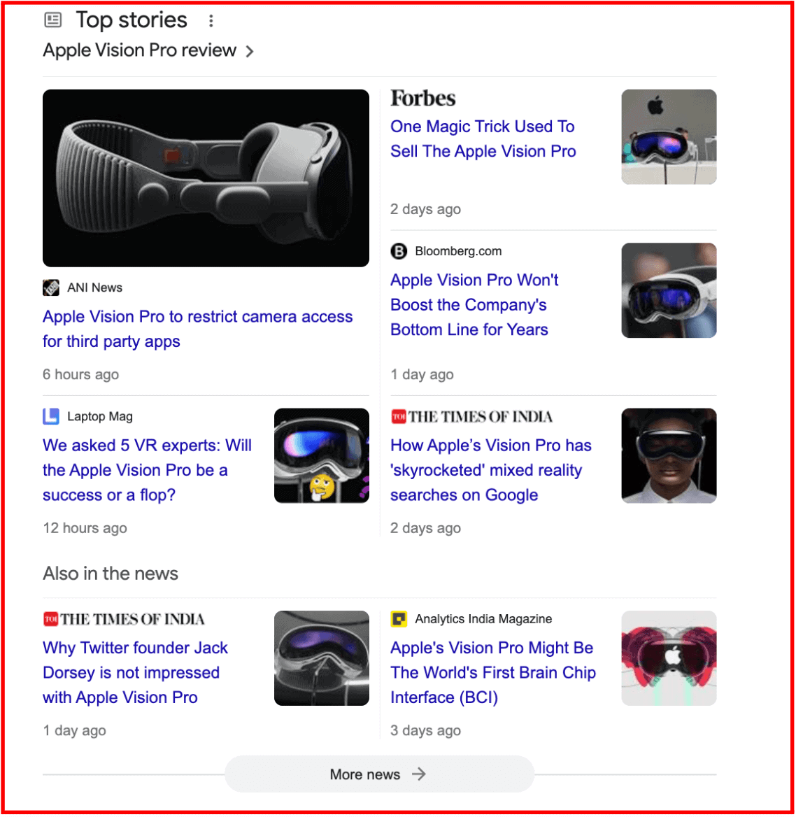
If you are tech-savvy like me, I’m sure you have watched the unveiling of Apple’s new virtual reality (VR) headset, the Apple Vision Pro, that happened last week. Even though the product is still to be launched, all tech companies and users are already talking about it.
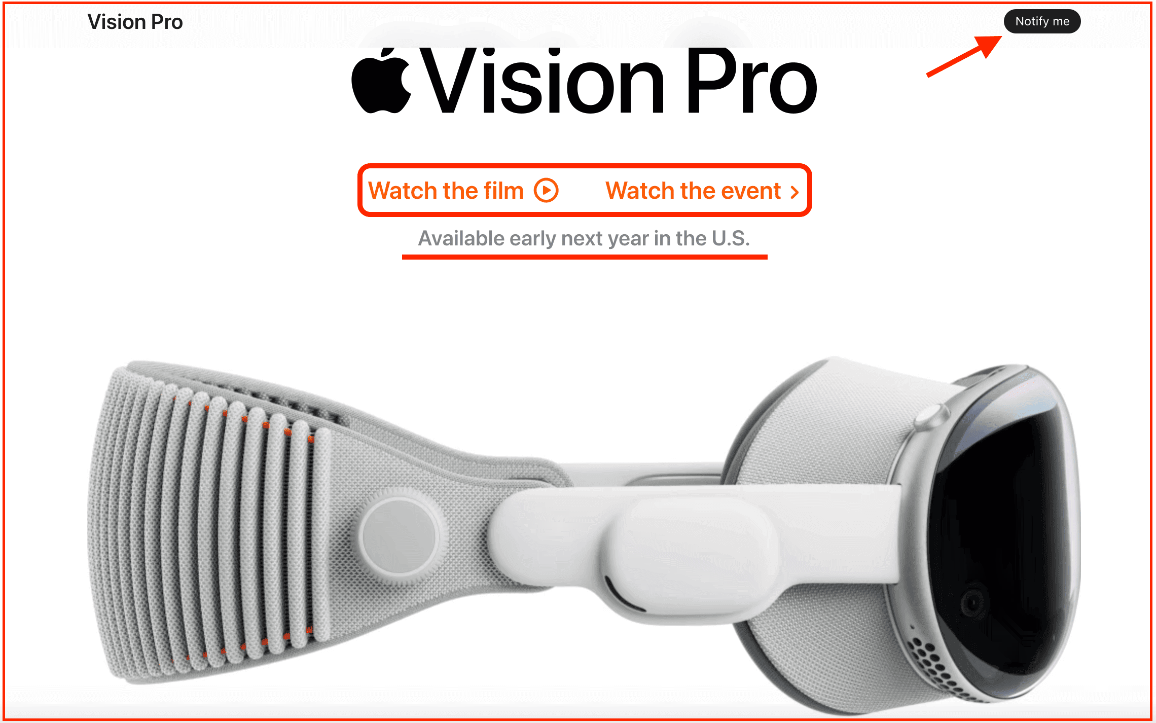
Well, that’s the power of ‘coming soon’ marketing – creating buzz or excitement before a product hits the market.
If you scroll down this coming soon page from Apple, the company has interestingly listed all its features. It has also added a ‘Notify Me’ option that allows consumers to subscribe and be notified when the product is available.
The ‘coming soon page’ is a critical marketing strategy for launching your new product or service. It not only helps you get the right publicity but also collects customer data and product feedback in the meantime.
In today’s blog post, we will look at how ‘coming soon’ pages help with marketing, what elements can make for a great coming soon page, and some top examples for inspiration.
Table of Contents
Why Do You Need a Coming Soon Page?
A coming soon page, also known as a pre-launch page, is a temporary landing page that helps people learn more about your new product, service, or venture. It helps capture visitors’ interest in your brand and encourages them to expand your reach, even when your business is still under wraps.
In other words, the hype around your new launch keeps customers glued to what’s coming next. Again, how you design your coming soon page campaign has an important role to play.
While these landing pages are temporary, there are a few key elements that you need to consider to capture leads and maximize conversions.
Let’s dive into it.
Key Elements of a Coming Soon Page
Typically, ‘coming soon’ pages are short and do not give too much information.
However, depending on your business goals, your pre-launch landing page can also be a detailed sales page for a longer-term marketing strategy.
Nevertheless, below is a list of key elements that every coming soon or pre-launch landing page should include.
#1. Describe Your Product as Smartly as You Can
While coming soon pages should not give away too much information, they should at least provide a glimpse into what is coming next.
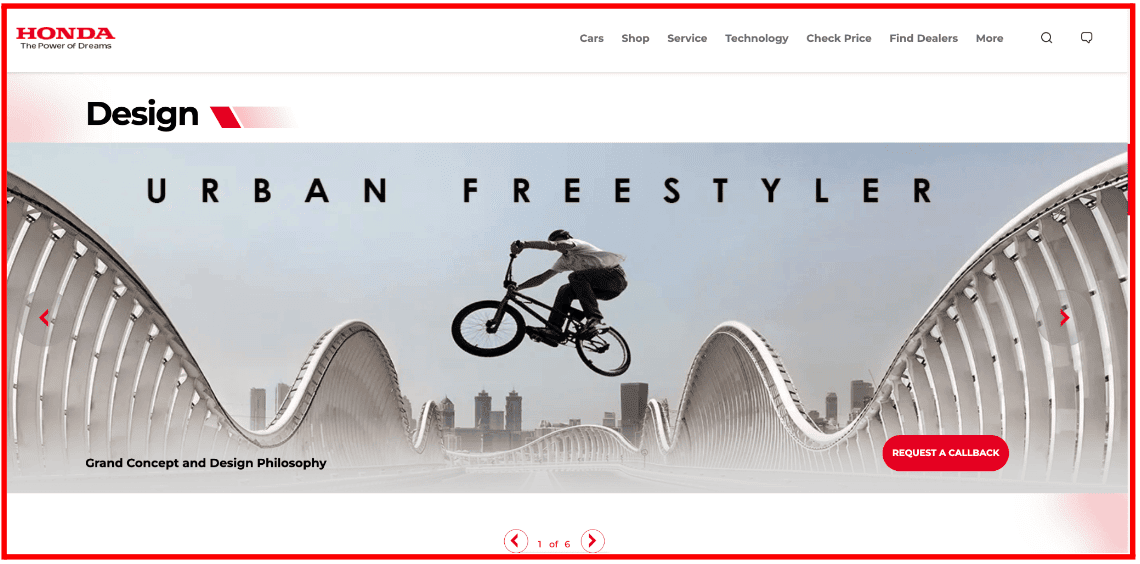
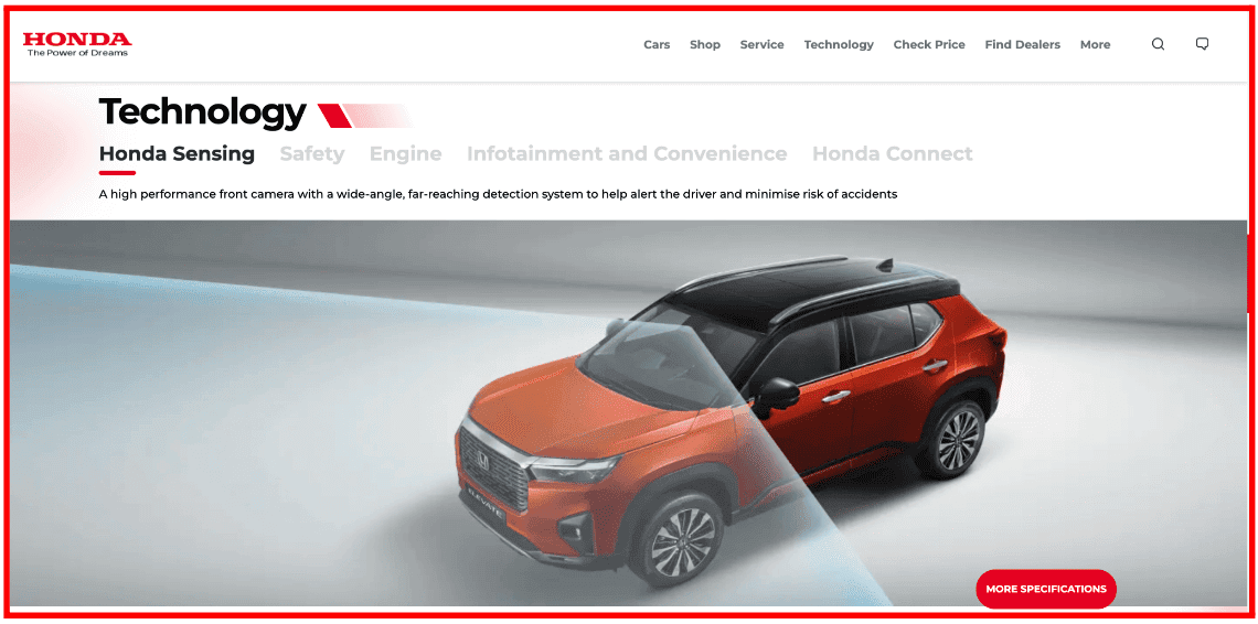
We can take a cue from the coming soon page for Honda’s New Global SUV ELEVATE, slated to make its world debut in India.
Customers want to know what kind of product or service you are launching and when it will become available.
Honda has smartly included a ‘Design’ section that shows the car from all angles. If you scroll further, you can even read about its specifications.
#2. Offer incentives for advance booking
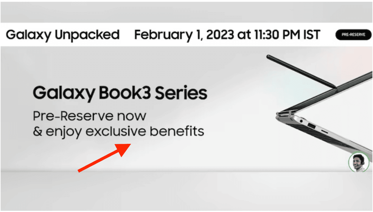
One of the best ways to keep customers hooked to your to-be-launched product is by providing them with incentives. These can include early-bird access, discounts, limited-period offers, and so on.
You can also convince them to join your mailing list by displaying social proof such as ‘over 100 pre-orders so far’ or ‘200 people have already signed up’ and create a sense of urgency among customers.
Here’s how Samsung, a South Korean multinational electronics corporation headquartered in Yeongtong-gu, South Korea, did it for its new Galaxy Book3 Series.
#3. Make sure there’s a value proposition
Unless customers know how your product will benefit them, they will not be interested in your brand. How is your product different from your competitors? Why should people switch to your brand?
What benefits will customers get by using your product? These are some questions you can include on your pre-launch landing page.
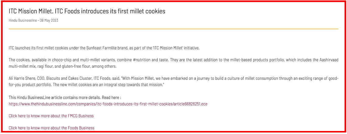
While this is not exactly a landing page, ITC Food did a press release introducing its new ‘Millet Cookies’ that combines both nutrition and taste.
To add to the value proposition, Ali Harris Shere, COO, Biscuits and Cakes Cluster, ITC Foods Division, said, “With Mission Millet, we have embarked on a journey to build a culture of millet consumption through an exciting range of good-for-you product portfolio.”
Read also: The Definitive Landing Page A/B Testing Guide [With Ideas & Case Studies]
#4. Encourage people to share your page
Another way to generate buzz around your product is by requesting people to share the coming soon page across various channels.
You can make it shareable by enabling social media links on the page itself so that audiences simply need to click the icon.
One popular way is to use Rafflecopter in the launch of a new product.
You can organize a giveaway where the user earns points for every activity, such as sharing it on different social media platforms, referring it to a friend, signing up, etc.
Thereafter, a random user is chosen as the winner with the highest score.
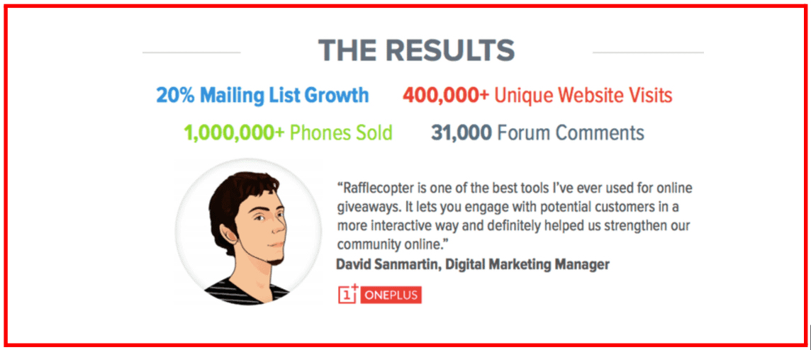
OnePlus was able to build huge awareness about the launch of its flagship product, the OnePlus One Android phone.
They grew their mailing lists by 20% and drove 200,000+ unique website visits.
Alternatively, you can onboard social media influencers to share the page on their respective social media handles to create hype around your brand further.
This not only helps with brand outreach but also builds credibility among the audience.
Read also: Target These Tech Keywords to Boost Your SEO and Online Visibility
#5. Have a strong call-to-action
Always include a call to action (CTA) on your pre-launch landing page.
This can include a link to join your mailing list, liking or subscribing to your social media profiles, providing contact details, or downloading a white paper.
With CTA, you can expand your brand reach and automatically increase the hype around your product.
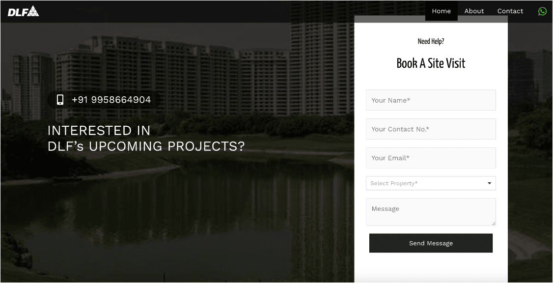
Here’s how DLF, a leading real estate developer group in India, does it.
They have included multiple CTA points – inserted a calling number, embedded a web form, and also added a WhatsApp icon to message them directly.
Read more: What is a Splash Page? — The Ultimate Guide
Best Coming Soon Page Examples To Get You Inspired
Now that you know the basics of it, it’s time to look at some of the best ‘coming soon’ page examples to help you get started.
#1. Shein
Shein is a Chinese online fast fashion retail brand. Founded in 2008, it is known for selling inexpensive apparel and catering to youngsters.
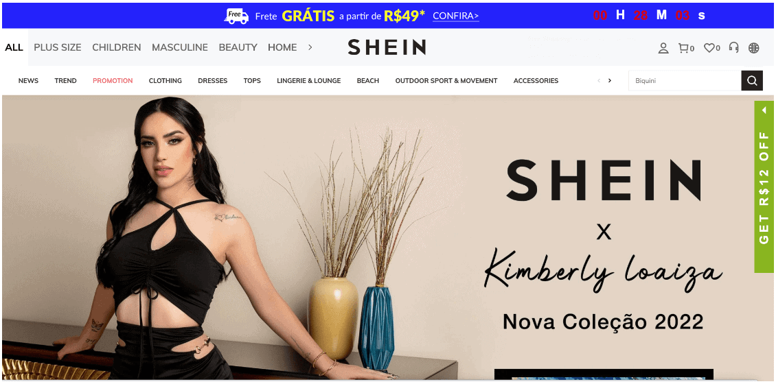
The above example is of Shein’s collaboration with Mexico-based social media influencer, Kimberly Loaiza for the upcoming collection. Kimberly Loaiza is a popular Mexican internet personality and singer with a huge fan base.
Their coming soon page added a countdown timer on top, allowing its consumers to get a sneak peek of the collection before it was made available.
Besides, they highlight the image of the influencer, Kimberly Loiza, in the background to ensure visitors know who is being discussed and what they can expect to see in a new collaboration.
#2. OpenAI GPT-4 API
OpenAI, an American artificial intelligence research laboratory, conducts AI research with the intention of promoting and developing friendly AI.
Last year, it created a buzz when it released ChatGPT, a generative AI that articulates responses spanning various domains of knowledge. By January 2023, it had become the fastest-growing consumer software application, gaining over 100 million users.
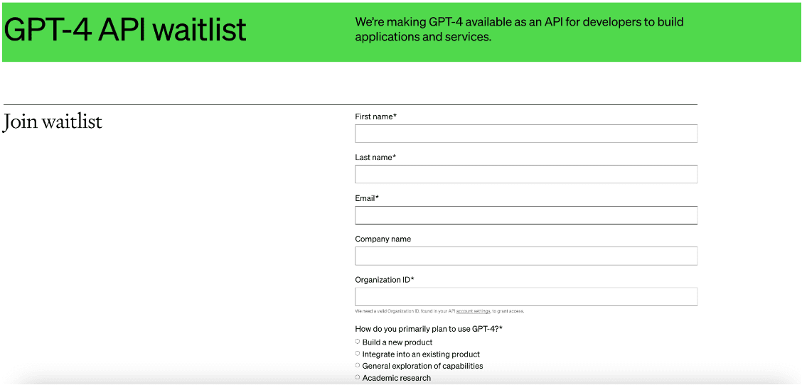
And now, OpenAI has begun the rollout of GPT-4 API, a powerful artificial intelligence model that gives access to developers. The idea is to help them contribute exceptional model evaluations to learn and improve the model for everyone.
They have placed a web form on their coming soon landing page to join the waitlist, and the form captures all necessary information about the developers.
Further down, it explains the purpose of releasing GPT-4 API, and if someone wants to know more, they can always click on ‘Read More About GPT-4.’
#3. Unbounce
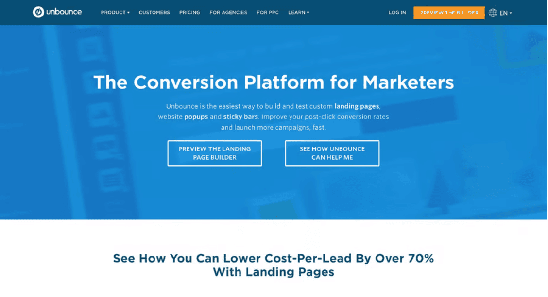
Unbounce is an AI-powered landing page builder platform that lets users create marketing campaigns with just a few simple clicks.
This is a great landing page example as it lets users take a sneak peek into its tools. Its two big CTA clearly catches its visitors’ attention.
People can get a preview of the tool before they actually have to purchase it. ‘See How Unbounce Can Help Me’ is also a smart way to educate the audience about how they can use this AI-powered landing page builder.
#4. McDonald’s
Who can resist a McDonald’s burger? Especially when they come wrapped in a more convenient manner.
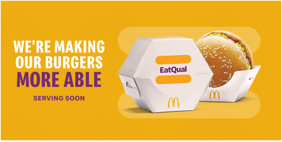
In the above example, McDonald’s introduced a packaging ‘EatQual’ designed for people with disabilities to eat their burgers easily. Brilliant, isn’t it?
The image shows what the packaging is expected to look like, while the logo ‘EatQual’ is trying to symbolize McDonald’s goal of becoming inclusive and accommodating towards its customers with disabilities.
Besides, the description conveys everything in just one line. They also included a short video on the same that illustrated the easy and fun way to eat a burger using only one hand.
You can watch it here:
#5. Canva
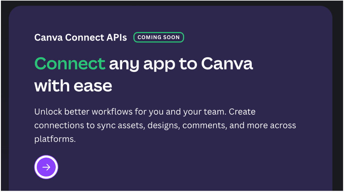
Canva, a graphic design platform with 135 million monthly active users, has introduced the Canva Developers Platform. It features APIs and development tools for building applications for the Canva community.
This platform, allowing developers to market their apps in the Canva App Marketplace, was rolled out in mid-June 2023. The release of its other functionality, ‘Canva Connect APIs’ – REST APIs to connect any app with Canva is due later this year.
On their coming soon landing page, they have included all crucial information about the tool with enough CTAs to take some actions. They even included a waiting list form and received more than 11,000 developers’ applications (at the time of this writing).
Canva also included a FAQ section below to clarify any doubts developers might have about the newly launched platform.
#6. Nordstrom
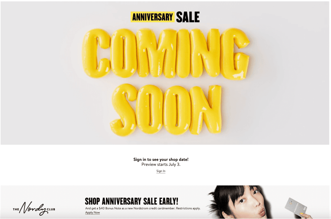
One thing that any fashionista can’t ignore is upcoming sales. This is why top fashion retailers know how to create an interest in their upcoming sales by dropping a preview of their collection.
Nordstrom is a US-based luxury retail chain headquartered in Seattle. Nordstrom has done a brilliant job with a bright, colorful design that instantly catches your attention. Yellow is associated with happiness that perfectly fits the shopping brand.
Here, Nordstrom is running an anniversary sale and urges its customers to sign up if they want to know their special sale date. You can even become a member and get access to its Anniversary sale early.
Without providing too much information, Nordstrom tells customers how and when they can access its deals. They didn’t miss out on the most important message, ‘Free Shipping. Free Return.’
Well, that’s all an online shopper craves for 🙂
#7. Ship by Product Hunt
Ship by Product Hunt is a website that helps companies ship their products all over the world. Further, the platform also helps you build landing pages for sending and receiving emails, instant messaging, and conducting surveys.
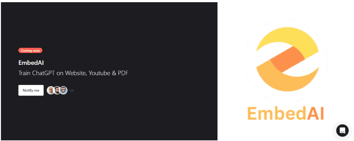
Right now, Ship by Product Hunt is launching several new products, one of them being EmbedAI.
In the above example, the brand only displays the to-be-launched products’ logo, along with a single-line explanation of what it does. It’s a classic example of how a simple coming soon page should be.
Users can click on the ‘Notify Me’ button to receive updates on when EmbedAI will be introduced. They can also look at the number of people who have already signed up for the platform.
Read more: 15 Great Sales Page Examples (And Why They Convert)
Tips For Building a Brilliant Coming Soon Page
How you design a coming soon page has a lot to depend on what you wish to achieve.
You might have a full-fledged coming soon page like Apple Pro Visions that covers every product specification in detail. Or, you can have as simple as the Product Hunt page that does not share much information on the coming soon landing page.
However, there are certain tips that will come in handy while designing a landing page.
#1. Generate some excitement
The main purpose of any coming soon page is to create a buzz before the launch.
Generating excitement around your soon-to-be-launched product is one of the easiest ways to expand brand outreach. Adding engaging visuals and graphics like countdown timers, bold text, and images can keep people hooked.
Of course, you also need to consider who your target audience is and which industry you belong to.
For instance, you can’t include a whole cheerful yellow graphic for a B2B SaaS leader. It might not suit their taste. But it perfectly fits fine for any fashion lover customer.
#2. Build a pre-launch mailing list
Another advantage of having a coming soon page is that you can capture users’ attention by encouraging them to subscribe to your mailing list.
This tactic helps drive them to your page even when there’s nothing to purchase immediately and also prevents them from losing interest in your brand.
However, for people to sign up for your mailing list, they need to be provided incentives. These can range from offering early bird discounts on a new product or service, exclusive discounts or giveaways, behind-the-scenes access, entry into a contest, and so on.
Ideally, you can use a pop-up dialog box where visitors can enter their email IDs, allowing them to subscribe immediately.
#3. Insert cool videos
Videos have become a crucial component of online marketing, as they can convey information easily without too much text.
You can either embed videos or GIFs onto your coming soon page. The video can act as a promo for what’s coming next and give a short glimpse into the product or service you will introduce.
Here’s a classic example of a brand launch video by Grommet, a marketplace to shop unique and ingenious products from entrepreneurs, inventors, and small businesses.
They developed an animated video promo to launch and introduce the fresh new look of their platform.
#4. Include a countdown timer
To create a sense of urgency among customers, you can insert a countdown timer on your pre-launch landing page.
This helps them know when they can expect to see your product launch and give them a concrete timeline for the same.
#5. Make it mobile friendly
Given that most people prefer to access the web on their mobile devices, your coming soon page should be optimized for the same.
While creating your coming soon page, ensure that the font, graphics, and webpage are of the right size such that everything is visible and can be easily read while viewing on a smartphone.
Read more: 14 Stunning eCommerce Landing Page Examples (+ Tips)
Wrap Up
The ‘coming soon’ page helps build marketing momentum for your product or service even before its launch. If you are worried about how to create a kickass coming soon page, you can try EngageBay for a free landing page.
EngageBay offers a wide range of landing page templates, including occasions like product launch, webinar, live events, etc. You can customize your free landing page as per your needs or create one from scratch.
