Subject line, check. Content, check. CTA, check.
Most marketers spend a lot of time perfecting these parts of their emails, yet many overlook a critical component: email headers.
As email providers fight back against rising phishing attacks, nearly 57% of all emails are sent to spam. Email headers play a key role in separating the good from the bad. They act as unique identifiers that help verify the sender and the receiver — and keep everybody safe.
Before diving into detail, let’s get a common confusion out of the way.
There are two types of email headers:
- Technical email header: This is the real email header and is actually just code.
- Design email header: This is the first visual part of an email and is the commonly understood type of email header.
In this blog post, we’ll:
✔ Differentiate between technical vs design email headers.
✔ Explain the different components of an email design header.
✔ Show you how to view the headers in different email clients.
✔ List 6 great design email header examples to help you get inspired.
Let’s get started!
Table of Contents
What Is an Email Header? Technical vs Design Email Headers
An email header is a record of an email’s routing information and metadata, such as the email addresses of the sender and the receiver, subject line, date, and time of transmission. It provides email servers with origin, destination, and authentication data to pass spam checks until they’re delivered to the inbox.
The technical email header is an HTML code snippet that helps email service providers understand who an email is from, who it’s addressed to, the route it took to arrive at the receiver’s inbox, and how it’s to be handled.
The code in the header will show the name and location of the sender and the receiver, the date and time it was sent, and other details like the subject line.
The design header is the top visual part of an email, usually containing the brand name and logo, navigation bar, and title. It is more important from the branding and customer experience perspective but does play a role in improving deliverability.
What is NOT an email header?
An email header is not the same as the pre-header that appears next to the subject line.
The pre-header only provides additional information related to the subject line and is often used to tease the offer in the email.

Read also: Email Anatomy 101: Essential Email Parts You Shouldn’t Ignore
Components of an Email Header
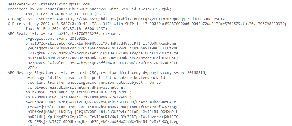
This is what an email header field looks like in HTML. It contains fields or labels such as ‘Delivered-To’ or ‘Received- By’ with corresponding values written in HTML code.
This crucial email header information looks less intimidating when viewed using an email client:
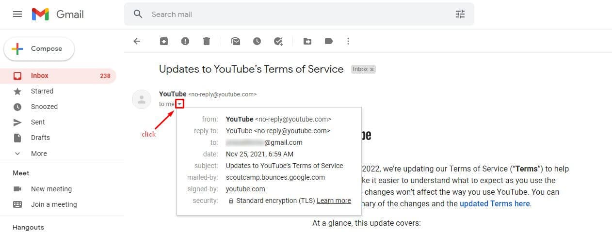
Every email header is made up of several fields. These fields, in turn, have a distinct value.
Let’s look at each email header field in detail:
- From: This field provides the sender’s address.
- Example: EngageBay <[email protected]>
- To: Shows the email addresses of the primary recipient and secondary recipients, if any.
- Example: George Martian <[email protected]>
- Delivered- To: Shows the name and address of the person who received the delivery.
- Example: [email protected]
- Subject line: This is the title of the email as mentioned in the subject line
- Example: email_subject_name
- Reply-to: This field has the address that the sender can reply to
- Example: Sender Name <[email protected]>
- Content-Type: Displays the format of the email – HTML, etc.
- Example: text/plain; or Content-Type: multipart/alternative;
- Return Path: This value tells the receiving server where to send bounced emails. This is separate from the original sending address.
- Received: This value records all servers that an email may have been handled by on its way to your inbox.
- Message ID: The message ID tags each email to make sure that only one copy per email gets delivered.
- Multipurpose Internet Mail Extensions: This is a protocol that allows you to attach audio, video, and other media files to an email. It has multiple versions depending on the type of attachment being sent.
- DKIM Signature: DKIM or Domain Key Identified Mail is a protocol related to security. It checks the digital signature (or key) of any email to confirm if it was authorized by the domain owner. This signature can be found in the sender’s DNS records.
- SPF: Sender Policy Framework is another security protocol used by the sender to indicate what hosts are authorized to send emails on its behalf. This information is also contained in the DNS records.
Read also: Email Design Best Practices: Do Your Designs Convert?
Why Is an Email Header Important?
Let’s first talk about the technical header. A technical email header provides the following advantages:
1. Authenticates the source of an email
Technical email headers tell the email provider and the receiver if the sender is legit. It contains all the identification information needed to pass spam checkers and helps the reader identify phishing attempts.
2. Protects against phishing
By analyzing the email header, email servers can tell if authentication protocols like DMARC, SPF, and DKIM were passed. If it didn’t, the email would never arrive in your inbox.
3. Evaluates the email route
Technical headers also contain details of the servers an email passed through on the way to your inbox. This information, known as the send path, can vary from email to email.
To learn more about improving sender reputation, read this blog post.
Read also: 40 Popular Email Abbreviations And Their Meanings
How to View Email Headers in Different Clients
Different clients will display the email headers differently. In this section, we’ll take a look at the different email header formats across leading clients:
1. Email headers in Gmail
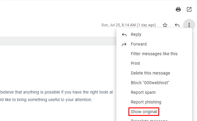
- Click on the three-dot icon in the top right corner of the Gmail.
- From the drop-down menu, select ‘Show Original’. A new window should open up, displaying the complete email header.
2. Email headers in Apple Mail
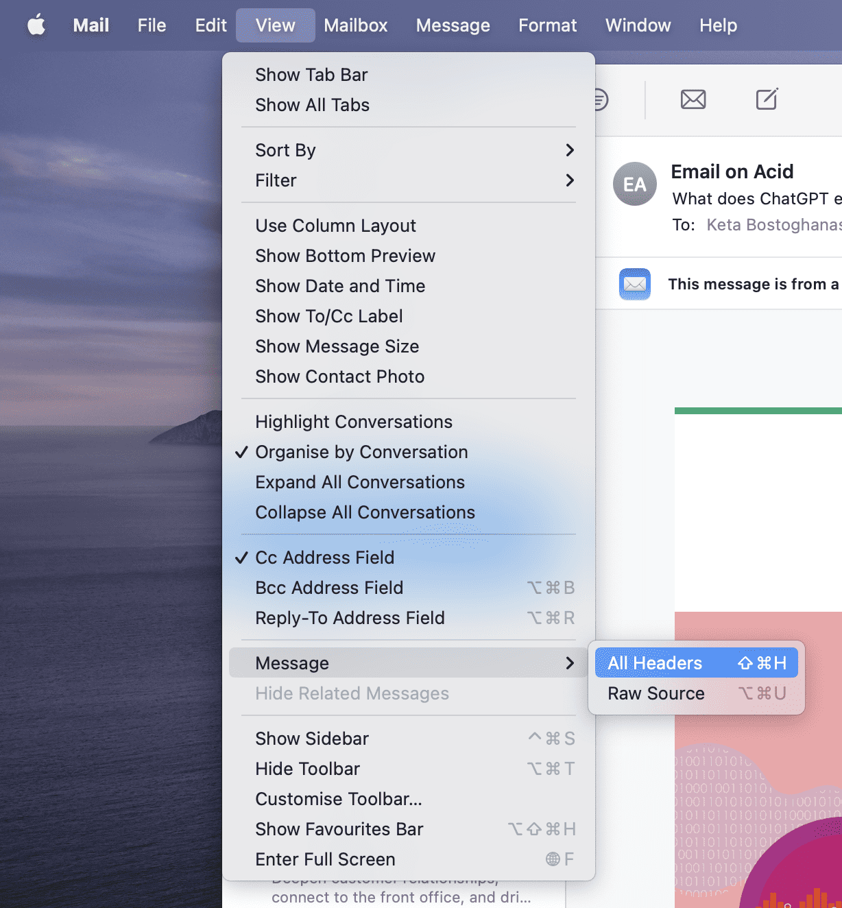
- Click on View in the top-left corner of the navigation bar (after opening Apple Mail).
- Next, click the Message option followed by All Headers.
Read also: Email Preheader Examples and Tips to Get More Email Opens
3. Email headers in Yahoo Mail
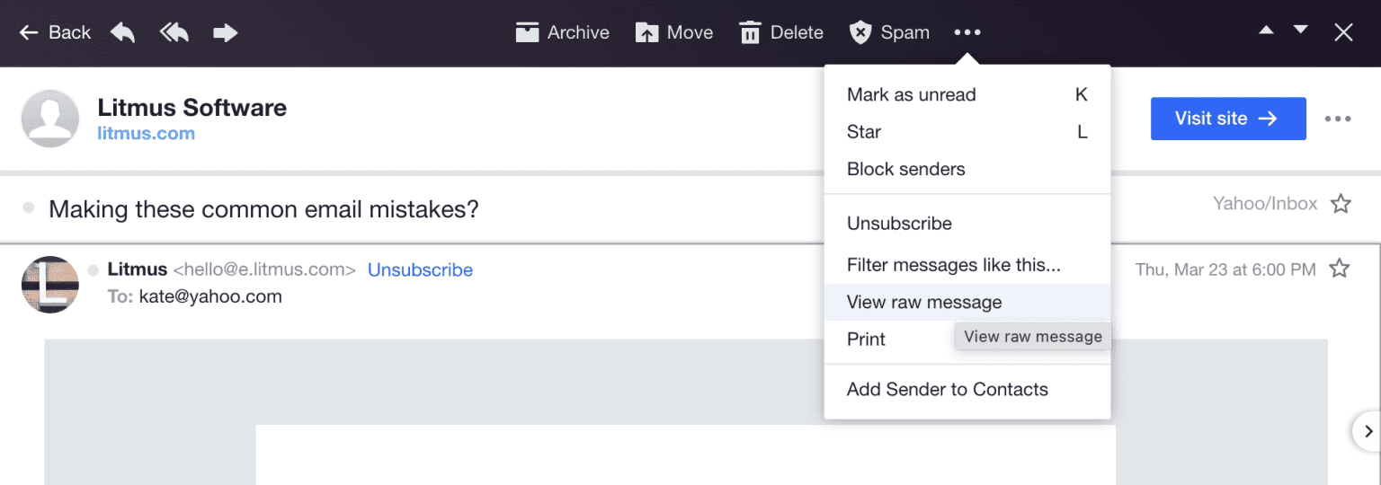
- Click on the three-dot icon from the navigation bar.
- Click on the View raw message option.
4. Email headers in Microsoft Outlook
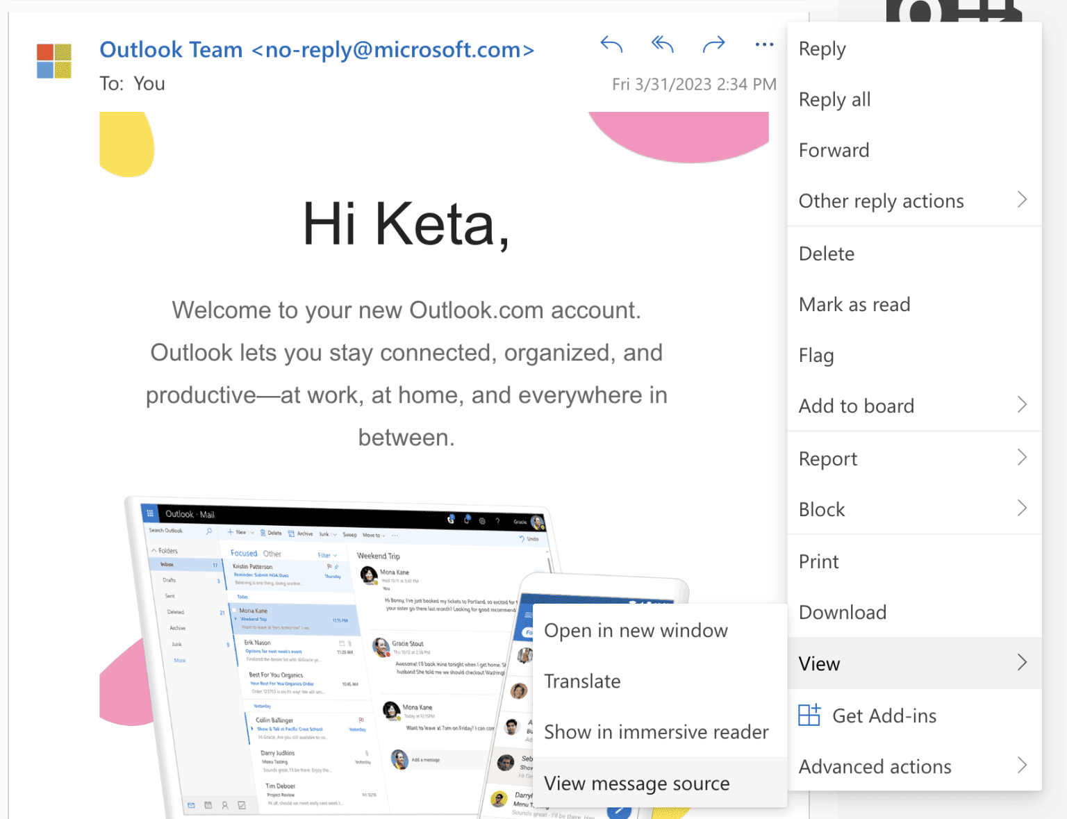
- Select the respective email and click on the three-dot icon in the top right corner.
- From the drop-down menu, click on the View option and then choose View message source.
Read also: Why You Should Try Email Threads (Gmail, Outlook, Apple Mail)
How to Optimize Your Email Header Design
Now that we’ve reviewed the technical header, let’s look at the design header.
Let’s start with some best practices for designing email headers.
1. Keep it clean and simple
A clean header with minimal text, an attractive hero image, and branding elements like a logo and tagline can encourage readers to scroll further.
2. Include standard branding
Make sure you use standard brand colors and imagery so that readers can associate it with other messages they may have seen on social media or your website.
3. Use a recognized name and email address
Use a professional headshot for your email avatar and the company domain. This immediately puts the reader at ease.
4. Place CTAs strategically
The email header is the first thing people see when they open your email.
This makes it perfect for placing a CTA. 38% of brands prefer placing it in the top right corner. Try to keep the header clean and simple — avoid too many GIFs or graphics, as that could distract readers.
5. Create responsive headers
Check the recommended image size given by your email service provider or email marketing tool and enable the required settings so that the header displays correctly.
6. Test, test, test
You may have created a beautiful header design, but formatting errors can crop up when you least expect it. A/B test the layout and every element, including the logo, header image, and CTA. Choose a layout that provides a better CTR.
EngageBay’s A/B testing tool makes the job a lot simpler. It lets you test each element of your email, along with the respective metrics to help you choose the variant that offers the best clickthrough rates.
Read also: Email Footer Examples To Inspire Your Design
6 Brilliant Email Header Examples for Your Inspiration
Here are a few email header examples that tick all the boxes, from aesthetics to accessibility.
1. B&Q
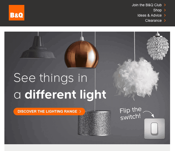
Have you heard of the ‘Yes Set’ technique in sales?
It involves getting the prospect to say ‘Yes’ three times before asking for a sale. That puts them in a ‘yes’ state of mind where they are more likely to make a purchase. Well, if it works for sales, it should work for marketing, too, right?
B&Q’s clever use of an interactive ‘flip switch’ in the header attempts to do just that. It invites the reader to ‘flip the switch’ and puts the CTA button right next to it so that readers will instinctively click on it, too.
The numbers prove it: interactive elements have significantly higher click-through rates. A great hack for your next email campaign, eh?
2. Duolingo

Square and rectangle-shaped headers are out-of-date. Brands like Duolingo are pushing the envelope with unconventional shapes and inset graphics. In this example, the 3D box frame perfectly complements the ‘gift of learning’ theme.
The use of bright colors along the fringes and the witty copy makes it look playful and endearing.
Learn more about the secrets to improving your email deliverability rates here.
Read also: How To Address Multiple People in an Email the Right Way
3. Nuebar
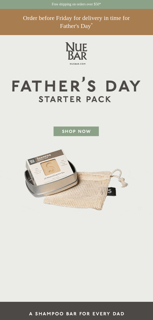
When it comes to letting the product do the talking, eCommerce brands do it best. Including a product image alongside the offer can translate into higher CTR and conversions. Nuebar is an Australian hand-made, organic soap brand.
In this email, it capitalizes on the Father’s Day theme with a clean, simple header design. Free shipping is a tried and tested email marketing strategy that works well all year round. It also builds urgency by subtly suggesting that the order may not arrive on time unless the reader hurried.
4. Surreal
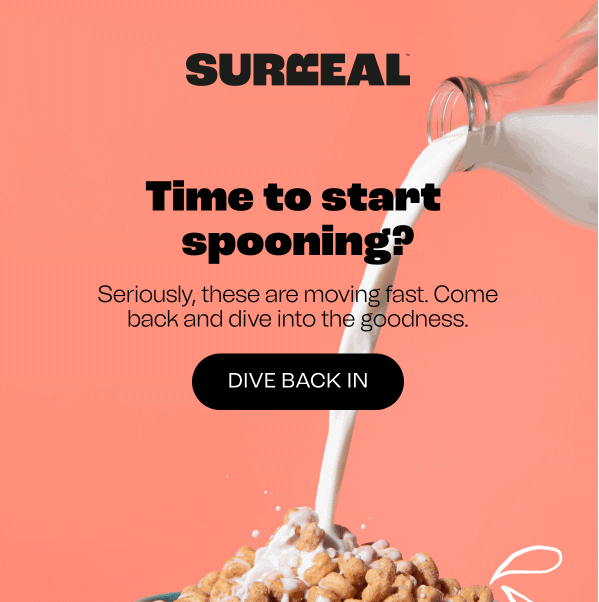
If you’re doing a re-engagement email, you need something extra. GIFs are a great way to attract attention to the CTA, driving CTRs and conversions. Surreal, a healthy cereal brand, uses it to good effect within the hero image, inviting the reader to ‘drive back in.’
Note that the GIF blends in seamlessly with the image and puts the CTA in direct line of sight — highly unlikely readers won’t notice it. An email header like this can help you win back inactive subscribers and generate more sales.
5. Apple
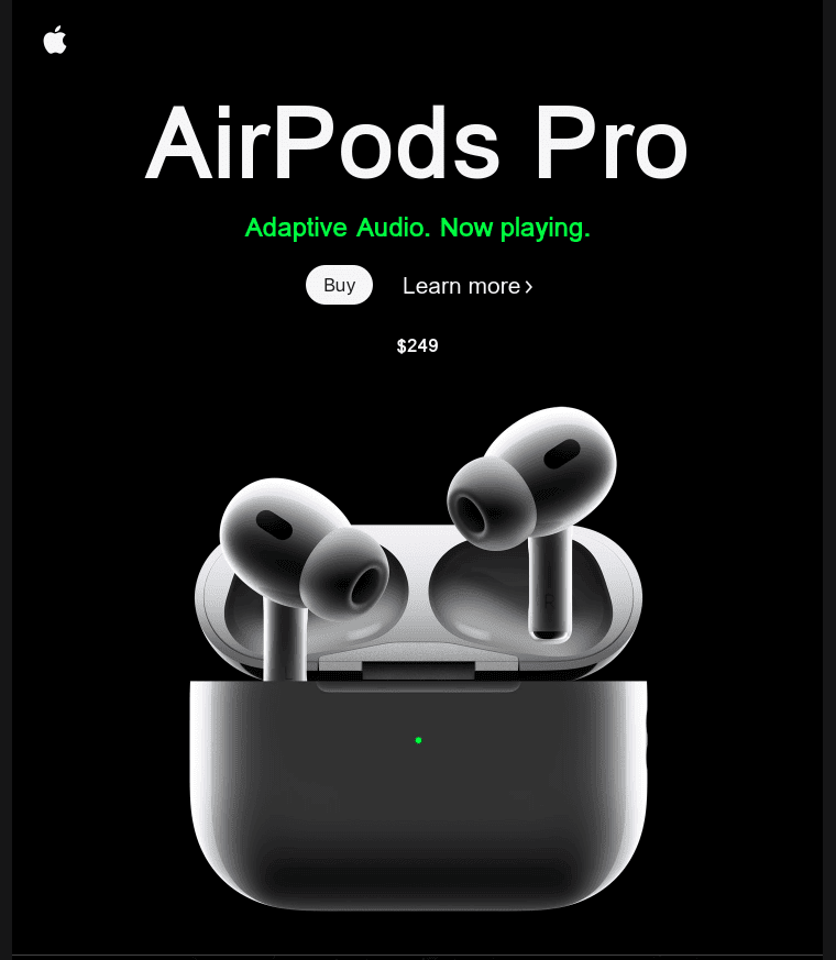
The vast majority of emails go unopened. You want to get the email message across as quickly as possible when they do open.
That is why brands like Apple opt for minimalistic headers with just one hero image in the center. As you can see from this example, there’s plenty of space around the Airpods Pro device with simple CTAs and pricing details.
The goal is to encourage readers to click through without analyzing too much. Notice the font does not overpower the hero image, which makes it more likely the reader will click through. This is a key design theme Apple has been using to engage readers and drive sales.
6. Vrbo
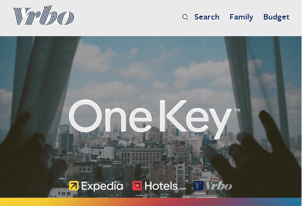
It may sound counter-intuitive, but you don’t have to include a CTA in your email header to drive engagement. The right combination of font, imagery, and navigation bar can create the same effect. This email header is from the family vacation rental brand, Vrbo. They’re announcing the launch of their first-ever rewards program.
As you might imagine, you’d need to provide quite a bit of T&C-related information before you can expect readers to sign up. Vrbo’s approach was to create an email with a balanced text-to-image ratio.
This example shows a live landscape hero image with a navigation bar on the top right corner of the header, plus partner links at the bottom. This allows the reader to browse the latest deals available and relate better to the terms of the rewards program listed further in the newsletter.
A balanced text-to-image ratio can improve deliverability and make it easier to read.
Read also: 10 Engaging Newsletter Ideas For Freelancers And Solopreneurs
Conclusion
Email headers tell you what to expect from an email that arrives in your inbox.
Now that you have a well-rounded perspective on the technical and creative aspects of email headers, keep experimenting.
Creating a distinctive design header will require testing different combinations of text and visual elements.
EngageBay is an all-in-one marketing, sales, and customer support software for small businesses and startups. You get A/B testing, a drag-and-drop landing page and email template builder, free email templates, marketing automation, and more.
Sign up for free with EngageBay and design beautiful, functional email headers. You can also book a demo with our experts.
