In a place where digital communication is everything, email footers hold a significance that often goes unnoticed. These compact yet powerful components of an email not only serve as a space for legal compliance and contact information but also as an opportunity to reinforce brand identity and foster engagement.
Email signatures and footers are used by 48% of digital marketers to drive traffic to their websites.
Understanding how to create an engaging email footer can be an important lesson for small business owners. It must be done to use this area intelligently to promote communication, trust, and brand awareness rather than simply following the rules.
Every aspect of your email footer, whether it’s quick links to social media, important contact information, or legal compliance with unsubscribe links and disclaimers, is critical to building a rapport with readers and protecting your company’s reputation.
In this blog post, we’ll help you examine some of the best email footer examples so that you can understand how to design yours and make a great impression every time you send an email.
Table of Contents
Understanding the Role of Email Footers
An email footer, often overlooked, is a fundamental component of email marketing and communication. It’s the section at the bottom of an email that contains important information and links, serving multiple purposes beyond just being a space filler.
An email footer is the concluding part of an email, typically containing standardized information and links that are consistent across a company’s email communications. Its functions extend beyond mere legal compliance. It plays an important role in branding, user experience, and maintaining a positive relationship with the audience.
Moreover, Email footers are mostly used for three things: communicating, branding, and following the rules. A note in an email sends important information and useful links in a way that fits with your brand’s style. This shows that you are professional and helps people remember your brand.
When you put your business address and an unsubscribe link in your footer, you’re also following the law regarding email.
Key Components of an Effective Email Footer
An efficient email footer is more than just required by law; it’s an opportunity to improve brand recognition, credibility, and communication. Consider the following while creating the design of your email footer.
1. Unsubscribe links
In many countries, it is legally required to provide an unsubscribe link in your email footer. Recipients should be able to easily locate and select this link to opt out of receiving any further emails at their discretion.
You may lessen the chance of your emails being classified as spam, which can damage your sender’s reputation and email deliverability, by honoring their preferences. It’s a component that guarantees you abide by anti-spam laws and preserve goodwill with your audience.
2. Social media buttons
Encouraging readers to interact with your brand on other channels is accomplished by including links to your company’s social media profiles.
Because followers may share your material, connect with your postings, and stay up to speed on your newest news and offers, this can result in improved engagement and brand visibility. It’s a means of expanding the dialogue online and creating a more complete web presence.
3. Legal disclaimers
To shield your business from responsibility, legal disclaimers may be required, depending on your industry and the content of your email. Copyright warnings, confidentiality advisories, and content accuracy disclaimers are a few examples of this.
These disclaimers are especially important since emails dealing with law, finance, or health carry a high potential for misrepresentation.
4. Privacy policy
Email footers must include a link to your privacy policy, particularly in the context of data protection laws such as the General Data Protection Regulation (GDPR) in the European Union.
To promote transparency and confidence, recipients must be informed about how their data is handled and protected. This link fulfills that need.
Read also: 14 Great Win-Back Email Examples Customers Can’t Resist
How Email Footers Influence Brand Perception and User Experience
- An email footer’s layout and content have a big influence on how users interact with the product and how people view the brand.
- Reiterating brand identification and fostering a feeling of familiarity among recipients are two benefits of a uniform footer throughout all emails.
- A polished footer with all the necessary elements conveys professionalism and meticulous attention to detail, enhancing the validity of the brand.
- With links and vital information, the footer helps users get what they need quickly and easily without having to search elsewhere.
- Transparency and respect for the audience’s rights and preferences are demonstrated by giving clear contact aimers.
Read also: Email Anatomy 101: Essential Email Parts You Shouldn’t Ignore
Impact on User Experience and Brand Perception
The design and content of an email footer significantly impact the user experience and how the brand is perceived.
- Consistency: A consistent footer across all emails reinforces brand identity and creates a sense of familiarity for the recipients.
- Professionalism: A well-designed footer with all necessary elements conveys professionalism and attention to detail, enhancing the brand’s credibility.
- User Convenience: By including essential information and links, the footer adds convenience for the user, allowing them to easily find what they need without having to search elsewhere.
- Trust: Providing clear contact information and legal disclaimers builds trust with the audience, showing transparency and respect for their rights and preferences.
Read also: Email Preheader Examples and Tips to Get More Email Opens
Inspiring Email Footer Examples
When analyzing successful email footer examples, it’s important to note the unique approaches taken by different brands to align with their industry and target audience.
A retail brand’s email footer might feature a visually appealing design with vibrant colors, showcasing links to its latest collections, customer support, and social media icons.
The inclusion of a loyalty program link can also encourage repeat purchases. For a tech company, the footer could be minimalist, focusing on clarity and functionality. It might include concise contact information, a clear unsubscribe link, and icons linking to their social media and support pages.
A small section highlighting recent innovations or blog posts can keep subscribers informed and engaged. A non-profit’s email footer can emphasize its mission statement, providing a brief but impactful reminder of its cause. Contact information, donation links, and social media buttons are crucial for encouraging support and involvement.
Moreover, a special chance to improve customer satisfaction and speed the support process exists when customer support is integrated into email footers. Every email should have a direct link to support so that companies may show their dedication to accessibility and customer service. This strategy lessens the work that clients must do to ask for assistance, resulting in a better experience and higher levels of satisfaction.
Legally speaking, including assistance options in email footers can help companies adhere to customer care guidelines and requirements. It guarantees that help is accessible when needed, which might be important in sectors with stringent customer service regulations.
Using email footers for customer service is a sensible and successful tactic. Enhancing the customer experience and upholding a brand’s reputation for being aware of and responsive to the requirements of its target audience are two benefits.
Read also: 15 Brilliant Newsletter Examples to Inspire You
5 Great Email Footer Examples To Learn From
Now, let us look at some nice email footers and why they work.
1. Skillshare

Skillshare’s email footer example takes a more straightforward and minimalist approach. It features links for unsubscribing from the email, managing all notifications, and accessing help resources.
The footer also includes the company’s physical address (Skillshare, 407 Broome Street, New York, NY 10013), providing legitimacy and contact information. While simple, it covers essential elements like email preference management and support options, along with the company’s location details.
2. Alaska Airlines

As you can see, Alaska Airlines incorporates a friendly and brand-consistent approach in the footer. The “Let’s be friends” text, accompanied by icons linking to their social media channels (Twitter, Facebook, and Instagram), invites recipients to connect with the airline on those platforms. It prominently displays the company’s mailing address and copyright notice.
Additionally, there are links to their privacy policy and contact information, providing transparency and customer support options. The inclusion of their iconic brand mascot image adds a visually appealing and recognizable touch.
3. Google
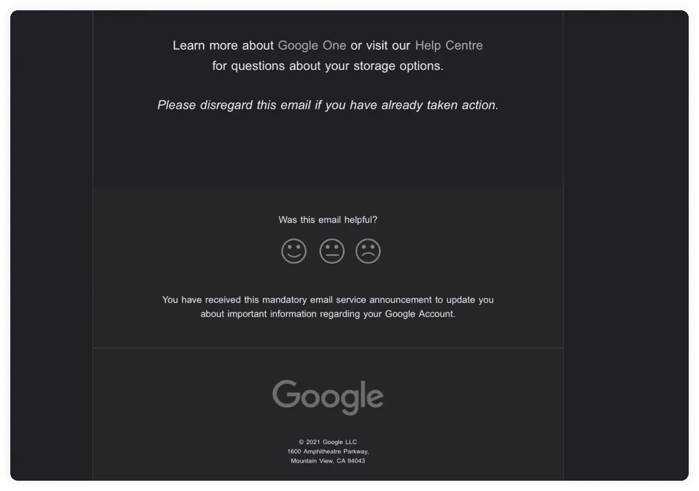
This Google email footer effectively combines simplicity with key elements. It offers links to learn about Google One and seek support, a user feedback mechanism, a clear purpose statement, and Google’s branding with legal information.
The minimalist dark design focuses on essential details while reflecting Google’s style consistency.
Read also: 15 Stunning Email Design Examples from Big Brands (2024)
4. DC Shoes
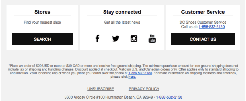
In this DC Shoes’ email footer, multiple columns are used to highlight customer service, social media, and shop locations. Subscribers can browse this organization’s library to locate the information they need.
Then, it goes into more detail about what qualifies for free shipping, gives buyers the option to finish their order over the phone, and provides a further link with all the details regarding shipment and delivery schedules.
5. Grammarly
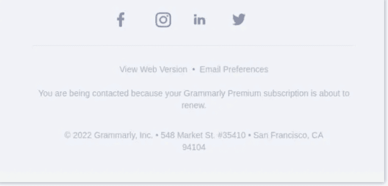
Grammarly’s email footer exemplifies best practices by striking the right balance between minimalism and providing essential information. The top row with social media icons allows recipients to easily connect with the company across different platforms. The centered links for viewing the web version and managing email preferences cater to user convenience.
At the bottom, including the company’s physical address adds credibility and transparency. Overall, it’s a clean, well-organized layout that maximizes impact within a compact space, making it an excellent model for effective email footers that leave a professional impression without being overwhelming.
Read also: Learn Email Acquisition From 6 Strategies And 5 Examples
Designing Your Email Footer: Best Practices and Tips
It takes thought and preparation to create an email footer that engages your readers and successfully conveys your business message.
Here are some practical advice and industry best practices to assist you in creating an email footer that guarantees engagement and compliance while also connecting with your audience and brand.
Non-technical tips
- Keep it organized and simple: A disorganized footer can be confusing and take attention away from the content that matters most. Make use of a clear, well-structured layout with distinct sections. This improves the overall appearance and feel of your email and makes it simpler for recipients to find what they’re looking for.
- Include your branding: The visual identity of your brand should be reflected in your email footer as it is an extension of it to strengthen brand awareness and establish a unified appearance throughout all of your email correspondence. Use consistent colors, fonts, and logos.
- Set Important information first: Decide which details should be included in your footer, most importantly. This usually consists of social media links, contact information, legal disclaimers, and an unsubscribe link. Setting this content as a top priority will keep your footer relevant and useful.
- Employ concise and clear language: Your email footer should be written in a clear, understandable manner. Steer clear of jargon and extremely technical terminology, as they can confuse readers and make your content less clear.
- Get input: Don’t be afraid to ask your peers or audience for input on the layout of your email footer. User feedback can help you fine-tune your footer for better performance by offering insightful opinions about what functions effectively and what needs improvement.
Technical tips
- Make sure your footer is mobile responsive: Since more people are reading emails on mobile devices, your footer must be made to be readable on smaller screens. Make use of flexible design strategies to make sure your footer remains functional and readable across a range of screen widths.
- Make links accessible: Make sure the links in your footer can be clicked with ease, and leave enough space between them to avoid unintentional clicks. To improve accessibility and user experience, employ descriptive link wording that makes it obvious where the user will land after clicking the link.
- Evaluate and enhance for interaction: Test the content and appearance of your email footer frequently to determine what appeals to your audience the most. To measure engagement, track data like click-through rates on footer links. To maximize engagement with your footer, use A/B testing to evaluate various layouts, contents, and calls to action.
- Keep yourself compliant with the law: Ensure that your email footer conforms with all applicable laws and regulations. For example, make sure your business’s physical address and a clear unsubscribe link are included. To guarantee continuous compliance, examine and update your footer regularly.
- Update often: Update your email footer with any new information about your privacy policy or new social media profiles. Frequent changes show your viewers that you are committed to giving them the most recent information while also keeping your footer current.
Read also: Email Redesign Best Practices: Do Your Designs Convert?
Things to Keep in Mind for Effective Email Footers
The importance of a well-designed email footer in the context of email marketing cannot be emphasized. It’s a strategic tool that may help your organization develop and succeed, not merely a place for compliance. The following things are important.
- Promote business growth: A well-thought-out email footer has the potential to be a significant promoter of business growth. You may directly affect the behavior of your audience and motivate them to take activities that support your business goals by incorporating persuasive calls to action, such as asking subscribers to check out a new product or sign up for an exclusive deal.
- Boost brand visibility: The footer is a great place to highlight your company’s identity and core values. You may improve brand awareness and familiarity with each email you send by including your logo, brand colors, and a unified design aesthetic. Increased client retention and brand loyalty may result from this regular exposure.
- Encourage customer engagement: By including links to your website and social media accounts in the footer, you can get more out of your emails and get your customers to interact with your business. This may result in more users visiting your platforms, more interaction rates, and more chances for conversions.
- Optimize ROI: Putting money into a stylish email footer can have a significant return on investment. By making the most of this area for conversions, interaction, and brand reinforcement, you’re utilizing every aspect of your email to help your company succeed.
- Remain flexible and adaptable: Your clients’ needs and the business environment change frequently. You can make sure that your message is still relevant and effective by routinely upgrading your email footer to reflect new developments in your brand, consumer feedback, and trends.
Read also: What Is an Email Header? 6 Email Header Examples to Learn From
Significance of Email Footer
When it comes to efficient communication and company expansion, the value of a well-designed email footer is immeasurable. By providing extra touchpoints like social media links, contact details, and helpful resources, a well-designed email footer may prolong the interaction with your readers.
If you want to increase engagement, traffic, or purchases, your footer can help you do just that by including things like subscription options and promotional content.
It is essential to comply with legislation and respect the wishes of your recipients by including an easy-to-use unsubscribe link and the required legal disclaimers in your email footer.
Creating an informative and engaging email footer requires finding the sweet spot between an aesthetically pleasing design and practical elements. Revisiting and updating your email footer is crucial to ensure that it remains relevant and useful as your brand changes and your audience’s needs evolve.
Email footers are more than simply a place to list legal information; small business owners should use them for other purposes as well. This is a chance to connect with your audience on a deeper level, build your brand’s reputation, and leave a long-lasting impact.
Read also: Business Email Format Secrets: Write Emails That Command Attention
Conclusion
The significance of a well-crafted email footer extends far beyond mere compliance with legal requirements. It is a crucial element of your email marketing strategy that deserves your time and creativity. A thoughtfully designed email footer can reinforce your brand identity, enhance user experience, and provide valuable information to your audience.
Small business owners should view their email footer not as an afterthought but as a strategic tool that can contribute to the success of their email marketing efforts. By leveraging the examples and tips provided in this article, you can create or revamp your email footers to be more engaging, informative, and reflective of your brand’s values.
Remember, every email you send is an opportunity to make a lasting impression on your recipients. A well-designed email footer can be the difference between a forgettable message and one that fosters stronger relationships with your audience. It’s a small space that holds immense potential for enhancing communication and supporting your business goals.
Don’t overlook the power of your email footer. Invest the time and effort to design it with intention, keeping in mind the best practices and tips shared in this article. By doing so, you’ll not only ensure compliance and functionality but also add a valuable touchpoint that resonates with your audience and bolsters your brand’s presence in their inbox.
FAQ
What are the legal requirements for email footers?
Email footers must follow regional rules and regulations. The unsubscribe link should be obvious and easy to find so recipients can opt out of future mailings. The sender’s physical address and privacy policy link should also be included. These aspects enhance openness and respect for recipient preferences and protect the sender from spam and privacy lawsuits.
How often should I update my email footer?
Your email footer should be reviewed and updated every few months or if your business changes, such as an address change, privacy policy revisions, or new social media outlets. Your footer stays relevant, compliant, and connected with your branding and marketing strategy with regular changes.
Can I include promotional content in my email footer?
Promotional content in your email footer is fine, but don’t overpower the important stuff. Subtle promotions like links to new products or events can boost engagement without being invasive.
What is the best way to format contact information in an email footer?
Contact information in an email footer should be clear, simple, and easy to understand. Use a simple typeface and layout to isolate contact information from other footer elements. Include your physical location, phone number, and email, and link to a contact form or support page on your website for simple access.
A well-thought-out email message can help your business grow in big ways. You can directly affect your audience’s behavior and get them to do things that help your business reach its goals by including strong calls to action, like asking subscribers to check out a new product or sign up for a special deal.
How can I make my email footer stand out while maintaining simplicity?
Clean style and branding will make your email footer stand out while being simple. Use your logo and colors to look consistent. Use subtle design elements like buttons or icons to highlight social media icons or calls to action. Keep the layout simple and readable.
Is it necessary to include an unsubscribe link in every email footer?
Marketing emails must have an unsubscribe link in the footer. Respecting recipient choices is a best practice and legal necessity in several places. The link should be simple to opt out of future communications.
How do social media links in email footers benefit my business?
Include social media links in your email footers to boost your online visibility and engagement. It lets recipients effortlessly communicate with your brand on social media, share your material, and stay up to speed on your news and offers. This may boost brand awareness, community strength, and conversions.

Thanks Priya for sharing these tips, I’ll implement them from today and share my results after 30 days here in the comments with you.