When did you last verify the email addresses on your list? It’s believed that only around 10% of email addresses are accurate. Can you believe that? Ten percent! That’s one of many reasons your business needs email verification email templates.
Using email verifications can cut your bounce rate by around 90%. Not only that, but your email deliverability rate will be destroyed if you have too many unverified emails on your contact list. That’s a risk you shouldn’t be willing to take.
So, what are the most important elements of an effective verification email? What best practices should you know as you start creating your own? Those questions and more will all be answered ahead of time.
In this blog post, we’ll take a look at the best email verification email templates and examples, and offer guidance and customization tips to help you maintain email list fidelity.
Table of Contents
Understanding Email Verification Emails
Let’s take it from the top, shall we? We’ll explore why email verification email templates are so important.
What is an email verification email?
An email verification message is issued to subscribers, asking them to verify their email addresses. Users can click a CTA button or link and be redirected to a page where they can input their email addresses.
After that, they receive confirmation on the page that they’ve updated their email addresses and can go about their day.
EngageBay has a Free Email Validator that will make email verification easy.
Common scenarios for email verification
There are plenty of instances in which you’ll use email verification or validation throughout the lifespan of your business. Let’s take a look at some.
You’ve obtained a new email list of subscribers
It’s an exciting time when potential customers join your email list. However, you want to be confident that the new subscribers are who they say they are, so it’s a good idea to send them a follow-up message after your welcome email (or even before) asking them to validate their email addresses.
Many of your emails are being marked as spam
Have you checked your spam complaint rates and noticed they’re getting higher? You can figure out what you’re doing wrong. If you haven’t changed many major parts of your email marketing strategy, send out a round of email verification templates.
After your audience validates their respective email addresses, monitor those spam complaints. They should hopefully dwindle.
You’re going in a new email marketing direction
Expanding or redirecting your email marketing can mark an exciting change for your company. However, with a new direction comes the need to send email verification messages to your ongoing subscribers.
Your email engagement has decreased
A drop in email engagement is a tough pill to swallow. It’s even tougher to stomach if you used to have decent email engagement rates, but now, they’re in the toilet. While many factors can influence email engagement, starting with email verification is a simple way to rule it out.
Your email deliverability is lower than usual
Uh-oh, are your emails not going through? A low email deliverability rate usually coincides with an increase in spam complaints. Your ISP could block your emails. You’ll know if that’s happened because your hard bounce rate will increase.
A hard bounce can be caused by email addresses that don’t exist or are no longer valid. These are permanent delivery failures your business can’t rectify. They’re the opposite of soft bounces, which can occur for reasons such as server outages or a full inbox.
You’ve obtained an old email list
If you’ve purchased or otherwise gotten your hands on an email list that didn’t previously belong to you, you should first send email validation messages. This will allow your subscribers to unsubscribe if they no longer want to be on the list now that it’s taken on a new direction.
For those who want to stay, you can be confident the email addresses are valid and open to receiving your communication.
Security considerations and best practices
One can’t ignore security considerations when sending email verification email templates. Incorporate these best practices into your emails when seeking validation:
- Begin backing up files related to your emails, such as your most up-to-date email list.
- Don’t use public Wi-Fi when sending emails; only private connections are allowed.
- Only send emails to your business contacts from a professional company email address, not a personal address.
- Use two-factor or multi-factor authentication if you aren’t already.
- Update all passwords to be stronger, and request your audience do the same.
- Block spam addresses as you see them.
- Request sender authentication regularly to ensure your email list is safe.
Read more: Email Authentication 101 — Cover Your Bases Against Phishing Attacks
Components of an Email Verification Email
So, what goes into a successful email verification email template? Good question! There are several critical components, so let’s take a look at them one by one.
Email header
Your header expands your subject line, providing more information without opening the email. Your goal is still for the customer to open the message and click the button to verify their email.
Email headers should be between 85 and 100 characters long. However, you should curtail the length even further to ensure your emails are mobile-friendly. The character limit shouldn’t exceed 80 characters so the mobile reader can see the entire header.
Call to action (CTA) button
CTA buttons work overtime with email verification email templates. Your subscribers will click the button to verify their email officially.
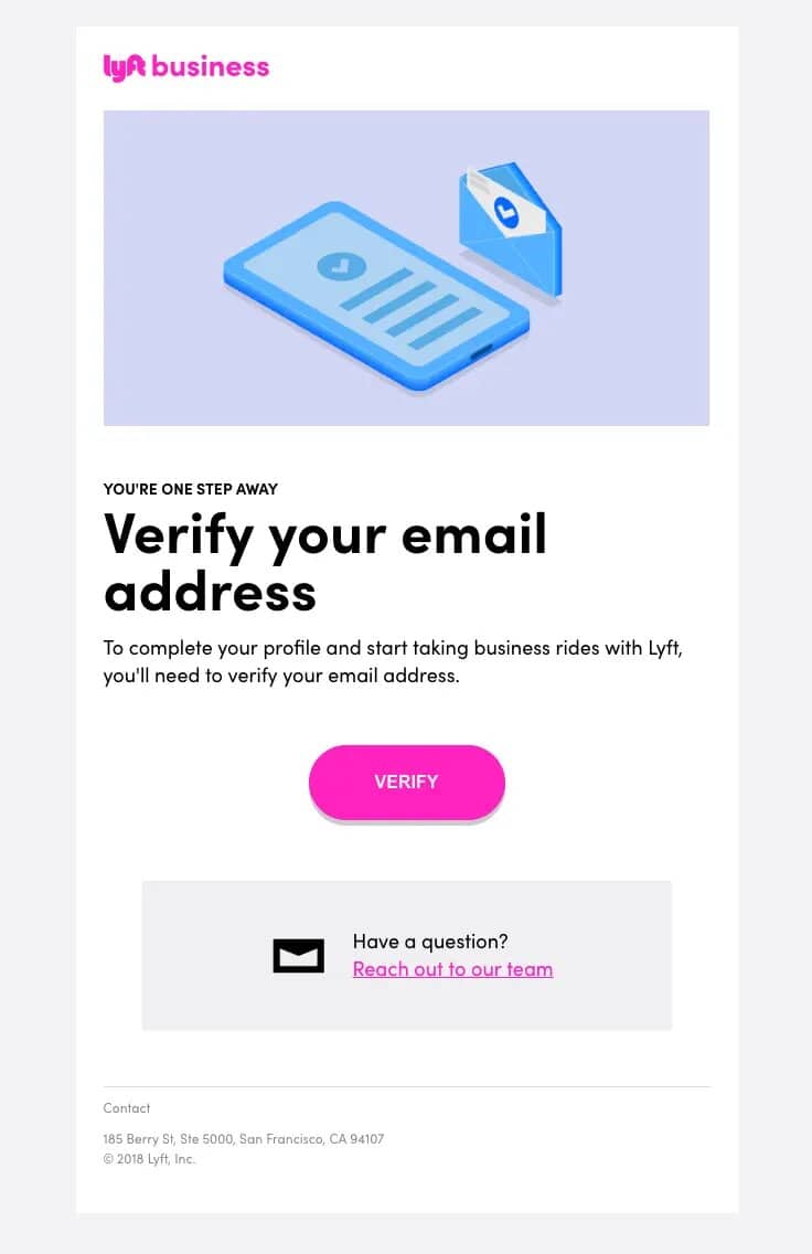
Look at the image above for an example of CTAs in action in an email verification message from Lyft Business.
Lyft Business uses a magenta logo in its email. That color is also used for its CTA button, contrasting with the other hues in the email, including white, teal blue, and lavender.
Your CTA button should also be attention-grabbing, using a complementary hue to stand out. You should also test the size, shape, and placement using split testing.
As for the copy? It doesn’t have to involve anything too much. The Lyft Business email’s button reads, “Verify.” That’s clear enough, considering the rest of the messaging in the email.
If you have a bigger button, your copy could read, “Verify My Email,” or “Verify Here.”
Email footer
Lastly, your email verification email template requires a footer. This part of your email should match the header in style and color. The footer is for your contact information, including your phone number, business address, and social media links.
Enhance Your Email Marketing
Ensure secure account setup with our beautifully crafted, easy-to-customize email verification templates! Just add your brand’s images, headings, and CTAs, and send quick, reliable verification emails in minutes!
Examples of Effective Email Verification Email Templates
What makes email verification email templates successful? How about taking a look at some examples to see them in action? Here are three of my favorite examples.
Example 1 – Minimalist design focused on clarity
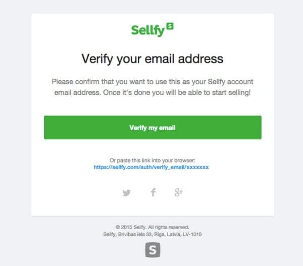
The first example is from the selling service Sellfy. Their account verification email has a very simple layout to make it easy for new users to confirm their email addresses.
The background of the email is white with black text. The top of the email features Sellfy’s logo in bright lime green, which is the brand’s color.
The headline implores the reader to verify their email address, with the copy below explaining that it’s needed to use a Sellfy account. Below that is a matching lime green CTA button that reads “Verify my email.” Sellfy lets users copy and paste a web address into their internet browser to validate their emails.
Sellfy’s white email footer, which blends in with the background, includes its Twitter, Facebook, and Google+ links and business address.
The entire confirmation email is straightforward and short yet informative. It provides just what a customer wants when verifying their emails.
Example 2 – Brand-centric design with engaging visuals
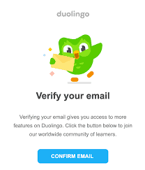
Of course, not all email verification email templates must be streamlined. If you’d rather augment your email with branding and appealing visuals, you can do so.
For example, there’s this email from Duolingo, the language-learning service. The email features a graphic of the bright green Duolingo owl holding an envelope that’s supposed to represent an email.
Below that, the copy says, “Verify your email,” followed by a paragraph explaining why users should verify (to access more of Duolingo’s features) and how.
Underneath that paragraph is a CTA button that says “Confirm Email” in bright teal blue. The color contrasts with the bright green of the Duolingo owl, so despite the otherwise eye-catching colors, it still stands out.
Read also: Promotional Email Templates to Drive Sales and Engagement
Example 3 – Security-focused template with strong call-to-action
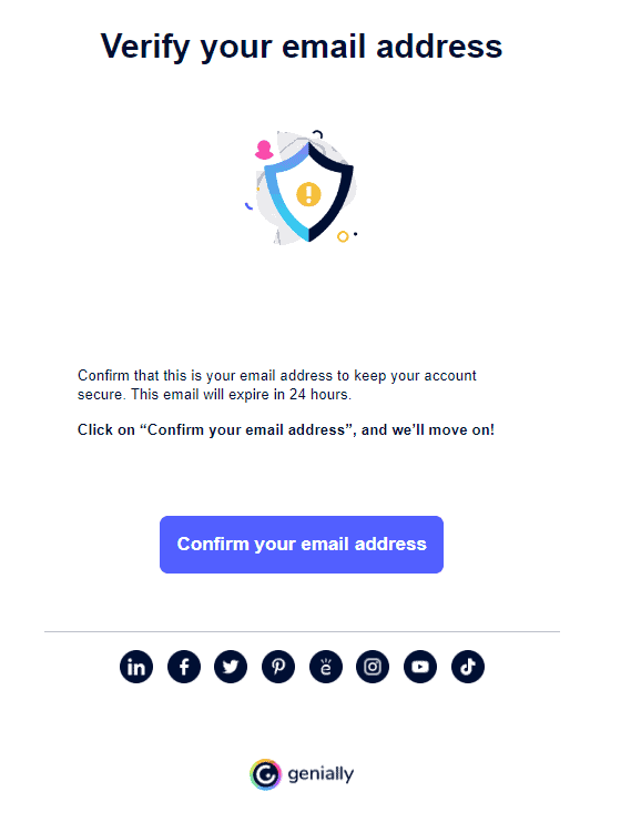
The interactive animated content platform Genially has a rather security-focused email template for email validation. The email confirmation link’s badge icon and expiration date are smart security features.
The email uses a simple white background with a header that reads, “Verify your email address.” Below two short paragraphs of copy is the CTA button that says, “Confirm your email address.”
The rectangular CTA button is a complementary blue hue. You can find all of Genially’s social links in the footer.
Read also: Top Tools & Strategies to Improve Email Deliverability Rates
Best Practices for Designing Email Verification Email Templates
Now that I’m sure you’re feeling inspired, it seems like a great time for me to share some pointers for creating your first email verification email templates. Here we go!
Craft clear and direct subject lines
When writing subject lines for email verification email templates, less is more.
Your audience can’t validate their email addresses if they don’t bother reading your emails. Increasing email engagement begins with a catchy subject line.
You don’t have to employ many subject line tricks to increase opens. Verifying emails is a serious matter in the same vein as password reset emails. There’s no room for emojis or FOMO here.
Instead, incorporate clarity and urgency in your subject lines. Here are some examples so you can see what I mean:
- Please Verify Your Email Address – [Company Name]
- Almost There! Verify Your Email to Activate Your Account
- Verify Your Email Address to Start Using Your [Company Name] Account Today
- Secure Your Account – Verify Your Email Now
- Welcome to [Company Name]! Please Verify Your Email
- One Last Step! Verify Your Email Address
- Action Required: Verify Your Email Address for [Company Name]
- Please Confirm Your Email Address
A good subject line should be between 50 and 60 characters, so your message doesn’t get cut off.
Ensure the sender information is recognizable
Another way to improve the chances of your email verification messages being read is to send them from a familiar email address. Remember, you should always use a business email address for these purposes, never a personal one.
Branding also makes your emails more recognizable. See examples of emails from Sellfy, Duolingo, or Lyft Business. You can be sure these email addresses are who they claim to be.
Include personalized greetings and user details
Your request for email validation shouldn’t come without personalization. You have plenty of ways to incorporate personalized elements into these emails, including in these areas:
- In the subject line, like “[Name], Please Confirm Your Email Address.”
- In the header text, you might begin with, “You’ve recently created an account, [Name], now verify to access all features.”
- You can reference the subscriber by name and user details in the email body.
Personalizing email verification email templates instills confidence in your subscribers that this email is intended for them and not someone else.
Write clear instructions for verification
You should provide a brief yet detailed overview of how your subscribers can confirm their email addresses. You don’t want your customer support team inundated with requests when you can enable your subscribers to do it themselves.
For example, you might write the following:
Hi [Name],
Thanks for choosing [Company Name] for your [specialty] needs. You’re almost done setting up your account. You have to do one more thing – confirm your email address.
Click the link below to get started. Type your email in, click Confirm, and voila! You’re all done.
Thanks,
[Your Name]
Incorporate security tips and warnings
Today, people care more about their privacy online than ever, with nine in 10 Americans considering online privacy “an important issue,” said Exploding Topics in 2024. With one in four US residents receiving requests to agree to privacy policies daily, these policies are becoming more accepted and appreciated.
It would be best if you had such a privacy policy yourself. Moreso than that, consider sharing security warnings and tips with your subscribers. You don’t want them clicking suspicious links or sharing their personal information with someone impersonating you. Give them pointers on how to steer clear of online dangers.
Design your emails for mobile optimization and accessibility
Today, more than 70% of businesses build their email marketing campaigns around mobile optimization. That’s because more people than ever access emails on their phones and other mobile devices. If your emails aren’t optimized, you will hurt your campaign.
You might notice more people unsubscribe from your newsletter. Your spam complaints could go up, which can impact email deliverability in the future.
Read more: Romantic Valentine’s Day Email Templates to Woo Subscribers
Customizing Email Verification Email Templates
Are you ready to add some panache to your email verification email templates through customization? Awesome. Here are my best practices for doing just that.
Incorporating branding and customization options
Your brand is big for building trust, which is important when sending email verification messages. You want the subscriber to feel at ease when they receive your email, and branding will seriously help.
Of course, you have many customization options for showcasing your brand through email verification email templates. You can use your brand logo as your profile image, incorporate brand colors throughout your email layout, and make your CTA a complementary hue that suits your brand colors.
Choosing the appropriate tone: formal vs. informal
What about the right tone for an email verification email template? It would be best if you didn’t radically depart from your standard tone, which can look suspicious to your subscribers.
Formal and informal tones both work when sending these emails. An informal tone will be conversational and a little tongue-in-cheek, whereas a formal email will use more buttoned-up language and get straight to the point.
Implementing multi-language support
Did you know that 43% of people speak more than one language? That’s no small number! That stat alone is a great reason to use multi-language support for email verification templates.
I recommend dividing your audience by language when segmenting, then ensuring that you only issue emails to those audience groups in their native language. Since verifying emails is a technical touch, you don’t want language barriers that can muddy the waters.
Read also: 8 Customer Support Email Templates to Make Customers Happy
How to Test and Optimize Email Verification Emails
Let’s talk about strategies for ensuring your emails are the best they can be with this and ongoing campaigns.
A/B testing subject lines and CTA buttons
One can never have enough testing. The most surefire way to optimize your email verification email templates is through A/B testing. For those who don’t know, A/B testing is named that way because you compare two versions of your email, Version A and Version B.
You need to go line for line through every element of your email and test it, beginning with the subject lines and CTAs. After all, those are the most important elements of your email verification emails.
However, even though the email body isn’t heavy on copy, you can’t skip testing it. That also goes for your headers, footers, and any other imagery in your email, whether graphics, photos, or videos.
Monitoring key metrics
You must monitor important numbers associated with your email marketing campaign as it goes live. Here’s a rundown for you:
- Open rate
- Click-through rate
- Conversion rate
- Email verification rate
- Soft bounce rate
- Hard bounce rate
- Email delivery rate
- Spam complaint rate
Use an email marketing tool like EngageBay’s to begin tracking the numbers that matter right out of the gate. If your emails have begun bouncing, you must determine how often they happen and whether they are soft or hard bounces.
You also need to watch your spam complaint rate in relation to email deliverability. One informs the other.
You can begin reviewing results on the first day of your email campaign, allowing you to switch to your approach early in your campaign. If you’re underperforming, you still have time to turn the ship around and steer it correctly.
Collecting user feedback for continuous improvement
Another way to augment and improve your email marketing campaigns is by periodically sending forms requesting feedback. Allowing your audience to share their unfiltered opinions means a mix of good and bad sentiments.
Pay attention to both. It would be best to continue doing whatever you do to garner positive feedback. Then, focus your energies where there’s negative feedback to turn the sentiment around.
Read also: Email List Cleaning – It’s Time to Give Yours a Good Scrub
Common Mistakes to Avoid in Email Verification Emails
You’ve come this far. Don’t let yourself make these errors when creating and sending your email verification email templates. Instead, be ready to implement these tried-and-true solutions so you can stay on the right path.
Unconvincing subject lines
Why should your subscribers care about your validation email? You must give them a reason to care, starting with your subject line.
Remember, use elements of personalization, such as the subscriber’s name.
Urgency also definitely has a place when writing these subject lines. Use words like “now,” “today,” “next step,” or “action required” to grab a reader’s attention and inspire them to open the email.
Overlooking mobile optimization
Go back and look at the stats on mobile optimization again. Businesses have prioritized mobile-friendly emails in a big way in response to how people read emails these days.
If you don’t optimize your mobile emails, it will spell nothing but trouble. Your competitors will have a clear advantage over you. As a result, you will lose business. Besides that, your email list will also shrink, and your sender reputation will drop as you get more spam complaints.
Lack of security advisories
While email address verification is in and of itself a form of security, you need to take your security protocols further. Send emails from a familiar address, use branding, and share security tips to keep your userbase safe.
You don’t need security breaches or leaked data affecting your company. Those headaches can take a lot of time to clean up, and the lack of trust in your business is difficult to build.
Ambiguous CTAs
Your CTAs do all the heavy lifting in an email verification email template. You can’t afford to launch an email series without clear-as-day CTA buttons.
The simpler, the better! Your CTA can read “Verify Now” and suffice, so don’t overthink it.
Vague verification instructions
Your subscribers rely on you to provide clear directions on validating their email addresses. Triple-check that your instructions are clear. Although verifying an email address is straightforward enough for most of us, some of your subscribers will appreciate the walkthrough.
Read also: How to Craft Flawless Email Templates
Conclusion
Email verification email templates give you the power to help new subscribers validate their information. Working with templates will make it simpler for you to send these emails whenever the occasion calls for it, and using email automation will streamline the entire process.
EngageBay is an all-in-one marketing, sales, and customer support software for small businesses, startups, and solopreneurs. You get email marketing, marketing automation, landing page and email templates, segmentation and personalization, sales pipelines, live chat, and more.
Sign up for free with EngageBay or book a demo with our experts.
Frequently Asked Questions (FAQ)
1. What should an email verification email include?
Your email verification email template requires the following:
- Responsive, mobile-friendly design
- Attention-grabbing subject lines
- Riveting header copy
- Clear instructions on how to validate an email address
- Good CTA button copy, color, shape, and placement
- Footer with contact information
2. How can I make my email verification email more secure?
Consider email encryption to improve the strength of your emails. You should also check your email privacy and security settings, configuring them to your liking.
3. Why is personalization important in email verification emails?
Personalizing email verification messages indicates to the subscriber that they were meant to receive the email and that you’re not confusing them for someone else.
4. What are common pitfalls in email verification email design?
An overcluttered design is one of the worst mistakes you can make when crafting email verification email templates. Just as bad is not considering mobile optimization in your design.
5. How often should email verification templates be updated?
Check the language and instructions in your email verification templates at least quarterly, modifying them if any parts of your process have changed. You should also consider an update when you change your privacy policy.
6. How do I ensure my email verification emails are delivered and not marked as spam?
Here are some tips for keeping your email verification emails out of the spam folder:
- Ask for permission to send emails.
- Make unsubscribing easy for those who are on the fence.
- Don’t use spam words in your subject line or email body.
- Prune your email list regularly, removing inactive and dead email addresses.
- Track your email deliverability rate and spam complaint rates.
7. Can I use a casual tone in email verification emails?
You can if that’s your brand style. Otherwise, stick to a more formal tone, but don’t make your emails too stuffy.
