+111.55% conversions!
These were the results when PartnerStack, a partner ecosystem platform, tweaked its call-to-action copy from “ Book a Demo” to “Get Started.” (Source)
The change doesn’t seem like a big deal, but such small details are proven to work. You can nail your copy’s headline, lead, benefit positioning, etc, but failing at CTA alone is enough to nullify all your efforts.
CTAs are the heroes of marketing material. They redirect leads, often warm ones, to take the action you want.
Here’s how it works:
- Lead -> Warmed by copy -> Takes your desired action -> Gets converted to customer
- Lead -> Warmed by copy -> Doesn’t take your desired action -> Bounces (loss/missed opportunity)
Additionally, customers these days are savvy and like to feel in charge. So, don’t take any more stress since this guide has the best CTA examples and everything you need to understand what makes them so good.
Table of Contents
Key Takeaways
|
Call To Action (CTA) Explained
Call-to-action, or CTA, is a tool of marketing and persuasion. It prompts users to take a specific action. They can be in various forms. Some examples of different types of CTAs are:
- Buttons
- Links
- Forms
- Banners
Despite different forms, the objective remains to nudge users to take action.
Read also: 50 Powerful Call-to-Action Phrases To Inspire You
What Makes a CTA Effective?
Effective CTAs leverage human psychology to influence decision-making successfully.
A compelling CTA packs the punch of multiple elements.
- Action-oriented language
- Sense of urgency
- Pleasing visual sense (Good appearance and use of color psychology)
With these principles, businesses can create CTAs that effectively guide users through the desired journey.
Let’s dig deep into each of them one by one.
1. Action-oriented language
One of the key psychological principles behind successful CTAs is the use of action-oriented language.
Words like “buy,” “subscribe,” “download,” or “sign up” directly instruct users on the next step, making the desired action clear and reducing ambiguity.
This clarity helps users understand exactly what they will gain by clicking the CTA.
2. Sense of urgency
Creating a sense of urgency or scarcity is another psychological tactic effective CTAs use.
Some famous phrases to create a sense of urgency are:
- Only a few spots left
- Limited time offer
- Don’t miss out
- Filling fast
These can trigger a fear of missing out (FOMO) and encourage users to act quickly. Having a countdown timer is also a common practice since a ticking clock might further enhance customers’ sense of urgency.
This urgency can motivate users to take action before the opportunity passes.
3. Pleasing visual sense
Beyond the psychological factors, the effectiveness of CTAs also depends on their placement, design, and message clarity. Here are some tips for you:
- Position the CTA in a prominent location on the web page or email
- Use contrasting colors and visually appealing design elements
- Ensuring the message is concise and easily understood.
Read also: 12 Tips to Optimize Your Email Calls to Action!
The Best CTA Examples From a Variety of Industries
Budgetinsta.com

Budgetnista effectively draws attention with the prominent question, “Want To Buy Your First Stock?” directly addressing the viewer’s potential interest.
The orange “Click Here” button is vibrant and sizable, strategically positioned after the persuasive text promoting the 5-day coaching.
The contrasting dark background makes the text and button stand out. The inclusion of the coach’s name, “Teri Ijeoma,” adds credibility.
Glossier

Glossier’s CTA creates a sense of exclusivity with phrases like “You deserve it” and “A special offer just for you”.
The soft, pastel colors evoke a luxurious, feminine vibe fitting for beauty products. The prominent product image whets the appetite.
Distinct calls-to-action (“Claim offer” and “No thanks”) guide the viewer’s next steps, and strategic use of white space draws focus.
Heyday Skincare
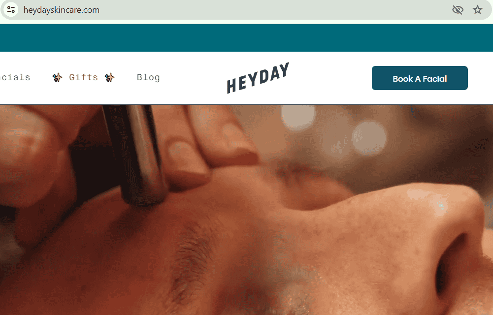
Heyday Skincare’s website exudes a calming, rejuvenating aesthetic through the soothing teal palette and the facial treatment imagery with soft lighting.
Clean, minimal design highlights the “Book A Facial” call-to-action.
Consistent branding cues professionalism. Thoughtful use of whitespace creates breathing room.
Hulu
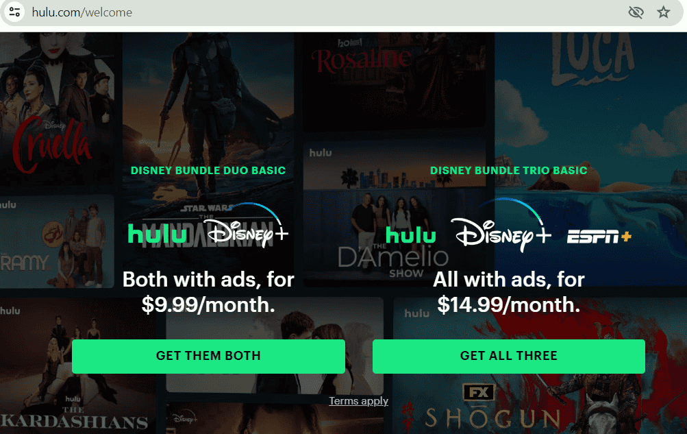
Hulu’s bundle overview page efficiently communicates offerings and pricing through crisp visuals of recognizable brands/logos and clear content pillars.
Contrasting green buttons grab attention amidst the darker background. Plan details are neatly compartmentalized, allowing focused comparison.
Strategic image placement reinforces an entertainment-centric experience.
Wool and the gang
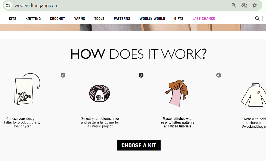
Wool and the Gang has an approachable, curious vibe through the simple illustrative icons explaining the service’s process.
The open-ended “CHOOSE A KIT” prompt empowers visitor agencies.
The neutral color scheme keeps focus on comprehending the concept. Smart use of negative space highlights each step’s succinct description.
Evernote
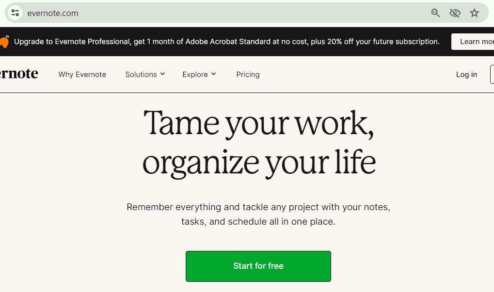
Evernote’s CTA, “Start for free,” is straight to the point, leaving no room for confusion. The contrasting green color grabs attention, while the central positioning ensures it’s the focal point.
The minimalistic design and message “Tame your work, organize your life” exude simplicity and efficiency, appealing to their potential target audience (productivity-seekers).
Dropbox

Dropbox’s CTA “Find your plan” is persuasive, thanks to its compelling language and bold blue hue.
The message “Join over 700 million registered users who trust Dropbox” builds confidence and social proof. With this statistic, Dropbox leverages the bandwagon effect, which makes people adopt a behavior if they believe others are doing the same. In short, “Trust” and “700 Million” make potential users feel reassured and more inclined to join.
The description also highlights key benefits: “Easy to use, reliable, private, and secure.” That vivid blue evokes trust and professionalism, and the CTA’s placement at the bottom encourages users to explore plans after reading the value proposition.
Workleap
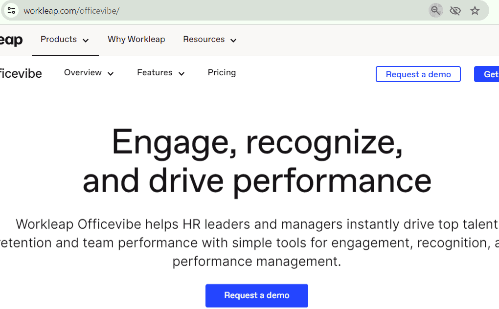
Workleap’s repetitive CTAs “Request a demo” effectively utilize contrast and prominent placement.
The clear language “Engage, recognize, and drive performance” communicates the core value proposition. Those blue CTAs pop against the white background, drawing the eye.
Repeating the CTA reinforces the desired action, increasing the likelihood of engagement. Positioning at the top and bottom ensures visibility throughout the user’s journey.
Full Bundle
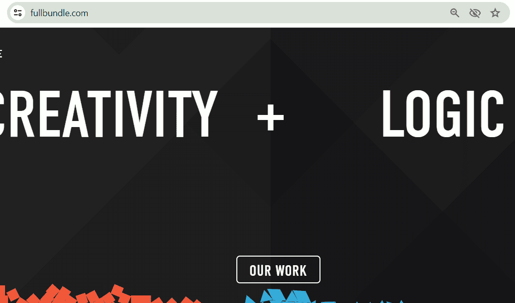
The “OUR WORK” CTA on Full Bundle’s website is visually striking, thanks to its bold typography, high contrast, and centered placement.
The combination of uppercase letters and negative space creates a powerful, minimalistic design.
The black-and-white color scheme exudes sophistication and professionalism.
Team Treehouse

Team Treehouse’s CTAs are attention-grabbing with their vibrant orange hue and persuasive language.
That bright color creates a sense of urgency and excitement, while the contrasting white text ensures legibility. Language like “Last chance to save!” and “64% OFF” instill a fear of missing out, encouraging users to act quickly.
Prominently displayed at the center of the page, surrounded by supporting visuals and information, these CTAs are hard to miss…
Read also: 20 Actionable Email Marketing Tips That Drive Results
Designing Your CTA: Tips and Best Practices
Creating visually appealing and effective CTAs requires a careful balance of design principles and audience understanding.
That’s the topic for another day. For now, you can keep these tips in mind (the first four are related to designing, while the rest are for CTA’s content):
- Use contrasting colors between the CTA button/text and the background to ensure it stands out and grabs attention. Vibrant colors like red, orange, or green can be effective, but ensure they align with your brand’s color scheme.
- Make the CTA large enough to be easily noticeable without overwhelming the page. Position it prominently, often above the fold or near the relevant content.
- Giving the CTA some breathing room with ample white space prevents a cluttered mess. It allows the CTA to command attention and focus. Open Mile serves as the great case study here – they increased conversions by a whopping 232% after decluttering their landing page and adding white space around that all-important CTA.
- Using design elements strategically, like adjusting the size, color, and placement, creates a clear visual hierarchy that draws the user’s eye right to the CTA.
- Keep the language short, sweet, and actionable. Spell out the desired action and its benefits. Vague or confusing phrasing is a no-go.
- Tailor that CTA copy to speak to your audience’s specific pain points, desires, and natural communication style.
- Highlight the value users will get, whether it’s a discount, free trial, or exclusive content. Give them a compelling reason to take action.
- Create a sense of urgency or scarcity with phrases like “limited time” or “limited spots.” That fear of missing out can motivate people to act now.
- Personalize it! Using the user’s name or location makes the experience feel more tailored and engaging.
A/B Testing
It is unlikely that you’ll hit a home run on your first strike. To avoid missing opportunities, experimentation is necessary. Be it CTA or any other part of the copy (structure, headline, color scheme, etc).
A/B testing, or split testing, can (and should) be used to optimize CTAs for maximum effectiveness.
Businesses create two or more variations of a CTA and present them to different audience segments. This helps in gathering data on which version performs better in terms of click-through rates, conversions, or other desired metrics.
This testing allows businesses to:
- Test different color schemes, sizes, placements, and copy variations to identify the most effective combination.
- Tailor CTAs to resonate with specific audience segments based on their preferences and behaviors.
- Regularly test new CTA variations to adapt to changing audience preferences and industry trends.
- Base CTA optimization decisions on real user data rather than assumptions, ensuring maximum impact.
Testing ultimately helps find CTAs that drive desired actions and help achieve marketing and business objectives.
Read also: eCommerce Email A/B Testing Basics For Beginners
Integrating CTAs into Your Marketing Strategy
Effective integration of calls-to-action (CTAs) across various digital marketing channels drives user engagement, conversion, and mainly – retention.
Websites and email marketing serve as the primary hub for many businesses, making it essential to strategically place CTAs throughout the user journey and sequences.
- Homepage: Use prominent CTAs to direct visitors to key pages, like product pages, lead capture forms, or special offers.
- Product/Service Pages: Include CTAs encouraging users to purchase, request a demo, or sign up for a trial.
- Blog/Content Pages: Incorporate CTAs that promote related offers, lead magnets, or newsletter subscriptions.
- Checkout Process: Guide users through the purchase funnel with clear CTAs at each step.
- Welcome Emails: Include CTAs that encourage users to explore your website, social media channels, or special offers.
- Promotional Emails: Highlight product/service offerings with compelling CTAs that drive conversions.
- Newsletters: Incorporate CTAs that promote your latest content, events, or resources.
- Transactional Emails: Leverage CTAs to cross-sell or upsell related products/services.
Read also: Email Footer Examples To Inspire Your Design
The Role of the CTA in the Sales Funnel and Customer Journey
The call to action serves as a critical virtual breadcrumb, guiding users step-by-step through the sales funnel. Its purpose and messaging must strategically shift at each stage to facilitate progression.
At the very top of the funnel, CTAs should prioritize capturing attention and harvesting leads. Think of eye-catching “Learn More” buttons or gamified spin-to-win popups exchanging an email address for an incentive. The goal here is to build initial brand awareness.
As prospects move into the consideration phase, CTAs graduate to nurture interest and establish value. Editorial CTAs like “Download Our Guide” provide relevant information. While promotional CTAs like “Get a Free Quote” prime buyers for deeper evaluation of your solution.
Once they’ve entered the decision stage, CTAs should eliminate the remaining friction and close the conversion definitively. Phrases like “Buy Now” or “Start Your Free Trial” make continued action clear and straightforward.
Post-conversion, CTAs play an important role in cultivating enthusiastic brand evangelists. Strategic CTAs can encourage new customers to activate premium memberships, leave public reviews, or upsell into complementary product lines.
Essentially, CTAs form the pivotal connective tissue between every micro-step a user takes. With purposeful CTAs satisfying needs at each funnel stage, you create a natural momentum that continually pulls buyers through to maximize lifetime value.
Read also: eCommerce Sales Funnels 101: A Beginner’s Guide
Balancing the CTA Placement
After learning about CTA integration, you might wonder if you need to include CTAs throughout your sales funnel. The short answer is no. Strike a balance and avoid overwhelming users with too many CTAs. Excessive CTAs can lead to confusion, decision paralysis, and a poor user experience.
Consider the following best practices.
Prioritize
Identify the most crucial actions you want users to take and prioritize those CTAs.
Hierarchy
Leverage design principles like size, color, and placement to establish a clear hierarchy that draws users’ attention toward the most important calls-to-action at each funnel stage. Don’t give equal weight to competing CTAs.
Alignment
Strategically integrate CTAs across all digital marketing channels – website, email, social media, ads, etc. Ensure consistent messaging and a cohesive experience that mirrors the customer’s progression through the sales funnel.
Seamlessness
While prominently featuring primary CTAs, avoid overwhelming users with too many distracting choices. Maintain a balanced, seamless user experience that gently guides them toward the next desired action.
The goal should be to strategically integrate CTAs across various digital marketing channels, aligning them with the sales funnel and customer journey.
Ultimately, by maintaining a balanced approach, businesses can create a seamless and engaging experience that effectively guides users toward desired actions.
Read also: The Art of Using Low vs High Context Marketing Strategies
Common Mistakes to Avoid in CTA Design
Missteps can be heavy. Super heavy. While there are no “official rules” on what should be avoided, you can avoid whatever diverts attention. Some common mistakes to avoid include:
Overly complex wording
Effectiveness diminishes when a Call-to-Action (CTA) is buried under complex wording or technical terms. A direct, uncomplicated approach ensures the message is universally understood.
Visibility issues
A CTA’s impact is lost if it’s not immediately visible due to a cluttered layout or insufficient contrast with its background. Optimal placement and distinctive design features are crucial for drawing attention.
Discrepancy between CTA and Landing page content
A seamless transition from CTA to a landing page is necessary. Any discrepancy can lead to user dissatisfaction and increased bounce rates, as the expected content does not match the actual offering.
Vague value proposition
A successful CTA clearly articulates the benefit or reward of taking action. Without specifying what users gain, engagement is likely to be low.
Lack of urgency or incentive
CTAs that lack a sense of urgency or scarcity fail to motivate immediate action. Phrases that suggest limited availability or time-bound offers can significantly boost response rates.
Brand inconsistency
A CTA that diverges from established brand elements (such as color scheme or typography) can appear out of place, weakening brand recognition and trust. Consistency reinforces brand identity.
Failure to test and optimize
Skipping the process of A/B testing and data analysis to refine CTA strategies overlooks the potential for improved conversion rates. Regular testing and adjustment based on performance metrics are essential for identifying the most effective CTA elements.
Read also: Promotional Email – How To Write Emails That Convert
Bottomline
Crafting the right calls to action can shift marketing materials from stagnation to sustained growth. For CTAs to remain at their best, it’s a must to dive into the data—user interactions, analytics, and direct feedback. This approach ensures they evolve with your audience’s needs.
Listening to your users is key. Whether through in-depth surveys or hands-on usability testing, their feedback reveals the hits and misses in your CTA strategy, offering a roadmap for refinement.
Moreover, consulting with marketing experts or tapping into industry know-how injects innovation into your CTAs, aligning them with cutting-edge trends and solid practices. This blend of insider knowledge and outside perspectives can turbocharge your growth strategy.
FAQ
What is the best color for a CTA button?
There is no universal “best” color that works across all situations. The ideal choice depends on several key factors: First, brand identity – Using a color that matches or complements your established brand palette helps reinforce recognition and cohesion. A random color could stick out like a sore thumb. Second, contrast – The button needs to stand out vibrantly against the background and surrounding elements. A clashing, high-contrast hue will command more attention.
Third, emotional impact — Different colors can subconsciously evoke different sentiments in viewers based on cultural associations. A growth-focused startup, for instance, may want an energetic green over a conservative blue. And fourth, testing — At the end of the day, data trumps gut instinct. A/B testing CTA button color variations against your specific audience provides the best insights.
So in summary, choose an on-brand, high-contrast, emotionally-aligned color option – then validate through real user testing.
How many CTAs should be on one page?
The number of CTAs should be balanced to avoid overwhelming users. Generally, prioritize 1-3 primary CTAs per page, with additional secondary CTAs if necessary. Ensure sufficient spacing and a clear hierarchy.
Is it better to use first-person or second-person language in CTAs?
Generally, directly addressing the user through second-person phrasing (e.g., “Get YOUR free trial”) creates a stronger personal connection and clearer call-to-action. First-person (e.g., “Get MY free trial”) inadvertently puts the focus back on the company rather than empowering the individual.
Exceptions can exist, like reiterating a value proposition streamlined as “I want…” But in most cases, that second-person “you” language more effectively opens a dialogue with the reader and compels them to visualize taking the next step for themselves.
So unless there’s a very specific creative rationale, always default to second-person for that more natural, user-centric experience.
Can the placement of a CTA affect its performance?
Absolutely. Proper placement is crucial for visibility and impact. Position CTAs prominently, often above the fold or near relevant content. Use design elements like size, color, and white space to guide users’ attention.
How do I know if my CTA is effective?
Quantitative performance metrics provide the best indication of whether a call-to-action is successful at driving desired user behavior:
- Click-through rate (CTR) on the CTA button itself
- The conversion rate for the linked action (signup, purchase, etc.)
- Engagement signals like average session duration, scroll depth, bounce rates
If these numbers underperform consistently across segments, that’s a clear sign the CTA messaging, design, and/or placement needs refinement.
Qualitative user testing, heat mapping, and feedback provide valuable supplemental insights on motivations and friction points as well. But those hard metrics are the first crucial diagnostic.
From there, A/B tests variations and iterates based on quantifiable performance upticks. Over time, you’ll hone in on the most high-converting CTA.
Should every page on my website have a CTA?
While not mandatory, incorporating relevant CTAs on key pages can help guide users through the desired journey. Prioritize high-traffic pages, product/service pages, and content-rich areas for strategic CTA placement.
How often should I update or change my CTAs?
Regularly refreshing CTAs can help maintain engagement and align with evolving audience preferences. Monitor performance data and update underperforming CTAs more frequently. Even high-performing CTAs may benefit from occasional testing of new variations.
Do CTAs work differently on mobile devices?
Yes, mobile users interact differently, so CTAs should be optimized for smaller screens and touch-based navigation. Ensure CTAs are large enough to tap easily and consider utilizing mobile-specific design patterns like sticky headers/footers.
What are some tools for creating and testing CTAs?
For A/B testing different CTA variations, platforms like Optimizely, VWO, and Google Optimize are industry leaders. They allow you to run controlled experiments pitting variable designs, copy, placements, etc., against one another to see what performs best with real users.
On the design side, tools like Canva, Snapseed, and Adobe Express make it simple to mock up visually compelling CTA buttons and layouts without great design skills. With their intuitive editors and asset libraries, you can quickly create clickable concepts to test.
After launch, robust analytics tools become essential to assess performance. Google Analytics provides a wealth of CTA engagement metrics like click tracks and conversion funnels. Supplemental insights from session recording and heat mapping in Hotjar expose qualitative signals around user motivation and friction.
Having this full ecosystem at your fingertips allows you to validate each deliverable through real user data rather than just guesswork. It’s the perpetual cycle of creating, testing, analyzing, and optimizing CTAs to steadily drive more conversions over time.
