In today’s world of digital communication, where each pixel counts, the font you choose for your emails isn’t just for aesthetics — it’s a statement.
The right email font can captivate your audience, convert your brand image, and even influence emotions. When chosen wisely, fonts elevate your content and ensure your emails don’t just reach inboxes, but people.
In this blog post, we’ll review some of the best email fonts, key criteria, and technical considerations when choosing a suitable font.
Let’s get started.
Table of Contents
Criteria for Selecting the Best Font for Email
Selecting the right font for email communications entails following requirements to enhance readability, as well as the proper business and brand image. Here are some factors to keep in mind:
Readability
Use fonts that will be easily legible on all devices. Do not use excessively fancy fonts because they might render easily on all displays, especially mobile devices.
Compatibility
Fonts should be compatible with the different email clients and available web browsers. Custom fonts can reflect your brand image and increase engagement, but they also have benefits and limitations that must be considered.
So, select a font that everyone on your email list can easily read. Choosing a web font and setting a web-safe fallback font is important to ensure compatibility across different email providers.
Pick the default fonts in web browsers such as Arial or Calibri to stay safe.
Brand consistency
When using fonts, ensure that the type of font you’re using conforms to your brand and the tone of your message.
The fonts used should be selected based on the disposition of the brand adopted: formal, professional, casual, and approachable.
Picking a professional font goes hand in hand with the subject to preserve the outlook of credibility with the audience.
Scalability
Ensure the chosen font maintains its visual appeal and legibility when scaled up or down, particularly on high-resolution screens or viewed on mobile devices.
Accessibility
Prioritize fonts that meet accessibility standards by providing adequate contrast between text and background colors and spacing between characters and lines.
10 Top Sans Serif Fonts for Email
Speaking of the choice of fonts for email communication, some sans serif fonts like Arial, Tahoma, Helvetica, Verdana, and Calibri are more suitable, easily readable, and compatible with various devices.
Here’s a comprehensive list of the top 10 fonts recommended for email correspondence, along with insights into their characteristics and suitability.
Arial
- Type: Sans-serif
- Characteristics: Clean, modern font style, and highly legible.
- Suitability: Arial is a classic for emails because it is most often installed and shared between different devices and email service providers. Its design is uncomplicated and effective in conveying messages that can be easily read and comprehended, which makes the font suitable for many applications.
Helvetica
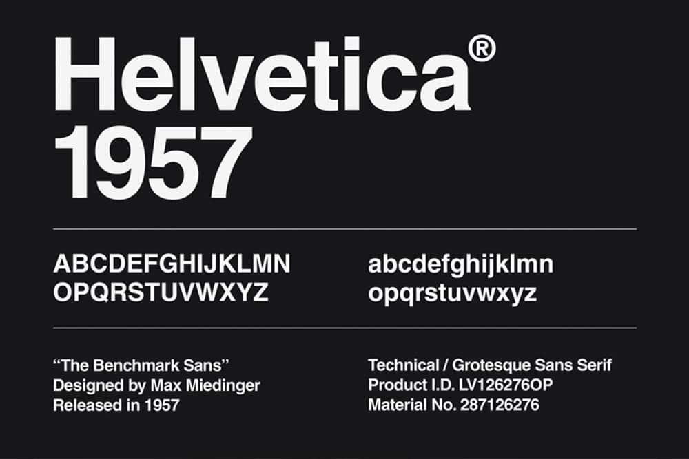
- Type: Sans-serif
- Characteristics: Minimalistic, elegant, and highly versatile.
- Suitability: Helvetica is distinguished for its sleek appearance and the ability to fit into any context, making it perfect for formal business emails. Its precise cuts are accompanied by harmonious proportions, making your messages look more consistent and refined, improving readability.
Calibri
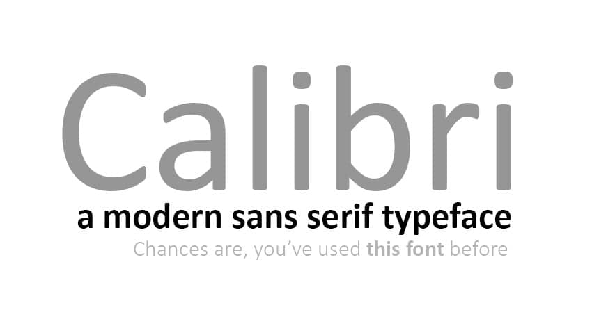
- Type: Sans-serif
- Characteristics: Rounded edges, modern, and approachable.
- Suitability: Calibri has a more professional but still relatively warm design, suitable for end-use emails for the workplace or business casual greetings.
Georgia
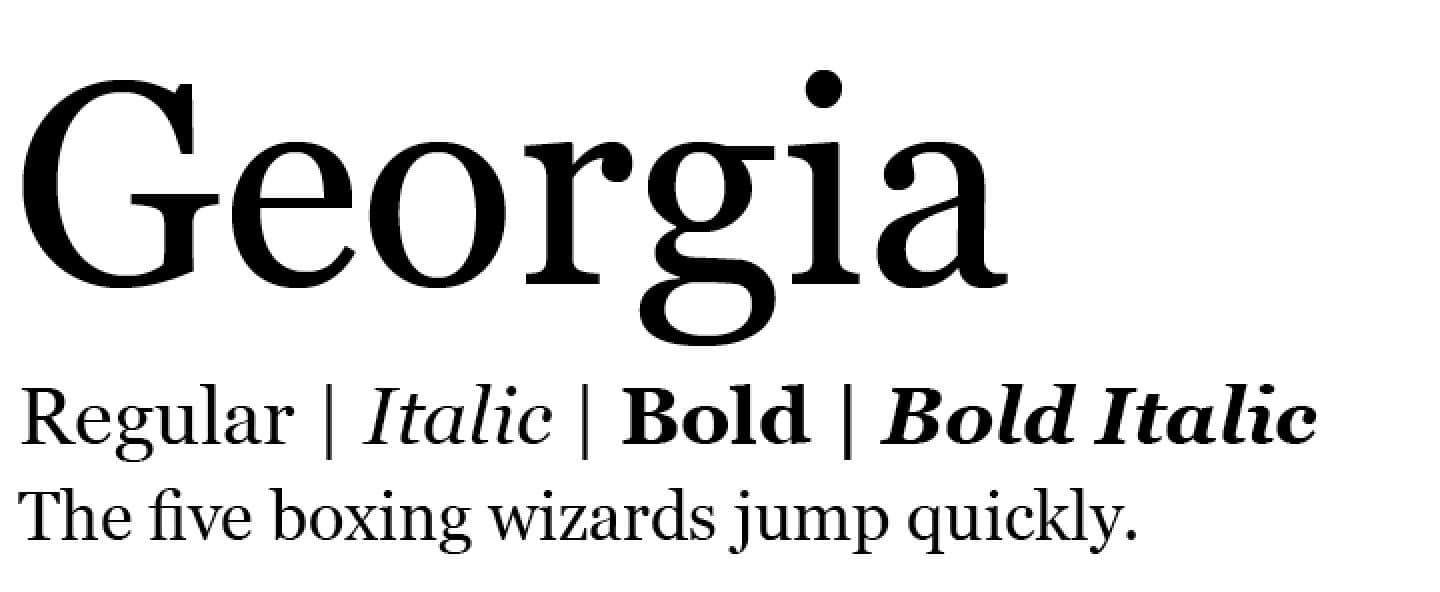
- Type: Serif
- Characteristics: Classic, traditional appearance with highly readable font styles.
- Suitability: Specifically, Georgia is a serif typeface appropriate for use in formal and official messages in business communication through email, which has been adapted for modern devices. Due to the combination of careful proportions and spacing, Georgia will be effective for emails with long texts.
Open Sans
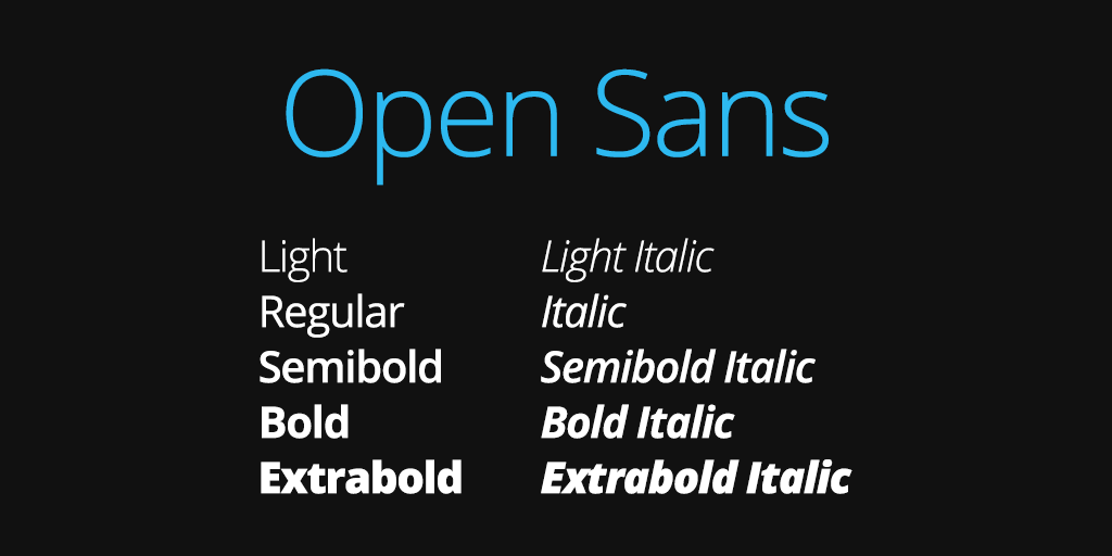
- Type: Sans-serif
- Characteristics: Friendly, modern, and highly legible.
- Suitability: Open Sans has a modern style, which also entails functionality for virtually any email exchange application. It has a simple geometrical structure, harmonic proportions, and a significant number of variations, including thin and thick, for easy reading on any device, even with different sizes of screens; at the same time, it has a friendly character.
Times New Roman
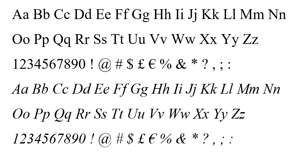
- Type: Serif
- Characteristics: Classic, formal, and highly legible.
- Suitability: Maintaining its popularity among adult users, Times New Roman is considered the traditional style for formal business emails, which are almost always used in academic, legal, and corporate correspondence. It has the conventional appearance of a font that looks professional and authoritative with high readability so that your communications are definitive and easily understandable.
Roboto

- Type: Sans-serif
- Characteristics: Modern, versatile, and highly readable.
- Suitability: Roboto is currently widely used for modern email exchange. It can also be used for both business and casual correspondence.
Verdana
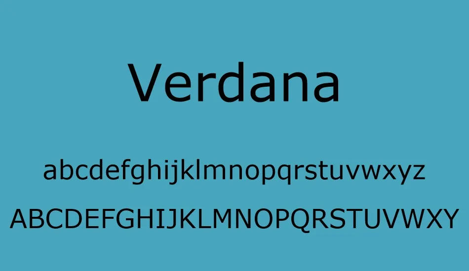
- Type: Sans-serif
- Characteristics: Bold, clear, and highly legible.
- Suitability: Verdana was developed primarily for digital devices, and it remains easy to read, even if the text size is rather small. Its thick lettering and legible arrangement make it suitable for communicating significant information or stressing certain particulars in the mail.
Tahoma
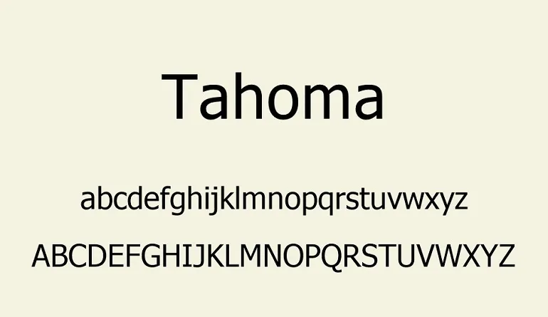
- Type: Sans-serif
- Characteristics: Compact, legible, and professional.
- Suitability: Tahoma can be the one if you’re looking for a relatively thin and closely packed font. The clean look and ease of reading make promoting messages that can be viewed on various devices desirable.
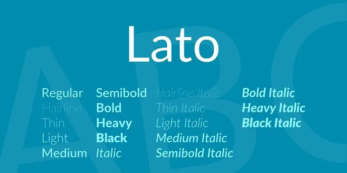
Lato
- Type: Sans-serif
- Characteristics: Modern, versatile, and elegant.
- Suitability: Lato provides the audience with a fresh and rather strict look, which will contribute to the successful use of this font in various email correspondence. A right-leaning typeface with a good medium contrast reveals good legibility. These favorable attributes give an undertone of sophistication to your emails.
Read also: A Brief eCommerce Email Marketing Strategy Guide
Best Email Fonts for Gmail and Outlook
Best fonts for Outlook
Outlook is seen almost everywhere in the corporate world as the primary tool for managing emails, and choosing the correct font will go a long way in having your emails presented well and professionally.
While selecting the fonts for Outlook, it is also important to consider its possibilities for further customization and compatibility with different program versions. It is safer to use fonts that will be easily readable across different versions of Outlook by clients. It may also be best to use the same font for the header and the messages to keep the design of the emails professional and organized.
The considered sans-serif fonts create recognition and ease of use in reading, meeting requirements for a minimalistic and modern look and being easily readable on any device.
Ensure your selected font looks good and remains readable when Outlook’s non-standard settings are applied.
Optimal fonts for Gmail
Gmail is one of the most used email applications.
Gmail’s default email font is set to sans-serif, a modern font type familiar to users. This is important to keep the email settings consistent with those of Gmail.
The recommended font is sans serif, which includes Arial, Helvetica, and Roboto. While using web fonts in Gmail emails, it is necessary to specify the web-safe fallback fonts so that the email is readable even if web fonts do not render on the reader’s machine.
It is important to keep the appearance of your emails as close as possible to the appearance you designed once you view it on a different email service provider.
However, one has to limit the toggling of font settings as much as possible because this might negatively impact the appearance of composed or received emails.
When choosing the font, select those corresponding to the primary Gmail fonts so the email does not look illegible.
Read also: 50 Powerful Call-to-Action Phrases (and Tips) to Boost Conversions
Font Considerations for Different Purposes
Widely available free fonts
When selecting fonts for various purposes, accessibility and availability are crucial factors. Fortunately, there is a plethora of free fonts that are widely accessible and easy to use across different platforms.
Google Fonts, Adobe Fonts (Typekit), and Font Squirrel are some platforms that contain an extensive list of free fonts for any style and typeface.
Free fonts can prove particularly helpful since you can be sure your chosen typefaces are available to anyone, whether it’s a question of budget or software compatibility.
Professional fonts for email signatures
Email signatures are a person’s personal or professional identity. The choice of fonts is highly important for enhancing the look and usability of the text.
Sans-serif fonts like Arial, Helvetica, and Open Sans are ideal for email signatures because they are easily readable on screens and devices.
It may be useful to discuss slight changes in font, such as making some texts bold or using a different style. Moreover, you must do it without making the document difficult to read.
Also, the font size should be large, just enough to be readable but not so large as to be overwhelming.
Read also: From Data to Strategy — Creating Your Ideal Customer Profile
Fonts suitable for farewell emails
Emotional messages, such as farewell messages, demand appropriate fonts to capture the emotions and moods of the message. Serif fonts like Georgia or Times New Roman are formal and respectful; you can apply them while writing farewell messages.
Conversely, minimalist sans-serif fonts like Google’s Roboto or Lat can be ideal in less businesslike or more sincere farewell emails.
Thus, one must select a font coherent with the message or the relationship between the sender and the recipient.
Fonts for marketing emails
Marketing emails aim to capture the recipient’s attention and compel them to take action. Therefore, the typeface issue is crucial for attracting attention and remaining accessible.
Display fonts can work wonders for headlines or call to action to grab the recipient’s attention and create interest.
Always complement a decorative/stylized font with a legible, san serif body text font because the text should be easy to read and understand.
Some of the most preferred website fonts for body text in a marketing email are sans-serif fonts. These include Arial, Roboto, or Montserrat, as they are clean, easy on the eyes, and attractively minimalistic.
Read also: Business Email Format Secrets You Must Know
Reddit Users on Email Fonts
What do Redditors think about email fonts? Here’s a brief take.
For documents that don’t involve litigation, Garamond is often preferred over Times New Roman due to its more attractive appearance and easier readability.
Court documents have also shown a positive reception to Century Schoolbook, which is noted for its professionalism and acceptance.
In “Typography for Lawyers,” valuable tips are highlighted. Users have applied different font styles to emails and letters—Garamond for a more formal tone and Arial for a modern look.
Verdana is particularly praised for its readability in memos, while fonts like Arial and Calibri are ideal for readability on screens and gadgets.
This exchange underscores the significant impact that font selection can have on the effectiveness and clarity of messages across various documents and communication channels.
Read also: The Hidden Revenue Opportunity in Sales and Marketing Alignment
Technical Considerations
Let’s take a closer look at two critical technical considerations.
How fonts work across different platforms and devices, and how your font choices can end up in spam filters.
Understanding font compatibility across different platforms and devices
A font’s compatibility is essential so the website can display properly across different platforms and devices.
Common fonts such as Arial, Helvetica, or Times New Roman render well on all platforms, but this will not be the case with custom or otherwise rarely used fonts.
When choosing fonts for your emails, get web-safe ones. This is to avoid absolute formatting in different mail clients and devices the recipients might use to access the emails.
Send test emails to different devices and various email clients to make sure the fonts look the same as seen by the receivers.
The impact of font choice on email deliverability and spam filters
Of course, font selection can affect the open and delivery rates by affecting how readers perceive your messages.
Sending messages that incorporate non-standard fonts might cause problems with spam indexes. They could also lessen the trust that targets have, decreasing the deliverability of your emails.
Do not use generic typefaces and sizes, and do not use those that have the reputation of ending your email in spam filters.
Further, other variables, including subject lines, sender reputation, and email details, require fine-tuning to ensure high delivery and avoid automated spam labels.
Read also: How to Write an Invoice Email and Get Paid Fast
Conclusion
Fonts are not just for the aesthetics. They have much more profound implications, such as establishing your brand identity, prioritizing clear communication, and exuding professionalism.
However, you need to consider factors such as readability, compatibility, and brand consistency to avoid getting stuck with the wrong font for email. Choosing the best font for email requires proper due diligence and a good eye for function and style.
EngageBay is an all-in-one marketing, sales, and customer support software for small businesses, startups, and solopreneurs. You get email marketing, marketing automation, landing page and email templates, segmentation and personalization, sales pipelines, live chat, and more.
Sign up for free with EngageBay or book a demo with our experts.
Additional Resources
Font libraries and tools
- Google Fonts: Access a wide range of free, open-source fonts suitable for various purposes.
- Adobe Fonts (formerly Typekit): Explore a vast collection of high-quality fonts for print and digital projects.
- Font Squirrel: Discover free fonts for commercial use, with desktop and web embedding options.
- Email on Acid: Test email readability across different devices and email clients to ensure optimal display.
Forums and communities
- Reddit: Explore threads such as r/Typography and r/Emailmarketing to discuss font usage and design principles.
- Stack Exchange – Graphic Design: Access a wealth of knowledge and expertise in graphic design, including discussions on font selection and best practices.
