How do you succinctly provide information on your startup or company? You can use a business one-pager or a company one-pager, of course.
One-pagers provide project, service, product, or company information, expertly combining brevity and detail. And yes, the keyword is brevity, as a one-pager can only be … one page. Creating a visually appealing company one-pager is crucial, as it helps make a memorable first impression and ensures your key information is easily absorbed.
You can share one-pagers with stakeholders, investors, clients, and other business partners to seal the deal, but that requires mastering how to write one of these documents first.
Small business owners, make sure you stay tuned.
In this blog post, we’ll explain what a business one-pager is, the key elements that make it successful, and eight real-world examples. This blog post also offers inspiration and guidance to create effective one-pagers through real-world examples, effectively conveying your value proposition.
Table of Contents
Key Takeaways
- Business one-pagers have many critical success factors, including clarity, conciseness, visual appeal, and a strong value proposition.
- Use your one-pager to refine and communicate your small business core message.
What Is a Business One-Pager?
A business one-pager is a single page that elaborates and breaks down what your company does and for what audience. Essentially, it’s a snapshot of your company, product, or service.
Whether as marketing collateral, part of a sales presentation, or for an investor pitch, your startup will use business one-pagers regularly throughout your company career. Including key points and key details in a business one-pager is crucial to clearly communicate its value, ensuring that essential information is quickly grasped by the audience.
Let’s explore the roles of this business document.
Expresses your value
Your value proposition will come through loud and clear when writing a one-pager. Articulating your brand’s value improves messaging clarity, elevates customer engagement and understanding, and provides direction.
Provides company information
What is your small business all about? You can use a one-pager to divulge critical information about your founding, objectives, and accomplishments. This lends your business more credibility and can build trust.
Showcases your brand identity
The one-pager is also an excellent opportunity to express and explain your brand. You can display your logo, showcase your tone, discuss your products and services, and build brand recognition. More established businesses can strengthen their branding.
Can help you get funding
Many new startups rely on funding from donors and angel investors to make their goals come true. A one-pager is the ideal platform for leveraging the funding you need by discussing the crux of your business and the products and services you specialize in.
Secures partners and vendors
Another common usage of a business one-liner is to secure new partners, whether a vendor or sponsor. Reviewing the background of your business and its goals drives faster decision-making for the other party.
Key Components of a Successful Business One-Pager
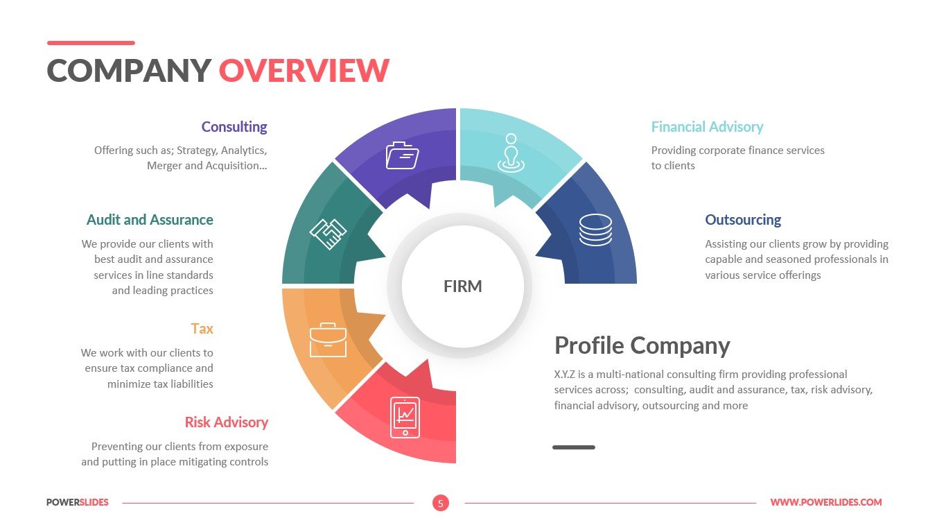
The multifaceted one-pager has so many uses, but what does yours require? Let’s outline the essential elements.
- Company overview: This section serves as an executive summary of the business, providing a brief overview of your company’s story, mission, and key achievements. It’s crucial to grab the reader’s attention and summarize critical information that consolidates detailed content into key bullet points for quick review and decision-making.
- Starting with a one-pager template: To ensure your one-pager includes all key components, it’s important to begin with a one-pager template. This template acts as a guide to creating a concise document that summarizes key information about your product, brand, project, or business in an easily digestible format. Whether for company one-pagers, product introductions, or investor updates, the right template can help emphasize essential details such as call-to-action, product features, and financial analysis.
Display your company overview
The first and arguably most important element is the company overview or summary. Include your business name, location, legal structure (such as a corporation or LLC), key employees, brief history, and mission statement.
Elaborate on your business value proposition
Next, delve into your value proposition. Research your audience’s main pain points, then discuss how your products and/or services treat those pain points.
Mention key products or services
You don’t have to discuss every product or service your company sells, only those that have been the biggest sellers or made the most difference in your customers’ lives (which are usually the biggest sellers).
Feel free to showcase the diversity of your offerings to make your business look more unique.
Understand your target market
Speaking of your audience, who are they?
You know, but a partner or vendor doesn’t, and this is the part of the one-pager where you tell them. Delve into who comprises your target market and audience, including their demographics, geographics, and especially their psychographics, tailoring the design to meet this group’s specific needs and interests.
Highlight your competitive advantages
What makes your business unique? You’ve explained it somewhat in your value proposition, but this is the section where you expound on it. If your products or services outsell the competition or have distinct advantages, share them here.
Add your contact information
You can’t send a one-pager without adding your contact information. Include your business address, phone number, email address, and social handles.
Employ quality visual design that reflects your brand
Balancing informative content with engaging visuals to grab attention is a careful balancing act.
The design of your one-pager can utilize charts, graphs, tables, and company images but must be aligned with your brand and add value.
Include a call-to-action
What do you want the recipient to do when they see your one-pager? Do you want them to call or email you to schedule a consultation? Do you prefer they complete a purchase? Whatever the answer, you need a call to action to inspire them to achieve the objective.
Read also: Email Design Essentials: Crafting Campaigns that Connect and Convert
Important Business One-Pager Design Principles
Let’s talk more about the design of a business one-pager, as that will drive its success.
Moreover, eschewing design principles can diminish the quality of your other elements, so it’s worth paying close attention to your design. The challenge and importance of fitting all crucial information into a single page while maintaining visual appeal cannot be overstated.
Here is a collection of best practices to consider when assembling your one-pager.
Use a legible layout
Semantic and visual space is not to be overlooked when selecting a layout for readability. Whitespace is there to help you design well, and if you use it properly, your page won’t look blank or naked.
A layout designates hierarchy, something whitespace is good at, as it delineates different elements.
Consider the color scheme
What color should your one-pager be? The hues you choose shouldn’t be an afterthought.
You’ll probably want to use your brand colors above all else, but don’t be afraid to deviate from them slightly, especially if they interrupt the appearance of the one-pager.
Colors should be complementary, meaning they pair well together. For example, magenta and green go well, as do blue and orange, purple and yellow, and green and red. These colors are naturally bold, but you can dull or darken them, and they will remain complementary.
Although I will talk about typography separately (in a moment), I want to note the importance of selecting font colors here. Black text on a white background is standard; you can also invert it to make your one-pager easier on the eyes.
However, beware of using colored text, especially on a non-complementary background. It will be too hard to read.
Choose typography carefully
I want to talk more about typography, as it’s one of the most important elements of your business one-pager. Here are some pointers when selecting your typography to ensure it’s readable:
- Don’t use text animations.
- Use single spaces between words; double spacing can bloat your one-pager, quickly making it into a three-pager.
- Avoid green or red text; although complementary colors, colorblind people struggle to see both hues, making your text less readable.
- Incorporate headers and subheads into your business one-pager, such as H1s, H2s, H3s, etc.
- Don’t use all caps for text unless it is part of an acronym.
- Select readable fonts, avoiding anything too flowery or overly cursive.
- Consider that the other party may read your one-pager on screens of varying sizes, from their smartphone to a tablet or desktop computer. The typeface should be easily readable, no matter the size.
- Stick with the standard fonts available on any machine. Custom fonts are great and certainly make your one-pager more unique, but they don’t always display correctly on devices that don’t have them downloaded.
Insert visuals that match your message and brand identity
Considering everything about your one-pager goes back to your brand identity, the visuals you select must also meet those requirements. Don’t use stock images if you can help it, but branded, personalized photos that underscore your message.
For example, if you sell vacuum cleaners, rather than a stock photo of a smiling, happy customer holding a vacuum, use an image of someone using your vacuum. That is more meaningful to potential investors and partners, as it’s excellent social proof.
Save a template
Once you create a business one-pager layout you like, create and save a template for next time. You can always tweak the template for each use of the one-pager, but having a skeleton outline will save you a lot of time.
Use high-quality imagery
This may seem rather obvious, but it bears mentioning, I think. The images you use represent your brand, so they must be high-quality.
Read also: Crafting the Perfect Mobile-Friendly eCommerce Email Design [Tips + Examples]
8 of the Best Business One-Pager Examples
As you assemble your business one-pager, including general and marketing one-pagers, look at these examples to inspire you.
Viewing a one-pager example, especially for marketing purposes, can offer valuable insights into creating a document that succinctly communicates your business’s value, whether for internal alignment or external engagement.
1. Travel Espana
Okay, do you need an excuse to travel to Spain (or anywhere else, for that matter)? No, admittedly, you don’t. However, one-pagers can only help, such as this one from travel agency Travel Espana.
It narrows down all the reasons you should visit Spain, mentioning accolades about how many visitors it attracts and its UNESCO World Heritage cities. The large graphics of life in Spain, from the fancy wine to the bulls and the beach, are the focal point and do a good job of hammering the message home.
I also like how the different elements are separated by lines, and the box with the contact information is beige to draw your eye there.
2. Project Zen
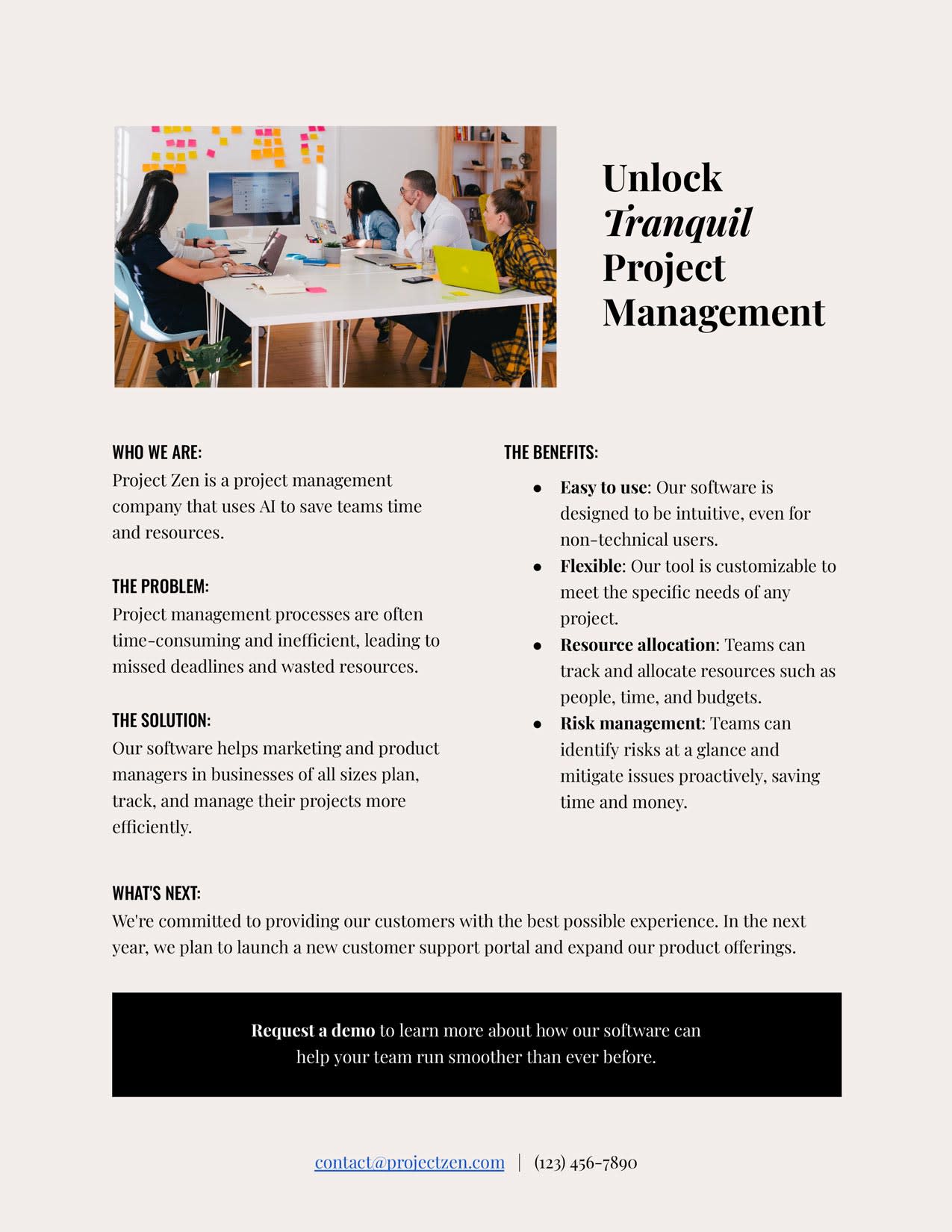
Project Zen put together a simple but still effective one-pager. The opening headline, “Unlock Tranquil Project Management,” is beside an image of a workplace in action.
Below that, Project Zen has several subheads, including “Who We Are,” “The Problem,” “The Solution,” “The Benefits,” and “What’s Next.”
Underneath is a black box with a CTA; Project Zen’s contact info is below that. It’s an overall great template.
3. Brafton
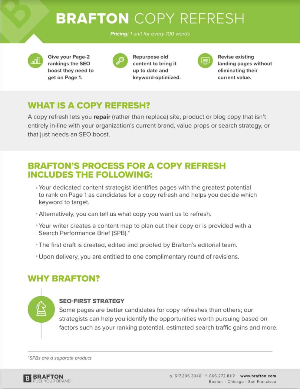
This business one-pager from content marketing resource Brafton underscores the value of its services, namely, its copy refreshes. The page describes what a copy refresh is and then explains Brafton’s process.
Finally, below is an overview of why you should choose Brafton, followed by contact information at the bottom.
The page uses whitespace excellently, with light gray blocks to separate some of the elements. The bright green is a refreshing, attention-grabbing color.
4. MarketMasters

Here’s another one-pager that masters how to use whitespace. It only features a single black line to separate the elements, yet it’s all needed because the paragraphs are in neat blocks.
This page uses only a few colors, primarily bubblegum pink and bright orange. Those colors appear in the MarketMasters header and the chart at the bottom. I also like how this one-pager features short bios on the team with its hard data.
Way to sell!
5. Product Marketing Alliance
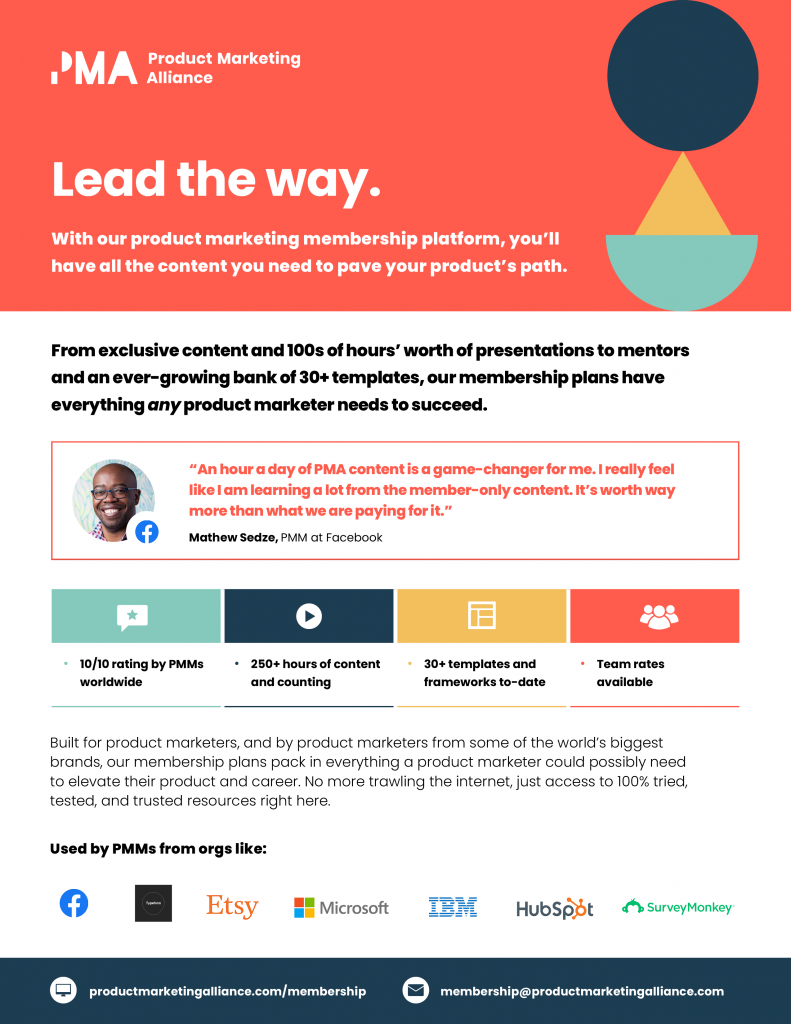
If you’d rather your one-pager be a bit more colorful, this example from PMA shows you how it’s done. The first block on the page is a bright salmon pink with shapes in hues like teal, royal blue, and yellow. That’s beside the intro header, which reads “Lead the way” in white text to match the PMA logo.
Below that is the main part of the page, which features a white background, an intro paragraph, and a testimonial below it. Underneath that are more accomplishments with colorful block elements for each one.
As if there isn’t enough social proof, PMA also mentions the organizations that work with them, including HubSpot, IBM, Microsoft, and Etsy. The navy blue block at the bottom features contact information, including a website URL and email address.
6. NASDA
Get to know the National Association of State Departments of Agriculture through this one-pager. Through graphics, it utilizes NASDA’s colors (teal, bright orange, and lime green). Although a teal blue background is a bold move, the white text keeps the background readable.
I will say that the paragraphs here are a little bloated compared to most and would be much more appealing if trimmed down, but this is a perfectly good one-pager to emulate, nevertheless.
7. Caddis Art Inc.
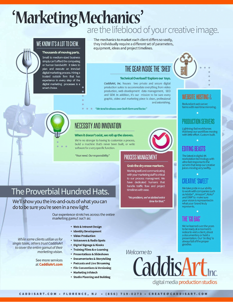
You would expect a lot from an art company when designing one-pagers, and Caddis Art did not disappoint.
Their business one-pager is more complex than most, using background images of a camera, small blocks of text with accompanying graphics such as a checkmark or light bulb, and readable text in paragraph and bullet form.
Overall, it works beautifully. Perhaps it’s more of an advanced example, but you’ll likely want to work your way up toward it.
8. IoT Job Jump

Proving that one-pagers are handy for everything, this next example illustrates what you’ll learn in a course from IoT Job Jump.
The page uses color beautifully, with a navy-blue arch that spans nearly the entire page and a yellow-to-blue gradient in the background.
The logo features teal and yellow and looks great against the background. The navy-blue color is commanding enough to create an elegant contrast to the white and teal blocks. The image of people taking a computer course even integrates nicely with the colors.
Read also:What Is A Sales Dashboard And How To Create The Perfect One
How to Create Your Own Business One-Pager
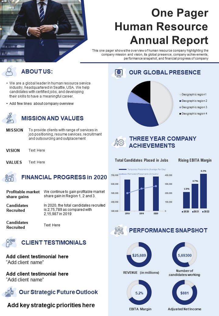
It’s time to write. Are you ready?
The goal is to create a concise one-page document that serves the needs of marketing and sales teams, providing them with a powerful tool to present essential information in a clear and compelling way. Here are the steps needed to build your own business one-pagers to knock ‘em out of the park.
These one-pagers are vital for engaging potential customers and serve as an invaluable resource for sales teams to reinforce training materials and effectively communicate key product benefits.
Step 1: Decide what elements you want
Brainstorming what you want to convey and how is the first step of crafting expert-level one-pagers and arguably the biggest step, so don’t gloss over the basics.
Think of it like building a house. If you rush through the main construction to get to the fun part, like interior decorating, you won’t have a stable foundation from which to build.
Step 2: Make a mock layout
I want to stress that this layout is not the final design but merely an outline of the details you’ll finalize as you go through the process. You don’t have to love the mock layout; you can change it later.
Step 3: Write a catchy headline
Many one-pagers have a headline in an oversized font. This is one of the first elements your viewers will see, so you must make it a good one.
First, concern yourself with the headline copy. I’ve written a lot of guides on writing email subject lines, which is essentially the same thing. You want to keep your one-pager headline short, sweet, and catchy.
You might focus on inspiring curiosity by asking a question or tapping into an emotion. Perhaps you go the benefits-focused route. Whatever you choose, don’t exceed 50 characters.
The next consideration is what font you will use and its size. Remember, the font should be easily readable in different sizes. Another consideration is that the larger the font, the less space you have for everything else in your one-pager.
Step 4: Add your main content
Now, you can move on to furnishing the one-pager with the main content, focusing on how your products or services can benefit potential customers.
This includes company history, customer pain points, products, services and how they solve them, other product/service benefits, charts, and graphs spotlighting your accomplishments. It is crucial to introduce your business to potential customers, engage them, and provide insight into how it can make a difference in their lives.
Take a look at the examples above to inspire you here. There is no one way to design the main part of your one-pager, but there are certainly incorrect ways to go about it.
Remember to use short paragraphs and visually distinct and unique elements, embrace whitespace, and avoid clashing colors or illegible fonts.
Step 5: Include the CTA and contact info
Oh yes, and don’t forget the contact information and your CTA, which you’ll usually present in two parts of the one-pager. The CTA should be near the bottom, and the contact info should usually be under that.
Using a different-colored block than the rest of the page makes your contact info or CTA stand out. Another tip for a visually attention-grabbing CTA: bold the font.
Step 6: Add at least one image
Next, it’s time to add your image. Yes, images are different from charts or graphs. One image is usually the limit, depending on the photo size.
For example, if you’re showcasing the headshots of your founders, you can include as many images as you need because they’re smaller. If we’re talking about a full-sized photo of a workspace or a product, you should limit it to only one.
Where to place the image is the only one you can answer. Play around with your layout and select a spot that seems right.
Step 7: Finalize the layout
Now you’re cooking with gas! With all the elements of the business one-pager created, you have to tinker around with the layout until it’s perfect.
Read also: 18 Great Sales Page Examples (And Why They Convert)
Conclusion
A well-crafted business one-pager can make a lasting impression on stakeholders. Looking at examples can inspire and guide, so please review our list before starting on your one-pager.
EngageBay is an all-in-one marketing, sales, and customer support software for small businesses, startups, and solopreneurs. You get email marketing, marketing automation, landing page and email templates, segmentation and personalization, sales pipelines, live chat, and more.
Sign up for free with EngageBay or book a demo with our experts.
Frequently Asked Questions (FAQ)
1. What is a business one-pager, and when should I use it?
A business one-pager is designed to provide information about your business in a condensed format (no more than a page). You can use it when seeking new clients, sponsors, vendors, customers, donors, or investors.
2. How much information should I include in my business one-pager?
You need the basics, such as your company name, key members, top products and services, value proposition, and the benefits of working with your small business over the competition. You should wrap up with a CTA and contact information.
3. What are some common mistakes to avoid when creating a business one-pager?
Some errors can trip you up when making your one-pager: using low-res images, writing long paragraphs, cramming in too many elements, not separating elements, forgetting your contact information, and surpassing one page in length.
4. Can I use my business one-pager for multiple purposes, such as fundraising or marketing?
You most certainly can, although it may require retooling depending on usage.
5. How often should I update my business one-pager?
Take a look at it once a quarter and make modifications. If not that frequently, then twice a year.
6. Are there any free tools available for designing a business one-pager?
Try Edit.org, Xtensio, and Canva to produce one-pagers you can use to impress your audience again and again.
7. How can I make my business one-pager stand out in a crowded market?
Unique visual elements will allow the rest of the information to shine, so naturally incorporate them into the page.
8. What’s the best way to distribute my business one-pager to potential clients or investors?
Email is the most reliable medium for one-pagers, although you can also post them on your website, upload them on social media, or send them via direct message.
9. Should I include testimonials or client logos on my business one-pager?
Yes, and yes! Both testimonials and client logos increase your social proof, which makes your brand more trustworthy and likelier to convert.
10. How can I measure the effectiveness of my business one-pager?
Review metrics like organic web traffic, social media followers, email subscribers, open and click-through rates, brand mentions, conversions, and sales.
