Email is one of the most prevalent forms of business communication.
To prevent your emails from being marked as spam, it is essential to understand and familiarize yourself with the components of an email. This knowledge can significantly improve your email’s deliverability.
Most marketers prefer to set up an email template and iterate over time.
This might look like a lot of work. However, optimizing email parts like layout, header, footer, email body, etc., is much easier once you know how each cog of the email machine operates – and that’s exactly what we have for you today!
In this blog post, we’ll analyze the basic anatomy of an email and explain all the essential email parts so that you can craft engaging campaigns.
Table of Contents
Email Anatomy Explained
A good email always has all the below parts. While many emails might have additional components, these are the basic building blocks of the modern form of communication:
- Subject line
- Preview/pre-header
- Header
- Salutation
- Headline
- Body copy
- CTA
- Footer
Some other email parts that are also important are the following:
- Sender email address
- The receiver’s email address
If you’re using an email marketing software, the sender’s email address, as well as the receiver’s email address, is automatically populated.
So, the email subject line, the body, and the CTA are the most important elements by far. It is these email parts that will ultimately decide if your email campaign meets its goals or not.
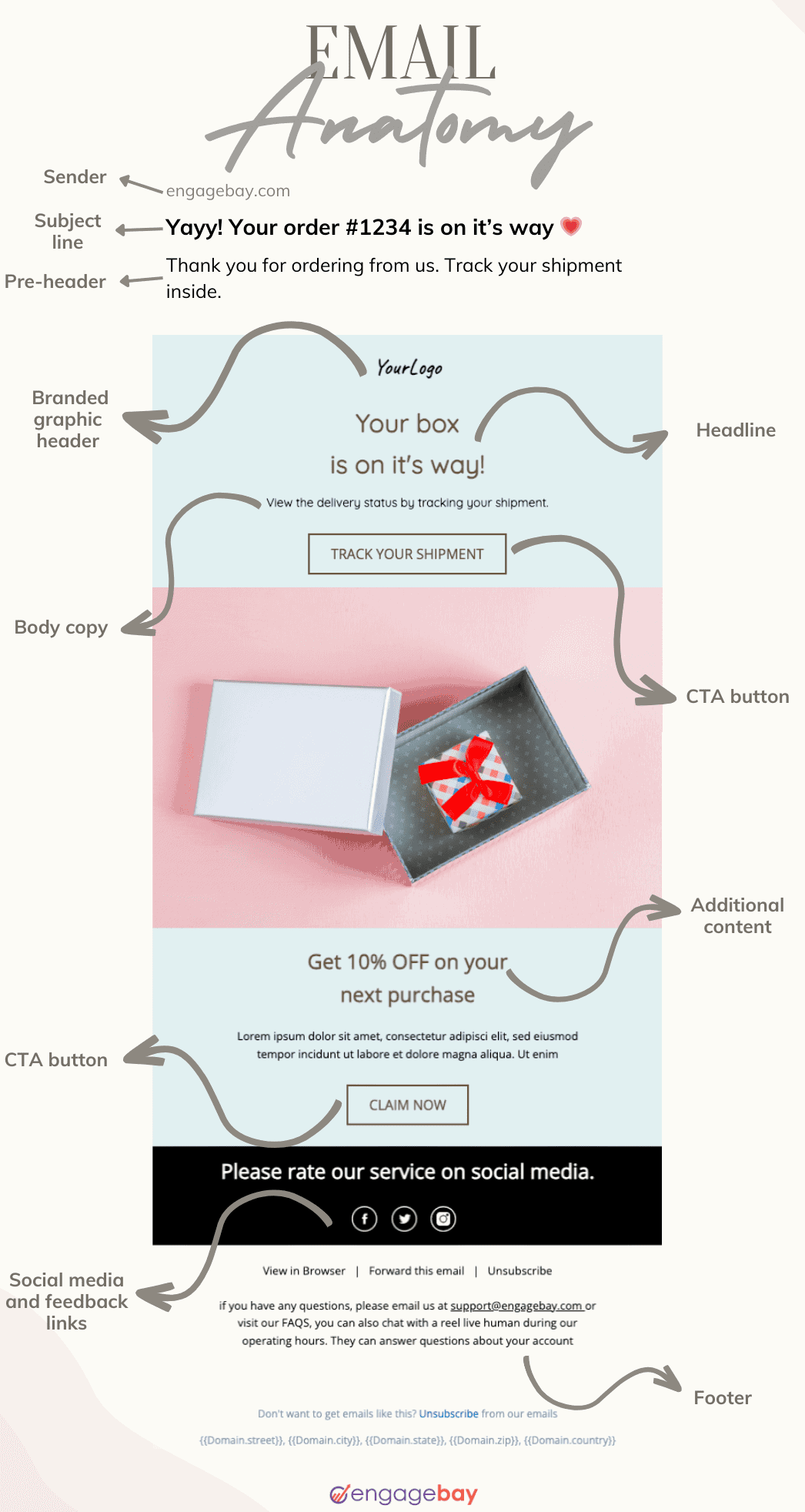
Let’s understand each part of a typical email in detail. Here’s an infographic that quickly depicts all the vital email parts, along with their positions:

Let’s look at them in detail.
1. Subject line
Readers can instinctively tell from a subject line if an email is worth their time or not.
The right subject line will compel the recipient to click on the email. The key is to be as clear and concise as possible. Keep the length under 60 characters so it’s fully visible across various devices and clients.
Email personalization matters as well. Mentioning the email recipient by name in the subject line can increase the open rate by 26%.
2. Pre-header
A pre-header appears right next to the subject line of an email.
It provides additional information related to the subject line. For example, you can use it to tease the offer or include a CTA. This increases the chances the reader will open your email.

Note that a pre-header is not shown by default in clients like Gmail.
It must be configured in the settings. Without a pre-header, the email client often ends up displaying the first line in your email body. Depending on the layout, the first line readers see could be ‘click here to unsubscribe’- you don’t want that to happen!
Here are some best practices to make the most of your pre-header:
- Keep it short — no more than 80 characters — to ensure it can be read fully.
- Using emojis in the right places can make it more attractive.
- Talk about the value or benefit the reader can get. This can increase the open rates.
- Use A/B testing to identify the most effective pre-header option.
Read also: Business Introduction Letter 101: Tips and Examples for Beginners
3. Branded header
The branded header (not HTML snippet) shows at the very top of the email. Adding your logo and tagline to it helps readers recognize you. The key is to use standard logos, colors, and design elements to build trust over time.
Here are quick dos and don’ts for optimizing it:
Dos
- Use a compelling headline to attract attention.
- Link the logo to the same page as the CTA instead of redirecting to your website’s home page.
Don’ts
- Don’t put a navigation menu right below the logo if you have multiple product categories. It can be distracting if you also have the tagline and/or social links in the same spot.
4. Hero image
A hero image is an image just above the top story in an email newsletter. It contextualizes the main story or makes it stand out. The visuals should not detract from the main message or have too many effects. If using a live image, avoid sourcing it from stock photography sites.
Use professionally shot images instead. Also, test the hero image to make sure it’s visible across devices and email clients.
5. Salutation
This is the greeting you open the email with.
As with all professional emails, the best salutation you could use is the receiver’s first name. It creates an instant personal connection. If you are running an outbound marketing campaign, you can be more formal and use the last name instead.
EngageBay’s email marketing tool seamlessly populates the recipient’s name from CRM records, helping you personalize your email marketing campaigns, save time, and ensure accuracy.
Read also: What Is An Email Header? 6 Email Header Examples To Learn From
6. Main message
Make it about them, not you.
To do this, think of benefits, not features. Connect their pain points to your product features and provide actionable tips and suggestions that solve their problems. The key is to avoid overwhelming the reader with too much information.
Use bullet points, headings, and white space to break up the text – it improves readability, especially on mobile devices. Infographics and embedded videos can also drive engagement.
You may run into compatibility problems with some email clients. However, EngageBay’s A/B testing and preview features can help you fix such issues.
Some best practices:
- Use moderate-length sentences: 50 to 60 characters per line, including spaces.
- Highlight key points to make reading easier.
Find out more about email design best practices to get more engagement.
7. Product gallery
Depending on your industry (for example, e-commerce, DTC), you can add a dynamic product gallery that displays multiple product categories based on the recipient’s browsing behavior or purchase history.
This is completely optional, though.
If you have only a few products, skip this. Similarly, if you’re creating a product recommendation flow, consider adding a section with each of your product categories just above the footer. The product gallery can also be automated to include personalized content for your target audience, thus improving clickthrough rates.
Read also: Business Email Format Secrets: Write Emails That Command Attention
8. Call-to-action (CTA)
A CTA tells the reader what to do next.
Don’t use words that make the reader stop and think. Instead, be clear and direct. For example, use words like ‘Buy Now’ or ‘Purchase Now’. The CTA button should be distinct, whether you place it at the top, middle, or bottom of the email body.

Provide plenty of whitespace around the CTA, and use solid colors and/or larger fonts to make it stand out. This can help you create separation between one or more sections and add multiple CTAs.
Learn more about optimizing your email CTA.
Read also: Email Preheader Examples and Tips to Get More Email Opens
9. Footer
The footer is the very end of your email.
Most email marketing teams use it to show contact information, social media links, and update preferences/unsubscribe buttons. Ensure you provide your mailing address and customer support numbers, including email.
Some subscribers may see this as a sign that you’re a legitimate business. Include an unsubscribe link, an ‘update preferences’ center, and a feedback link so readers can manage subscriptions and provide feedback.
This creates transparency and builds trust.
10. Legal disclaimers
You may be required to provide a legal disclaimer and T&C information in specific markets. This can be accommodated in the very last part of the email.
Read also: How to End an Email Appropriately: Tips & Examples
Is the sender’s address considered an important email part?
The answer is yes; the address is a key part of the anatomy of a marketing email.
For one, it promotes brand recognition. The email address ensures that it’s delivered to the right person and that the receiver can tell who sent it. For content marketing teams, deliverability is everything, and the email address is critical to that.
The address itself and the authentication information contained in the header (HTML snippet) ensure that the email passes spam checkers and goes through to the inbox.
Read also: Master All the Key Types of Email Marketing Campaigns
How Structuring Your Email Parts Correctly Improves Conversions
The typical marketing email sports images, links, CTA buttons, sign-up forms, banners, and other elements. Structuring each element correctly helps dodge spam filters, improves email deliverability rates, and increases clickthrough rates.
1. Renders correctly
Not all email clients will display every little element correctly.
For example, you may notice that the font size isn’t the same or that paragraph spacing is off. As a result, an email may look quite different in, say, Microsoft Outlook compared to Gmail. The right structuring can mitigate at least some of these issues.
Remember, the simpler the layout, the better it displays. By optimizing every part of the email anatomy, you can ensure your reader understands the email message.
2. Improves the sender’s reputation
56.5% of emails go to spam for a variety of reasons.
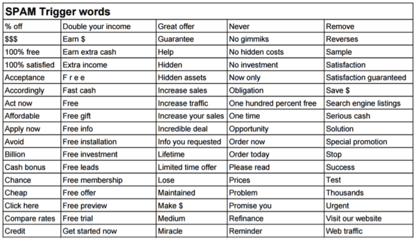
A lot of it boils down to one thing: bad design and formatting. An email with low-quality images or inconsistent fonts will likely get marked as spam. The other factor is spam trigger words like ‘free,’ ‘win,’ or ‘discount,’ which are all red flags for spam filters.

You might still get away with using some of these words – they are everyday words, after all – but they need to fit the context and not be misleading. Running your email through a spam word checker can make all the difference between going to spam or the inbox. Unsolicited emails are also often marked as spam.
Read also: 10 Best Email Fonts for Your Next Campaign
3. Increases conversion
If you want to increase CTR and conversion, the structure of your email is all the more important.
A well-structured email highlights the header, headline, and CTA. It’s easy to navigate, and each line of copy connects seamlessly to the CTA, increasing the odds of conversion.
Check out this blog post to learn more about writing promotional emails that convert.
4. Meets compliance requirements
As an email marketer, you must give readers control over what emails they receive.
That means placing ‘unsubscribe’ and ‘update preferences’ buttons where they can clearly see them. With a clear layout, you can meet compliance requirements and reduce spam reports.
Read also: Email Verification Email Templates to Cut Down Bounce Rates
How to Create Templates for Each Part of Your Email
Here is a quick guide to creating email master templates for each email part and optimizing them:
Email marketing tools like EngageBay offer pre-built email templates you can quickly customize for specific digital marketing emails in minutes. Here’s how:
1. Start with a to-do list
Write down all of the email flows you need templates for. These could be welcome emails, abandoned cart emails, etc.
2. Create a base template
Next, build a base template with a header, body, and footer section. This template should have branding elements like logo, tagline, fonts, etc.
3. Create content blocks
You can now add content blocks to the base template based on the email flow you have in mind.
These blocks can be used for adding elements like images, logos, email body, footer, etc. Remember to save each template after you’ve added the relevant blocks. This saved copy becomes your master template for that specific flow.
4. Start using the templates in your campaigns
The next time you need to send a welcome email, you can simply open the template saved under that name, modify the elements, and it’s ready to go.
You can create multiple master templates for each email flow you may have.
Read also: B2B Email Marketing Examples From Billion Dollar Firms
Conclusion
You don’t need to know coding to create high-quality, personalized emails that look great and have excellent deliverability.
What you need is the right toolkit.
EngageBay can help you build and test custom marketing flows rapidly, scale campaigns across multiple email clients, and track performance from a single location.
EngageBay gives you access to contact management, a beautiful library of email templates, landing pages, A/B testing, personalization, and more.
Sign up for free, or book a demo with our experts.

