Email design is the process and art of creating visually appealing emails to enhance engagement, increase conversions, and drive revenue. As marketing teams run targeted campaigns, they adopt strategic systems to make emails more attractive and compelling for readers to take action.
Presentation matters greatly in email marketing, no matter how powerful your copy or offer is. If readers don’t find your email attractive at first glance, they will discard it or send it to the junk folder. An effective email design strengthens your copy and captures the audience’s attention while communicating your message in the right tone and style.
This comprehensive article explains everything you need to know about email design and how to craft your emails in the most appropriate format. To help you further, we have listed some best practices, design trends, email examples, and tools to get you started.
Table of Contents
Fundamentals of Email Design
Email design adopts the general principles of design: contrast, balance, repetition, rhythm, pattern, emphasis, proportion, hierarchy, and unity. It uses specific techniques to enhance legibility, improve engagement, and drive conversions.
As marketers create several email types for different occasions and audiences, they optimize their processes to design visually appealing emails that attract readers and compel them to take action. Good email design allows you to deliver the most appropriate content to the right audience, regardless of their devices.
Email design is a complex aspect of email marketing. As marketers adopt improved strategies, they can design emails that deliver information and include elements that create pleasant customer experiences.
Key Elements of Email Design and How to Master Them
Every email design has essential components and features that play crucial roles in enhancing user experience and improving engagement. We will examine these features closely:
- Layout
- Typography
- Copy
- Color
- Visual elements
- Call to action
1. Email layout
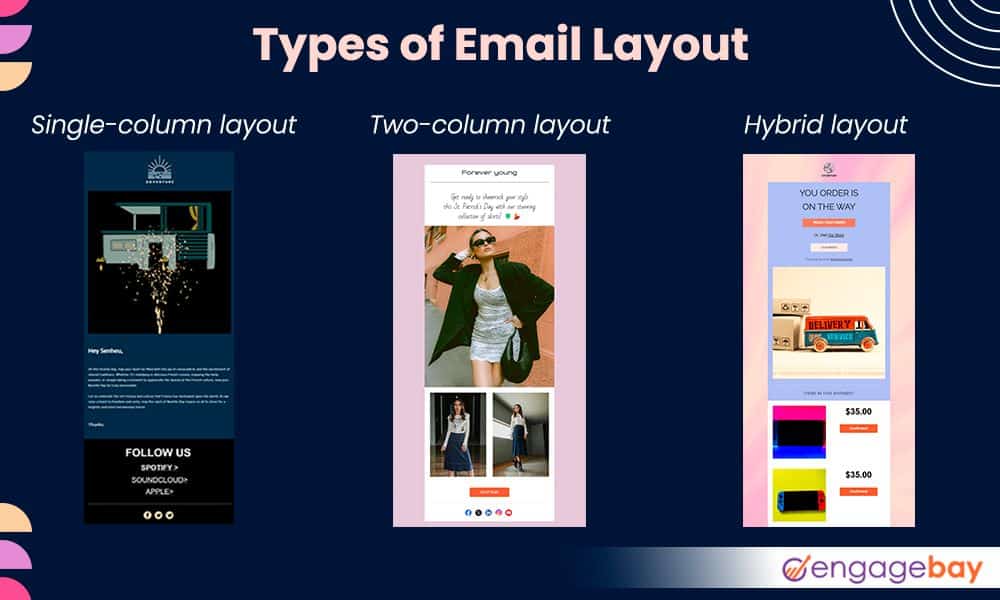
Email layout refers to the arrangement, pattern, and look of your email—it is the overall appearance of your design. The layout is a strategic combination of other design elements that creates a smooth flow of information and enhances readability. This way, readers stay engaged, moving from one section of the email to another.
There are three major email layouts. Exploring each lets you identify the most suitable format for your campaigns and internal communications.
a. Single-column layout: This simple and linear format organizes content in one vertical column. It is suitable for mobile devices as readers can browse the information arranged continuously from top to bottom.
b. Two-column layout: This layout organizes the email content in two columns, side by side. It is well-suited for official announcements and educational or information-rich emails. eCommerce brands can also use this email format to display products.
c. Hybrid layout: The hybrid layout combines single- and double-column layouts in one email, giving it a more stylish and dynamic feel.
Email layout patterns
In addition to these formats, several layout patterns and flows make your emails visually appealing, accessible, and scannable.
a. Inverted pyramid: This pattern directs readers to the major goal by using three sections in the order Header > Body > Call-to-action. It is a great way to eliminate distractions while propelling the reader to take action.
b. Zig-zag/Z-pattern: This pattern is great for eCommerce emails. It uses visuals to break up large blocks of text to make reading less boring. This way, readers can stay engaged with attractive elements strategically placed in the emails.
c. F-pattern: This pattern is based on the principle of how website visitors read. Generally, readers start from the top left to the right before scanning downwards to find a more eye-catching or engaging piece of information.
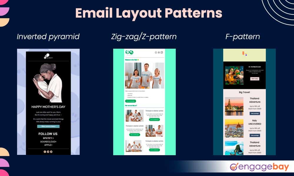
The layout or pattern you use largely depends on the type of email and branding style. This will help you create more engaging, attractive, and visually appealing frameworks for your audience.
2. Typography
In email design, typography refers to the appearance and arrangement of texts. Tools like a word generator can assist in choosing the right words, while typography.
It involves using different typefaces, font sizes and weights, letter and line spacing, etc., to establish hierarchy, enhance readability, and help communicate the right message and tone.
Using your brand typography in your emails helps you stay consistent across platforms. There are five primary categories of typefaces, and they can all be used on different occasions:
- Serif
- Sans serif
- Script
- Monospaced
- Display
Serif and sans serif are generally used for body text or headlines, while script and display are only used for headlines. Monospaced fonts are commonly used in coding and technical documentation.

The following tips can help you choose a suitable typeface for your emails:
- Avoid using more than 2-3 fonts. Ideally, one for the heading and one for the body.
- The recommended font size is 14-16px for the body and 20-30px for headings
- Avoid using decorative typefaces on the body
- Use black font color against a white background
- Appropriately use bold, italics, underline, uppercase, etc., to avoid ruining readability
- Test the font appearance and legibility on multiple devices, especially on mobile
- Use the right spacing between characters and lines
3. Copy
Your email copy contains the primary intent and message you want to convey to your audience. The copy highlights the purpose of the email in clear, plain, and concise text to persuade the reader to take the desired action.
The primary goal of the email copy is to inform and compel readers to purchase, share an update, make an announcement, etc., depending on the email type. These are some best practices for designing your email copy:
- Use more white space or visuals to break up large blocks of text
- Avoid using center alignment or justify for body text. Only use center alignment for headings
- Use a legible typeface and avoid overly stylish text
- Preview your text to see how it appears on other devices
- Make your copy clear and concise
- Offer a clear call to action
Read also: 10 Best Email Fonts for Your Next Campaign
4. Color
Color psychology in email design involves using the right amount and combination of colors to evoke a specific response from readers. Your color choice is primarily influenced by a number of factors, including:
- Branding
- Email campaign
- Customer age, gender, etc.
- Holidays and special occasions
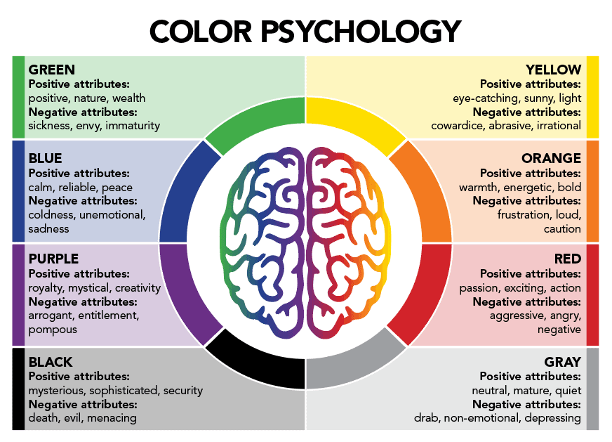
Different sections of your email use one or more color combinations, from headings to body text, CTA buttons, footer, links, visuals, etc. Based on relevance, a good mix of the right proportions makes your email attractive and hooks your readers while highlighting areas of increased importance.
Understanding the meaning of different colors and how they influence your brand perception can help you choose the right combination to convey the most appropriate message, tone, and value to the right audience.
Read also: 15 Stunning Email Design Examples from Big Brands (2024)
4. Visual elements
Visual elements in email design include everything but text. They range from images to infographics, logos, banners, illustrations, icons, gifs, and sometimes videos (although not recommended). Visuals help break up large blocks of text and make the emails easier to read. They are great for attracting and engaging readers.
Like every other design element, your visuals are influenced by email type, audience, branding, etc. Visual elements enhance readability; with one image, readers can grasp the whole idea behind your email even without reading the entire copy.
“One picture is worth a thousand words.”
~ Fred R. Barnard
Whether you’re adding a product image or a team photo, including an alt text is important. This is helpful for accessibility, and since some email clients disable image loading, readers can still use the alt text to understand the image content.
Here are some tips for adding images to emails:
- Use JPEG or PNG for images and GIFs and APNGs for animated visuals
- Compress your images for easy loading
- Avoid sending video files. Instead, insert a link to the video
- Create a healthy balance between visuals and text. The 60/40 rule is the standard recommendation for text-to-image ratio
- Ensure your images are consistent with your brand style across platforms
- Use high-quality photos that fit on multiple devices
- Only use images relevant to the email type and occasion. Avoid using random, unrelated images that add no value to the email
5. Call-to-action
The call to action is a critical aspect of every email design. Among other factors, it is used as a pointer to evaluate the success of an email campaign. The CTA is the turning point of every email, as it acts as a prompt that guides the reader on what to do next: sign up, download, create an account, purchase, read an article, etc.
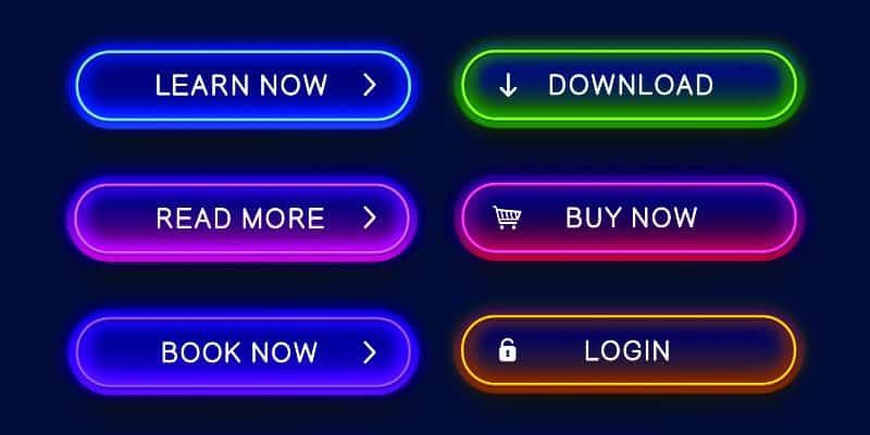
Since the goal of the email is to direct readers to take action, the CTA should be compelling enough to attract conversions. As a general practice, you can use buttons with an anchor text instead of pasting the link directly into the text.
The button separates the CTA from every other element in the email, making it accessible and clickable. With the different email layouts, your CTA can take multiple positions across the content—top, middle, bottom, side, etc.
Generally, you can have a primary CTA that prompts the reader to take the most desired action. The secondary CTA is more tailored to readers who aren’t ready to dive in but may need extra information or resources to guide them before they revisit the primary goal. Here are some tips for writing clear and compelling CTAs:
- Make them specific. Avoid generic words like “Click Here”
- Use appropriate color contrast to separate the button from the text and email background
- Personalize your CTA to suit your offer and target audience
- Test multiple CTA variations to see the one with the most conversions
- Keep it short, clear, and simple
Key Categories of Email Design
Emails are sent to different audiences for various purposes, from announcements to product updates, appreciation, promotions, etc. Each of these emails has unique designs to convey the right message and feel.
For example, a promotional email will contain more visuals that make the product look appealing. However, an invitation is more informational. Here are three main classes of email design.
Basic HTML/Plain text email
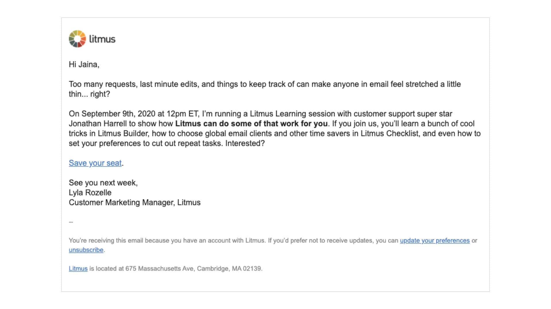
This is the simplest form of email design, as it is a text-only email without visual elements. No special features stand out in these emails, so they are easy to create.
Plain text emails are straight to the point and concise. However, they are not attractive, so users may find them boring. For this reason, they are only used for important emails, usually transactional, official, or informational.
Rich HTML email
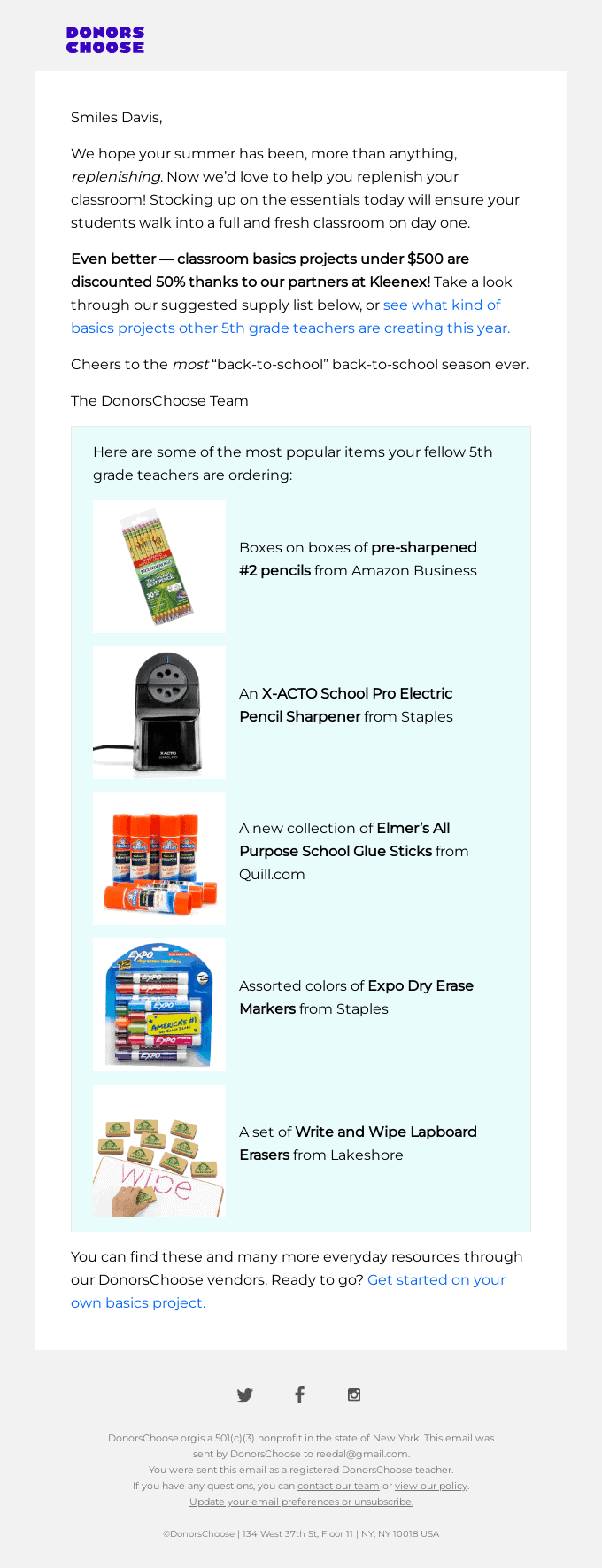
This is the most popular type of email design, as it involves more visuals, colors, and dynamic layouts. These emails are attractive, flexible, and visually appealing, as they are made with a mix of CSS and HTML.
Rich HTML emails are mostly used to showcase products and services and special offers and are sometimes used as welcome or thank you emails. However, they need extra design steps to make them responsive across devices and compatible with operating systems and email providers.
Interactive email
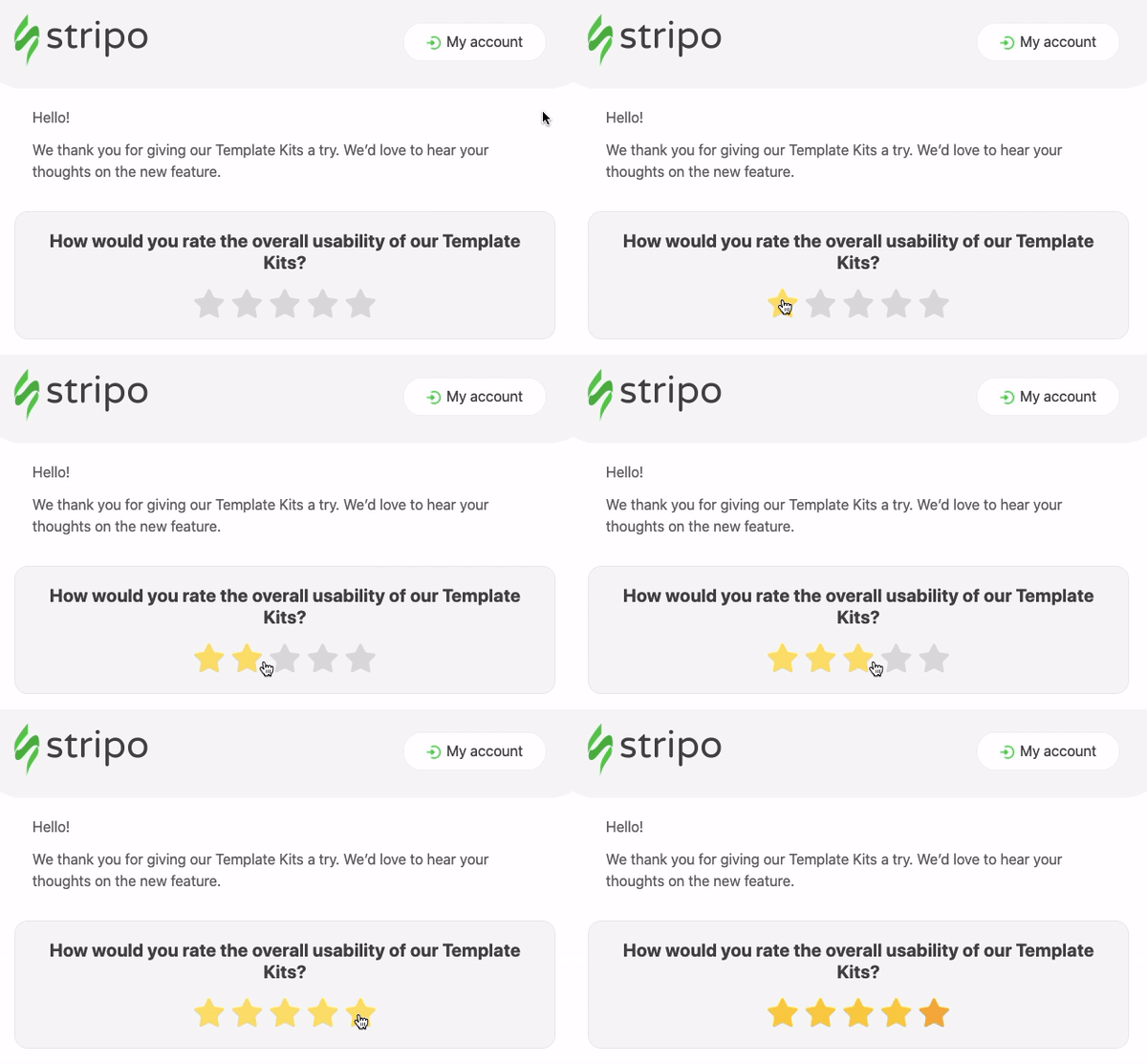
This is a new form of email design that uses JavaScript, in addition to HTML and CSS, to create interactive and visually appealing elements. It is engaging and is mostly used in promotional emails.
A downside, however, is they may not be compatible with some devices, operating systems, and email providers.
Creating Responsive Email Designs
Responsive email design involves creating content, layout, and structures that fit multiple devices and screen sizes, especially mobile. When emails don’t adapt to multiple screen sizes, they hurt the user experience, as readers may have to pinch and zoom to view several parts of the email.
More than trying to fit every element on a smaller screen, responsive emails show the most relevant and appropriate content tailored for each device type. So, your content or template is dynamic and changes to render correctly on multiple screens.
Here are some tips for creating responsive designs:
- Avoid cluttering hyperlinks since readers may find it difficult to click the right link on mobile
- Place the most important information above the fold
- Use alt texts for images and ensure they can be resized to fit smaller screens
- A single-column layout is preferred, especially for mobile devices
- Write short paragraphs with two or three sentences, and use an appropriate font size
- Ensure a text-to-image ratio of 60/40
- Preview your emails to see how they appear on other devices and platforms
- Carry out A/B testing to evaluate the performance of your design and spot opportunities for adjustments
Email Design Trends You Can Get Behind
The email marketing industry is ever-evolving, with marketers using creative strategies to make emails more attractive and engaging. Check out the following trends in email design:
- Interactive features
- Dynamic content
- Dark mode compatibility
- Augmented reality
- Email gamification
- Brand representation
- Animated GIFs and illustrations
- AMP emails
- Floating products
- Hyper-personalization and accessibility
Email Design Tools You Should Try (For Free!) Today
These tools and software packages support robust functionalities for crafting beautiful marketing emails, regardless of your business type, size, and model. Usually, they offer HTML editors to code your design.
However, many marketing teams have little or no experience in coding, so these programs also offer drag-and-drop editors that allow teams to move elements around easily. They also support prebuilt, customizable templates that let you create custom emails in minutes.
So, whether or not you have coding experience, you can still create attractive emails that will drive conversions. Here are some popular tools for designing engaging emails:
1. EngageBay
EngageBay is an all-in-one marketing automation and CRM platform that offers robust design functionalities for creating visually appealing emails tailored to your business needs.
Key features
- Rich text formatting
- Customizable prebuilt (HTML) templates
- Drag-and-drop email builder
- Email A/B testing
- Email automation
2. Mailmodo
Mailmodo is an AI-powered email marketing platform with interactive email features that allow you to create and send attractive, engaging emails.
Key features
- Coding free AMP emails
- Interactive emails
- Drag-and-drop email builder
- Pre-made email templates
- Dynamic emails
3. Stripo
Stripo is a simple email design software that enables you to build custom, responsive, and professional email templates that suit your business.
Key Features
- Drag-and-drop email builder
- HTML & CSS code editor
- Free HTML email templates
- Brand kit generator
- Font customization
Read also: Mastering Email Format: Essential Guide for Small Business Owners
Final Thoughts
Understanding the fundamentals and elements of email design lets you craft the perfect email for the right audience and occasion. A poor design can ruin your marketing strategy, even with a free offer. So, before you create your next campaign, ensure your email is well-crafted and tailored to convey your desired message.
Small businesses with small or inexperienced teams can use email design tools to create attractive emails from pre-built templates.
An email marketing tool like EngageBay supports robust email design functionalities and offers marketing automation capabilities, allowing targeted campaigns to run on autopilot. You can launch your first campaign for as low as $11.95 monthly.
What other tools do you use for crafting visually appealing emails? Let us know in the comments.
Frequently Asked Questions
Why is email design important for my marketing strategy?
Email design enables marketers to create attractive and engaging emails that compel readers to take action, leading to increased conversions and sales.
What are the best practices for responsive email design?
Best practices for responsive email design are:
- Use alt text for images
- Use a font size of 13-16px for text and 20-30px for headings
- Use single-column layout
- If you use templates, ensure they’re responsive
- Place important information above the fold
- Maintain a healthy text-to-image ratio
- Use a clear CTA button
- Use web-safe fonts
- Optimize images for multiple screens, viewport sizes, and orientations
What types of visuals should I include in my emails?
Visual elements include:
- Images
- Infographics
- Logos
- Banners
- Illustrations
- Icons
- Gifs
- Patterns
How do I choose the right fonts for my emails?
Factors influencing your font choice include legibility, branding, size, email type, and compatibility. Understanding how each applies can help you choose the most appropriate email font.
What makes a compelling call-to-action in email design?
A compelling CTA is clear, concise, action-oriented, and compelling. A button that stands out from other elements makes it accessible and clickable.
How often should I update my email design?
You can update your email design every six months or once a year, depending on the success of the existing design.
Are there any tools or resources to help with email design?
Email design tools include:
- EngageBay
- Mailmodo
- Mailchimp
- HubSpot
- Stripo
- Moosend
- MailerLite
- ConvertKit
- Bee
How can I test the effectiveness of my email design?
You can test your emails using Litmus, Mailtrap, or Email on Acid.
Can good email design improve my open and click-through rates?
Yes, a good email design can lead to increased conversions.
