Imagine you have thousands of customers seated in a large hall, waiting to purchase your product. A rough survey reveals they all have diverse interests and preferences. But you have one landing page and one opportunity to promote your product to attract most of the crowd. What will you add to that landing page?
From catchy headlines to 5-star reviews, irresistible offers, and attractive images, your landing page is set to amp up your sales and boost your ROI. But knowing how to use the right combination of these elements for business growth doesn’t always come by intuition – it comes by conducting a controlled and well-optimized A/B test.
This is why we’ve created this comprehensive article on landing page A/B testing. In this guide, you’d explore winning strategies to help you split test your landing pages, as well as, a few ideas to spice up your experiments — and essential metrics to track.
However, A/B testing is a tricky process, and mistakes are bound to happen, so as you read further, you identify these common mistakes and helpful tips to avoid them. Even more, there are a few case studies to show you how different brands used A/B testing to increase their landing page conversions.
But before we dive deeper, let’s explore the basics.
Table of Contents
What Is Landing Page A/B Testing?
An A/B test or split test for a landing page is a controlled marketing experiment that allows you to compare two versions of your page to determine the one with the best performance – in this case, a higher conversion rate. Basically, landing page A/B testing involves the following:
- Creating two landing page variations (A and B)
- Splitting your audience into two equal groups (50/50)
- Assigning one group to page A and the other to page B
- Running campaigns simultaneously at defined timelines
- Comparing results and choosing the best-performing page
- Documenting your findings
A/B testing reveals the ideal elements and practices influencing user behavior and actions. These changes could be anything from a color change, a minor copy rewrite, or a complete page redesign.
What’s the difference between A/B testing and Multivariate testing?
In A/B or split testing, you test only one variable at a time. For example, if you’re testing the impact of CTA buttons, all other page elements will remain the same on both variants while you zero in on the test variable to experiment with several formats and styles.
In multivariate testing, however, you can measure multiple variables at once. So, to determine the impact of headlines, copy, or images, you can create several variations of each to run in a single test.
Read also: 8 Exceptional Landing Page Examples And Why They Work
Why Do You Need to Test Your Landing Pages?
“If you double the number of experiments you do per year, you’re going to double your inventiveness.”
A/B testing supports practices that let you discover proven and tested strategies that increase your conversions and enhance user experience. Here are a few benefits of A/B testing:
1. Increases conversion rates
Landing page tests provide real-time insights into the factors that affect customers’ buying decisions. You can run campaigns that lead to higher conversion rates by identifying a winning variant and making strategic changes.
2. Reduces risks
A/B testing provides sufficient data to make calculated decisions based on user interaction and real-time data, thus preventing you from working solely based on intuition or third-party suggestions.
3. Improves user experience
As customers’ tastes and preferences change over time, you need to run a series of tests that help you identify these changes and create optimized offers. These tests enable you to track user behavior and discover hindrances like visual distractions, unclear call-to-action, confusing copy, poor design, etc.
For instance, over the years, Amazon has constantly improved its homepage to express its brand values, attract more users, and increase conversions.
Landing Page A/B Testing Elements
What should you test on your landing page?
A/B testing allows you to change only one (1) page element at a time. And these variations will include slight differences centered around the elements controlling user behavior and engagement – the modifications depend on your brand goals and values.
Check out these 10 elements you can modify in your next A/B test:
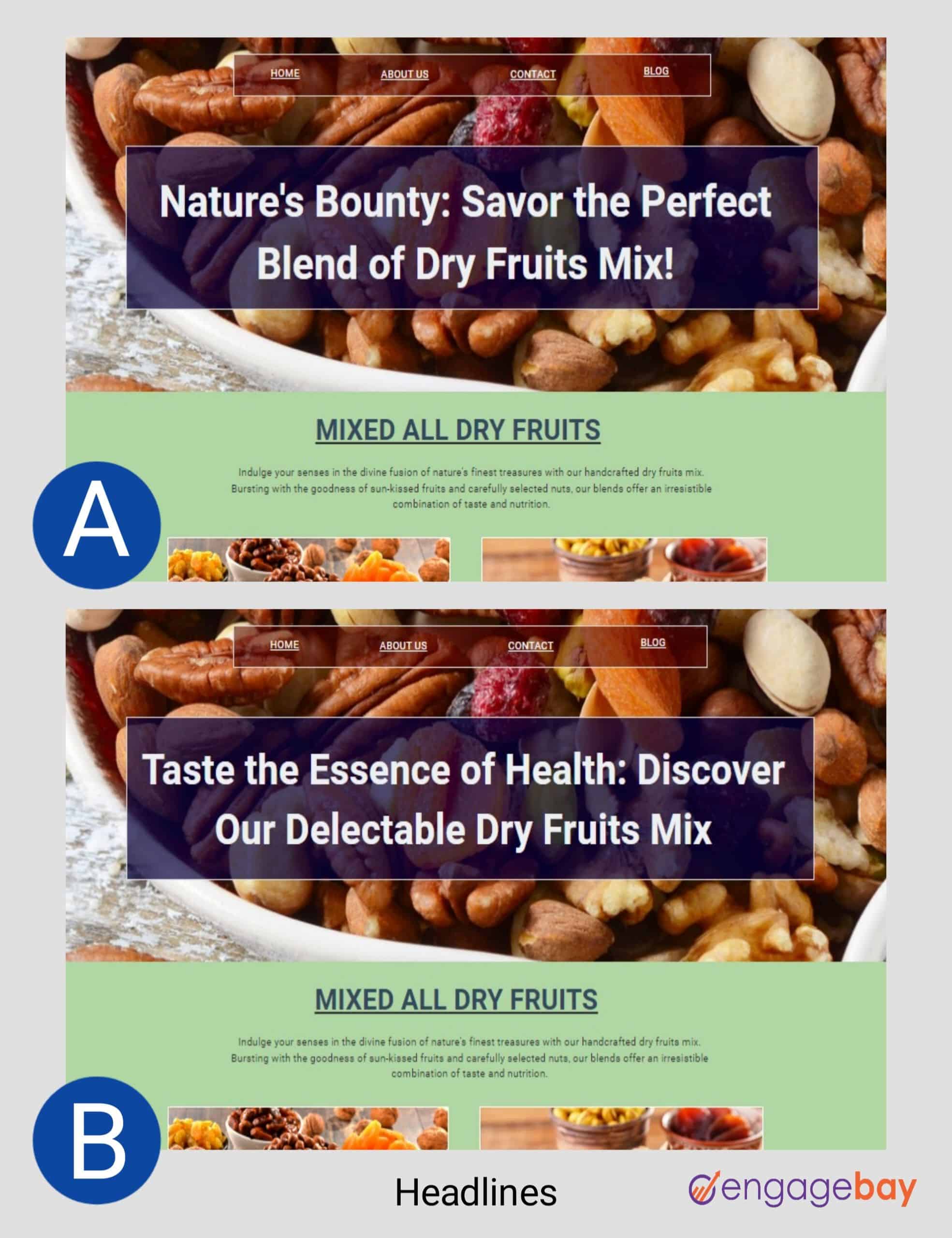
1. Headlines
Your headline is the first thing your readers see when they visit your landing page, so it has to be attractive, compelling, specific, and clear. Testing several variations of your headline will help you identify the best variant that will yield increased conversions.
So, here are a few approaches to try:
- Numbers, special characters, or emojis
- Title length
- Expressing positive or negative emotions
- Highlighting benefits or offers
- Stats, facts, or testimonials
- Asking questions
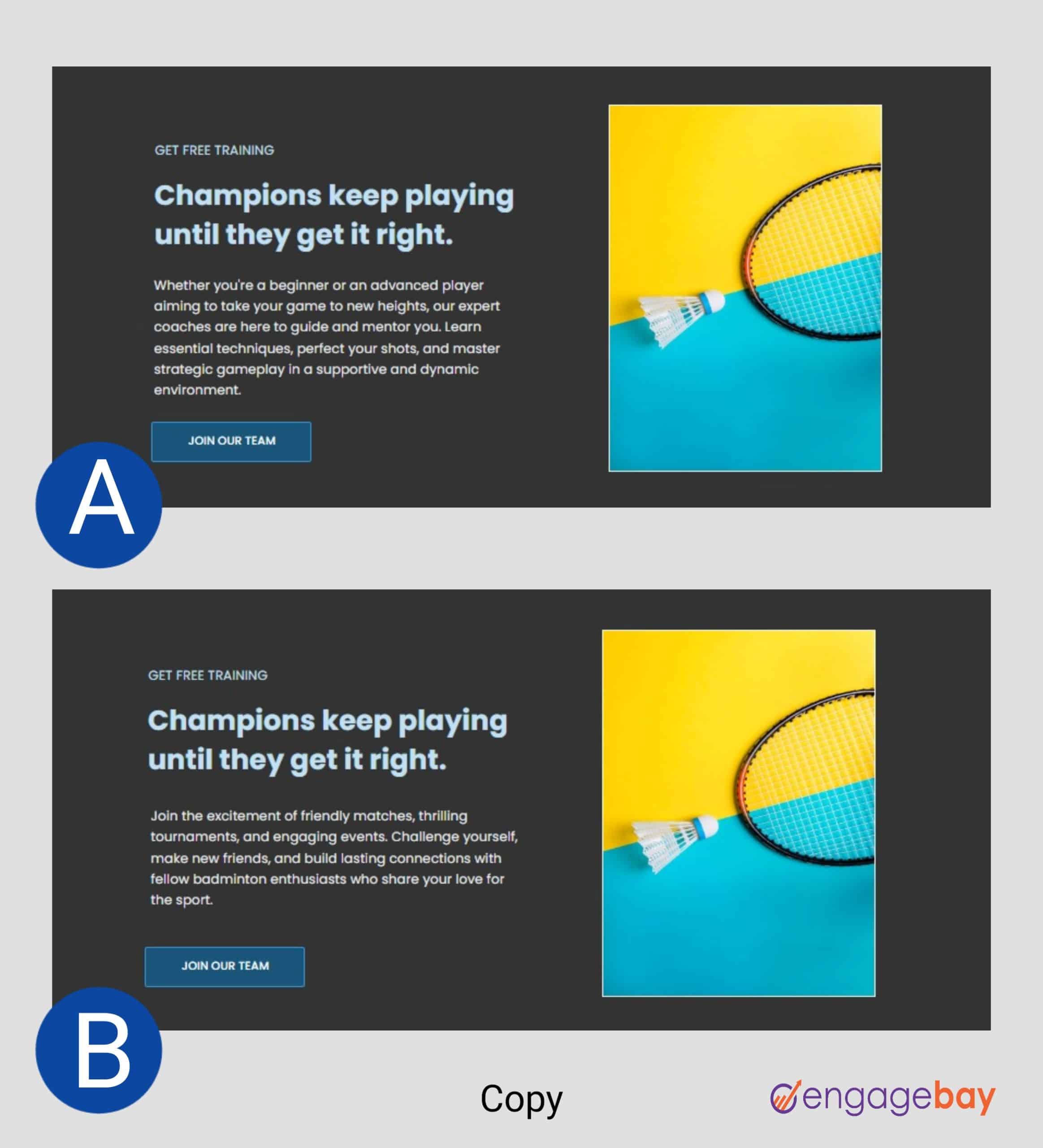
2. Copy
Unlike the headline, your copy is a more detailed representation of your values, proposition, message, and offers. A bland copy will always leave your readers confused and bored. What can you test on your copy? Try these:
- Copy length
- Different tones: casual or formal
- Reordering ideas, messages, features, and benefits
- Bullet points
- Several font types and sizes
- Different text formats
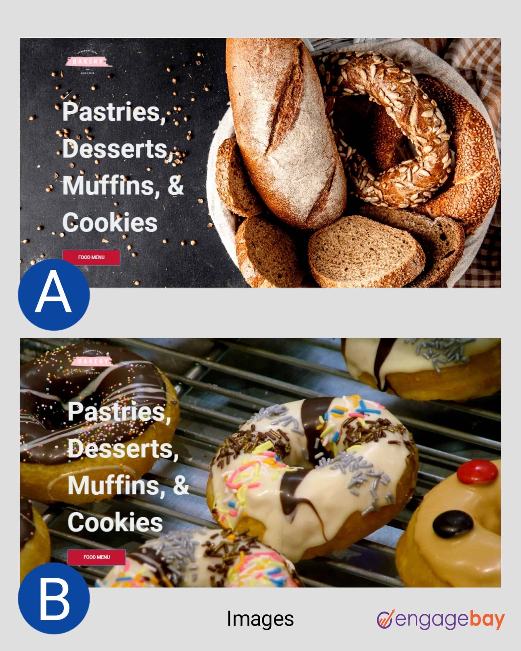
3. Images (hero shot)
The hero shot is the primary image or photo on a landing page – usually, it appears above the fold. This image could be a solid color, a photo of your employees or customers, a quote, an image of your product, or something abstract.
Testing several images – including videos – can help you determine your audience’s tastes and preferences.
Do human photos increase landing page conversions?
There’s no one-size-fits-all approach to optimizing your images (or hero shot) for increased conversions. However, the results of a few A/B tests reveal how human photos attract visitors and can increase engagement rates.
A clear example is an A/B test conducted by MedaliaArt, an online art store, to determine the impact of photos and paintings on user engagement. The result of the test shows a striking 95% increase in conversions.
So, should you use human photos on your landing page?
As shared earlier, your decisions shouldn’t be based on intuition alone. You can run an A/B test to find the perfect fit for your brand.
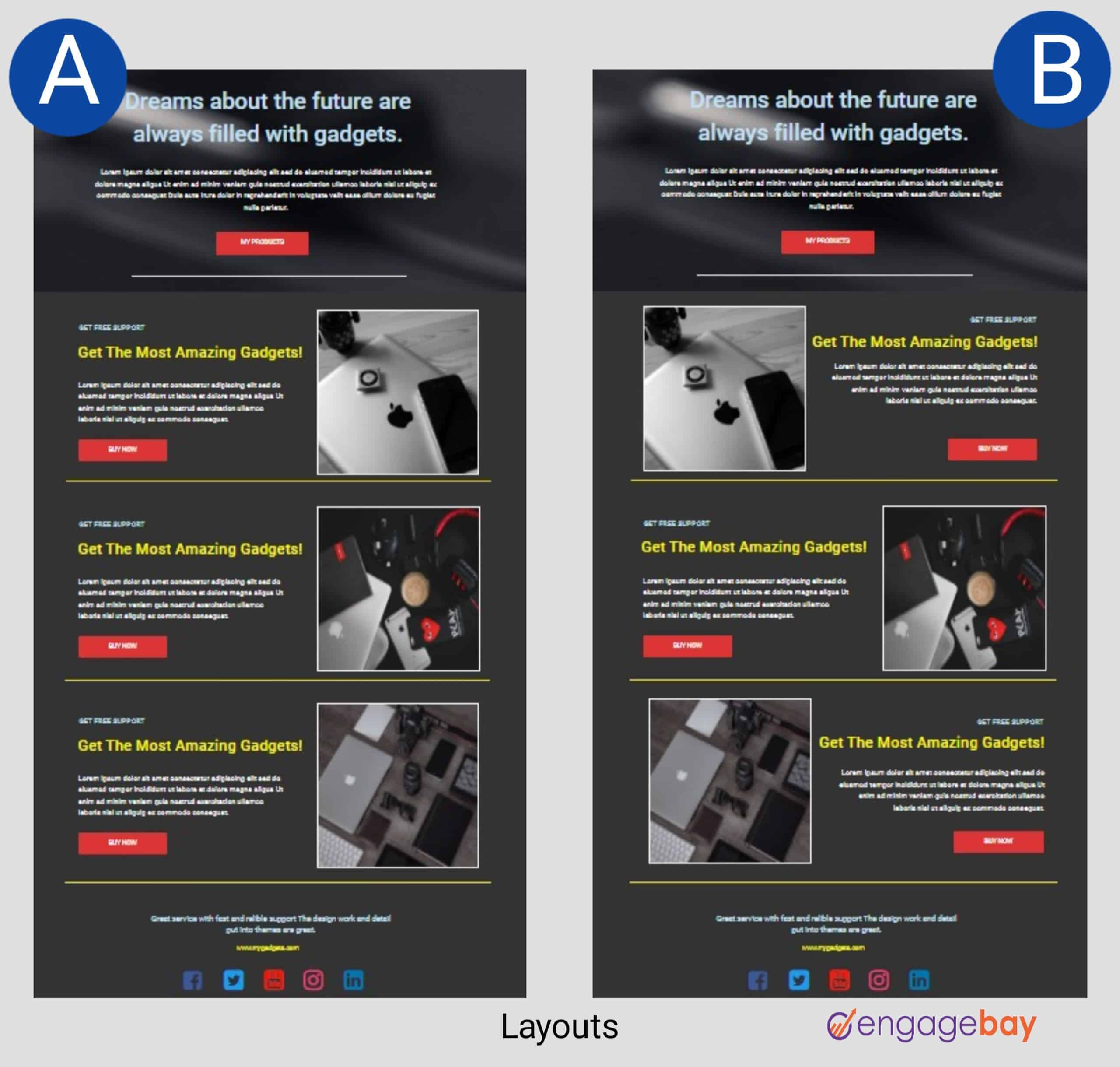
4. Layout
The layout is the structure, design, and arrangement of page elements. Experimenting with various layouts will help you create a visual hierarchy that influences what your visitors see. It will also enable you to improve navigation, accessibility, and overall user experience.
These changes include:
- Texts and image alignment
- Reordering elements
- Adding the CTA button above or below the fold
- Using carousels or static images
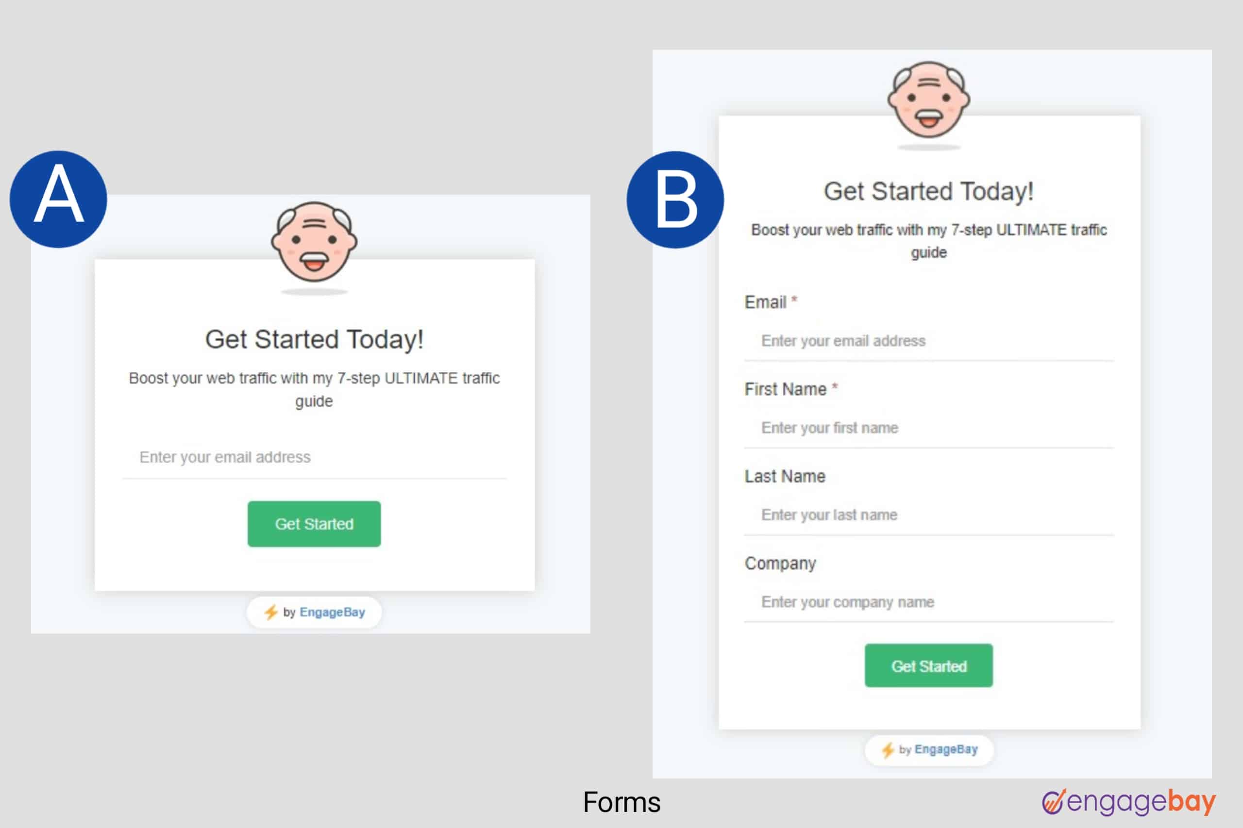
5. Forms
Without an opt-in form, you cannot capture your visitors’ details – you need these details to track and measure the success of your tests. So, how many fields should you add to your form? And what data does your company require for sales, marketing, and operations?
Generally, fewer form fields have been shown to increase conversion rates. But if your company requires more data, you may need to highlight the necessary fields. To test the impact of opt-in forms on conversion rates, try these approaches:
- Single or double columns
- Adding a progress bar
- Adding required and optional fields
- Trying several field labels
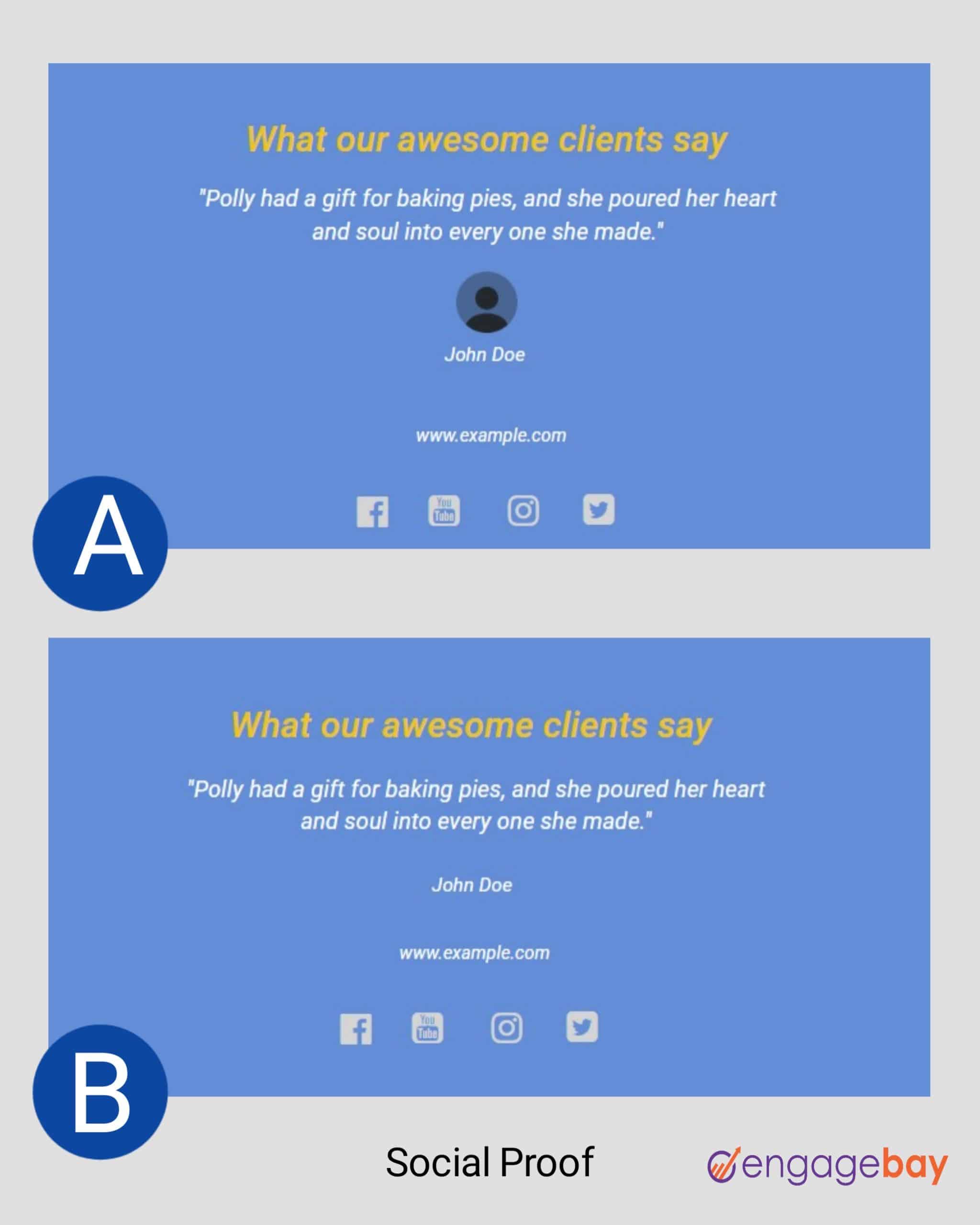
6. Social proof (Testimonials)
According to TINT, 72% of consumers believe that reviews and testimonials submitted by customers are more credible than the brand talking about their products. Adding social proof to your landing page increases your trust and brand perception.
Even more, it influences your customers’ buying decisions, as they’d likely buy from a brand with more recommendations than a new brand with fewer ratings. But what social proofs should you add to your landing pages? And how should you place them?
You can only find out after the test. Try these:
- Using badges, trust icons, star ratings, testimonials, client logos, or client/user count
- Adding client photo
- Using static or sliding images
- Adding the position and company of users/clients
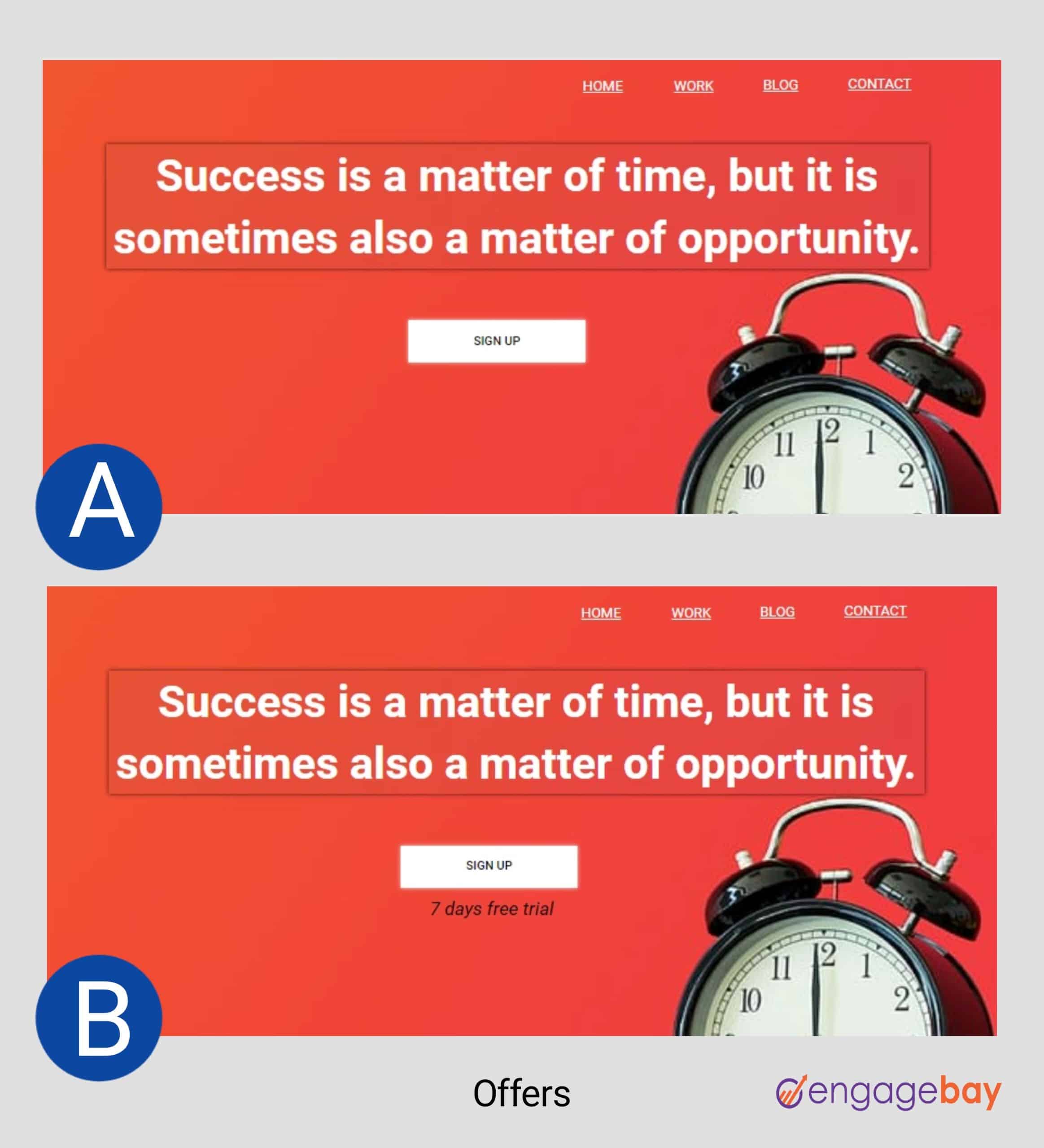
7. Offers
If your offer is not compelling enough, your visitors will lose interest – even with a powerful headline and copy. The offer includes what your visitors stand to gain when they purchase a product or sign up for an event.
So, making your provisions irresistible will compel your audience to willingly give out their details or make the purchase without feeling they’ve lost anything.
Check out a few changes that can help you choose the best offer for increased conversions:
- Adding a sense of urgency with phrases like “limited supply,” “early bird sales,” “offer expires in 3 days,” etc.
- Creating curiosity and the fear of missing out (FOMO)
- Adding special offers like free trials, presale bonuses, free shipping, discounts, free plans, etc.
- Using one-time offers like “Black Friday,” “Cyber Monday,” etc.
8. Pricing strategy
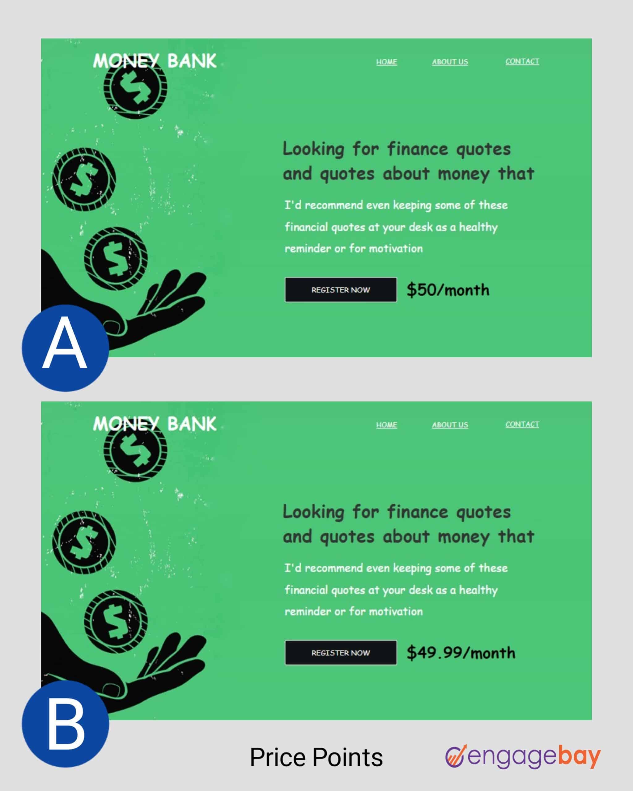
Prices can influence your user behavior and preferences. Also, a subtle difference in pricing can affect your brand perception and conversions, so you need an ideal pricing strategy to simplify the buying process and make your products easily accessible.
These variations can help you determine what pricing system works best for your business:
- Using decimals or whole numbers (e.g., $50 and $49.99)
- Testing a higher or lower pricing
- Adding several pricing plans (basic, pro, premium)
- Testing several font types and sizes
9. Conversion goal
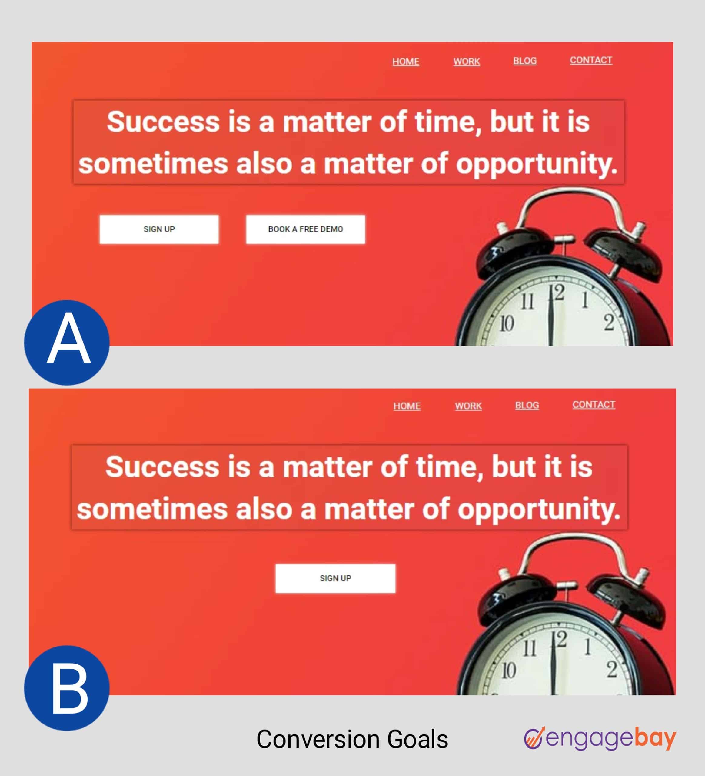
The conversion goal is the action you want your visitors to take after visiting your landing page. These actions depend on your business goals and objectives: Do you want more sign-ups or downloads? Should they schedule a demo or a 45-minute call? Are they buying your latest product or subscribing to a service?
Testing multiple conversion goals shows you what your visitors would prefer. You can add multiple goals to a landing page or stick to one goal per page.
In fact, studies have shown that multiple offers can decrease conversions by up to 266%.
10. Call-to-action (CTA) buttons
The call to action is the prime focus of your landing page and has a huge impact on your conversions. A case study released by VWO showed how The Vineyard, a luxury hotel company, increased their click-through rate by 32.12% after switching from text-based to button-based CTA.
Your CTA button represents your conversion goal and brings your offer to light, so it should be clear, concise, and compelling enough to make your visitors take the desired action.
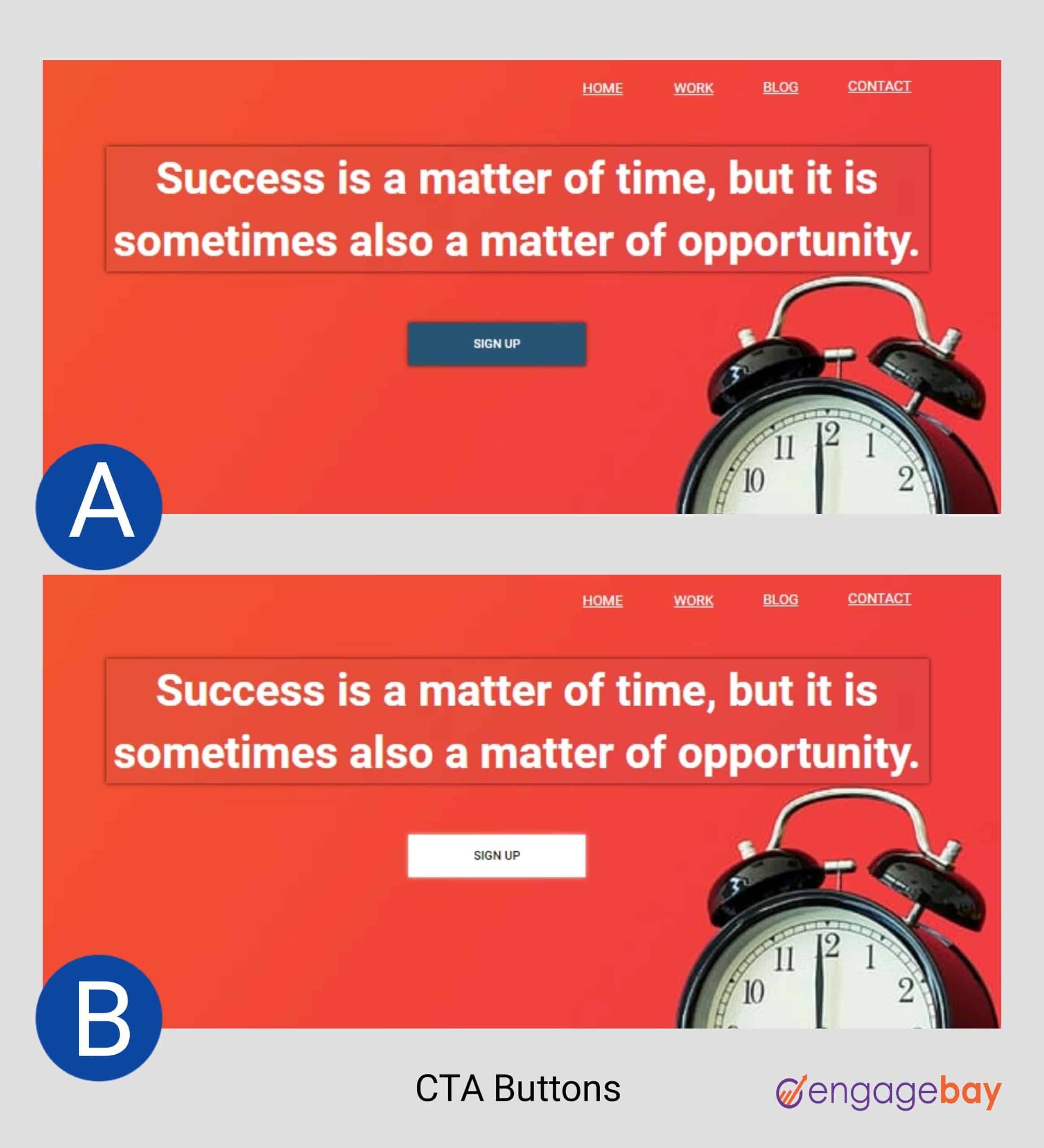
What is the perfect CTA button for your landing page? Create a test to find out. You can try any of these ideas:
- The button color and contrast (red, blue, yellow, etc.)
- Different font types and sizes
- A compelling CTA copy (“submit” or “Get Started” or “sign up,” etc.)
- CTA placement (above or below the fold)
- One or multiple CTAs
- Flat or 3D, plain or with a shadow
- With or without icon/emoji
Read also: 20 Of The Best Product Landing Page Examples Online
How To A/B Test Your Landing Pages [8 Winning Strategies]
Landing page A/B testing is a complex process that requires precision and accuracy, given that you have a wide variety of modifications to make. So, the accuracy of your results largely depends on your strategy and testing techniques.
However, there are specific measures to consider before running your test. They include:
- Your brand goals: Setting specific goals for your tests enhances your focus and eliminates distractions that may arise from secondary needs. Also, it reveals the actual impact of the changes you make, thus increasing your chances of producing more accurate results.
For example, your goals could be more sign-ups, downloads, or sales. Tracking all these at once in a landing page A/B test will produce cluttered data that can affect your results. - Traffic volume: You need enough traffic to help you randomize and split your population evenly. Assigning equal traffic weights to your landing pages will ensure balance, enabling you to deduce the ideal sample size for each test. This will increase your chances of producing accurate results.
- Test duration: The credibility of your results depends on the test duration. Running a short test can produce false positives or false negatives as there is insufficient data to obtain a statistically significant result. There is no specific test duration, depending on your business size and conversion goals. However, several free A/B testing calculators can help you determine your sample size and test duration.
Now that we’ve done the groundwork, let’s explore the strategies for running a successful landing page split test.
1. Create a data-driven hypothesis
According to Optimizely, a hypothesis is a prediction you create prior to running an experiment. It states clearly what is being changed, what the outcome will be, and why you think this is the case.
Eventually, the test results will either confirm or disprove your hypothesis. For example, your landing page contains an opt-in form with too many fields, and you predict that fewer form fields will increase your conversion rates – this is your hypothesis. When you run the test and the variant with fewer fields wins, it validates your hypothesis; otherwise, it nullifies it.
“A good hypothesis will ensure that you’re running a test for a valid reason, not just a guess or a hunch, and doing so aids in making your testing approach much more scientific.”
– Jon MacDonald, CEO, The Good
Using existing data from website analytics, customer feedback, or user engagement metrics, you can formulate your hypothesis in line with your business goals.
2. Create your variants
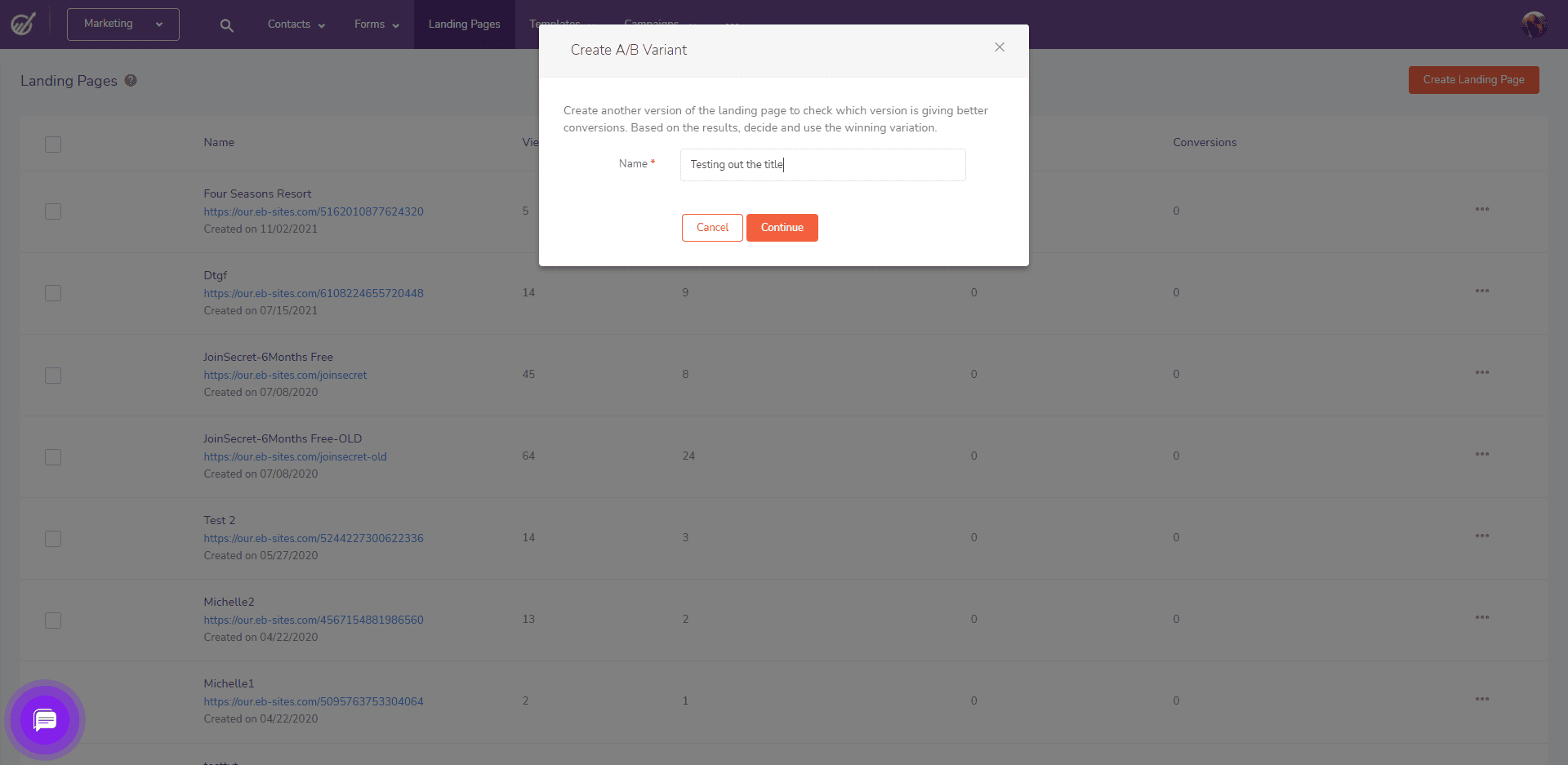
Whether starting from scratch or testing an existing landing page, you can create a different version with slight differences. The original or existing landing page is your “Control” while the variant is the “Challenger” that aims to validate or invalidate your proposition.
Unlike multivariate testing, A/B testing isolates an independent variable to test at a time. So, using the test ideas shared earlier, you can run a series of tests to identify the best-performing version.
3. Assign equal traffic weights to each page
Randomly split your traffic to your landing page variants so each group gets a specific version each time they visit the page. Your audience size can influence how much traffic you direct to each page and the results that follow.
It can also determine your sample size because you’d need a subset of your audience large enough to produce significant results.
4. Test both variants simultaneously
You need a landing page testing tool to conduct your test and track performance. These tools support a wide range of features like visual editors, customizable templates, real-time reporting, etc.
After creating your pages, begin the test by running both variants simultaneously. This is necessary to reduce the influence of external factors like seasonal changes and shifts in demand.
The test duration can also affect your results. If the timing is too short, you may not have substantial data to confirm or disprove your hypothesis. Instead, let the test run long enough to collect a significant sample size.
But how long is “long enough?”
The test duration depends on your business size and periodic traffic flow. Optimizely has a sample size calculator that helps you determine the ideal test duration.
5. Conduct surveys and polls
In addition to your test data, you also need to understand your user behavior and perception. Knowing why a user took a particular action will further help you justify your results.
So, getting real-time customer feedback will help you craft a rationale that explains the “why” behind the test.
6. Analyze your results
The results and metrics you track depend on your conversion goals. And by focusing on your primary goal, you can easily determine the outcome of the test. These goals can be anything from click-through rates to purchases, sign-ups, downloads, etc.
Your landing page testing tool provides substantial data that enables you to identify the performance of each page. These tools use heatmaps, session recordings, and form analytics to reveal how users engage and interact with your landing page.
But here’s the catch, while this data may show you the winning variant (based on conversion rate), it may not be substantial enough to produce a statistically significant result.
There are a wide variety of A/B testing calculators that let you determine if the results are enough to validate or nullify your proposition.
7. Take action based on your results
Whether there was an increase or decrease in conversion rates, the focal point of your test lies in the action you take. If the original landing page (control) wins, you can disable the variant and continue your existing strategy.
But if the challenger obtains more conversion and outperforms the control, it becomes the new version and control for future tests.
There are, however, instances where both variants obtain similar or insignificantly different results. In this case, the test is inconclusive, so you can either re-run the test or stick to the original version.
8. Document your findings
Documenting your results and findings will help you make smart decisions for future tests. By observing the losses and wins, you can create a series of data-driven hypotheses for specific marketing campaigns.
And over time, you’d have a comprehensive resource for your business, showing proven strategies that improve conversions at different timelines.
Read also: 15 Great Sales Page Examples (And Why They Convert)
Landing Page A/B Testing Key Performance Indicators (KPIs)
When you analyze the results of your landing page A/B test, what should you look out for? How do you measure your performance? And what are the benchmarks that indicate possible wins?
Generally, these metrics vary from industry to industry. So, based on your business goals and objectives, here are a few metrics and KPIs you can track:
1. Click-through rate (CTR)
The click-through rate is the ratio of clicks to impressions. It measures the rate at which your visitors click the links on your landing page. You can calculate your CTR by dividing the number of clicks by the total impressions, multiplied by 100.
For example, if your landing page generated 84 clicks and was seen by 1,200 visitors, you can calculate your CTR using the formula:
CTR = (number of clicks/number of impressions) x 100%
CTR = (84/1,200) x 100%
CTR = 7%
2. Leads
A lead is a person who has interacted with your brand and has shown interest in your products or services. Leads are potential customers, and though they aren’t ready to buy, you can nurture them by sharing helpful content and personalized offers.
Your leads include people who have downloaded your resource, signed up for a free trial, joined your waitlist, or subscribed to your newsletter.
3. Session duration
This is the time a user spends on your landing page during a single visit. It shows how long a user stays on your page from the moment they enter to the moment they leave or become inactive.
Ideally, longer page sessions indicate that your visitors find your page interesting and may want to take action.
4. Conversions
A conversion happens whenever a user takes an action on your page. Your conversions vary with your goals – sign-ups, downloads, purchases, clicks, etc.
5. Bounce rate
Your bounce rate shows the number of visitors who leave your site without taking any action: clicking a link, watching a video, signing up, etc.
Identifying the factors that repel your visitors and optimizing your pages to reduce friction will help you decrease your bounce rate.
Read also: 14 Stunning eCommerce Landing Page Examples (+ Tips)
Common Mistakes To Avoid While Running Your Landing Page A/B Test
With a good strategy, you can conduct a successful landing page A/B test. However, the process can be quite complex, and chances are, you may encounter a few obstacles that can affect your outcome.
So, before wrapping up, let’s explore a few common mistakes to avoid while running your test.
1. Stopping your test too early
The accuracy of your results depends on your test duration. This is because your audience will access your page at different periods.
So, estimating a longer duration will give your users more time to access and interact with your landing page. Stopping the test too early will not give you enough data to produce statistically significant results.
2. Testing with a small traffic
No matter how long your test runs, small traffic will not give you substantial data to validate or invalidate your hypothesis.
This largely affects smaller teams and may compel them to run the test for months to obtain a significant sample size before conclusion.
3. Testing too many variables at once
Running an A/B test requires you to experiment with only one variable to determine its impact on conversions. Unlike multivariate testing, A/B testing is more focused.
But when you try multiple variables in a single test, it will be hard to identify the single element that caused the increase or decrease in conversion rates.
4. Altering the test while it’s still running
Once the test starts, it’s necessary to let it play out before making any changes or adjustments.
Even if you have new or better ideas, changing the variables mid-test will give you a false negative or false positive result – like testing too many variables at once, it will be difficult to tell if the new or old variable impacted the conversions.
So, if you have other ideas, allow the current test to run and end before trying anything new.
5. Using your results to create a one-size-fits-all strategy
Your winning variant is only as powerful as the audience it appeals to. And although it may increase your conversion rate, it should not be used as a one-size-fits-all strategy.
Moreover, customers’ demands constantly change, so what worked in the first test may not work in the second. And while the champion variant attracted more users, the losing variant may have more valuable visitors that would likely convert.
So, while running your campaigns, remember you have visitors with varying interests and preferences.
Check this video out to learn how to create landing pages with EngageBay:
Examples Of Landing Page A/B Testing Success [Case Studies]
Here’s how different brands used landing page A/B testing to improve their conversion rates:
1. Bannersnack had a 25% increase in sign-ups by using a larger CTA button
Bannersnack, an online banner maker and design tool, needed to make improvements on their landing page. But without enough data to understand how users interacted with the site, they didn’t know what to change.
Eventually, they used Hotjar heatmaps to understand how users interacted with the site.
Before creating the landing page variants, they discovered they needed to make the call-to-action (CTA) button bigger and increase its contrast. The results: a 25% increase in sign-ups.
2. Imsider.ru increased form submissions by 10% by changing the headline
Imsider.ru, a Russian company, wanted to increase leads through sign-up forms, as only a few visitors were subscribing to the mailing list.
After changing the headline from “A step-by-step plan for opening your internet store*” to “Open your internet store in one evening,*” the challenger won and increased leads generated by 9.5%.
* Headline translated to English from the Russian language
3. Moving the form to the center increased the conversions by nearly 50%

Aaron Levy, the PPC account manager at SEER Interactive, conducted a simple A/B test for a client.
The original landing page (with the form at the right) had a conversion rate of about 11%. But after making the change and moving the form to the center, the conversion rate rose to 16%.
4. The original landing page outperformed its challenger

Sometimes, “best practices” may not always win. From the image above, version A got a 24% increase in form submissions by simply removing the image.
While images are great, they’re not the perfect fit in all conditions. In version B, the image pushed the form downwards, making it more difficult for users to access.
So, it’s best always to test and confirm the most suitable strategy for your brand.
Read also: Product Landing Pages and Everything You Need to Know
Landing page A/B Testing Terminologies
In this section, we’ll quickly go through the common words used in landing page A/B testing.
1. Challenger
This is the new variant (Page B) that aims to outperform the original page. It possesses all characteristics of the original page, except a slight difference in a single element.
2. Champion
This is the winning variant – the page with the highest conversion rate. Usually, it is seen as the control.
3. Control
The control is the original or existing landing page (Page A). And all tests will be run against the control to identify the impact of a single element on conversions. The winning element becomes the champion and control for the next test
4. Page element
A page element is a distinct unit on the page. It could be a form, button, block of text, video, or image. Also, you can create several variations of an element to test its impact on your conversion rate.
Read also: Tips And Inspiring Examples For Your Coming Soon Page
Wrap Up
When it comes to landing page A/B testing, data-driven decisions will most likely outperform your intuition. In meeting customer demands, you need to pinpoint strategies that work and others that have become obsolete.
That being said, A/B testing your landing pages is an iterative process, not a one-off experiment.
Conducting these tests occasionally will give you a competitive edge as you constantly evolve with the shift in customer demand. Also, you will have a comprehensive database filled with diverse strategies for producing positive results.
Once you’ve chosen your variables, try EngageBay’s free landing page builder to create and measure your test performance.
It supports features like contact segmentation, landing page customization, and in-depth reporting to measure click-through, bounce, and conversion rates.
Other tailored software tools for landing page A/B testing include Hotjar, Google Analytics, Optimizely, and UserBrain.
