You can have the best product in the world, but if your landing page is crappy, your visitors will leave.
It takes mere seconds to make an impression, and a landing page is one of the first things your potential customers will come across.
That’s why you need a great landing page.
So how do you create a perfect landing page that will incentivize your visitors to stay?
Don’t worry, we have got you covered!
In this blog post, we’ll show you:
- What landing page optimization means
- How to identify landing page optimization problems
- 10 of the best landing page optimization practices
Let’s dive right in!
Table of Contents
What Is Landing Page Optimization?
Landing page optimization refers to the process of improving the elements and contents of your landing page to enhance conversions. This is done through various testing techniques, data collection, SEO, and common sense.
In a nutshell, this is how you optimize landing pages: You can collect information and data through surveys and past metrics and use this to create a great landing page.
Once published, you can tweak your landing pages to perfection — one step at a time — and see your bounces reduce and your conversions increase!
Landing pages matter for your small business, too. Period.
This is because landing pages are a key component of your digital marketing strategy.
They capture leads and act as a prelude to how good your services are.
This video by Neil Patel explains the points that constitute a high converting landing page:
Great looking and functional landing pages show your leads that you care about quality, and by extension, customer happiness.
How To Identify Potential Landing Page Optimization Problems
First things first.
You don’t have to redo every bit of your landing page every time something does not work.
Before publishing or redoing your landing page, it helps to figure out problems that may arise. One way to do this is to predict your customers’ requirements and expectations.
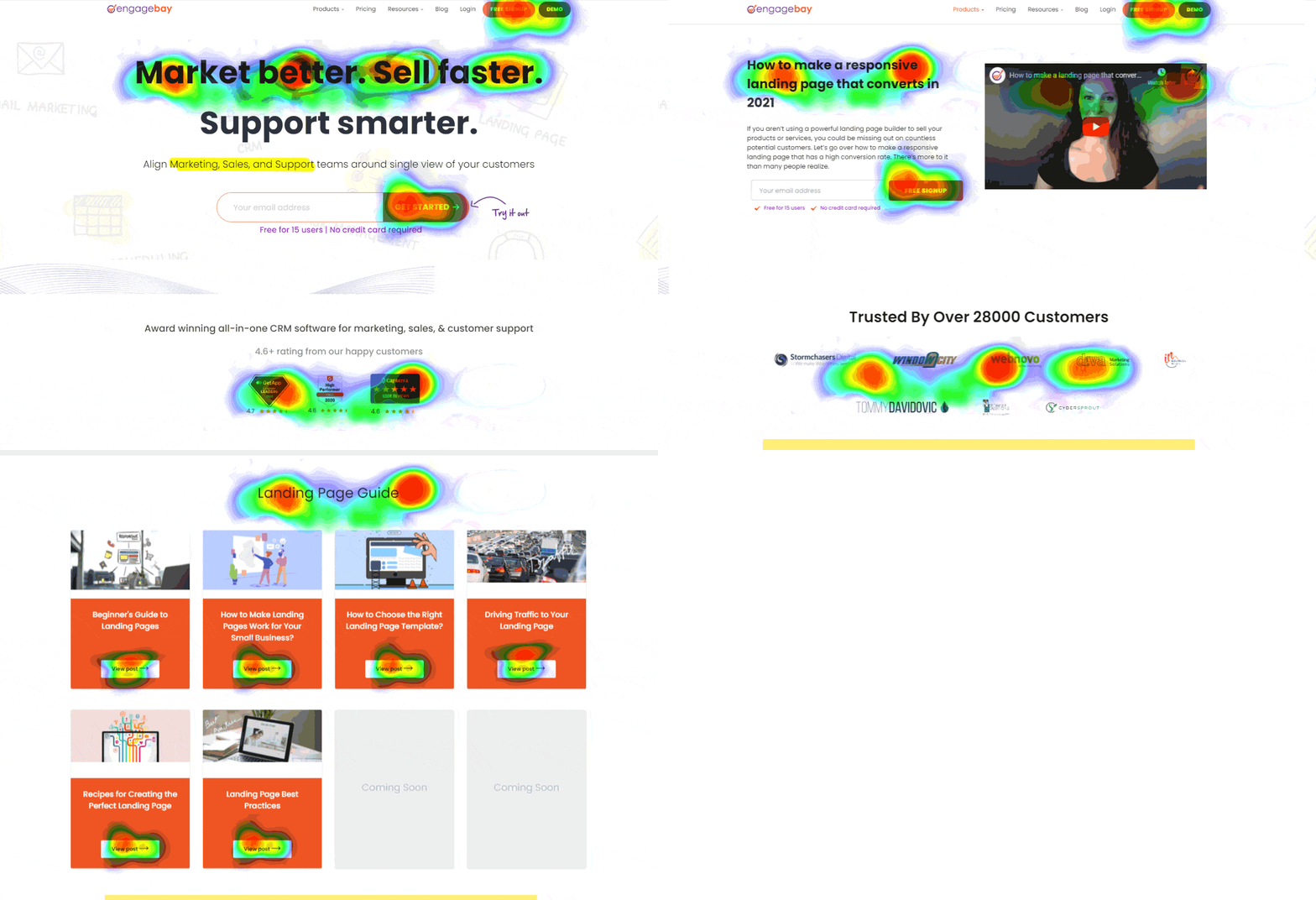
A heat map offers fantastic metrics about your website visitors.
Using a scroll map, you can see where your visitors have stopped reading or taking action.
If more visitors aren’t stopping on your CTAs, that’s your cue.
In addition, a confetti map can show you what your visitors are clicking the most.
Similarly, poor design can cause poor conversions.
If you have outstanding traffic but low conversions, your landing page may be suffering from bad UI, poor CTA placement, and unwanted content that distracts visitors from the page’s primary objective.
Once you understand such problems, you can focus on them individually instead of completely changing your landing pages.
10 Great Landing Page Optimization Practices
Great landing pages have excellent conversion rates. But the objective here is to keep improving your conversion rates and engaging website visitors.
Here, we’ve listed out the 10 landing page best practices for you!
- Keep your target audience in mind
- Focus on your CTAs
- Leverage testimonials
- A/B test your landing pages
- Perform an SEO (Search Engine Optimization) audit
- Improve the ‘above the fold’ part of your webpage
- Keep it simple
- Invoke FOMO
- Set up customer support
- Use exit popups
#1. Keep Your Target Audience in Mind
Here’s your first landing page optimization best practice.
Focusing on your customers’ needs can help you design a fantastic landing page and enhance conversions.
Your landing pages should make your potential customers and leads feel inspired, excited, and should offer a solution to their problems.
Find out how you can offer the ultimate customer experience right from the moment your page loads.
Also, you need to ensure that your landing page content is crisp, engaging, and free from grammatical errors.
Take a look at Apple’s landing pages, and you’ll know what we’re talking about.

Pro Tip: Focus on your customer’s goal, and use that in your headline. This will boost conversion rates and improve user experience.
Read also: Ultimate Insights For High-Converting Lead Capture Landing Pages
#2. Focus on Your CTAs
Keep your Call-To-Action (CTA) buttons crisp, clear, and open.
Your CTAs should not be placed in a way that is hard to access or confusing to the readers.
It’s best to stick to simple, easy to understand phrases:
- Start here!
- Join Now
- Click to download
- Subscribe
You also need to keep an eye on fonts and colors — the fonts shouldn’t be obscure, and the colors should not clash. Stay away from flashing CTAs and macros, as these are past trends and may look untrustworthy.
A great way to see how your CTAs perform is to use A/B testing. We’ll discuss more on this later.
Read also: 16 Best Email Marketing Software for Small Businesses
#3. Leverage Testimonials
There’s nothing more powerful than social proof.
No matter how great-looking your edited images are or how engaging your product video is, your visitors would want to know the experience of other users.
If your products or services have positively impacted your customer’s business or life, getting that out in the open can show others how valuable you are.
That’s where testimonials come to play.
Word-of-mouth works wonders for a reason. You can collect testimonials from your customers and add them to your landing page.
If you can add their names, photos, and social links, you’ll surely boost your conversion rate optimization and have the upper hand over your competitors.
Video testimonials are great social proof elements, too.
Read also: Best CTA Examples for Small Businesses To Learn From
#4. A/B Test All Landing Page Elements – And Keep Testing
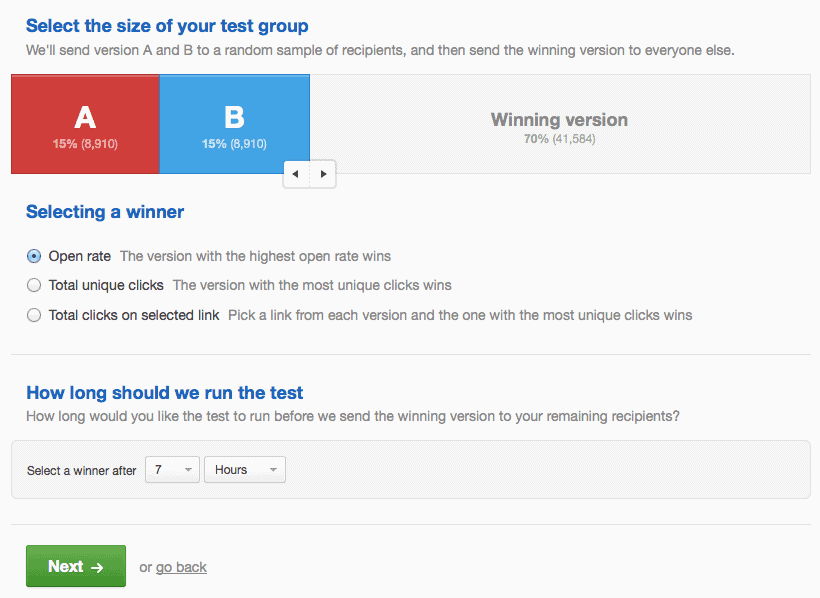
Also known as split testing, A/B testing lets you compare two versions of your landing pages (with one element tweaked or changed) to determine which one has better performance.
Here, you show the different variations of the same landing page to random visitors and monitor how they perform for different conversion goals.
The importance of A/B testing to enhance landing page optimization cannot be overstated.
A/B testing is a continuous process, too. The more tests you perform, the better your pages become.
Pro Tip: For each A/B test, change one element at a time. If you make multiple changes, you can’t pinpoint which change caused an increase (or decrease) in conversions. A/B testing offers a quality score and tells you which variation has improved the conversation rate — thereby engaging visitors better.
Read also: 7 Landing Page Optimization Tools For Smooth Conversions
#5. Perform a Landing Page SEO Audit
Your landing page should come up when people search for your brand’s name organically — ideally in the first result of the first page.
How do you do that? Through Search Engine Optimization (SEO).
Getting your landing page ranked on the first page of search results is a great way to boost your traffic, and consequently, your landing page conversion rate. But what you really need is targeted traffic.
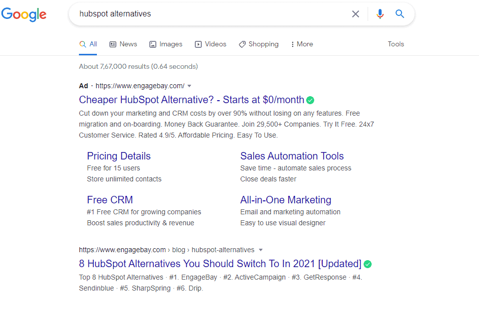
One great way to do this is to rank on search engines for industry-related SEO keywords. For example, EngageBay ranks first when people search for HubSpot alternatives.
Pro Tip: You can use landing page search engine optimization tools like Surfer or SEMrush. They offer keyword suggestions, and content audits to help rank your pages better.

#6. “Above the Fold”
Everything you see within your window when a page gets loaded is termed “above the fold.”
Everything else is “below the fold.”
Keep eye-catching and important information — including your heading and CTAs — above the fold. This is more important now as smartphone users may not even see your ‘below the fold’ content unless they scroll down.
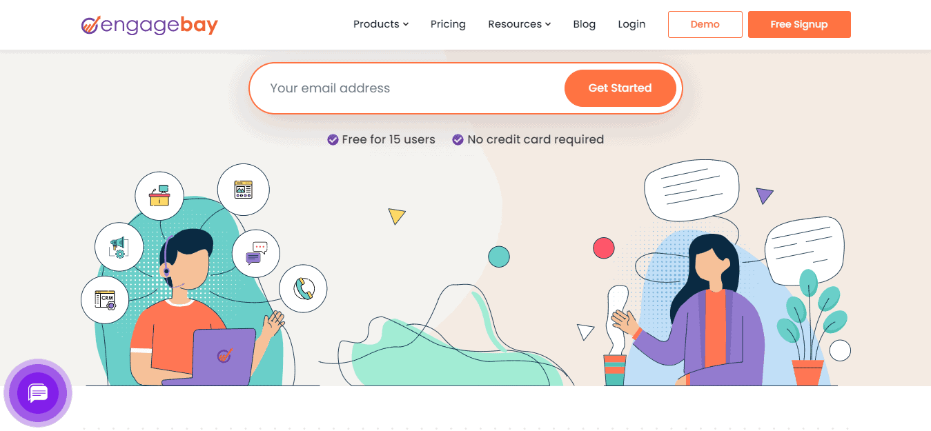
That said, don’t stuff everything in that small window. Ideally, you can have a headline, a CTA, punchy catchphrase, or a summary. Here’s an example:
Pro Tip: You can use a heatmap to discover the average fold size of your visitors and plan your landing page design accordingly.
#7. Keep Your Landing Page Simple
Minimalism is the new fad, and it makes sense to keep your landing page that way.
Too much information, moving parts, and colors can distract your visitors from the main objective: to make them click on your CTA.
Lyft’s minimalist landing page is one of our favorites. They have a simple yet eye-catching headline, their CTAs are above the fold and are clearly visible, and their color palette is consistent — reflecting their brand image.
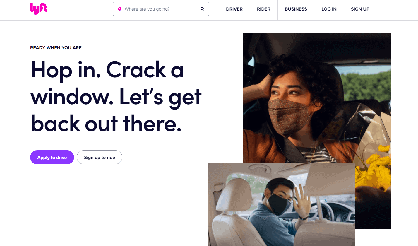
What’s more, a simple landing page can improve page speed score, bring the CTA button to the forefront, and help your pages rank better on search engines.
Read more: 12 Great Landing Page Optimization Practices: The Ultimate Guide
#8. Invoke FOMO
While optimizing landing pages, you can and should leverage FOMO to your advantage.
Fear of missing out can push visitors into taking action immediately.
This is why limited-time offers and ‘Until stock lasts’ promotions work so well.
Add promotions on your landing pages to attract visitors, but go one step further. Tell your visitors that they have only until midnight or the weekend to avail of this discount. Or try telling how limited the stock is.
Want to go even further?
Try a countdown timer just like e-commerce giants do on their special, limited promotions — and watch the magic unfold.
#9. Set Up Customer Support
In today’s world, customer support is indispensable.
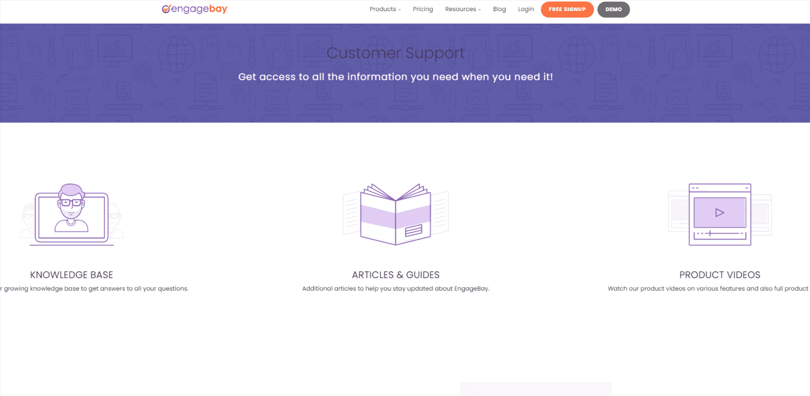
You need to have a sound customer support system, including a help center, a knowledge base, email, chat, phone support, and, if possible, a community.
Add contact information on your landing page, preferably in the footer section. Have your links to different customer support channels in a clear view so that your customers can contact you if needed.
Pro Tip: If applicable, add an FAQ section at the end of your landing page with important details related to your products or services. But don’t overdo it; 3-4 questions will suffice.
#10. Use Exit Popups
If your visitor decides to close the page, you can make one last stand.
How? Through the use of an ingenious landing page optimization feature called exit popups.
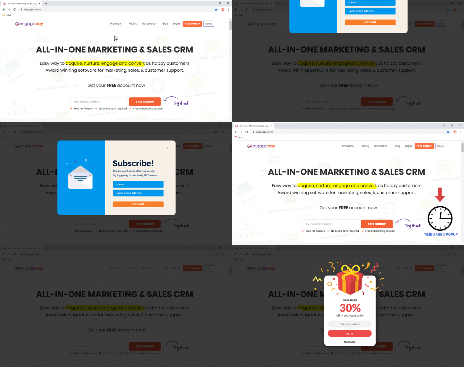
An exit popup shows up when the user is about to leave or close the page — and offers another chance to convert your lead.
Here, you can use some of the tips mentioned above to create a compelling exit popup. You can invoke a sense of FOMO by using a lead magnet and a timer or letting them know how many people have subscribed to your newsletter.
Here’s an example from EngageBay:
Exit popups are less likely to annoy users, especially when compared to full-page popups that appear as soon as a visitor opens the page.
Wrapping Up: Next Steps
Landing pages are a must-have for any business. Even if you are a small business, you need a high converting landing page, and that takes some effort.
We have shared a handy landing page optimization checklist with you in this blog post.
There are plenty of landing page optimization software in the market today, but not many of them are free.
For small businesses, EngageBay is the best landing page optimization software.
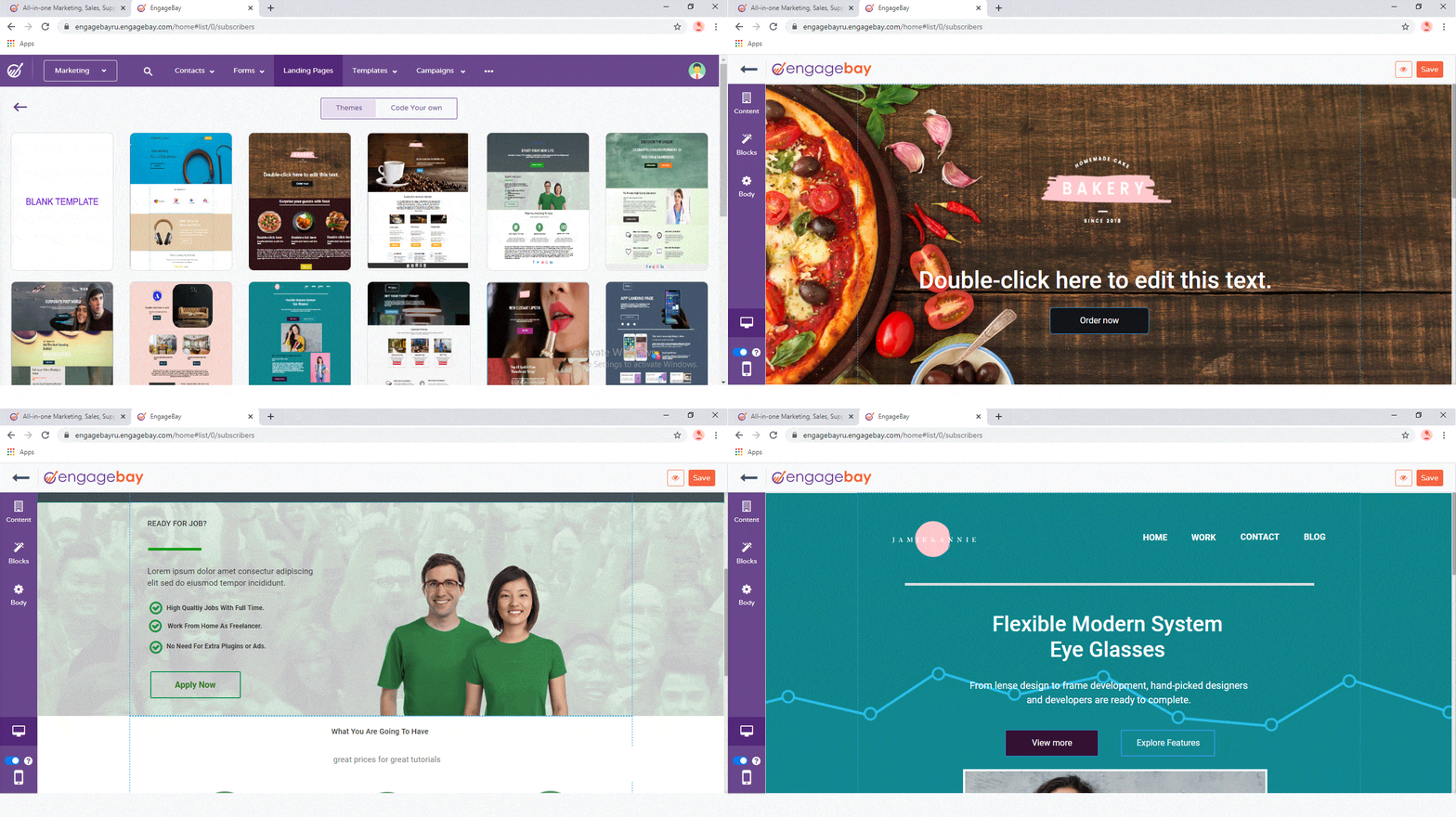
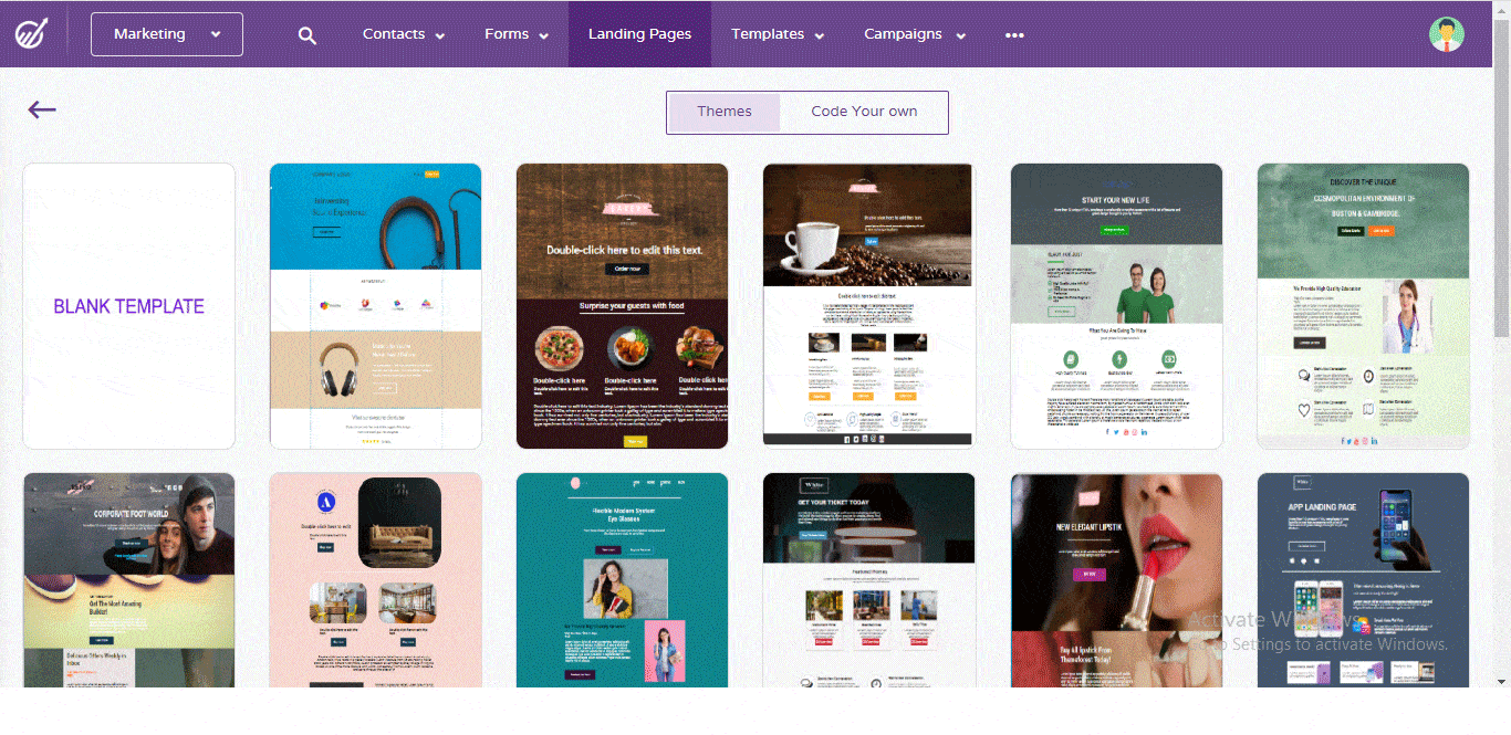
You get a drag-and-drop landing page builder that makes it easy to create eye-catching pages without writing a single line of code. EngageBay also has dozens of landing page templates to pick from and customize.
You also get A/B testing, audience segmentation, exit popups, email marketing campaign management, email forms, automated lead capturing, and social listening.
What’s more, you can even populate your landing pages with personalized content for enhanced conversions — essentially turning them into targeted landing pages.
But EngageBay is more than just a landing page optimization tool. It is a full-fledged marketing, sales, and customer service software, with an integrated CRM that remains free forever.
The best part? EngageBay is one of the most affordable CRM solutions in the market today. You can start with a free plan, but even the most advanced package costs just under $80 a month!


You should keep a few things in mind such as using clear and concise language to create content, placing your CTA buttons, tracking the performance, optimizing the images, videos, etc. You must fix these issues before it harms your business.