Did you know the first link you see when you search for a brand is most probably a landing page advertisement? And to be specific, these advertisements are product landing pages!
Wait, wait! Let’s start from the beginning.
You go to Google and look for a brand “XYZ”. A dozen web pages may resemble what you searched for, but you’re more likely to click on the first page the search engine showed.
Based on the information you see on this page, your willingness to buy from that brand may change.
This is why smart brands make a conscious effort at showing you what sells. They want to show you a web page that contains what you seek!
This is why they make a landing page.
This is the page they want you to encounter before you get to “learn more”, “buy now” or any other such CTA.
Depending on what the brand wants to accomplish with a landing page, there can be various types of it.
If the brand wants you to know about them, not one service they offer in particular but their values, mission, team, etc, they will rather pass their home page as the landing page. However, the motive behind these landing pages is very abstract.
Clearly they are not looking to sell a particular thing here.
What if you are?
In that case, you go for a product landing page.
A product landing page, to put it simply, is a page that gives you the relevant information you need regarding a product to make a purchase, and the information does not dwell so much upon the larger business, instead, the page stays very to the point and the main goal here is to boost the sales of that specific product.
Table of Contents
What is a Product Landing Page?
So, think of this page as a TV commercial, wherein big MNCs such as Unilever do not advertise themselves, but their products.
You would find a different commercial for Dove and very different from that would be the commercial for Lux.
Both of these are soaps under the label of Unilever, yet they get a very different treatment from the brand.
You would notice the message and tonality of both these soaps’ marketing is very different from one another as if they are completely different brands in their own sector.
This is precisely what a product landing page intends to do, make a brand out of your products.
Rather than spiraling down on the whole brand, you give each product a space to reflect its USPs independently.
Not only does it help your product get representation but it helps your business too. We’ll see how that works shortly.
But, if you have multiple products to offer, then most certainly, you should consider multiple landing pages for each good.
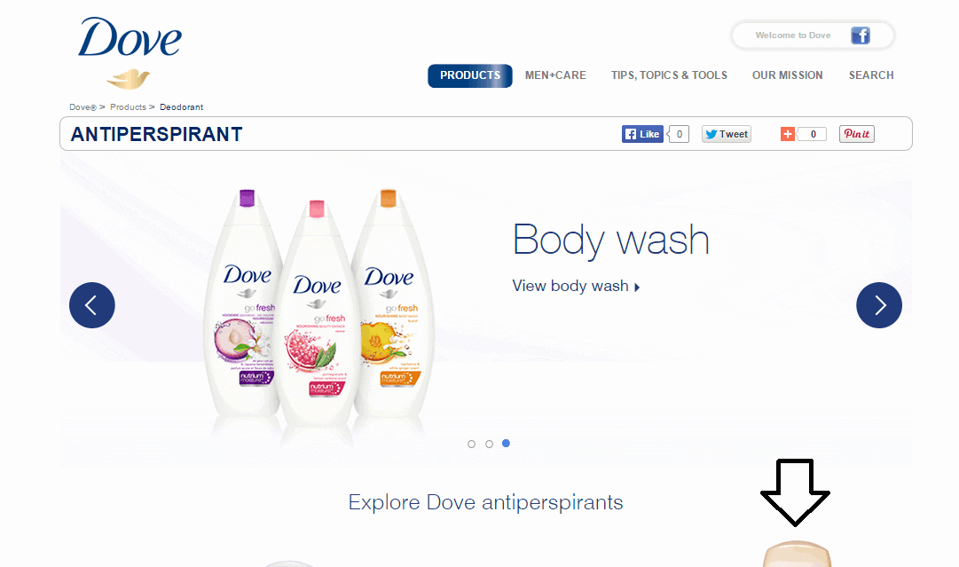
Just for your reference, here are two separate landing pages for two separate products from one company.
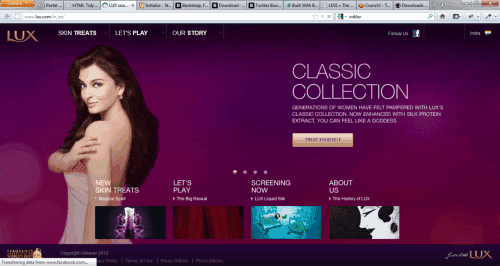
The first is of Dove, and the second is of Lux, as discussed above.
Image Courtesy: PPC. ORG
As you can see, this landing page is only focusing on antiperspirants, shampoos, body washes, and soaps provided by Dove. No mention of the larger brand, Unilver, or the other products such as Lux.
Now, when you look at the landing page of Lux, you find a very striking difference between the language, tonality, display, and you feel as if overall it doesn’t belong to one parent brand.
Thus, making both the products a brand of their own separate existence!
A brand like Unilever has an enviable global presence and so many products to market and sell.
Just clubbing them all together actually does more harm than good. You may save up on time and effort by just making a single webpage for all your services and goods.
That page may even serve well as your product catalogue or the product page. However, it would fail to deliver results given how cluttered, non-focused, and diverse it would be.
Such pages are great when you want to impress the customer with your variety and versatility, however, when you want to sell an item, you need to prove its worth. For that establishment, you also need more space and detailed showcasing.
A product landing page gives you that space to reflect each of your offerings with more details.
Unlike the other pages on your website, this page does not dwell upon the sidelines and “what’s more”. So, this draws a clear difference from the static web pages you have on your website.
One more thing, your landing page should not be present on your website. Wait, this might get confusing, so you might want to slow down and re-read.
Yes, the landing page should only be there when someone Googles a keyword you have made it for, the link should help them reach a particular CTA on your landing page. But if one user were to look for the landing page in your website, they shouldn’t be able to find it.
Having a landing page as a permanent part of your website could lead to ranking and SEO hazards, which you need to dodge!
In fact, this is why marketing experts recommend you make a separate landing page rather than using your home page for one!
However, most online businesses seem to have a bigger, more prominent doubt: Should you make a sales pitch or should you make a talk?
The idea behind both is to ultimately sell the product but should you just pounce on that goal?
Perhaps why, some marketers recommend going for a lead generation page instead!
👉Ready to create a winning sales page? Uncover the best examples in our extensive guide for inspiration! 🏆
How do Product Landing Pages Differ From Lead Generation Pages?
A lead generation page does exactly what it claims to do. You make a soft pitch here, we say soft because you do not actively try making a sale on the page.
You just want to showcase what is so great about your product or your brand. Remember that a lead generation page does not have to be just one-offering specific. So, you could just make a lead generation page that pertains to multiple products or your whole business.
So, the approach isn’t particular here. However, you do not have a very abstract style too with these pages. You know exactly what you are doing by putting that “Contact Us”, “Chat now”, or “Enquire” CTA.
You simply want the lead to show interest, plus if the lead does show interest, the first move will be theirs.
How do you get the lead to show interest?
You offer something on the page that lures visitors into wanting more.
You give them content that solves their problems. You offer them free magazines or newsletters regularly. In return, they just have to hit on that subscribe button. You can probably make a sales pitch here too, however, instead of a clear CTA for buying, you make it more relaxed and give them an option to “find out more”.
This way they get the content they want and you get another lead in your database.
However, on a product landing page, the approach has to be very focused from the start.
You have one product.
You speak of it for the major parts. While you can put your brand image to use, you can not make it the crux of the page. You can give them more options to contact you or get a demo, however, the end goal is just the sale!
There is not much beating around the bush with a product landing page.
Another major difference occurs with the CTAs.
You would see multiple numbers and purpose-serving CTAs on a product landing page.
Since the goal is to make a sale anyhow, the business doesn’t just give a “add to cart” button or “Shop it” button.
They would also give the visitors a chance to go for a “free trial” or “book appointment”. Furthermore, if your product comes in various colors, sizes, and variants, you may keep a “try now” button too.
This isn’t the case with a lead generation page. There are no CTAs prompting sales and usually, the CTAs found are strictly contact detail form popups or “subscribe now”, which both serve the same purpose.
You would also find that a lead generation page is more informative than its sales-oriented counterpart.
A sales page or a product landing page does not get the point of beating around the bush with technical jargon and bulky messages. It gets straight to the point and usually has a more short-and-sweet approach.
So, if you’re looking to give more information and fewer pitches, then you should probably go for a lead generation page.
But, since any business runs on money and not awareness solely, you should reconsider your choices.
Read more: Unlocking Success: 8 Exceptional Landing Page Examples And Why They Work
Why a Product Landing Page is Best for Conversions
Image Courtesy: Ittisa
Although you may feel inclined towards a lead generation informative subtle landing page, you should consider a product landing page even then!
Why?
There are certain merits to it; the following are a few reasons why product landing pages up to your conversion rate as no other formats do:
Shorter sales cycle
Yes, a lead generation page does not feel very direct and rather seems to be more awareness-focused. This may be a good point, however, there is a fallback! It prolongs your sales cycle.
Anybody who goes on that page and likes your offerings would not be able to buy something then and there. Even worse is the fact that sometimes the page wouldn’t even feature your products.
It may just be a page that helps them understand something or they may just give you their details never to pick up your calls. What this means is that in the end, you just have a deal to analyze, maybe not even a deal to pursue.
On the other hand, with a direct product selling page, you give them all the options. They want to know more, they can pick that option. They want to cut through the chase and just buy it, they can pick that option as well.
This implies a single landing page is most likely to suffice. You would not have to follow-up so much or you would not have to send them additional links to find your products or final purchase action.
Gives information that’s most relevant
Let’s admit the facts: Nobody has time on them! So, your lengthy detail-generous pages are just a waste of time from your end. Nobody’s going to read it fully anyway.
So, your best hope is to retain the attention of your users via catchy headlines and to-the-point descriptions.
This is why a product landing page makes sense because it only divulges the most needed information.
Read also: Top Website Header Examples to Inspire Your Design
Flexibility
You may think a product landing page is so towards sales that it refuses to make even the slightest diversion.
However, you can make sure that your product landing page gives your lead the most choices. Some of the best product landing page examples have 5-8 CTAs in a single page, ranging from a button to help your lead call you to a button that straight away leads to purchase.
Individuality
If you operate in the digital space or you run your e-commerce website, you quite possibly deal with diverse projects and products.
A mobile, a T-shirt, and a juicer can not be advertised together. They, pretty similar to other virtual assets, deserve individual spaces. Thus, you need a landing page made only for one product.
Ideal for product launches
When you launch something new in the market, you naturally want your contact list to know about that product. You need to find a new audience for your new product too. Both can be accomplished using a landing page that only dwells on the new product launch.
More broadly written pages would focus on the whole brand, thus, not making the impact your actual show-stopper needs!
A product landing page would just use the brand to make a name for the new baby. It doesn’t steal your product’s thunder, instead gives it a loud smashing entrance with higher possibilities for love and sales pouring on the product from the market.
Read more: Create A Buzz With Your Coming Soon Page: Inspiring Examples And Tips
Why your Product Landing Page Needs Optimization
Image Courtesy: BRANDON GAILLE
The simple answer would be COMPETITION!
The internet has become a fiercely treasured place, where business owners strive to be seen and bought.
However, this also makes it very crucial for your brand to optimize the presence it has on the internet.
A landing page, being your foremost ad, needs to be optimized too!
Here’s how you can do it:
Content
Optimizing your content does not just include putting the right keywords.
There’s more!
You need to ensure that your landing pages have crisp yet catchy text.
The headlines need to be super-attractive and relevant to your business. Furthermore, if you divide the contents of your page into sub-heading and pointers, your readers are more likely to find your page easy to read.
Not only will this help them understand your content, but it will also help retain the visitors. Always remember: Content is the king!
But never go overboard with it. Your page design should not seem too cluttered with too many words. You need to let the images, videos, and testimonials do the talking for you.
Read also: Best CTA Examples for Small Businesses To Learn From
Don’t hide out of stock items
This is a subtle thing, which could make a huge difference. A lot many businesses hide the items or worse the landing page when something goes out of stock.
You have to remember that’s not a permanent gap. Your supplies will be back, however, someone who searched for that product may not search for that again.
You need to give your leads the option to select “remind me when the item is back in stock” so that when your inventory is loaded again, these leads get a mail. You may be surprised to know how these mails actually registered over 40% conversion.
Not only will this plug-in make your brand more profitable but it might just improve your whole inventory management as well!
Give them options with CTAs
We have already discussed how a product landing page may seem like it just wants to make a sale, but in reality, it just doesn’t lose any opportunity of enticing your leads into converting someday.
This can be accomplished when you give your leads more choices.
Thus, you should consider involving more than 5 CTAs for each landing page.
However, remember that using way too many- say 7 or 9 might just spoil the chances. You should also ensure that no two CTAs nullify each other.
For instance, if you have one CTA to “call now” but right next to it is “Okay, show me something else”, you are confusing the lead.
Instead, your CTAs should complement each other, if a CTA for call action is there, you can leave another for chat or mail. In this way, you give your leads more options to contact you with.
Personalize the experience
No business is just one product. However, you can’t just scatter your people’s attention too!
What do you do?
You use one to better another.
If someone enquires about a hard disk, it is natural that your visitor may also find a pen drive interesting. For that matter, you can advise them to purchase a USB cable too.
You should use intuitive CRMs like EngageBay to offer these personalized suggestions to your customers, which not only helps them make better purchases but also get you more purchases too!
Use testimonials
You know what really sells a product? Your market rep!
How do you enforce that?
Show the new users who have just landed on your new product landing page how great your product is by showing them what other people, similar users like them, may have to say about it. Take any review, feedback, and testimonial you can from your present users.
Feature the most positive and relatable ones. Pay heed to negative feedback too as that is what helps you improve.
Mobile responsive
Did you know over 70% of prospects shop over their phones!
This means if your website does not look as pretty on the phone as it did on your laptop, you are no game!
You need to ensure your website is mobile responsive too. Better yet, get a mobile app developed, however, you should make sure that your user interface does not lag and rather provides your customers something fun and reusable.
Loading time
In the 21st century, nothing is running as short as patience.
If something doesn’t present itself within seconds, it would naturally be CANCELLED!
You don’t want that. Thus, you naturally do whatever you can to retain it. It, being your lead, would be repelled if your page doesn’t load too quickly.
Heavy files, spammed content, malware, non-indexed pages, poor landing page design are some reasons that could really increase the bounce rate on your product landing page. Make sure that none of these are hampering you, and be vigilant since these little pointers often seem harmless but they can really hurt your search rankings.
Do not redirect too much
“Buy Now” – when something looks as direct as this, you don’t want lazy surprises. But imagine, if upon clicking here, someone had to find out they have to register first. Maybe they register too, but then, they have to re-find that product.
You get the drill. Very many websites use these redirects.
No wonder, their sales do suffer!
With 5 CTAs on your product landing page, you are redirecting enough. Just make sure when people click on a CTA, they get what they clicked for within a few clicks.
A/B testing
What we have listed above surely help your SEO but how do you ensure that it would actually do your website favors?
You hit and trial!
Make two groups. Group A gets one version, Group B gets another. Whichever group converts more is your answer. This method is A/B testing. You can use it to examine which product images or page designs are working for you.
Use images and videos
Too many cooks spoil the broth!
And that’s what happens when you put too much content.
But, we get it! Your product is truly unique and you need to speak about the USSPs with great detail.
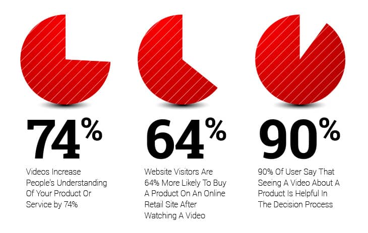
Let infographics, videos, and photos do the talking. If your product is a physical item – a cup, for instance, then, show more pictures of it to really establish its perfection. You should use features that allow a 3-D mapping of the product and zoom shots may help users get an up-close view.
Image Courtesy: Exitbee
What Types of Products Can You Sell With a Product Landing Page
As long as it’s a product that can be purchased online, it can be represented well on a product landing page.
Ecommerce guys need this, for sure!
However, people who do training online, workshops, courses, seminars, etc too could market their products here.
Service-providing and SaaS companies often use product landing pages.
If you want to be a hit in the online world, you would need to promote yourself. Or this very purpose, there are landing pages. Solo advertisements for all your products!
However, where and how can you make them is the only question left without an answer. Not anymore!
You need a smart tool, which doesn’t just build a landing page but does so with utmost ease and compatibility with your vision.
You need EngageBay.
EngageBay is an all-in-one incredible solution for all your marketing, sales, customer support, and CRM needs. What’s more, is that it comes with a super easy yet super-advanced landing page builder.
Here’s how you can build your product landing pages using EngageBay.
How to Design your Product Landing Pages Using EngageBay
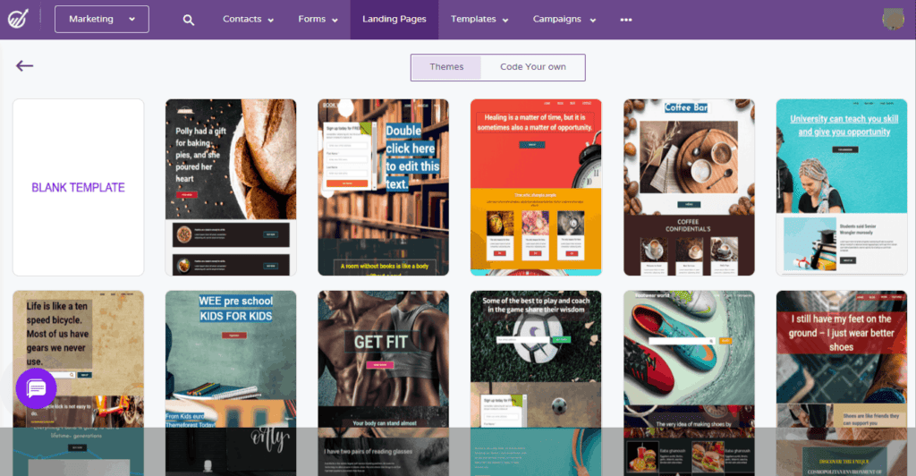
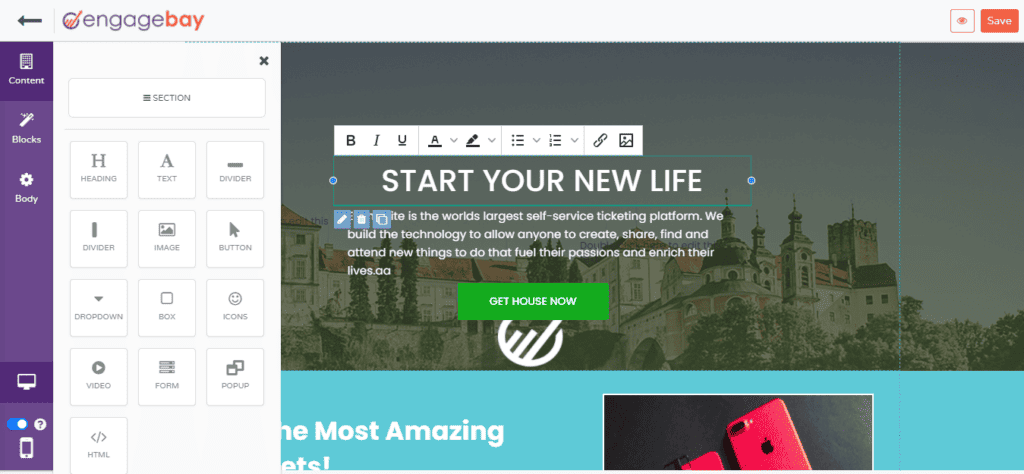
The first thing you need to do, once you log in, would be heading to “Marketing Bay”, where you’ll find the option to create a landing page. Select it.
We have dozens of beautiful ready-made landing page templates for you to choose from, however, you can also code and create your own template for a landing page.
Once you have selected a template, you will need to add text, images, reviews, etc. For this, you need to add elements to your page, which can be done by our quick and easy drag and drop editor.
All you need to do is drag the element to your page and drop it where you want it positioned; done!
You can go to our detailed editor to make aesthetic changes to your elements.
After finalizing all the elements, just click “save”.
By the way, be sure to check out EngageBay’s inbuilt form builder, which you can use to make even more responsive product landing pages. You can use this feature to make response pages or forms.
Now, go over to settings, where you can put your title, keywords, and other content enriched with SEO juice.
Now, what good is a product landing page whose results you can’t measure! We give you tracking facilities as well. Just enter your Google analytics or other evaluating code to viably track how your landing page is doing.
You also want to make sure every lead you have caught using the page stays, right! For this, you need to up your lead management; the leads your forms have got are viewable easily from the contacts tab.
All this and more, you can start today and take your business to newer heights.
Just click here!
Conclusion
The market, be it online or offline, is super crowded with too many look-alike products; you need to make a n impression. Make sure you give your products the right product landing page. They are the highest converting landing pages.
You could make use of great tools such as EngageBay to make a product landing page for your business.
