Ever wondered how your favorite restaurant manages to draw you in even before you step foot through the door?
Well, that’s the magic of a restaurant landing page! It’s not just a webpage; it’s your digital maître d’, enticing you with tantalizing offers and tempting menus, all designed to keep you coming back for more.
Effective restaurant landing pages are not just about aesthetics but are strategic tools designed to drive engagement and conversions.
So, are you ready to make your restaurant’s online presence pop? We’re diving into the world of restaurant landing pages, where design, content, and CTAs work together like magic to reel in hungry customers.
But it’s not just about looks — how you present your menu, shout out promotions, and engage with your audience is what really seals the deal. Stick around, and I’ll show you how to create a restaurant landing page that turns clicks into reservations and orders.
Let’s dive in.
Table of Contents
The Essentials of an Effective Restaurant Landing Page
Creating a standout restaurant landing page requires attention to detail and an understanding of what makes visitors click. Let’s break down the key components contributing to an effective online presence for your eatery business.
Best practices for restaurant landing pages
Here are four important factors to consider while designing a landing page for your restaurant.
- Simplicity: Do not clutter your landing page with too much information. Keep the website design clean and minimalistic, and use a simple and intuitive navigation menu to help users find what they’re looking for quickly and easily.
- Compelling copy: To stand out, craft enticing descriptions for your dishes — highlighting their unique flavors and ingredients to tempt your website visitors’ taste buds. Incorporate persuasive language to encourage user action, such as “Chef’s special menu for today,” “Get discounts on an online reservation,” or “Reserve your table to avoid waiting.”
- Standout CTAs (Call-to-Actions): Whether making a reservation, ordering online, or signing up for updates, ensure your CTAs are eye-catching and prominently placed throughout the page. Use compelling verbiage in your CTAs to communicate the benefit or outcome of clicking, such as “Reserve Your Table Now” or “Get 15% Off Your Order Today.”
- Mobile optimization: More than 55% of internet traffic comes from mobile devices. Mobile optimization improves user browsing experience by providing seamless access to ordering options, catering to the on-the-go needs of modern diners. Responsive design and streamlined layouts are essential for capturing and retaining the attention of mobile users.
- Fast loading speeds: Optimize images and content to reduce load times, as slow-loading pages can lead to higher bounce rates and frustrated visitors. Test your landing page across different devices and internet connections to ensure a seamless experience for all users, regardless of their device or location.
Designing for conversion
Designing a restaurant landing page for optimal conversion requires strategic use of elements. Here’s how you can ensure your design effectively engages visitors and entices them to take action.
- Quality content and design: To grab your visitors’ attention, ensure your content is visually appealing as well as informative and compelling. Use high-quality images of your dishes and ambiance, and write engaging descriptions to create temptation.
- Active voice in copy: Active voice can add to your user experience as it’s concise, easy to read, and authoritative. Instead of passive phrases, such as “Reservations can be made,” opt for more direct language like “Make your reservation now!” to encourage users to take action.
- Strategic placement of CTAs: It’s not just about including actionable CTAs; their strategic placement plays a crucial role in encouraging user actions. Ensure your call-to-action buttons are strategically positioned throughout the page, making them easily accessible and highly visible. Whether it’s an “Order Now” or a “View Menu” button, ensure they stand out and prompt visitors to take the desired action.
- User-friendly navigation: Keep the navigation simple and intuitive, allowing visitors to find what they’re looking for easily. Whether navigating the menu, making a reservation, or learning about special promotions, ensure their browsing journey is seamless.
- Incorporate testimonials and reviews: Customer testimonials and reviews are powerful tools for building credibility and trust with potential diners. Incorporating these social proofs into your landing page can significantly influence visitors’ perceptions of your restaurant. Highlighting positive experiences and accolades can reinforce your reputation and encourage visitors to take action.
- Location and contact details: To build trust, provide your restaurant’s accurate location and contact details. Including a map feature, such as Google Maps integration, allows visitors to visualize your location and plan their visit easily. Additionally, prominently displaying contact information, including phone number and email address, ensures accessibility for inquiries and reservations.
Read also: Top 5 Restaurant CRM Software You Should Consider Using
Crafting Your Restaurant Landing Page Content
Your landing page content is the heart of your restaurant’s online presence. Let’s delve into key strategies for crafting compelling content that drives engagement and conversions.
1. Showcasing your menu
You can stand out from your competitors with unique menu offerings. An online menu serves as a doorway to your culinary world, offering potential customers a tantalizing preview of what awaits them. It provides crucial information about your dishes, prices, and dietary options, helping customers make informed decisions.
Here’s how to present it compellingly:
- Effective sales pitch: Your menu should do more than just list dishes—it should tell a story and sell an experience. Use descriptive language to highlight your most enticing offerings, tempting visitors to indulge in your cuisine. For instance, you can create a ‘Chef’s Special Offerings’ section in your menu. This tempts them to try something different than the regular food items. Most restaurants also incorporate the story behind every cuisine and dish name and mention the ingredients used. It helps tell a story and keeps your customers hooked.
- Visual appeal: Incorporate high-quality images of your dishes to enhance visual appeal and whet appetites. A study showed that adding professional photos to a restaurant app can increase sales by 30%. In fact, you would see that it’s a common practice in US restaurants and casual dining places to include food images next to the dish name. Invest in professional photography to elevate the perceived value of your menu items and entice customers to dine with you.
2. Engaging customers with promotions and sign-up benefits
Promotions can be a powerful tool for attracting more customers to your restaurant. A study conducted by Dr. Paul J. Zak, a professor of neuroeconomics at Claremont Graduate University, sheds light on the impact promotions can have on our brains.
Interestingly, participants who had received restaurant discounts reported feeling 11% happier than those who didn’t.

Let’s look at how you can leverage promotions effectively:
- Offer a limited-time deal on your landing page. Incorporate a visual countdown timer to create a sense of urgency, signaling that time is running out and guests may miss out on the offer. This can prompt visitors to seize the opportunity, knowing they have only a short window to act.
- According to a survey, 26% of respondents expressed willingness to pay more for special menu items. Capitalize on this opportunity by introducing limited-time menu offerings with high-profit margins.
- Happy Hours promotions offer discounted prices on select food and drinks during specific hours of the day, typically in the late afternoon or early evening. These promotions attract customers during off-peak hours and create a lively atmosphere, encouraging increased foot traffic and boosting overall sales for the restaurant.
- Encourage visitors to sign up for your mailing list or loyalty program by offering exclusive benefits such as discounts, birthday treats, or VIP access to events. Highlight these perks prominently on your landing page to entice customers to join your community.
How you strategically showcase your promotions on your landing page can affect your conversion rate.
3. Collecting leads and making reservations easy
Streamlining the reservation process and collecting customer information is essential for nurturing leads and converting them into patrons. A restaurant landing page provides the best opportunity to convert your visitors. Here’s how to make it seamless:
Techniques for collecting customer information:
- Embed forms on your landing page to collect essential customer details such as name, email, and contact number.
- Offer incentives for customers to provide information, such as exclusive discounts or access to special events.
- Keep the forms concise and easy to fill, minimizing the required fields to encourage participation.
- Incorporate checkboxes for customers to opt into your mailing list or loyalty program, allowing for seamless lead generation.
- Ensure the security of collected data by implementing SSL encryption and clearly communicating your privacy policy.
- Integrate social media login options for added convenience, allowing customers to register or make reservations with their existing accounts.
Techniques for a seamless reservation process:
- Integrate a user-friendly online reservation system directly into your landing page, allowing customers to book tables with just a few clicks.
- Give options for selecting preferred dates, times, and party sizes to streamline the booking process.
- Offer real-time availability updates to prevent double bookings and ensure accurate reservation confirmations.
- Send immediate confirmation emails or SMS notifications to guests upon successful booking to avoid any uncertainties.
Read also: What Is Restaurant CRM Software & Which One Suits A Small Business?
Inspiring Restaurant Landing Page Examples
If you’re looking for inspiration to elevate your restaurant landing page, here are some standout examples that excel in design and functionality, offering visitors a seamless experience from start to finish.
Dishoom
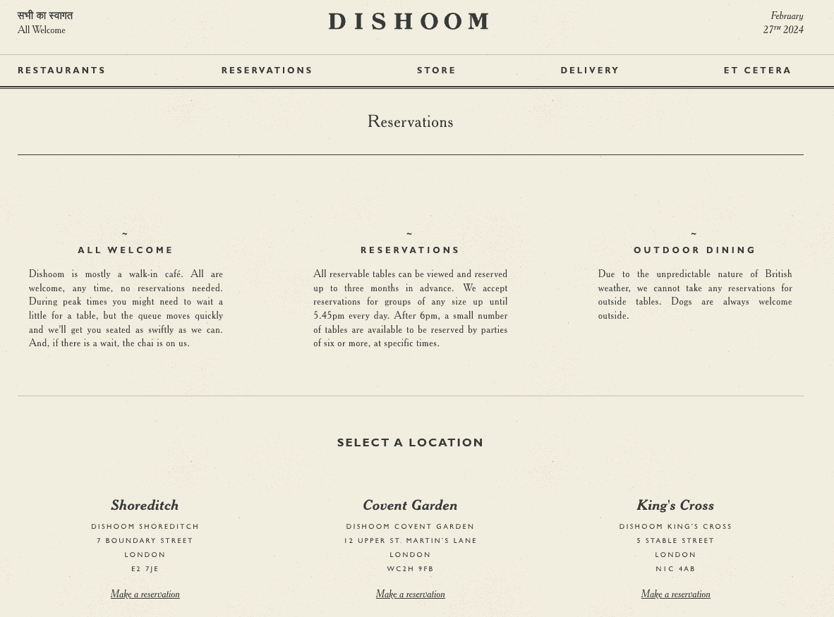
Dishoom is a renowned chain of restaurants inspired by the Irani cafes of Bombay, serving up delicious Indian cuisine with a contemporary twist.
Dishoom’s website is straightforward and has a minimalist aesthetic, focusing on essential elements like menu options, location details, and reservations. The website provides visitors with the most crucial information they need, such as the restaurant’s story, product offerings with high-quality images, opening hours, and contact details.
Its landing page has intuitive navigation, making it easy for users to find what they want. The restaurant website theme matches well with the type of gourmet they offer, with a vintage-style food menu.
Read also: 8 Perfect Email Marketing Software for Restaurants in 2024
Maple
Maple stands out by keeping distractions to a minimum—they draw attention to what sets them apart, enticing visitors to explore further. Upon landing on the homepage, visitors are greeted with stunning visuals of the restaurant’s delectable dishes, creating an immediate sense of anticipation.
The menu is elegantly presented, and they have a gallery full of vibrant images of each dish, tempting visitors to explore further. Seamless integration of a booking system allows guests to order online with ease. Engaging storytelling elements share Maple’s culinary journey, keeping their visitors hooked. Maple’s restaurant landing page layout fits well with the visuals, creating and appetizing atmosphere.
The French Laundry
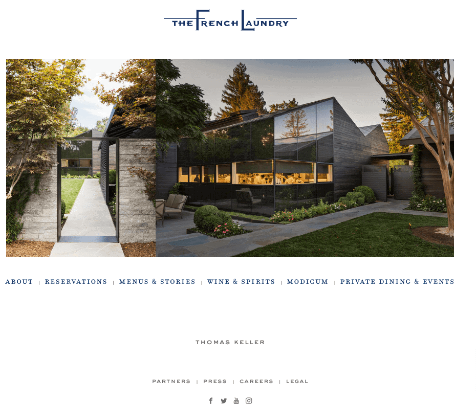
The French Laundry landing page epitomizes elegance and sophistication, mirroring the renowned fine dining experience offered at the restaurant itself.
The design exudes a timeless charm, with a classic color palette and refined typography reflecting the restaurant’s upscale ambiance. Clear calls-to-action for making reservations or exploring the menu are strategically placed, ensuring a seamless user experience.
Through its website, The French Laundry effectively conveys its commitment to culinary excellence and impeccable hospitality, enticing visitors to indulge in a truly unforgettable dining experience.
Read also: How to Write Your Restaurant Business Plan
Wrap Up
Crafting a restaurant landing page doesn’t need to be daunting. You can elicit strong online responses from your prospects by integrating key elements like high-quality images, compelling CTAs, and more. To build a highly converting landing page for your restaurant, explore EngageBay’s landing page builder today.
Elevate your online presence effortlessly and captivate your audience with enticing visuals and persuasive messaging. Don’t miss out on the opportunity to attract and engage potential customers—unlock the potential of your restaurant’s online presence now!
Sign up with EngageBay for free, or book a demo with our experts.
Frequently Asked Questions (FAQ)
1. What is a restaurant landing page?
A restaurant landing page is a dedicated web page designed to showcase a restaurant’s offerings, promote its brand, and encourage visitors to take specific actions, such as making reservations or ordering online. It serves as a digital storefront, providing essential information about the restaurant’s menu, location, contact details, and promotions to potential customers.
2. How do I create a restaurant landing page?
Here are a few key elements to consider while building a responsive landing page:
- Quality content and design
- Strategic placement of CTAs
- Active voice in copy
- User-friendly navigation
- Incorporate testimonials and reviews
- Location and contact details
3. Why does my restaurant need a landing page?
A landing page for your restaurant is essential as it allows you to embed forms for collecting customer information, enabling targeted marketing campaigns. Moreover, it facilitates a seamless reservation system, boosting your order sales and enhancing customer satisfaction.


Great blog! I love how you break down the essential elements of a restaurant landing page. The tips and examples provided are really helpful in understanding how to create a captivating page. One thing I’m curious about is how to balance showcasing the menu and promoting the ambiance. Any thoughts?
https://biteblueprint.com