Your products are planned, tested, and priced. You’re all ready to launch, right? Wait a minute…aren’t you forgetting something? For instance, have you written a sales page yet?
A great sales page is a simple yet straightforward overview of what your company sells and why it’s worth buying.
However, it’s not quite the same as your website homepage, nor is it a landing page, which can get some people confused.
Don’t worry. That’s not going to be you!
In this blog post, we’ll discuss what a sales page is, the key elements, a few brilliant examples, and mistakes to avoid while creating one.
Let’s get started!
Table of Contents
What Is a Sales Page?
A sales page is a web page designed to convince visitors to make a purchase. It focuses on selling a specific product or service by presenting compelling content highlighting its benefits, features, and value.
Key elements of a sales page include an attention-grabbing headline and subheadline, a detailed product description, and high-quality visuals. It also features social proof, such as testimonials and reviews, to build credibility and clearly outlines the benefits and features of the product.
The goal is to guide visitors through decision-making and persuade them to purchase by addressing their needs, desires, and objections.
Essential Elements of a Sales Page
While sales pages can be long- or short-form, they all require these elements:
Headlines
Your headline is your first (and possibly only) chance to make a first impression. Think of it the same way you would an email subject line or the opener of an ad. If it grabs your reader, you’ve got their attention, at least for the next couple of seconds (or hopefully, minutes).
However, if it doesn’t? They’ll bounce, and your chances of getting them back will be low.
Here are some pointers for writing headlines that will grab attention:
- Play up those emotions! Ask a compelling question or tap into one’s feelings of FOMO with urgent language.
- Keep it short, as there’s no need for your headline to go on too long.
- Write in active voice, never passive.
- Use your brand tone.
Another element of readability is typography. Your sales page headline should be larger than the rest of the copy but not so big that it dominates half the page. Use font and text sizes that are legible.
Consider mobile-friendliness as well when formatting your headlines.
Subheadings
No one wants to read a block of 400 or 500 words with nothing to separate them.
While I recommend using bullet points appropriately, subheadings are also your friend. You can use them to make your copy more concise, focusing on different areas of your product or service, like benefits, features, and pricing.
Persuasive copy
The bulk of your sales page is copy. This is your big opportunity to drive home the importance of your product or service and inspire the customer to take action, such as completing a purchase.
Your copy has to be persuasive above all else. It can contain a degree of sales-ness without jamming the product down the reader’s throat. You want to convince them they need it by focusing on the benefits.
High-quality images
What is a sales page without images of your product or service? And they can’t be stock photos; they need images you took.
The images should showcase your product from various sides and angles to give your audience a full picture of what to expect if they purchase it.
Take the pictures using a high-quality camera. You don’t necessarily need a brand-new, high-tech camera to get the job done. A smartphone camera will work.
You should also take the pictures in bright, natural lighting. Ideally, that would be in daylight, but using artificial lighting to mimic daylight is also fine.
Videos
It’s also helpful if you have videos showcasing your product or service in real-time. You can upload a demonstration of using your product or service, so prospective customers can see how easy it is.
The same applies to videos, just as you should take photos with a good camera and lighting.
Social proof
There might not be a more important element of a sales page than social proof. Capable of elevating your conversions by up to 15%, social proof like testimonials and reviews inspires people.
But how do you get reviews if your product or service hasn’t gone up for sale yet? That’s a great question. I recommend letting a trial audience try it and share honest feedback. Use the best comments as your social proof.
CTAs
Calls to action complete your sales page. Most marketers opt for CTA buttons, but you can also use links. Your page will likely have more than one CTA, but the first one should always go above the fold.
CTA buttons make it easy for prospective customers to take the next step.
Special offers
You can also sweeten the deal via a special offer, like 20% off for a limited time. If price is an obstacle, discounting your product or service eliminates that obstacle.
Read also: Dropshipping vs Wholesale: What’s Better for You?
How to Design Effective Sales Pages
You’ve got the elements that go into a sales page, but now you’ve got to organize them so they’re visually appealing. The design shouldn’t suit just anyone but your brand specifically to attract your target audience.
Let’s discuss what goes into that design so you can maximize yours.
Optimize for mobile
With over 92% of your customers using mobile devices to go online, your website must be optimized for mobile, or you’ll hinder your sales. To control your bounce rate, a mobile-optimized site should load in two to eight seconds.
Besides that, the site should have clear navigation and neatly arranged elements. In other words, your pictures don’t look squished, and your video doesn’t overlap a text block.
Add arrows
Do you want to guide the eye without being overt about it? You’ve got options. For instance, you can incorporate arrows across the page that tell the readers where to go.
This isn’t necessarily required in all sales page designs, especially if you keep your layout simple, but it’s a trick to keep in your back pocket.
Build a visual hierarchy
You have to think of your sales page hierarchically. In other words, the most important information should go on top, followed by increasingly less important information until the reader reaches the bottom.
Arranging your layout according to visual hierarchy rules ensures that if the reader doesn’t make it to the end of the page they’ll still get the most important information.
Use complementary colors
Familiarize yourself with the color wheel, as it’s key to helping your visual elements stand out on your sales page.
The layout should primarily use your brand colors, but other elements, such as CTAs, should be complementary colors to emphasize their importance.
Blue and orange, purple and yellow, and green and red are three complementary color combos to explore, but there are plenty more.
Brand it
Your sales page needs branding. Besides the color, you should also add your brand logo and write copy in your tone. You don’t want someone to land on your page and mistake your products or services for one of your competitors, so make it uniquely yours.
Read more: 18 Great Sales Page Examples (And Why They Convert)
How to Write a Sales Copy That Converts
Arguably, copy is the biggest and most profound part of your sales page. It gets people’s eyes moving down the page, answers their questions, and inspires them to purchase your product or service.
Due to its gravity, not just any type of writing will do here. You need persuasive, crisp copywriting and five-star stuff.
How do you nail a persuasive yet engaging tone that will get your audience eagerly reading every last word on the page? Try these strategies!
Know your audience
First, you have to understand your target market. Study your various segments and their pain points. I recommend creating customer avatars for this. The avatar will make it a lot easier for you to write for each customer segment.
Use urgent language
Implying there isn’t an infinite supply of your product or service is a great psychological tactic. Scarcity can inspire prospective customers to take faster action.
Write in a benefits-focused way, paying the most attention to the benefits that suit your target market.
Master persuasive language
Do you know what your copy needs? Persuasive words! There are plenty of terms to incorporate into your sales page writing, including:
- Win
- Unleash
- Build
- Reduce
- Solve
- Change
- Establish
- Maximize
- Generate
- Raise
- Succeed
- Act
- Simplify
- Develop
- Learn
- Evaluate
- Innovate
- Mobilize
Read also: 14 Stunning eCommerce Landing Page Examples (With Expert Tips)
How to Optimize Sales Pages for Higher Conversions
I hope I’ve stressed how important it is to optimize your sales page before it goes live. If not, allow me to do so now.
You have to optimize your sales pages if you want them to rank and convert, aka if you want your products or services to sell. Here’s how.
The importance of A/B testing
Split testing, or A/B testing, will help you optimize your sales page so it’s ready to perform. When you split test marketing materials, such as a sales page, you compare different versions of the page to audiences like your target market.
What exactly should you test? Just about everything, but here’s a rundown for you:
- CTA: Many elements of the CTA warrant testing, including whether a button or link would perform better. If you opt for a button, its size, shape, and color all require testing. You should also find the most ideal button placements based on split test results.
- Headline: Discover which version of your sales page headline gets the best reaction through A/B testing. You can also test various headline aspects, such as font type and size, to select the best one.
- Image placement: Where on your sales page should your images go? Should you include one above the fold, or is it better to put it in the middle of the page? Demystify this crucial part of your sales page design via a split test. m
- Video placement: You should also test where the most optimal selection for your video(s) on the sales page is based on your layout. They will likely go above the fold, so your audience doesn’t miss them.
- Page length: Sales pages are either short or long, and it’s worth writing and testing two versions. While short sales pages are succinct, some test audiences might feel like they’re missing information compared to the longer page.
The value of analytics
Once your sales page gloriously goes live, you should begin tracking the numbers associated with its performance. Review data such as clicks, bounce rate, time spent on the page, purchases, and conversions.
Your sales page might need adjustments before it’s ready for optimal performance. Use the data you collected to decide which improvements to make, then test and implement them.
Read also: 12 Tips to Optimize Your Email Calls to Action!
5 Examples of Successful Sales Pages
Would seeing some sales pages help you design your own layout? I thought so, so I gathered my favorites to share with you. Let’s take a look!
1. Design Sprint Masterclass
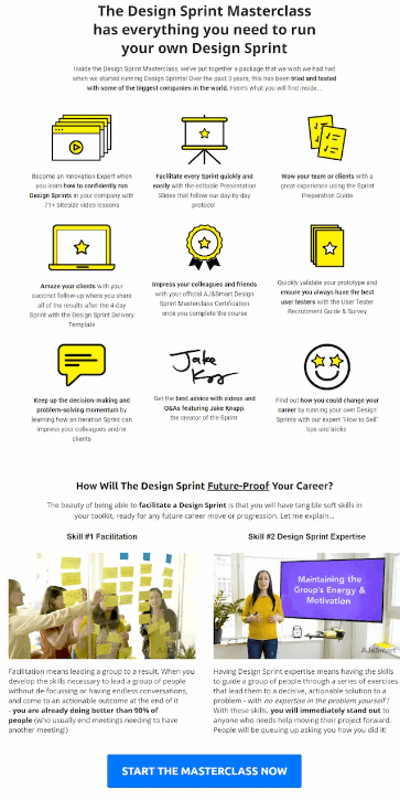
First, there’s the long-form Design Sprint Masterclass sales page. It has a longer headline but tells you everything you need to know in those first three lines alone.
The first paragraph details more about the class and why you should trust its instructors, complete with bolding to underscore the valuable points.
The benefits are presented as short paragraphs under graphics, which is nice. Then, there’s more copy about the class, and finally, a blue CTA button reads, “Start the Masterclass Now.”
The entire page has a white background, so the CTA button color would have stood out no matter what, but the blue grabs your attention.
2. Kiffanie Stahle

How about a shorter-form sales page? This one by legal coach Kiffanie Stahle is short, sweet, and to the point, which I like.
It features one image of an older man painting. The headline arouses curiosity in four words, “What if you could…” The benefits are presented in a straightforward, bulleted list.
As you finish reading the bulleted list, your eyes naturally gravitate to the CTA button to “Chat with Kiff!” The button is unique in that it includes a small portrait of Kiff.
The sales page has a clean white background, so the visual elements like the CTA button, headline, and image stand out beautifully.
3. Ramit Sethi
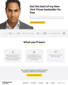
Entrepreneur and author Ramit Sethi created a sales page for his book, I Will Teach You To Be Rich. Immediately, this sales page commands attention with a rather serious-looking portrait of Ramit beside a headline calling his book a New York Times bestseller.
As if that isn’t incentivizing enough, the headline also mentions that the book is available for free.
There’s a CTA above the fold in bright yellow, which complements the elements used further down the page in the “What you’ll learn” section, which is also yellow.
Ramit does an excellent job building social proof, as he mentions how his book has been featured on CNBC, Fox Business, PBS, The Wall Street Journal, CNN, and ABC News.
I also love his tone. He makes you feel like you’re being let in on a well-kept secret by mentioning how he’s “never put all this content online before” and only offering the book for free “before I come to my senses and take this down.”
4. OptinMonster University

How about a more colorful example to inspire you? OptinMonster, a marketing service, announced its OptinMonster University through a sales page. The section of the page above the fold features a photo of a smiling woman that’s used as the background. The image is a fresh, appealing shade of blue.
The headline promises that students will “explode business growth.” Below a brief opening paragraph is a bright green contrasting CTA button that simply says “Enroll Now.”
There’s a welcome video below the fold, then social proof, as OptinMonster mentions that brands from Capterra to Patreon and McAffee use its services.
5. Level Up Your LIVE
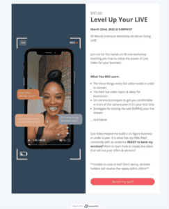
If you sell services, look at this example of a sales page selling a Level Up Your LIVE webinar.
It doesn’t have a traditional headline, but it does include all pertinent information above the fold, including the name of the course, the date and time, how long it lasts, and what it costs.
Below is a short intro paragraph followed by a bulleted list explaining the course’s benefits. Beside all this information is a photo of the course instructor going live herself (or staged to look like she is).
The red CTA button, which reads “Secure My Spot,” stands out nicely against the simple white background.
Read also: 25 Of The Best Product Landing Page Examples Online
Common Mistakes to Avoid When Designing a Sales Page
Is your sales page ready to go live? Triple-check that you don’t make these detrimental mistakes that can take away from all the hard work you’ve put in.
Since mistakes happen, browse solutions in this section, too.
Slow loading times
Your sales page has to load two to eight seconds fast. If it doesn’t, you will lose traffic.
Many culprits can bog down your site’s loading speed. They include JavaScript codes, uncompressed images, and too many pop-ups. Cut down on the extraneous elements, test your site loading speed again, and then see how traffic picks up.
Vague CTA buttons
What happens when a visitor clicks your CTA button? It shouldn’t be a mystery.
The anchor text should explain exactly where the link will take the visitor, such as “Sign up now” or “Click here to buy.”
The point of the CTA button is to drive action, not make people hesitate.
Harsh colors
Oh, my eyes! You don’t want your site visitors proclaiming that when they land on your sales page. It’s supposed to be an enjoyable browsing experience, not one that has them closing their laptop in frustration.
Remember, colors opposite one another on the color wheel are complementary and will look the best together.
Lack of information
Sometimes, you might try to whittle down your sales message so much that by the time you’re done, there isn’t much of a message left.
While you don’t want a sales page to go on forever, you must identify your value proposition, product benefits, and starring features and incorporate that information into your copy. Convey it in short paragraphs and bullets.
Too few visuals
While whitespace is a good thing in web design, too much will leave people questioning why your sales page looks so unfinished. Images underscore your message, generate interest, and build social proof. Well, at least photos featuring people’s faces.
Videos amplify your product and underscore its value, so they’re a great addition if you have them.
No social proof
Up to 81% of today’s consumers trust product and service recommendations from their family and friends versus a company. Why? They know a friend’s product suggestion is coming from the goodness of their heart. A company, on the other hand, wants to make a buck.
Social proof is the best way to prove that your business is trustworthy. If you don’t have any testimonials or reviews, you need to get them, ideally before your sales page goes live.
Playing too much on the emotions
Is it okay to toy with the reader’s emotions a little? Yes, but only a little. If you lay it on too thick, you will annoy readers. Your message will seem inauthentic.
Have another team member proofread your content and suggest ways to pull back on the emotions.
The page is too long
Long-form sales pages are thorough, but you don’t need to give customers everything but the kitchen sink. The point of a sales page is to pique curiosity. It’s not a technical manual or specs sheet. Prospective customers don’t need every last detail about your product.
If you’re having difficulty curtailing your long sales copy, add a video. This way, the video can cover some talking points so you can cut down on your word count.
Easy-to-miss CTA buttons
There are several reasons a CTA button is easily skippable. Perhaps its position is in a poor place, such as in the middle of the page or, worse yet, the bottom. Or you used a color too close to the main page colors, so it blends right in.
A/B testing your CTA buttons will help you identify and rectify the issue.
Advanced Strategies to Get the Perfect Sales Page
Mastering sales pages requires delving into advanced territory. These strategies, although more time-consuming to implement, pay off bigger dividends.
Psychological triggers and emotional connections
We all have psychological triggers, from anger to rejection, vulnerability, and, yes, the fear of missing out. Since these are some heavy-duty emotions, you have to wield them responsibly. You can’t mess with readers’ emotions.
That means using emotional language sparingly. The headline and opening paragraphs are wise areas to unleash your emotional copywriting, but then it’s time to reel it back in. As I mentioned, being overemotional can come across as fake, which won’t win you the sale.
Advanced segmentation
Make your audience buckets even more specific and tailored using advanced segmentation. Tools like Adobe Analytics, Klaviyo, and Mailchimp, as do AI tools, offer this feature. Implementing flexible yet more complex filtering will help you target the right audience segments every time.
Putting your marketing message in front of them, especially if combined with a special offer, will inspire them to buy.
Advanced personalization
Combine your advanced segmentation tools with personalization. Advancing this area means tailoring your sales page to a prospect’s purchasing or browsing behavior through dynamic web pages.
Dynamic web pages change content according to audience segments, although the layout differs from page to page. For example, a newer customer would see a different sales page than a longer-term customer.
Conclusion
Sales pages are a critical conversion tool that provides information on a product or service and motivates the customer to complete their purchasing decision. They’re excellent for customers at all sales funnel stages, from new leads buying for the first time to long-term customers purchasing something new.
Remember, sales pages require a lot of testing and optimizing to gain traction, but the results make it worth it.
EngageBay is an all-in-one marketing, sales, and customer support software for small businesses, startups, and solopreneurs. You get email marketing, marketing automation, landing page and email templates, segmentation and personalization, sales pipelines, live chat, and more.
Sign up for free with EngageBay or book a demo with our experts.
Frequently Asked Questions (FAQ)
1. What is the difference between sales and landing pages?
Landing pages aren’t exclusively about making sales, which is the sole purpose of a sales page. Instead, a landing page could be for lead magnets or obtaining email addresses.
2. How long should a sales page be?
The word count range is 500 to 5,000 words, with the former considered a short-form sales page and the latter a long-form page.
3. What are the best practices for placing CTAs on a sales page?
At least one CTA should always be above the fold. Before your sales page goes live, you should test its color, shape, and size. The color of the CTA button should contrast with the main color of the sales page. The button can blend in and be missed if they’re within the same color family.
4. How can I measure the effectiveness of my sales page?
Track metrics such as traffic, clicks, conversions, leads, and sales.
